I think it’s now directly incorporated into the scrollbar. Press/hold the scrollbar until letter pops up, then drag the scrollbar up/down to jump to that alphabetic position in the list.
1 Like
They show up on the individual album page view but are not an option in artist or album list views.
Create a Bookmark
Just start typing the artist or album you’re looking for and it jumps straight there.
I shared your initial reactions - but the vertical screening is much smoother and have adjusted to the larger icons that also you to see a lot more detail - and I use both an ipad and a laptop
1 Like
I am unhappy. Roon has lost sight of what made it good.
When I launch Roon, I want to find music to listen to. I have a local collection of stuff I’ve accumulated over the years. Music that I like. Roon was once a great browsing tool, with the bonus of great metadata management. It was just an infinite scroll to flip through my stacks.
Now? It’s a mishmash of ugly typefaces, small text, useless statistics, ‘see more’ buttons which re-render the entire page, and suggestions for streaming radio stations that I will not be listening to. If there is a way to rearrange or remove all the undesirable UI tiles, I have not yet found it.
I don’t want to see a list of what I listened to last night. When you go to a restaurant, do they offer you another plate of what you ate for dinner last night? No.
I don’t want a big graphic statistical breakdown of what I’ve listened to lately. I don’t care. I expect Roon is bundling that behavioral data and selling it to third parties (and charging me for the privilege of generating a revenue stream…) but it does not merit such a large, prominent place in the UI.
Why is there less music choice on the screen?
Why does it take MORE clicks to get to my music?
Why does it take MORE MORE clicks to get to more music?
Why is external content that loosely matches some random metadata field preferred over the local content that I have made an active effort to include in my library? Is somebody paying for that placement, and if so, may I please have a discount on my subscription?
Why can I not rearrange or edit the tiles on the home screen? It’s clearly built to be modular.
Bring back infinite scroll!
24 Likes
Not being able to adjust the memory used for image caching makes the experience of scrolling through albums on iOS absolutely awful. All I’m looking at for the first 20 seconds is a bunch of grey squares. Please give me back the option to set it to 2048 MB.
3 Likes
It is now integrated in the scrollbar. Go to artist and push/hold the scrollbar.
Sorry my english. Grats from Switzerland
1 Like
Agreed here too - everything running smoothly on M1 MBP, iPad Pro and iPhone.
And I really like 1.8 - the Focus feature is now something I use all the time, as are Tags. Somehow a product of all this is that discovery / suggestions on my Home page have been much more useful.
I can’t comment on old workflows that have been altered by the move to 1.8, but overall having watched the promo video, it does seem that Roon have achieved what they wanted,
Hi Everybody,
First feedback about 1.8. I like very much the new look and feel and feel it opens a new way to navigate and wander through my music library.
One small remark: when in the Album list sorted by Album Title, I enjoyed in 1.7 the possibility to jump directly to a letter (e.g. albums starting with M like Mozart). I did not find this feature again in 1.8.
Have great music listening!
FWIW, I like a number of the changes. The suggested links seem to be more relevant and helpful, for example.
But because we’re all doing the just-released badgering  what I think is not effective is the new, graphically indulgent Credits design. Those huge icons (that are supposed to include pix but most often just have useless initials) are way over the top. Graphic designer luv their icons, but icons aren’t particularly informative. When you get down to the level of researching producer, engineer, side men, etc. you just want the info, not pretty (and informationally pointless) graphics.
Something I learned the hard way while designing and user testing interfaces professionally is that while designers may wax orgasmic over images, users often take them to imply a dearth of content; and therefore, frequently prefer a simple array of hot-linked text (a shocking revelation in the testing room when you’ve spent a bucks-load on developing attractive imagery.) I think that the text-based solution worked perfectly for Credits in 1.7. As currently presented, Credits are a waste of space, a nuisance to scroll through, and incredibly inefficient in conveying the info.
14 Likes
What specs are your QNAP. I have a TVS471 i3 with 16 GB Ram and it works perfectly.
Not quite it jumps to albums containing that string
Filter Funnel type Q i see albums with Q in the title, NOT starting with Q
just a couple of examples…
- first one:
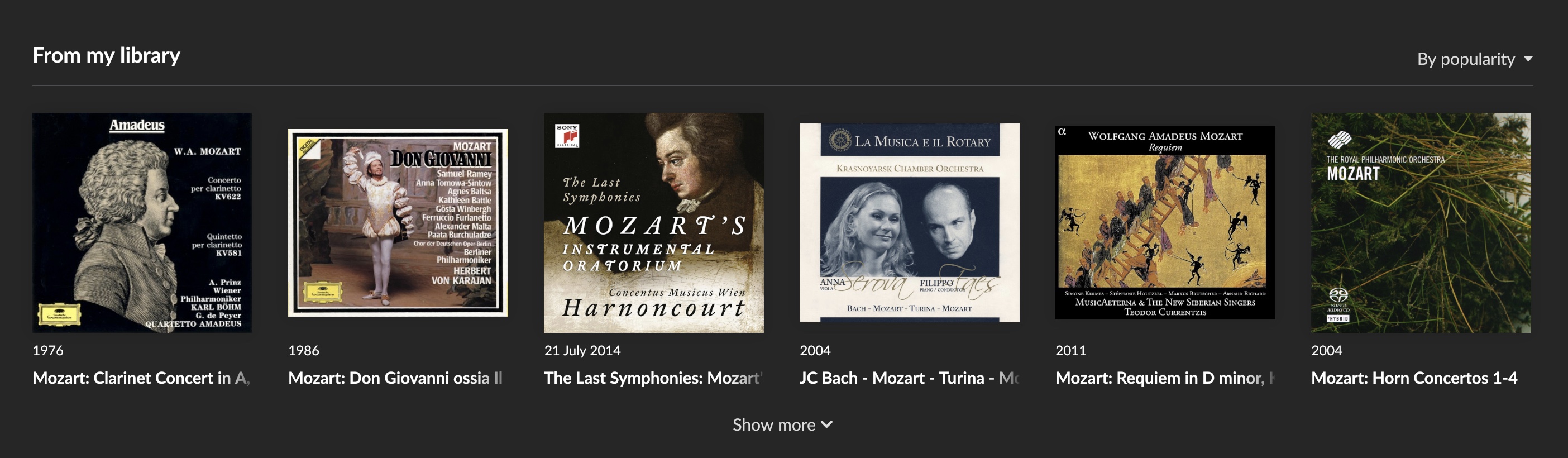
fourth album is by… a dear, but barely known as musician (btw… he is a pianist and Chopin is his “specialty”), friend of mine. is he really more popular than Teodor Currentzis? ![]()
![]()
won’t even say a word about those other “most popular”, according to Valence, choices ![]()
- second example:
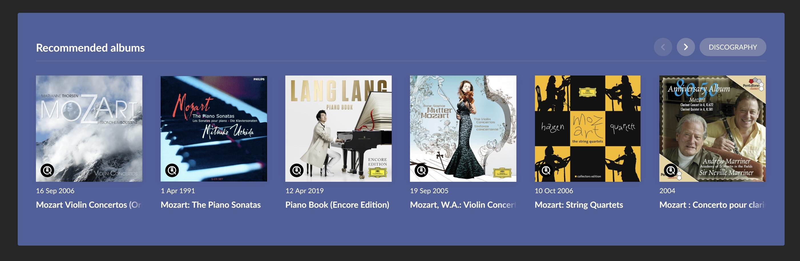
… seriuosly? ![]()
![]()
![]()
so, back to your question: NO, THANKS!
1 Like
Roon 1.8.00756 on Nucleus.
Album is playing. Roon Radio is enabled.
Again sudden unexplained music stop.
This morning at the end of an album the music stopped, the display stuk at 3/4 of the last track.
Play button gets music going again and then proceed to the next radio track.
I have this problem on my MAC OS desktop.
It’s probably been mentioned but. Being able to sort albums by “Date Added” to a Tag both ascending / descending. At the moment it just offers “Filter” but as a text entry box.
Because I now need to go into the Tag (with xx’s of albums) to remove the Tag from an Album, it makes it tricky to find the album you want to remove from the Tag.
Been using the new Roon for a day now. It’s fine - still playing music for me and still working reliably. Most of the things I liked about Roon are still there - just in a different location or a different colour. I’m not a purple hater, so that is OK as well. I can see Roon being my player of choice for the indefinite future.
I’m a little disappointed at the overall new layout. It’s lost its “roon-ness”. Right now, if you showed me a screen, I could not tell you whether it is Roon, Apple Music, Qobuz, or Tidal. It’s just looks like a generic, web-based music player. I hope, over time, it re-gains some of its character.
12 Likes
![]()
tenchars
1 Like