As in life not all is perfect and I have mixed feelings about the new Roon.
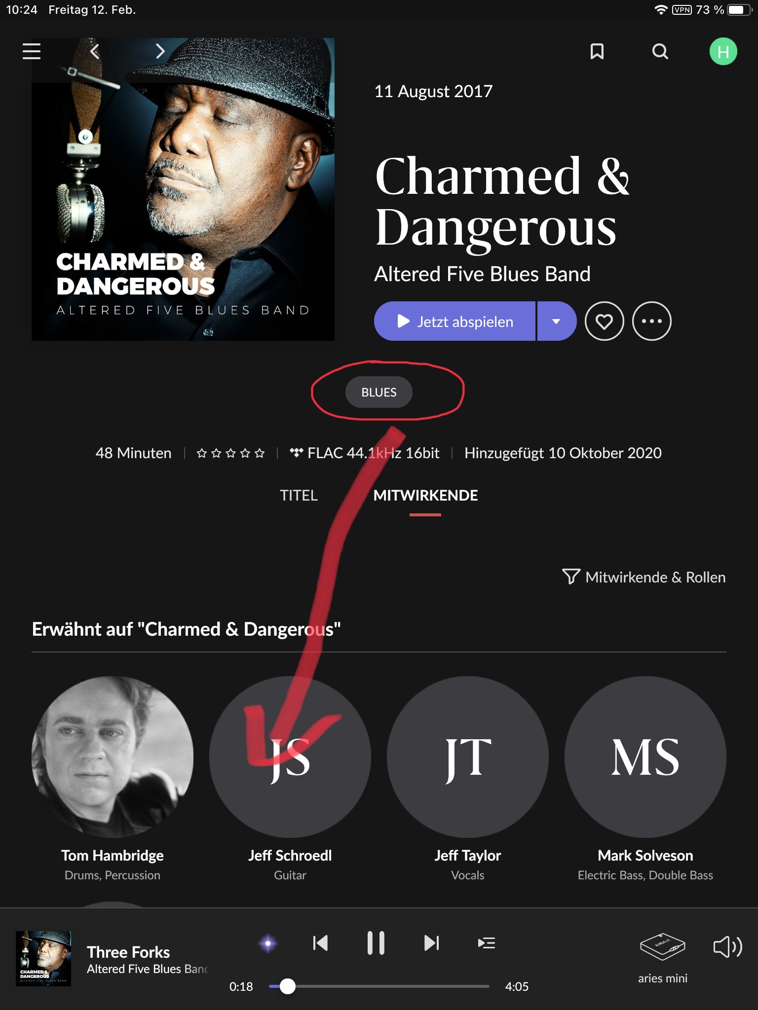
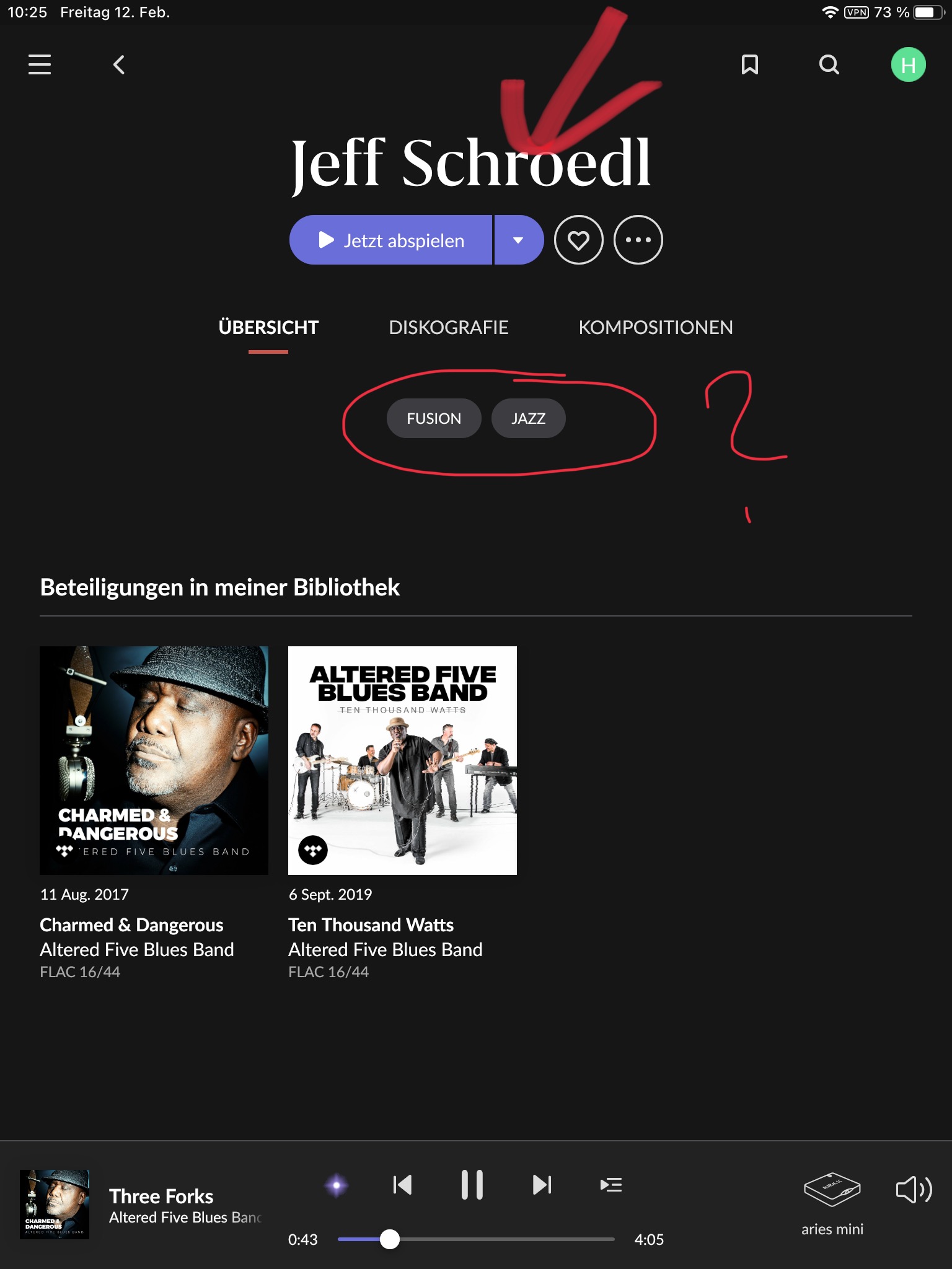
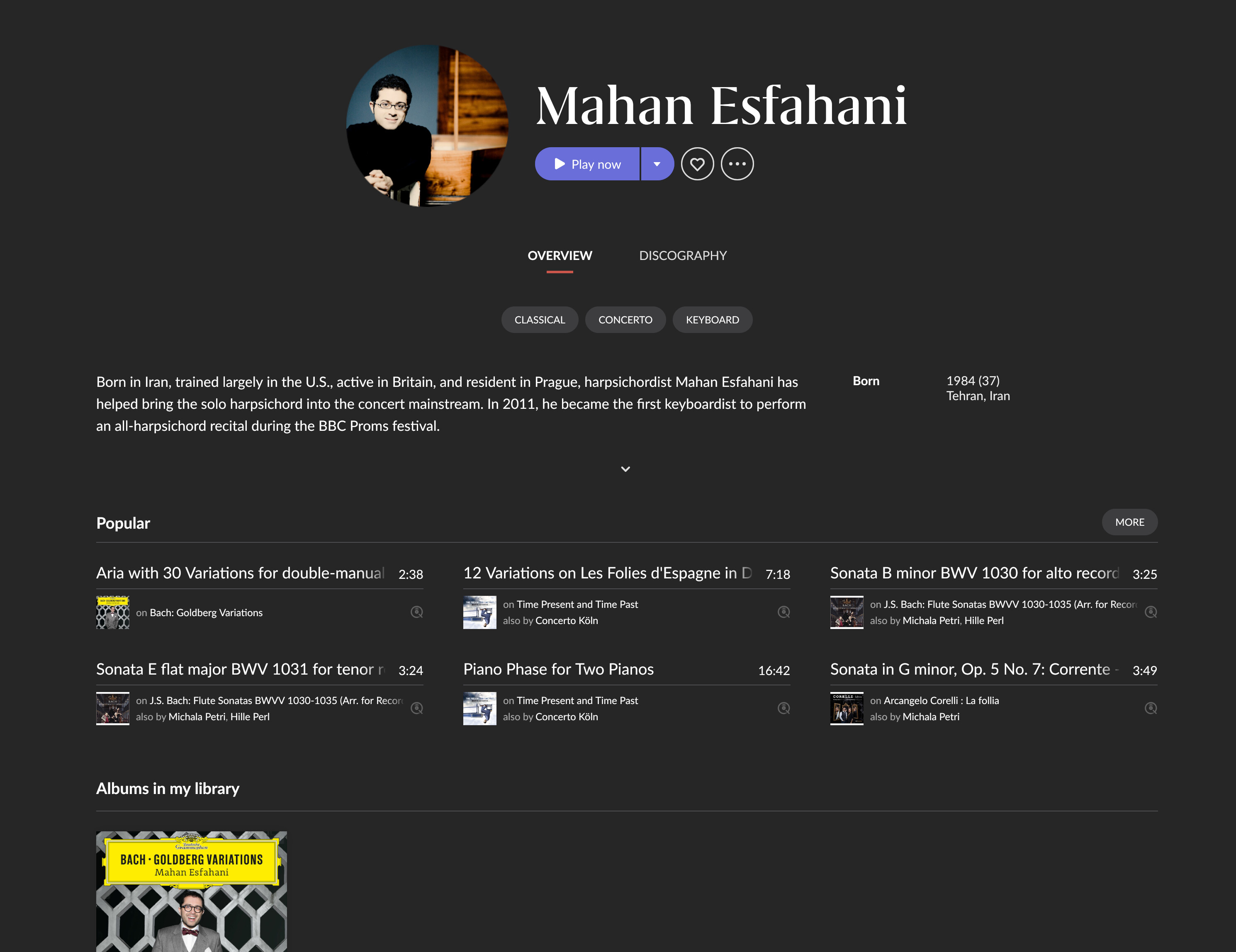
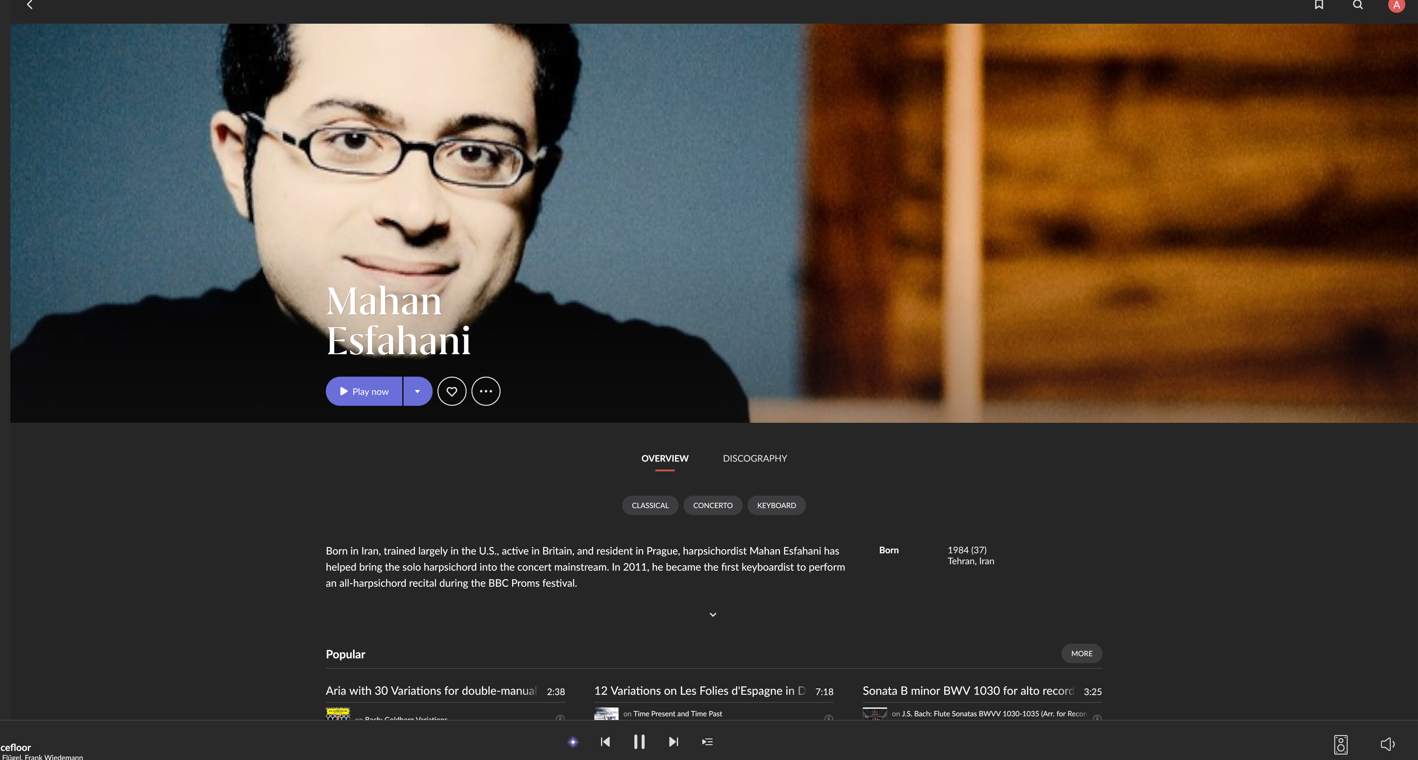
I really like the artist page and all the infos and connetcions it gives me - all bundled the way it is now. Especially on my iPad, which now also has portrait view (great) . Holding Roon in my hands that is when this new magazine style makes most sense. This is fun with artists I do not know well and getting me to know new stuff. As I stated before - I really do not like the new Credits and would love an option to view it the old way. It simply does not work, when you mostly have grey dots.
1.8 also seems to be a lot faster now. Actions are almost immediate, definitely was not that way on my 1.7 setup. Would I like less unused space? Definitely - but I hope the finetuning has already begun.
Roon created another app whose primary goal is too navigate and listen to the music already in/added to the library.
After all, the apps are just an interpretation or presentation of the database that the roon server has created on our hard drives. Similar to like what Plex did, Plex has all the bells and whistles and Plex Amp focuses just on listening to music.
My first impression 3 days ago of 1.8 was not so good, but with that time now elapsed I am slightly more positive. I will be converting to a lifetime subscription as there’s still nothing out there that even comes close to what Roon offers
Totally agree with most your comments: On the „circle“ vs „rectangle“;
The preview is circle. If you open an artist and his picture resolution is high enough, it spreads accross the top part of the screen, which I think is perfect and just as it was before in 1.7.
If the resolution is too small, it will just show a circle. I am always „hunting“ for high enough resolution pictures, so I get those nicely spread out over the top.
NB: All this „Statistic“, „Popular“ and „Top Performer“ stuff is indeed a major annoyance / waste of space and the user should get the choice to kill it / switch it of.