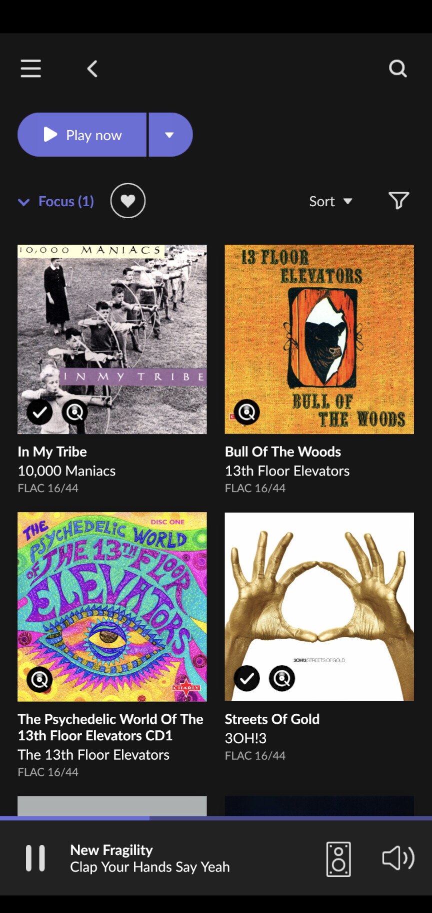
I don’t share this opinion. ‘CD’ is much easier to read. I miss the labels on the covers.
3 Likes
Yeah, it’s easier to read. It’s also at best ambiguous and at worst meaningless.
Yes. „CD“ is so much easier, shorter and more obvious than „FLAC 16/44“
1 Like
@bbrip
The point is I got to this page the same way:
Artists → click on artist name, and received 2 completely different layouts for the same artist.
I appreciate the details and well framed post on a specific use case. I just finished my update and am getting used to / learning the new version. Can you briefly provide details (workflow) on how you came to the two screen shots you provided?
That’s strange. Have you checked that you have this artist really only once in the database? Sometimes there are duplicates
working now !
1 Like
My media files are on ZFS and Roon works fine. Indeed Roon has no influence on the underlying file system.
I suggest you open a Support thread.
Yes, thanks. Spotted that.
But in 1.7 there were two icons, so I knew where I was. Now I never really know, I am just hesitant. For a start there is no consistent behaviour with icons. There are blocked ones, line ones, ones that switch color and ones that don’t. In effect I have to internalise different rules depending on the icon I am interacting with.
Also I get no count of local content vs streamed content. What I get is all content, with a count on another screen. Or local content with no count. To get a local content count I must scroll down and count my content manually. To get the streamed count I must mentally subtract that from the total count.
I actually found these counts useful as I used them to fix composition hierarchies and composition mis-matches so that large box-sets can be at least partially navigated.
3 Likes
That one is really a big miss. No idea why Roon felt this would not be needed.
1 Like
You can still do this. Either use the keyboard or grab the scroll bar and the current letter is displayed, then drag to the dealer letter.
1 Like
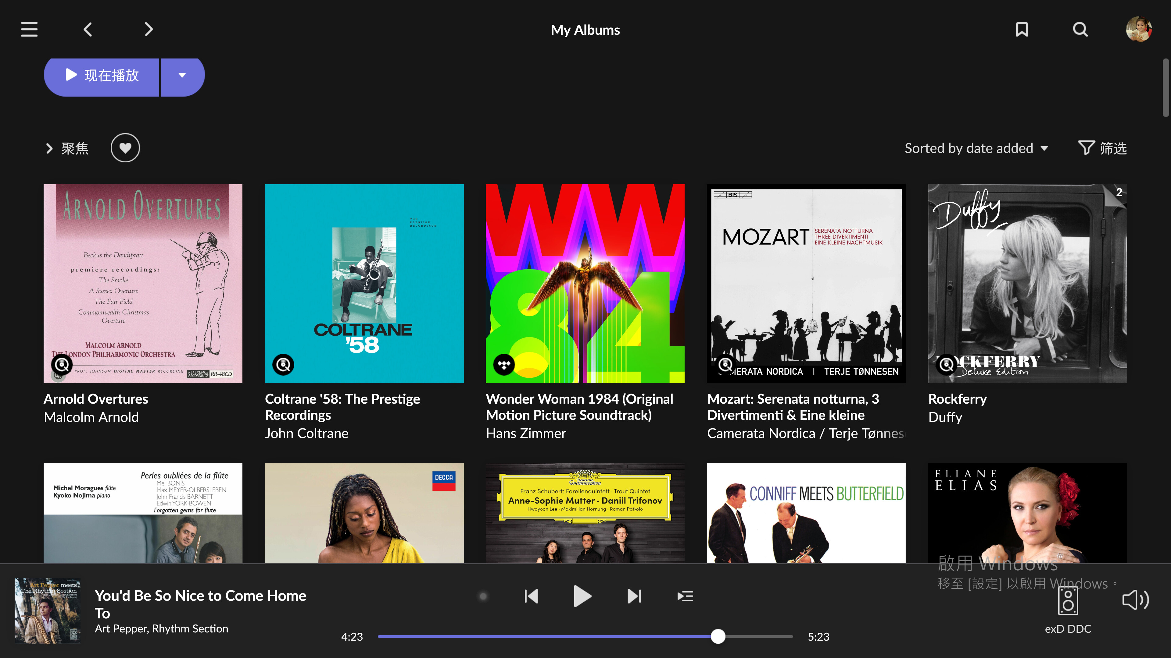
Certainly I need “Allow more covers”. It’s a big trouble for me to have only five to ten cover I can see, especially the scroll is so slow.
Please kindly let the “Allow more covers” come back
I NEED it!!
Also I prefer horizontal movement per scroll, strongly recommend to make it an option(vertical or horizental) to be decided by user.
Vertical movement might be ok for pad user, but for desktop PC or laptop user who use 16:10 or 21:9 monitor, vertical movement is NOT efficient.
3 Likes
Personally, it’s the other way around for me. I’d prefer see what file-format the song’s from, rather than what medium it was taken from. Everyone’s different and it’s obvious that ROON can’t please everyone.
6 Likes
So roon 1.8 is influenced by Classical music magazines. Interesting because I didn’t think Classical music magazine web-sites were influenced by Classical music magazines. Anyone else noticed that? The publishers seem to treat different media differently although there are often obvious shared elements from a branding perspective.
I haven’t bought a Classical music magazine since this time last year (last time I was in an airport) but I was comparing for example a year old BBC Music Magazine with their current companion web site. Quite a difference to the magazine.
Web site is using smaller bolder fonts to the magazine and higher contrast background and foreground colors. Not really sure what to make of the current roon main album page. Very low contrast, odd mixture of fonts, not clear where links or content is from screen to screen. From screenshots I’ve seen, the layout seems to work with certain views on a phone. Looks odd I’m afraid and difficult to navigate on my laptop. I’ll eventually figure out where everything is I’m sure. Just does not feel very “roon” anymore. I don’t think that is just the unfamiliar of the new. Some magic dust has been lost.
1 Like
Great release. I use the dark theme (I cannot fathom how anyone would like the light theme!!!  ). The purple links look gorgeous. It’s been flawless thus far, and the iphone app seems to be behaving.
Thank you.
9 Likes
I hate it. A face only its mother could love ![]() . Cannot get on with the dark theme unfortunately. Must be eyesight related. Not sure what as I often go for amber or green on black for example.
. Cannot get on with the dark theme unfortunately. Must be eyesight related. Not sure what as I often go for amber or green on black for example.
1 Like
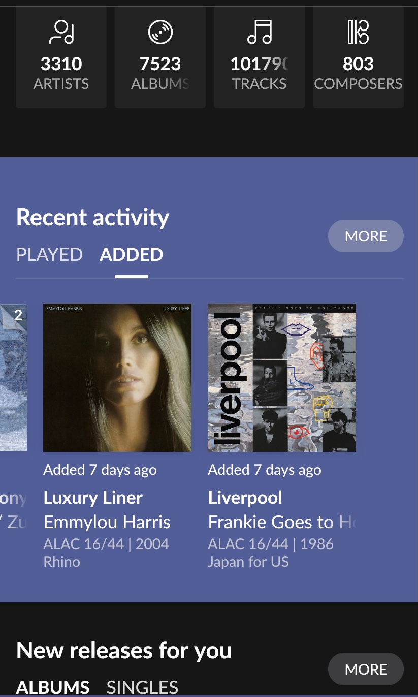
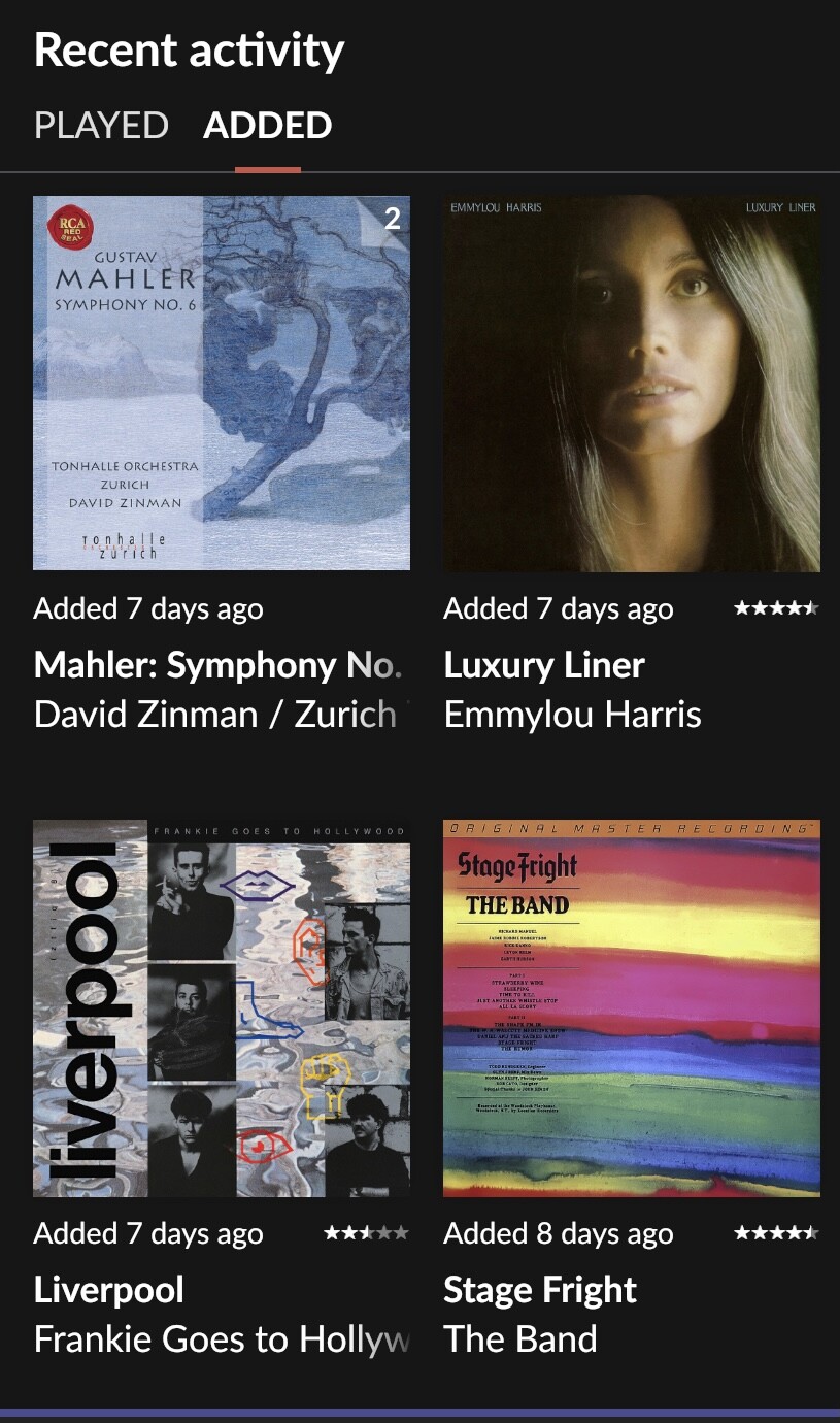
I started naming my album titles in iTunes with brackets at the end so that this information would show up on Roon’s album art on pretty much all interfaces (eg. Luxury Liner [2004 Rhino]). Now This information only shows up on specific screens:
1 Like
And of course it wasn’t even an indicator of that, since the “CD” badge was applied to 16/44 titles in the library from Tidal/Qobuz.
1 Like
Ah! so the CD labels have ben depreciated as well? I thought I just hadn’t figured out the right switches yet. Why on earth have they gone? If you don’t like them you just don’t set them.