I don‘t have this Problem.
Overall I think 1.8 is a winner! On iOS the app is a bit too touch sensitive - I keep opening windows I don’t want to open. Needs some adjustment.
The next update should be soley technical to enhance network performance. I still don’t understand why using a 250 mb/s internet connection and a FritzBox 7590 I can only stream flac files without frequent drop outs.
2 Likes
One more problem after 2 days’ using: redesign the progress bar in dark theme please. The blue light under the total progress bar is ugly and the waveform in the played section is hard to recognize.
OS: macOS
Roon has evolved from release to release for the better.
Same is true for 1.8.
What I love most is the purple color. Great choice.
7 Likes


Good call. I don’t want to be reminded how much time I spend with Roon. Stats should be optional or hidden. Thanks.
1 Like
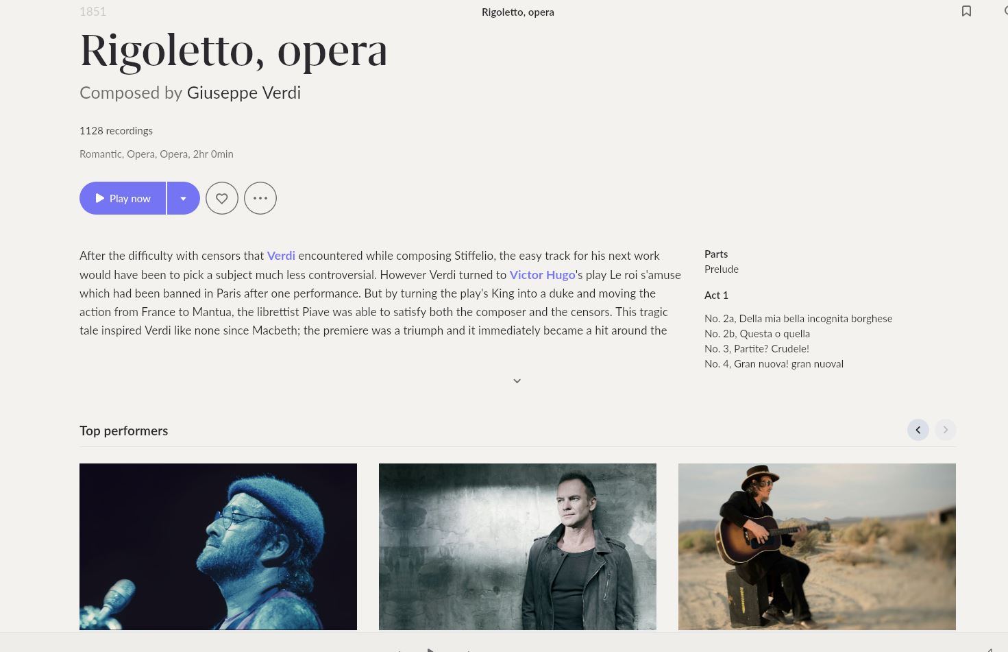
This atleast made me smile. I really had no idea there was a great Rigoletto recording with Sting and Lucio Dalla - I guess we never stop learning 
3 Likes
What, you expected consistency from the summer intern given the design brief?
5 Likes
To be fair, you’re displaying the last screen of top performers and both Sting and Zucchero appear with Pavarotti. I’m disappointed Brian May isn’t listed!
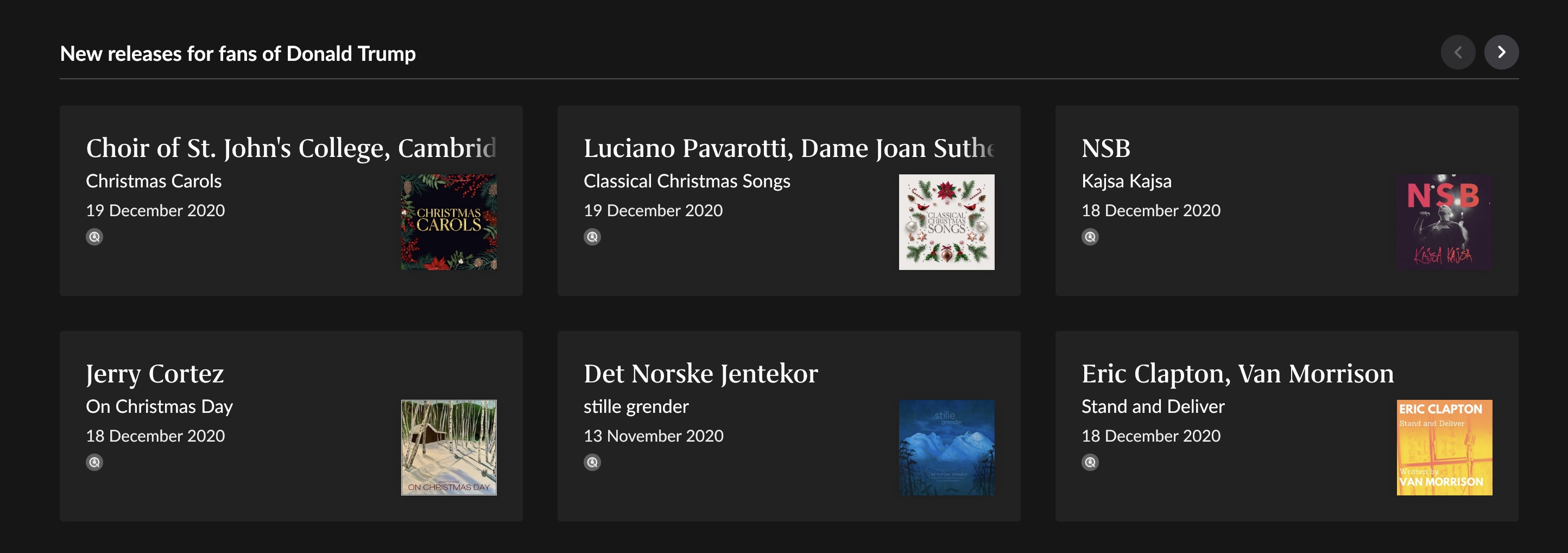
Funny thing is I recently deleted all of the Eric Clapton records in my library (I think they got there via Tidal Essentials as I never like the guy and more so now). So what do I get as a rec on the home page first thing: Eric Clapton! Not ‘My’ Artist!
2 Likes
… which makes it all the more ridiculous, what with Tidal/Qobuz being streaming file platforms.
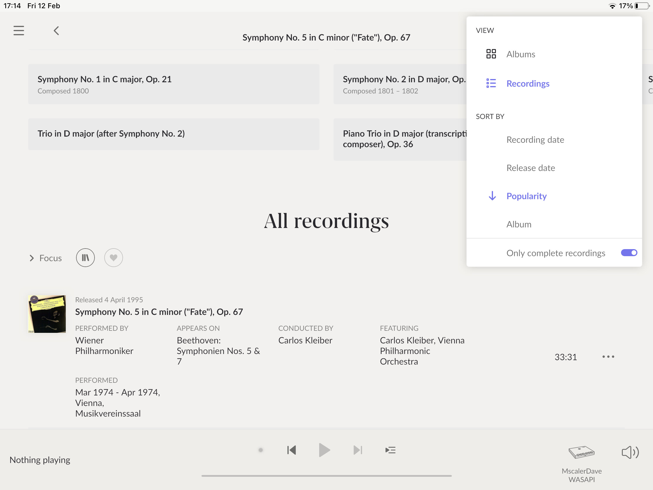
Click on the drop down where it says “Recordings by popularity”. You will get a drop down at the bottom of which it says “Only complete recordings”. Select it and the majority of the spurious recordings will disappear. It’s a brilliant feature. Agree with you they could use the space more effectively though.
1 Like
I am not a fan at all. I have a lifetime membership, but there’s no way that would have happened with 1.8. I doubt I’d even renew after thirty days. While I was posting this, a friend down the street texted. He wasn’t sure about getting a Roon membership and is running a trial and he just said he wasn’t going to go forward after the update.
Weird software glitches. I never know if my DAC will be there when I start up Roon on my Mac. This was not the case with 1.7 (or any release before). Unexplained music stops galore. Roon crashes more than it did. I suppose this is the easy part, new software, new glitches.
A self-indulgent design with tons and tons of wasted space. There was wasted space before and now it is virtually all wasted space. How could they make the genres page worse? I really don’t need to see a photo of Rush under rock. I know they are rock (in fairness they were in Roon before), I know what rock is. Brian Eno isn’t classical, but it’s kind of funny to see him there. William Basinski is “unclassifiable,” ok, great! Either way, it’s a ton of scrolling for absolutely no reason.
Why is there so much giant text everywhere? Let me shrink the overall size of text if you’re going to gratuitously take over my screen. The interface violates a basic rule of typography every student learns in their first week: make small variations. If you are going to mix serif and sans-serif texts, don’t make the serif text much, much bigger. The change in serif or the change in size is enough. The giant “Hi, username” up top. I don’t need to see a graph of recent listening and what I’ve been listening to. This is not Strava. Why? The home page is now designed to take up as much space as possible and encourage scrolling. No!
Two massive images take up virtually the entirety of my 5k monitor on my home page, one to advertise other performers playing Led Zeppelin the other on collaborations between Sonny Rollins and Roy Haynes. Ok, I get it, you could have put these in a tiny box and given me the same experience. Most of the home page is useless info (the Strava-like statistics of my playing and these recommendations). These are hardly quibbles. The UI experience is broken and that is hardly a question of taste when for most of us, the UI is the main reason we use Roon over another solution.
There’s more but there’s also work to do here, and there are plenty of comments about how awful this release is.
1.7 was fine. Had it included Roon on the road, a la Plex, I would have been thrilled. This, however looks like they’ve ignored everything we’ve asked for and have, instead, built something to appeal to venture capitalists who think that this is the next SoundJam and Apple will buy it for a billion dollars.
26 Likes
![]()
tenchars
5 Likes
Your last sentence is, sadly, probably the most accurate I’ve seen.
4 Likes
Sorry. I was afraid of that.
Since ROCK had an update sometime on 11/02/21 I’m stuck in an initialising loop. Everything was fine in 1.8 beforehand from Tuesday. The app is up to date on my 2020 iPad Pro. Trying to connect through a Fire tablet is exactly the same. Hopefully this is a minor speed bump.
Would be great to get people’s thoughts on UI changes based on their primary remote type. I have a guess as to how some of the polarization is shaking out, but I’d like to know if I have a strong hypothesis or not based on data:
I have the same quip about the waveform. But also, the current song info (track name and artist) is tucked away in the left corner and in a small font, making it harder to read. Whatever you say about the elegant features of the new UI; the current track info is paramount and should be easy to find and read. That was the case when it was in the center.
6 Likes
Not quite. Not using the filter, if you are sorted by artist and you type B it takes you to the start of artists beginning with B. In sorted by album view if you type b it takes you to the first album starting with the letter B.