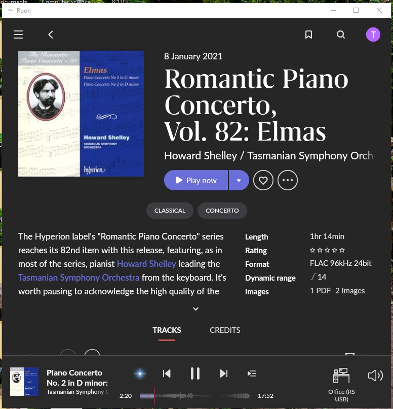
No doubt many people will be unhappy with the changes made in 1.8, however my initial impression is very favourable:
-
Allows me to focus on composers and performers more easily than was MY experience before
-
I can at last use my cheap and nasty Amazon Fire HD 10 in portrait mode, making it usable as a control device
-
Apart from the odd serif font used for main headings, I like the typography and layout
-
Most pleased with the ability to have a much smaller window size when using on my Windows 10 desktop - makes the whole experience much more manageable
My current main gripe is more to do with a lost opportunity:
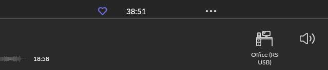
When maximised, or set at a larger size, a large amount of useable graphic area is left empty (nsert tumble weed image?). My suggestion is that this area could be used to show the icons that appear when clicking on the ‘speaker’ volume icon:
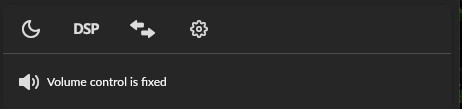
So, I could then more easily access the DSP icon, for example.
Any other ideas for using the ‘tumble weed’ space (NOT ‘make the tracking timer wider’!)?