Hi all,
I often use my 48’’ OLED screen as a Roon display. The layout you provide is undoubtedly clean and sleek: I like it.
However, I think it does not value cover arts properly. One of the reasons why people like so much vinyls (I don’t) is because of the connection that their big cover art creates with the listener and I think that Roon display could do better in that sense. As it is today, while overall clean, I think it does not leverage the available asset space of a big TV screen to value the cover art properly.
Maybe you could offer a few layouts to choose from, without adding complex customization functionalities?
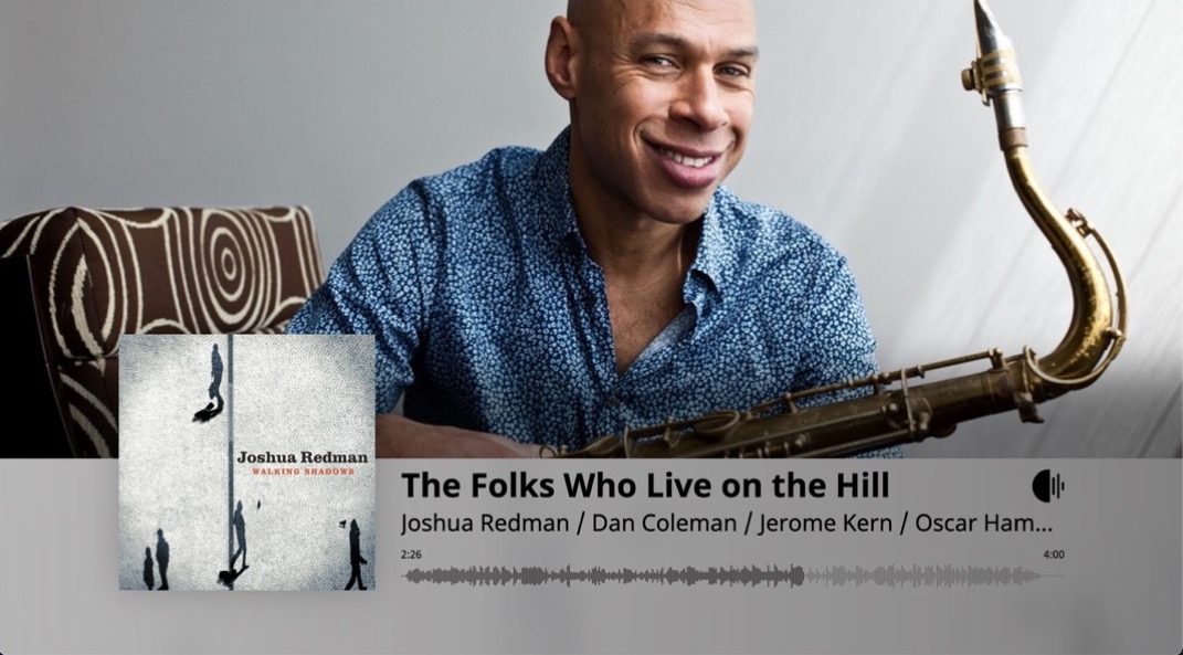
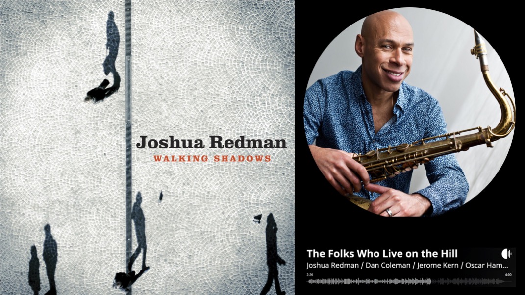
Attached is an example AS IS and my proposal for a second layout to offer. As you can see, in my version the cover art is standing out much more. Moreover it abides by Roon’s rule that square = album and circle = artist.
I think that adding a few additional options to choose from would definitely increase the value of the Roon display functionality while not complicating your software.
If you’re feeling adventurous, and have some basic css skills, you can edit the display yourself. If your core is on a Mac the file you need to change is here:
Not what you’re after, but I’m sure it would be fairly straightforward to code your proposed layout. The only thing you’d need to look out for is how to incorporate the lyrics, assuming you view them when using your display.
Hi Dave, all,
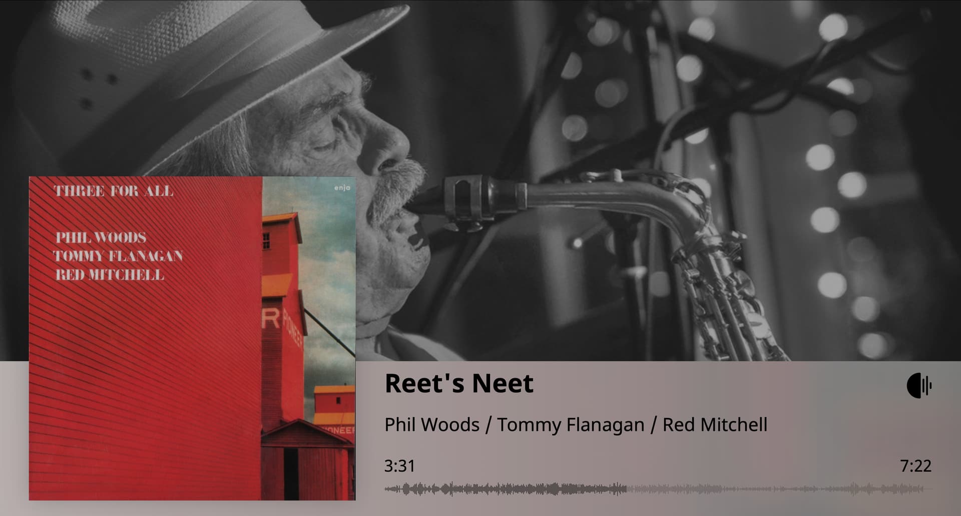
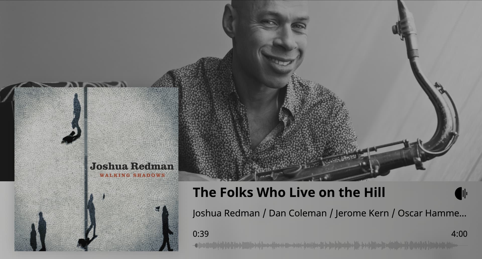
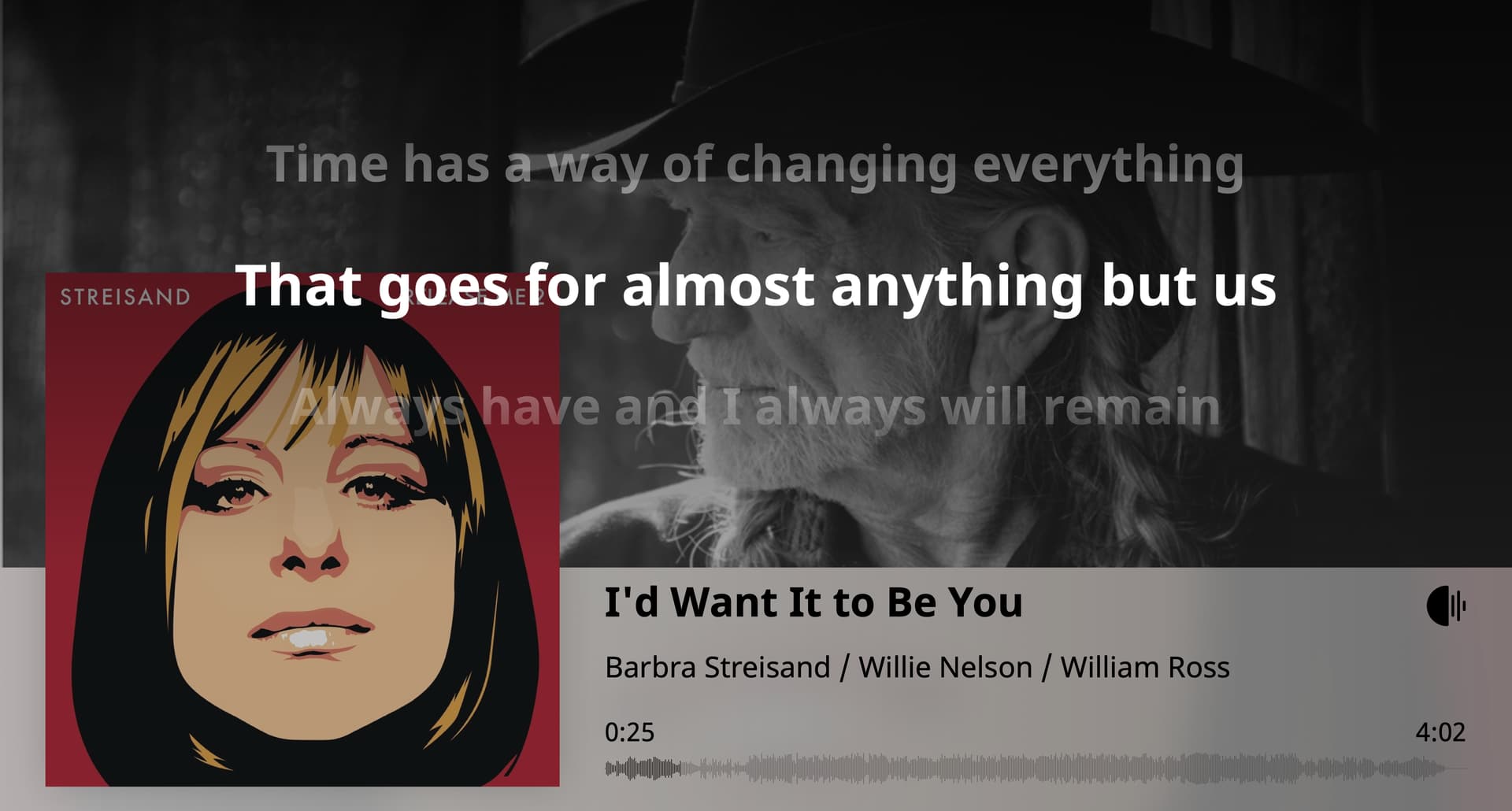
I did some tweaks to the original style, with the idea of emphasizing the cover art and make the overall look and feel less glossy / more paper-like (to fatigue less the eye):
cover art: much bigger, slightly darker and slightly less contrasted;
artist image: B&W, darker and less contrasted;
lyrics: brought to forefront (else they would be hidden by the bigger cover art) and adjusted the background gradient to make the central line stand out;
bigger font for the progress and end time (before I could barely read them from my sitting position).
It does not give a WOW! sensation but I like it as I find it resting but not distracting.