Best summary as to “WHY AT ALL”.
I read that Discover was removed completely and put back in at the last minute, I think it should have a better treatment than just a solid purple bar.
One thing that would greatly appease me would be to have a configurable Home Screen, say you want Discover easily accessible, configure it so that its at the top of the Home Screen, I won’t ever use the stats, so I’d configure that at the bottom of the Home Screen (or turn it off, given the option).
Initially I had a very emotional angry response to 1.8, well its growing on me but I don’t think I will ever like the lay out of the album screen, the date above the album name/artist name, the font is too large and pretty ugly. The use “My” everywhere is also something I remember from early on in iTunes v12, it was removed pretty quickly.
I think Roon had to change after all its fundamentally looked the same since its inception, they have to stay relevant and modernise. The design principles used are all common in todays iDevice driven world, I’m personally not a fan of the artist circles but they have been used in iTunes for years and that’s the rub for me, Roon has become derivative whereas it stood out as being different pre 1.8.
I used to be a design engineer for many years and used enough CAD software packages that were entirely different to know that eventually I’ll get used to 1.8 and in a year or so I will struggle to remember what 1.7 looked like.
I like the purple block, not so much the red but I think that both blocks of colour could be streamlined so that they aren’t so large. I understand these colours are being used in modern GUI design to highlight relevant information but its size compared to the album covers is too big but I’m not a GUI designer and perhaps they tried different possibilities and felt that this was the best.
I generally used TIDAL to find new music and then purchase albums if I like them enough. The valence driven discovery features on nearly every screen are pretty cool and I have already found several new artists that I hadn’t heard of who will be getting my money.
Actually, the journey goes back to Sooloos. I think that preceeded Roon by at least 7 years. There is/was a lot of that product in Roon. That in itself may be a part of why this was such a substantial update.
It’s also just the nature of software development to change; myriad dynamics cause this.
Perceived value can decrease over time if a product like this remains essentially static.
Oh come on! You know what you were saying, and you know what others were arguing. If you’re in a company that devotes time and ressources to make changes and 1/3 of your customers are unhappy with the result, that’s a bad thing. That’s the gist.
Hello Klaus,
I think you are right in many aspects. And some of the changes are only changes, no improvements.
For example the area in which the progress of the actual title is shown is shrunk. By this it is more difficult to go to a specific point of the title. And the symbol of the wait list shrunk. Why? There are not only young users with best eyes but also older ones. Und why shrink an area if there is space enough?
I think you will find that some of these changes look better for example on a smaller format phone device. Using the waveform to queue up a point in a track is not really practical on such a device. I am not arguing it doesn’t have its uses on a larger format device. That is actually my own use case and I found the older waveform useful for that and also other reasons.
Good summarize!
But for the future Roon has to decide where to go.
Do you remember ebay at the beginning and now? Now ebay is taken over more or less by commercial sellers. And very much of the advertising of ebay is to support commercial sellers. And it makes less fun for private ebay users.
What this has to do with Roon? Well, the question is whether in the long run Roon supports the users or the streaming companies.
Up to now the quality of music reproduced from local files can be better ( depends on the equippment ) than streamed music. Therefore the local file library will probably be very important for at least the next decade. And Roon should recognize this. But streaming is an important part even now. When I use Roon radio after my programmed files I get music not only from my local library but from Qobuz too, and sometimes get very good inspirations by that.
So both parts, local library and streaming are similar important.
But the user and his music experience should always be the center of Roon´s focus.
If I stream I pay for that, so there is no need for Roon to make any concessions to streaming services which would reduce music quality or music handling.
The funny is that this progress bar was made that small already in v. 1.6 and then enlarged again upon a lot of complaints, or it was in 1.7 beginning. Now in 1.8 Roon tries again and we as users need to fight against, maybe succeed again Roon to reason on it that in 2.0 there will be the next battle. Quite curious to who in Roon is the opponent to that users wish??
They didn’t do the vertical scrolling right though, it’s a janky mess on iOS and should have never been released past beta.
Gimme 1/3 of your money. It’s just a minority! ![]()
I’ll send you my PayPal in a private message.
So, I don’t think it’s universal… I use 1.8 on an old iPad Pro and on an iPhone 12 Pro and on an iPhone 8, and none of them have the vertical scrolling problems that you & others have talked about; for me it’s a delight. I’m not saying that they should have released it - clearly something is wrong - just that when they fix the bugs you are experiencing the quality is great, so I’m holding out hope that they can fix it since it’s not universal.
It can be quite a bit stuttery and its also not keeping the correct position when you select an album and then go back - you suddenly find youself a page up or down or back to the very top…
All that obviously needs fixing. But overall I‘m glad vertical browsing has arrived. So much more natural overall.
Yeah it’s definitely not universal, hopefully they’ll fix it. I have 2 days left on my trial and then I’ll purchase a years membership and see how things go within the 30 day refund window. Overall I’m pretty happy but there’s a few bugs that I’d really like fixing, especially the one that blinds me after switching apps. Not writing roon off completely, I’ll be back with another trial at some point if I do cancel.
If it goes to the top after you went back: click the filter button on the right and click the x mark. Then you can go forth and back again without going to the top of the list.
Just a workaround for what I would call a bug.
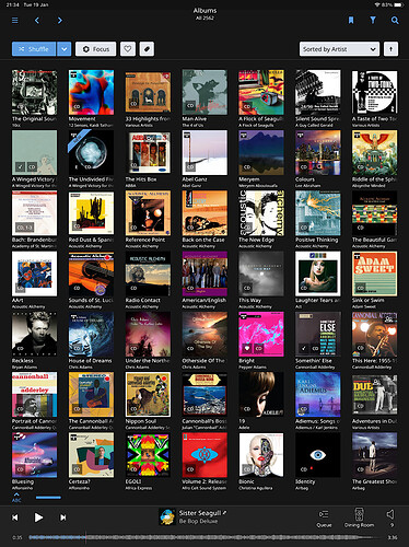
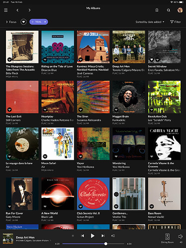
I’m not sure why you think one is better than the other for everyone… I prefer the latter, because the effort to scroll in a touchscreen is effectively zero, and i prefer the additional visual information in the larger covers. The density of visual information is an upside to you and a downside to me. Different strokes.
You clearly prefer the other way around. Maybe because of your set up, maybe because you process information differently than I do, maybe because you dislike change. All fine things. But to say “why oh why did you change this perfect thing?” is to ignore that there are others who don’t have the same opinion, needs, etc.
Now… I do think that there are enough Roon users who clearly consume information / browse in a way that privileged density that the team can think about bringing back the “show more albums” configuration; it doesn’t hurt me and it helps you.
But if they were to change the default and remove the ability for it to look like this, I and many (I’m not saying what %, just a non-trivial portion) others would say “Roon no longer acts like I want it to”. Am I married to it? Nope. I’d still use the software. Maybe they have a reason beyond just design for having changed it, and if so, then I want to see what that rain is before I say “eliminate that”.
Maybe I’m just saying “different strokes”.
I fully agree, Roon is shy to show us our albums  Probably the Roon team grows older and cannot yet confess they actually would need glasses. A normal problem of those that get 40+ years old.
You make far too many assumptions about my preferences, I didn’t express a preference 
I think you are totally wrong. In 1.7 you could choose to have larger and less albums shown, so what you prefer was there as well as what @PixelPopper and I prefer. But in 1.8 this choice is not anymore available, for no obvious reason. The albums are too big, even on my iPad mini, and ridiculous on an big screen of an iMac or PC. It’s quite crazy to run mouse or scroll miles to choose from 14k albums I have in my local library.

