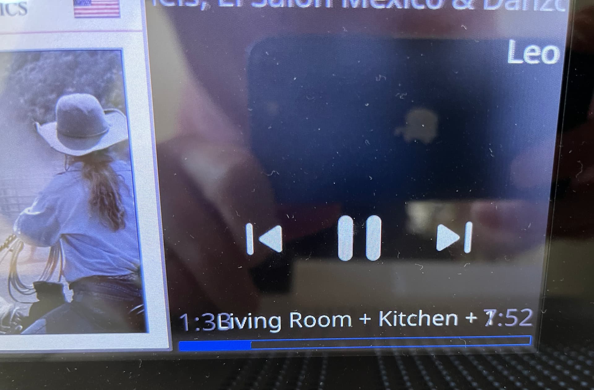
I have noticed an issue with long zone titles following the recent updates to Display handling. The zone name encroaches on the mm:ss timing indicators on either side.
While changing this behavior may be non-trivial for pathologically long zone names, there is another fix that would mostly ameliorate the issue in this case. This Display is controlling a Grouped zone called “Living Room + Kitchen”
However on the Ropieee Display, the zone appears as “Living Room + Kitchen +1” (see first photo). In this specific case, eliminating the superfluous " + 1" would make the zone name short enough, and would also remove general redundancy for all users with a cleaner data presentation.
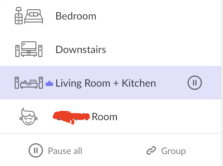
Yes, this is a grouped zone. I believe Roon initially set this name as “Living Room + 1” and I edited this in Roon zone settings to be “Living Room + Kitchen” for more clarity (especially for other members of the household).
At any rate, nothing in Roon settings currently seems to append the " + 1" marker to the name, and I’m not sure where Ropieee is pulling it. It may be that Roon reports “[Base Name] +1” for all grouped zones, and Ropieee (or Roon) is taking my edited group zone name of “Living Room + Kitchen” as [Base Name] instead of “Living Room” as the [Base Name]?
Yeah, I think this is where the problem is. Roon has a very limited way of showing (over the API) that you’re dealing with a grouped zone: that’s literally done with the ‘+’ symbol. So there’s some very crude detection mechanism in RoPieee as well to detect that.
I assume (and this is speculation: did not had the time yet to have an actual look) that this is somehow related to that.