Hi all, I’ve been using Roon for a short while now and I’ve come across a few UI/UX quirks that I think shouldn’t be for such an articulate and fluid piece of software. They are mostly to do with unnecessary interaction with the app. I tried Roon a few months ago but couldn’t thoroughly test it for lack of time, but I am pleased to see some UI tweaks implemented in the meantime, like the ‘Track Action Play Preference’ and ‘Play Now’ function button which greatly improve UX.
- Why no home button? You have a beautiful Overview page, yet I have to click on the nested (three line, left-hand bar) menu in order to access it. I suggest implementing a ‘Home’ or ‘Overview’ button (see Fig. 1)
- Why, if wishing to play an album is a two-click operation needed? Currently you click the album, then click the Play Album button. I know this used to be even worse (three clicks??) but a play button on the album on all pages should exist. Both iTunes and Spotify do this. I don’t accept the argument that this ease of use function somehow embodies a hedonistic/disposable (younger) generational ideal. It is simply a matter of fluid UX.
- To this point, this function should mimic the ‘Add Next’ function. For the life of me I have no idea why the Play Now function destroys a queue without warning. Play Now might be better implemented by inserting the song/album before the queue and preserving the queue’s integrity, and simply having an ‘Add to Queue’ option instead of all three. If one wants to destroy one’s Queue, one can do this alone by going to the Queue screen and clearing it. This applies to the play button next to each track in album view.
- Library view: With all due respect, why is this still horizontal? Or at least vertical scrolling not an option? (if the Feature Request forums were to have a vote button for requests, I’m sure the dev team would see how seriously people might take this counter-intuitive functionality)
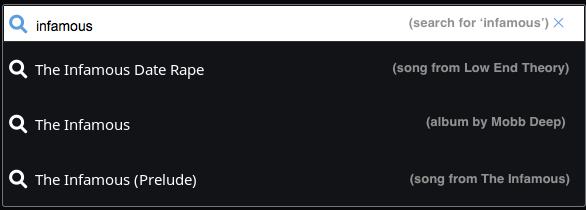
- Search bar: When typing text and pressing enter, the action should take me to the standard ‘Searching for x’ page. However, when I type text then select from the drop down box, please take me directly to the view of the object I selected. Presumably those suggested options on the list are taken from metadata, and so when I specifically select one, why would I want the generalised search view? The UI fix for this could delineate the object being suggested. (Fig. 2)
- Radio function: There is only the possibility of thumbs up/down the next track, not the existing track. Sometimes you are not too familiar with the next track and want to listen before you alter the feed.
- Radio function 2: When transitioned to radio, it would be great for the cue to reflect a populated list of what to expect, and what has played. The normal ‘on-the-fly’ playlist has what is to be played, so what I am requesting is that the radio show what is next to be played in a playlist type function, with thumbs up/down options (Fig. 3)
- Right-click functionality: Counter to normal OS interaction, to select a file you must right-click. This doesn’t seem to make much sense, especially when the action menu the single-click has can be placed in the track-level menu (three dots, currently has ‘Add to Playlist’, ‘Add to Tag’, ‘Share’, ‘Export’ and so on). This is naturally where additional functions which are not intuitively found are searched for. There is a play button next to each track (which as I’ve said above should replace the Queue destroying function and simply play it immediately in front of the Queue). I suggest these actions should remain consistent with OS level click interaction and this current single click menu be enveloped into the track-level menu–which incidentally, is where most people will look for non-counterintuitive functions like adding to queue and so on. Single clicking on blank space should select a file, which is complimented by shift/command/alt functions to select multiple items to then click the track level menu to Play Now, or Add to Queue.
- Queue. I find the layout in Queue to be a missed opportunity. Once again a single-click enables functions like ‘Play from Here’ or ‘Play Now’, yet a play button (as is seen in album view) would resolve this. There is already the ability to move tracks up/and down, so a ‘Play from Here’ is unnecessary, as is a ‘Go to Album’ if you only added the album info (which is hot-linked anyway) in the Queue. A delete button would resolve the awkward right-click function in this view. There should also be a link to History, which is, at the moment, another two clicks away. (Fig. 4)


Interested to hear the community’s thoughts on the above