Where is the innovation? There is so much wasted space and it looks the same as all the other services. I love Roon though.
Where are the Graphic designers on here to help others and offer suggestions? We must have some even if it’s just for fun to see possibilities…
+100…there is too much wasted space all over Roon which causes a visual imbalance esp when the artist or album art is tiny. Another page I think needs work is the queue page. Why are so many items repeated with the bottom now playing bar (waveform, heart icon, lyric icon).
In my opinion, the adherence to a strictly horizontal orientation is limiting creativity.
- There’s plenty of room for the album review to be displayed with the cover on the top of the screen…
- In radio mode, why not keep the queue populated with 15 or 20 songs so we can look ahead and maybe delete those we don’t want to hear – that empty queue is just a big hunk of dead space
- that radio on/off window should just be a button vice a static window
- Someone else suggested, and I concur, that on screens with multiple windows, it would be nice if the windows were independently scrollable
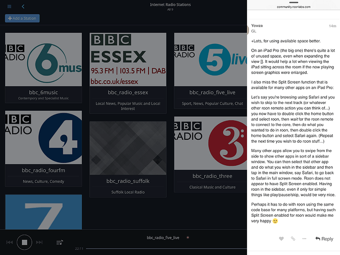
+Lots, for using available space better.
On an iPad Pro (the big one) there’s quite a lot of unused space, even when expanding the view []. It would help a lot when viewing the iPad sitting across the room if the now playing screen graphics were enlarged.
I also miss the Split Screen function that is available for many other apps on an iPad Pro:
Let’s say you’re browsing using Safari and you wish to skip to the next track (or whatever other roon remote action you can think of…) you now have to double click the home button and select roon, then wait for the roon remote to connect to the core, then do what you wanted to do in roon, then double click the home button and select Safari again. (Repeat the next time you wish to do roon stuff…)
Many other apps allow you to swipe from the side to show other apps in sort of a sidebar window. You can then select that other app and do what you wish in the sidebar and then tap in the main window, say Safari, to go back to Safari in full screen mode. Roon does not appear to have Split Screen enabled. Having roon in the sidebar, even if only for simple things like play/pause/skip, would be very nice.
Perhaps it has to do with roon using the same code base for many platforms, but having such Split Screen enabled for roon would make me very happy 
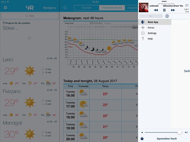
Well you can sort of can split screen Roon as my screen shot will show…
I know what you mean though.
Chris
iPeng to the rescue!
I used the iPeng app on iOS devices as a very good remote back in the LMS/Squeezebox days. As I switched to roon/Squeezebox iPeng fell to the wayside.
With the newest release of iPeng there is roon support and you can even use your iOS device as an endpoint. Haven’t tried the endpoint function but another happy side effect is that one can use iPeng as a simple remote in the ‘sidebar’ on an iPad Pro, something you still can’t do with roon.
This allows me to quickly change tracks and then go back to whatever other app that I was using. This is much quicker than switching to the roon remote - skip to the next track - and back again.
See enclosed pic with iPeng in the right side margin of the iPad screen:
Thanks iPeng!
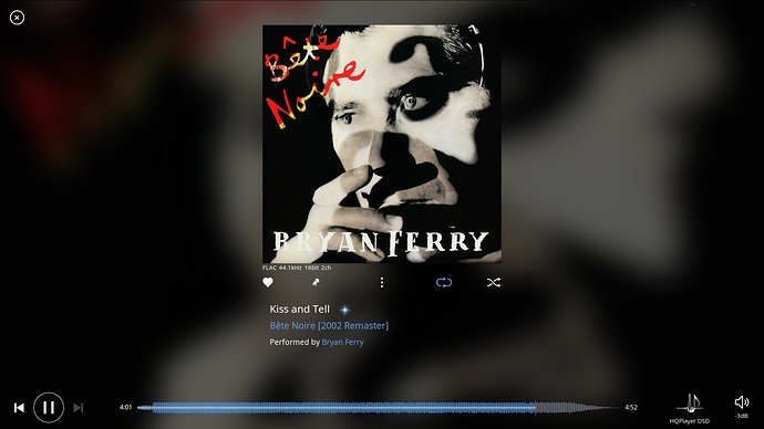
100% on this. On the full screen now playing, the album art is hardly larger than the non full screen version, and there’s so much wasted real estate.
You could move the track details to the left hand side, and maximize the artwork to use as much of the height as possible.
You’d get a much better view of the artwork, which is surely why you have gone to full screen mode?
This is all a matter of opinion and taste, but I much prefer the current now playing screen over what’s been suggested in the posts above. Although on my screen (27" monitor) the album art is quite a bit larger than it appears to be in Steve_Catterall’s “before” image in the post just before this one. What I see on my screen is like a compromise between Steve’s before and after pictures, retaining the text below the image, which I think looks great.
To my eye, there’s nothing more generic than a huge picture of the album art. Plus, the text is just as important. I enjoy being able to look up from across the room and see the current artist title, album, audio format, etc.
And that gets to what may be the heart of the matter. I like the current implementation so much that I have that 27" monitor in my system for the sole purpose of displaying it - to be read from across the room. Maybe if you’re looking at it up close on a laptop or tablet, you wish it had more information, but for my needs, it’s ideal as is. One man’s “wasted space” is another man’s “pleasing minimalist aesthetic”.
Perhaps offering a few set options for the now playing screen (including the current view, please) would be an effective strategy.
I take your point if you have a large monitor. But I would suggest that quite a lot of people will be using a laptop or tablet in their music room, and then the image becomes much smaller.
I think your idea of offering a few options is a good one, because, like you say, everyone has a different view on what works best for them


