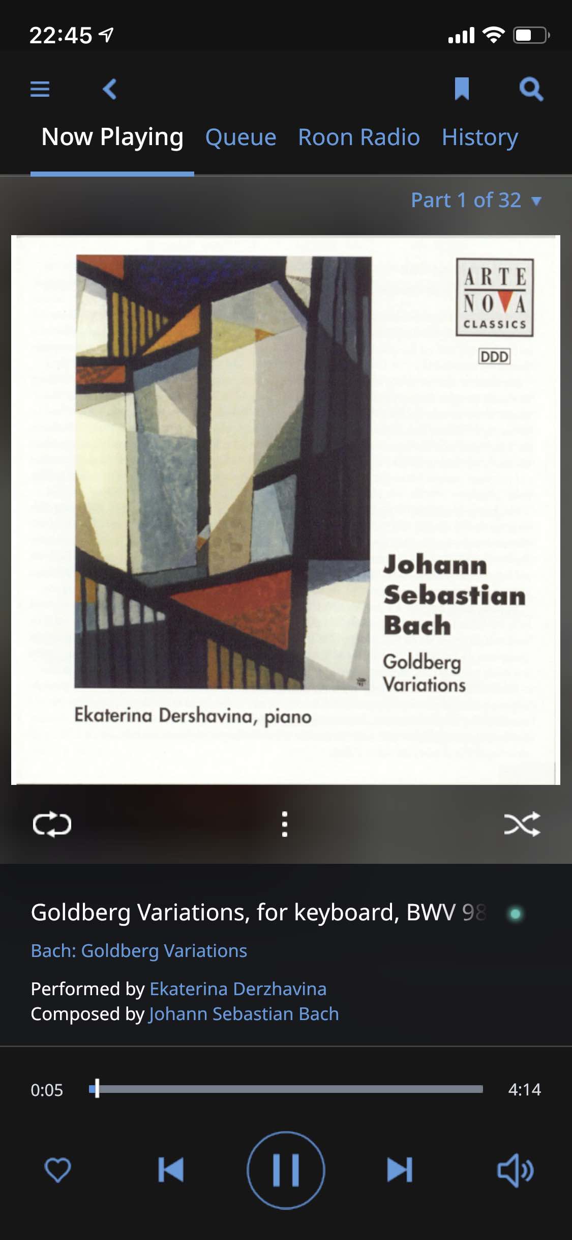
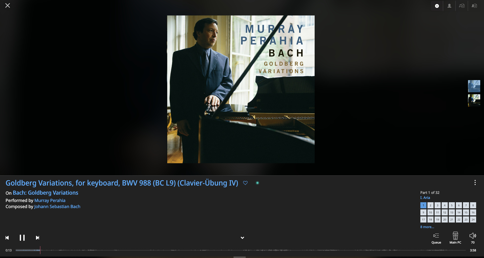
Unfortunately, particularly when it comes to classical albums, track names frequently include a lot of verbose (and redundant) information such as composer, album/composition name, catalog numbers etc. This pushes the unique part of the information out of view. Simple example here (from a throughly recommendable Goldberg set btw):
The information about the composition etc. is already displayed so all I want to see in the track name is the track name, in this case “Aria”. Seems to be a common issue with metadata curation of classical albums.
Not sure if this is a bug, a feature request or just a point of debate. Mods please feel to weigh in!! This has been mentioned before but nothing seems to have been done about it.
Having the title automatically scroll when over the character limit of the display would be a nice feature so I guess that makes this a feature request post.
That’s a good idea, but wouldn’t really remove the need for better metadata curation which was the point of my post.
In the example above the Composer name is duplicated into Album. Then the Album (Composition) name is duplicated, along with a whole raft of other extraneous information, into Track. Normalizing the metadata would make them much clearer and easier to read.
So it’s really about metadata. Ah metadata, that great ideal in the sky or should I say cloud. If only…
I written many posts begging for Roon to be more proactive when it comes to metadata but the standard response is always that Roon doesn’t provide the metadata, Roon gets the metadata, whatever it may be, from others. Sad, very sad. Hey but at least all that fancy AI brings us Roon Radio and New Releases For You!
Thanks Mike but delving into this a bit further it seems I might be able to get to where I want. The problem here is that Roon’s WORK and PART (see here for more) are being merged to create the TRACK ID, with the result that it is too long for the visible part to be unique. So if I can get Roon to only display PART in the “currently playing” field for certain albums I am good. I haven’t been able to figure out if this is possible. Does anybody know?
Thanks Mike. Yes, I totally get that a bigger screen (esp in landscape) avoids the problem, I just find that I am using my phone as a remote more and more (because it is always with me) and iPads and my iMac correspondingly less and less. Always having the remote in my pocket is something I have come to appreciate as Roon has become quite ubiquitous in my home (now zones in 7 rooms), so for me the phone UX is important.