Appreciate it is not vital and is quite a task, but would it be possible to change the BBC Radio Stations to their new 2021 logos? The local radio logos looking especially dated.
See:
Appreciate it is not vital and is quite a task, but would it be possible to change the BBC Radio Stations to their new 2021 logos? The local radio logos looking especially dated.
See:
No probem. Give me some time and I’ll change them all.
Should be OK now. Let me know if I’ve missed any.
PS 2022 logos
Perfect, thank you ![]()
Thanks, the logo’s for the BBC stations below in My Live Radio all updated on a first through-click.
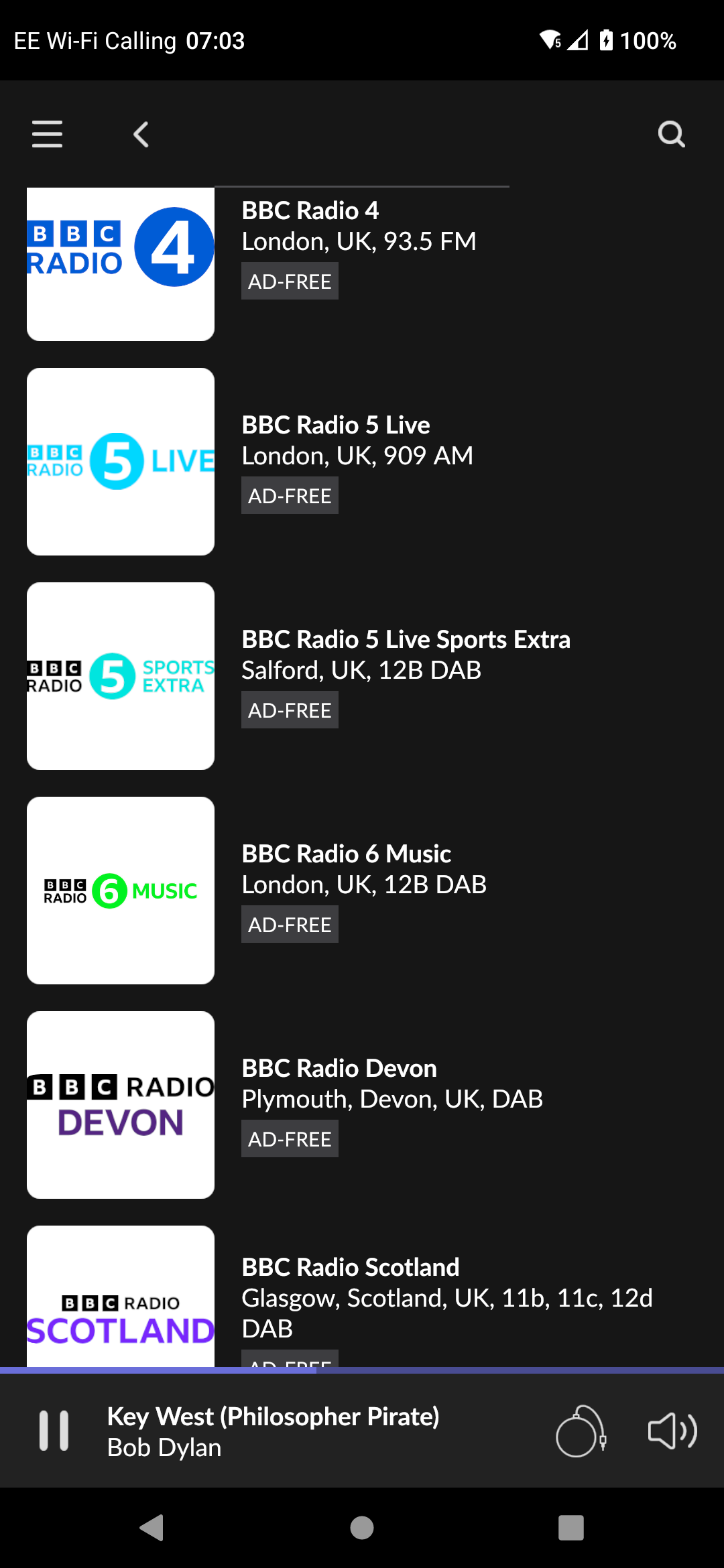
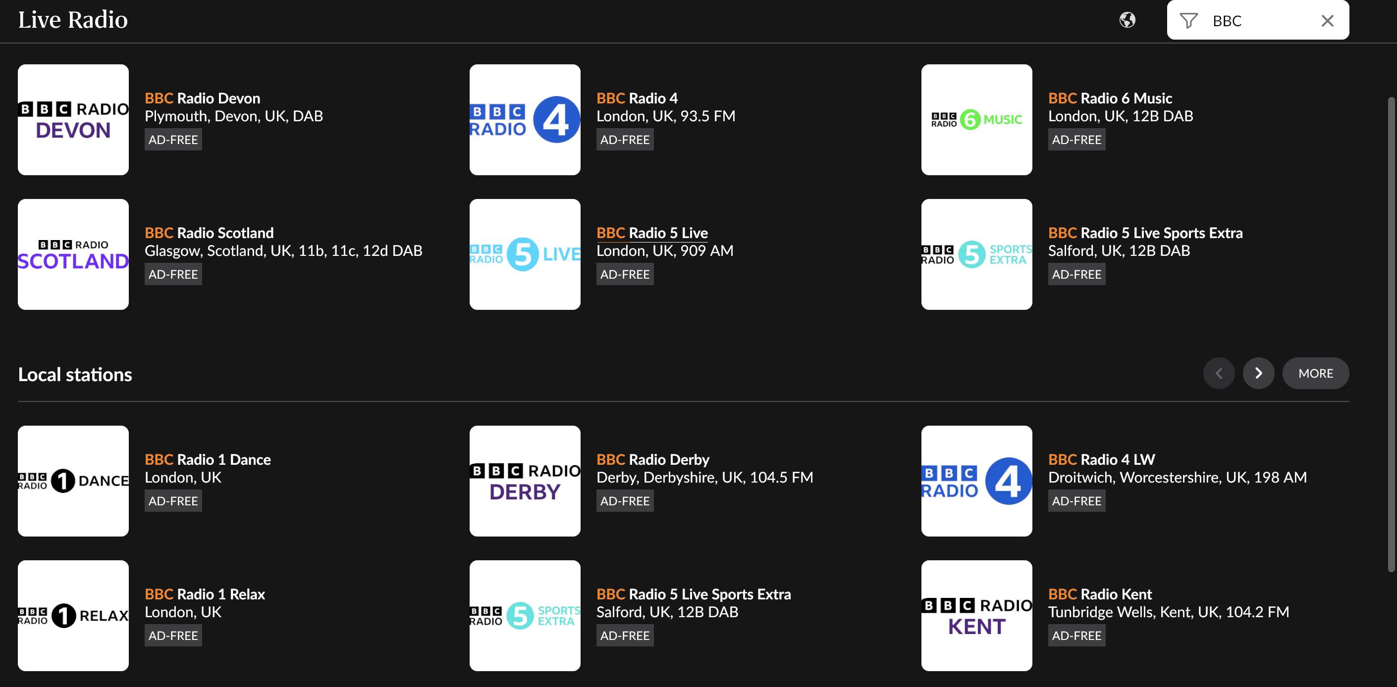
But, at least on Android mobile, there is messy looking variation in lettering, colouring vs b/w, and artwork size between these stations, and lettering is (too?) close to edges in all but one case. Is BBC being sloppy or is it a result from the ingest process?
I obtained the logos from Category:BBC Radio station logos - Wikimedia Commons, choosing the 2022 variants. (Except for BBC Radio 6 music - I had already updated that using @Phil_Allaway2 's offering.).
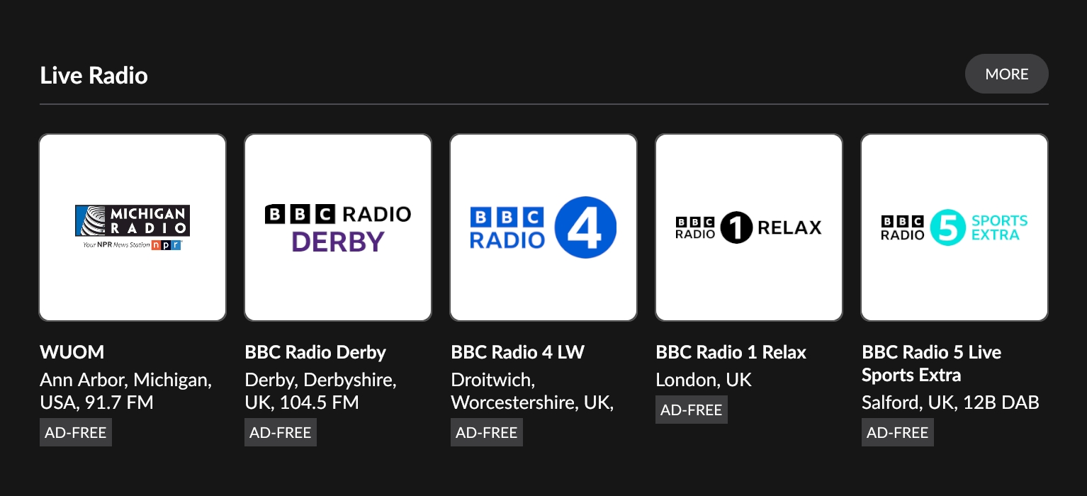
Interestingly, this is what I see on my tablet…
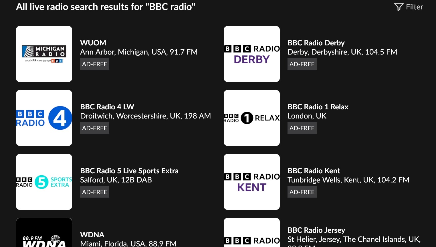
First, from a search for bbc radio
Things look fine…
But after hitting the more button…
We see the compressed form.
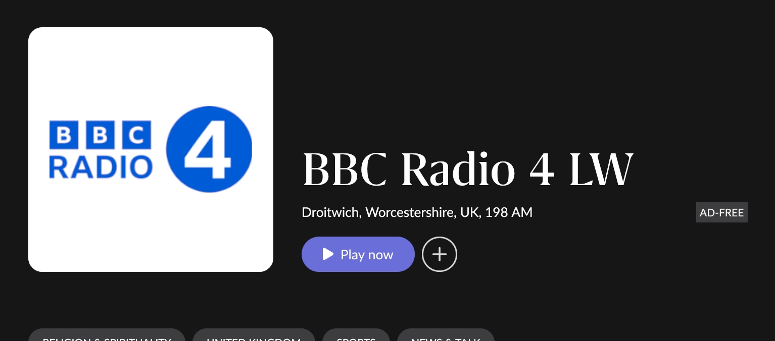
Then actually choosing a station…
Things look fine.
For my own curiosity, I’ll explore further.
Thanks very much for checking this out Brian - probably nothing much you can do unless there is a more ‘consistent’ source available somewhere. I failed to find one with a cursory search this morning and decided it’s hardly worth losing sleep about ![]() .
.
I get similar results to your screenshot with search on Mac, and, also like you, the more messy version when clicking through, or e.g using filters under My Live Radio - like this:
Looks to me like Roon perhaps resizes the image so the ‘longest line’ of non-white / non transparent stuff to sit flush with the left and right box margins. Compare e.g. Devon and Scotland above. Anyway, no biggie.
(Meanwhile BBC Devon, even with it’s new logo ![]() ) tells me there is a storm coming my way - which is also obvious from looking at the trees across the road. So I better get on with enjoying the music and enjoying Roon as long as the power cables are still in one piece)
) tells me there is a storm coming my way - which is also obvious from looking at the trees across the road. So I better get on with enjoying the music and enjoying Roon as long as the power cables are still in one piece)
I can’t find a better overall source. The ‘official’ logos all seem to be flush to the edges. Websites that might use these sometimes expand them, which is why odd better ones can be seen.
I agree it’s not worth losing sleep over it, though I might ‘upgrade’ the main national stations.
This topic was automatically closed after 10 hours. New replies are no longer allowed.