Based on reading this forum daily for some time now, I agree with your statement 100%.

I apologize for the length of this post, but I realized that anyone who has only used Roon for a year or two wouldn’t understand that the issue of butchered photos is not recent. It is important to understand the history and evolution of Roon design. On a positive note, an understanding of how we got here also points to a possible solution.
The current debate about cropped photos in the circles results from design decisions that were made over two years ago, and have now resulted in even more perverse and destructive outcomes.
I would prefer to avoid the design debate of circles versus squares, and just want a design that works. Thus my response to Pete. But Pete is correct about the use of squares, but possibly not for the reason he gave.
The evidence, right on Roon, clearly shows that the butchered circular photos are a direct result of the change from square photos to rectangular photos on the main artist page.
Those of us who have used Roon for many years recall when the main photo on the artist page was often in the square format. That square photo could then be more easily and accurately cropped and dropped into a smaller circle or smaller square.
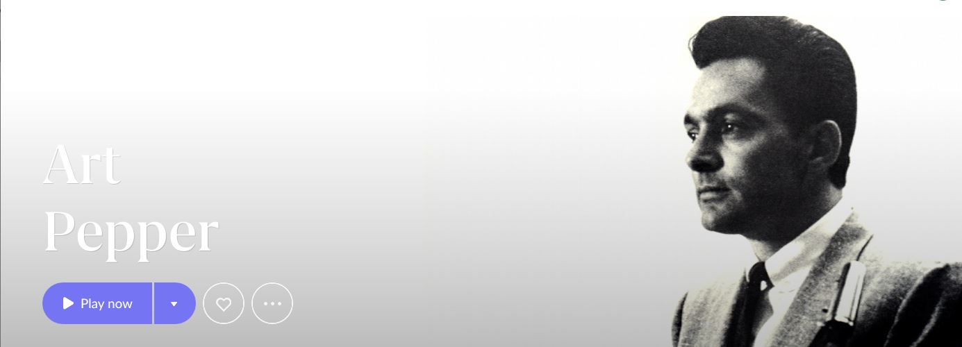
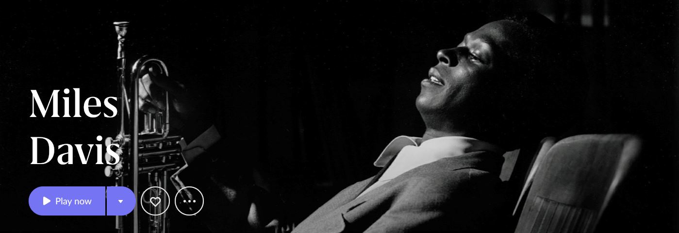
Roon shifted from using some square photos to only rectangular photos on the main artist page, as I recall, in version 1.6, and the complaints about brute force and severe crops began at that time. It is important to understand that this design change did not result in minor crops. It resulted in drastic crops, literally brute force crops, as Roon required a small part of the middle of the photo that could be stretched across the screen from left to right. Part of the reason that some of these photos look distorted is because the distortion results from Roon starting with lower quality images, and severely cropping them, and then enlarging the results. All of this was evident to the designers of version 1.6 before they released it. It was impossible for Roon to claim that they couldn’t see the results. This occurs more with artists from the 1930s to the 1960s, as the original photos were roughly square, and less with more recent artists, as the rectangular format took over for photography. (But brutal crops can still occur with recent photography, as illustrated in the above post from “bbrip” based on Alexander Melnikov.)
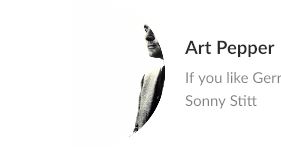
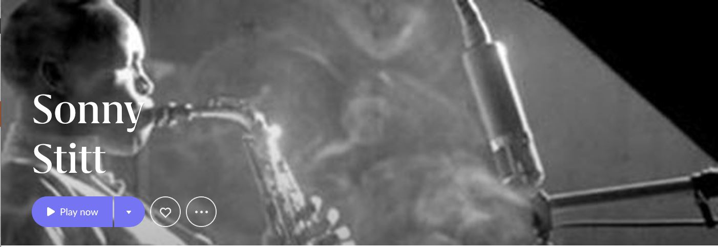
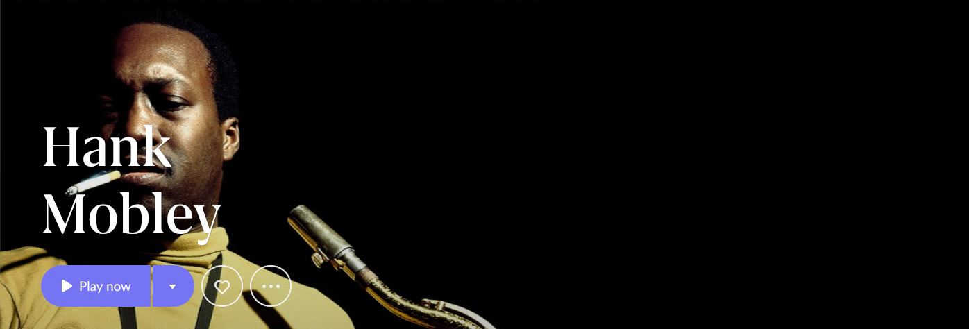
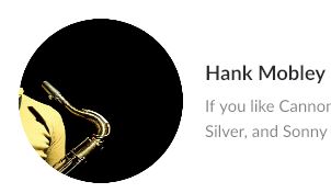
At the time, there were many complaints about text written directly across the face of the artist, and that still happens, as shown below. Look at the egregious examples of Hank Mobley and Sonny Stitt.
Do the stretched rectangular photos look good on the main artist page? Yes. Better than the original square photos? In many cases, yes.
The problem is how this has now been compounded and made worse. Two years later, the basic design of Roon is severely impacted by the changes in version 1.6.
We have come full circle, so to speak. The management of Roon made a deliberate choice over two years ago to severely crop older photos. They moved from roughly square photos on the artist page, that looked old fashioned, and shifted to a rectangular format, resulting in the brute force severe crops from square to rectangular.
In the current version, Roon compounds that, by cropping the already severely cropped photo a second time, and dropping the butchered results into a small circle. (The result would be the same if they dropped the results into a small square.) One design choice and debacle led to another.
The result is that in many cases, Roon can’t properly crop an already severely cropped rectangular photo to drop them into small circles or squares.
The results are not just absurd in some cases. They are laughable.
A possible solution would be for Roon to crop the original square photo but ONLY for the rectangular photo on the main artist page. Roon could then use the ORIGINAL square photo and crop that for that for the small circles. The result would be far better. It might not solve the issue completely, but it would be a large step in the right direction.
When it comes to responses from Roon, experience shows that they address small issues, and loudly trumpet how quickly they respond to feedback from their customers, but systemic problems that are based in the design itself are ignored, year after year. In my opinion, the evidence shows that the management of Roon is rather cynical, if not completely cynical, in how they deal with their customers.
Roon knows that their critics either drop the service, or stop posting. That will be the result here. That is what happened two years ago. Roon fixed the most egregious problems, and ignored the rest. That is exactly what happened on this issue, and the use of severe brute forced crops.
My prediction is that we will still be living with butchered photos in either small circles or small squares, as well as small circles with initials, when the next full release comes out, one or two years from now. I doubt that this will ever be fixed, or it will take years, as in the complaints about vertical orientation of iPads.
The examples posted below compare the severe and brute force cropped rectangular photo from the artist page in the current version, and how it is then cropped a second time for the circles. It is easy to visualize how the original square photo, not shown here, would work far better for a smaller square crop, that can then be dropped into a circle or small square.

Face recognition like apple does? Or is that to simple?
If it is that simple, why hasn’t Roon done it in over two years?
I they cant do it themselves, there are many third parties to get a license from.
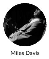
That site has a demo page where you can upload images and check the face recognition. I uploaded the images of Art Pepper, Miles Davis and Sonny Stitt.
It failed on all of them. (I must admit I was surprised it didn’t get Art Pepper)
I’m not surprised. If it is the easy, I assume Roon would have done it.
That is why I took the time to compose my long post, above, explaining the history of design changes over the last two years, as that explains the cause of the issues with photographs during that time, and more recently with circles.
Understanding that history of the design changes points to a possible solution.
The failure of face recognition only underscores why the solution I proposed may be the only thing that will work.
It appears that all that Roon can do is a basic crop in the middle of a photograph, and the examples I posted show that is what they are doing – dead center in the middle. The problem is that the second crop in the middle of a rectangular photo that is taken from an already cropped square photo results in the current butchered photos.
A crop or even just a reduction of the original square photo, for the circles, is far more likely to be successful.
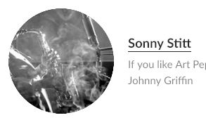
With an important caveat – it all depends on the square photo. Some may have the artist off to the side, and it would still fail. But it would be an improvement over what they are now doing. I also don’t understand the very poor quality of some photos, such as Sonny Stitt, when there are so many available.
Then Roon can continue to crop the square photos for rectangular use and stretch them across the top of the artist page, although it would be nice if they could design a program that would move the text over to the right when the photograph is on the left, so it is not mauled by the text.
That’s not always true, although it may be for the difficult ones.
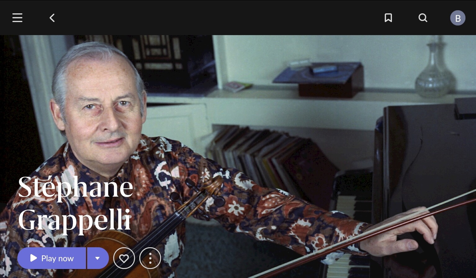
Here’s Stephane Grapelli on the left of his photo
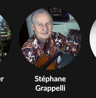
And his circle
Agreed. There are always exceptions to the rule. What Roon needs is one standard method to apply to all photographs. My wild guess would be that the original photo was probably in the square format, so a crop of the original in the in the middle would also work, both for this and others. As I explained in my long post.
I’m just trying to propose a solution to this, so we don’t have to live with this for the next one year, or three years, or five years. And that is how long it takes Roon to fix basic problems to the design while they ignore the posts from their own customers until we go away and stop posting.
And since Roon is not posting here, and have provided no information as to the source of the problem, or a solution, all we can do is provide our best guesses as to solutions.
Your example illustrates my other point – whether Roon can move the text to the right side when the face is on the left. It works OK with Grappelli, but in many cases the text is applied directly across the face, and it looks just plain ugly. See the example of Hank Mobley above, and there are many others. That has been a problem that began two years ago, and continues to this day.
I wish that would work, as it would solve the problem for all photos, whether square or rectangular. You posted a rectangular example that Roon also butchered.
Unfortunately, based on the post from Brian, it doesn’t work for the photos that Roon is using.
Here’s the original picture:

(source is Wikimedia Commons - File:Stephane Grappelli 10 Allan Warren.jpg - Wikimedia Commons)
Here’s a screenshot from the Artist Overview:
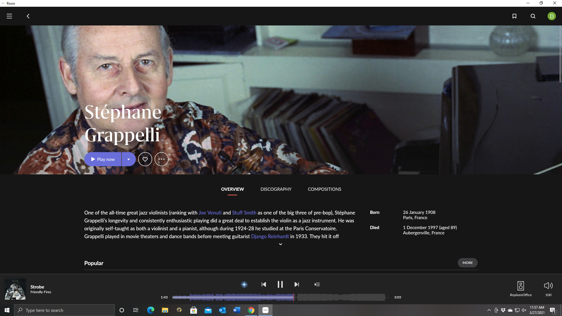
It’s not terrible, but why is his forehead cut off and why is the text covering his face? These have been issues for years now. Many threads and many comments about the issues associated with artist images. Of course it’s not easy, but I don’t think Roon has made significant improvement in this area at least since I’ve been subscribing.
Well, I am not saying that one works, was just the result of a quick google 
I got nosy and just tried it with my favourite example. And it gets it absolutely right:

So no rocket science, maybe?
NB: Interesting as well to go thru the JSON file that program creates for the pictures. It recognizes ethnicity, hair color, smile or not, mustache or not etc etc. pretty amazing. But we dnot need that for our purposes 
Was that a photo you have added or a Roon default? In which case they may have pre-fixed it.
It’s a Roon default.
Your example is a modern high resolution photo. It apparently does not work with many others.
You have provided a great example of what I described in my long post above. This is a classic example of the brute force severe crop that Roon does, since version 1.6, to get a very long rectangular crop from a square photo. That is why they sliced off the top of his head. Just look at the rectangular proportions that Roon now requires, and you can see that the only way they can get the required size, which is very long and not very high, is brute force crop. This was a systemic flaw in the design of 1.6 and we have been forced to look at the results ever since. Sometimes it works fine. In many cases it is terrible.
And they have clearly set up their program to put the text on the left in most or all cases, and they cover the face of the artist with text.
The evolution of Roon is brute force crops of square photos since version 1.6, and now, butchered crops taken from those brute force crops, for the little circles. Sometimes the crops for the circles work, as with Grappelli, but often it fails.
You are correct – we have complained about this for years. Roon has done nothing. They know that eventually we will stop posting as we all have more important things to do with our time. So they ignore us.
And Roon either can’t or won’t address systemic and fundamental flaws in the design of the program.
Well, yes sure. I dont keep those default mugshots Roon uses… They are mostly replaced with nice high res pics that I searched for.
I don’t think Roon is ignoring their users. But I am a little disappointed they haven’t put more priority into this rather than implementing circles.