I’ll add my voice to those asking for a customizable home screen. I actually do like the graph showing my recent listening times, and I also like the circular thing showing (I think) percentage by genre of my recent listening. However, I mostly listen to jazz, so it ends up just being a purple circle! If you want to apply some of that smart, behind-the-scenes analysis, it’d be great for the system to recognize one genre is dominating the graph and switch to showing sub-genres. Or maybe the simplest thing would be for a setting to show top artists instead, which the user could select if they notice the genres aren’t varying much.
3 Likes
+1 for the ability to customize the home screen.
Roon has everything to make it an exciting portal to each own’s music library that allows to explore, discover and be surprised.
Some of the home screen features are great (discover, daily mixes, performing the music of, collaborators), but many elements just spit out useless stats (pie charts, your top this, your top that) that are the exact opposite of what Roon stands for imo…
Give us the flexibility to customize the home screen, at least to order and show/hide each element!
2 Likes
The number of artists on my home screen differs substantially from information on the album page. Is there a way to update the number?
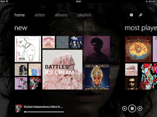
Something like this would make a great home-screen. A combination of new and recenthly played albums in a one view tile-styled thing. (screenshot is from Track 8, another music player out there)
At least remove the “Hi, …”, it takes a lot of space, and most of the time I do remember my own name 
Fully customizable would be the top!
2 Likes
I suppose it seems trivial in the face of all the hard work and complexity created by the Roon team, but the name thing annoys me too. Who is it that is supposed to be saying “hi” to me? I bought the software, and as much as I appreciate the ongoing work that goes into maintaining and improving it, it’s just a tool. My tool. I didn’t intend to buy an artificial personal relationship with some code in that software.
Perhaps its a generational/lifestyle thing, but I work face to face with real people and real things all day. I’m not lonely. I’m not craving artificial relationships. I don’t want my tools to pretend they are sentient. When I lift the tonearm on my turntable, it doesn’t say “hi” to me. I’d really prefer that my music management software offered me the opportunity to find information, rather than acting like those annoying people who disturb you with lines like “Oooh, I see you’re sitting by yourself reading! Would you like some company?”
7 Likes
Whoa! Metaphysical!
1 Like
It’s Eddie …
-
It would be great to be able to customise the menu to re-order or remove items to suit each user.
-
Also would be nice to be able to do the same with home page content and order.
-
Finally a shuffle button (or a few) on the home page would result in music being played with far fewer clicks from startup than is possible now:

This is an old idea. I suggest you search for it and vote.
yes i see it from 2 years ago but it’s closed. maybe roon will see it this time and make sensible improvements instead of forcing me to scroll past composers and compositions every time I use the app which i never and will never use
1 Like
1 Like
agree completely. And having the first 30% of the real estate of the home screen dedicate to saying hello to me is nothing short of daft
1 Like
another +1 here. One of the main things I use is the Discover option, but it’s hidden right at the bottom of the page.
What is the logic behind telling me what I’ve been listening to? I know what I’ve listened to, and I don’t need various charts showing it.
Get rid of the “Hi xxx” and reduce the size of the number of composers, artists, albums etc
Make everything else on the page something that only appears through configuration, like a series of tick boxes in settings.
1 Like
Does roon ever listen??
They listen but often don’t agree.
1 Like
Roon is not a “build your own” product. However, they do factor in customer opinions and ideas into their product development efforts.
I guess because there isn’t really a major competitor so they can do the least amount of work necessary to placate everyone. And Users can like it or lump it… Where are they going to go after all?
Not a solution, but creating a bookmark for the discover page makes it a bit more accessible.
1 Like
Yes, I think with each and every newly added feature the need for user customization is getting bigger and bigger. The recently added Roon curated playlists is a perfect example of it. It servers absolutely zero purposes for me, it’s full of playlists with music I don’t even remotely like and even some that I never want to see if possible (like Christmas crap). Roon feels more like a music store that tries to sell me (mainstream) music than a player for my own music and with features like this, I more and more get the feeling I am shopping in the wrong music store. The interface has become totally bloated with way too many forms of recommendations, so many that I’m losing interest instead of gaining any, it is contra-productive. IMHO the interface is in desperate need of some user customization.
3 Likes