I’m old, and my eyes aren’t as good as they once were. I literally can’t see a lot of the new interface, as it uses a lower contrast ratio (between the foreground and background colours). The UI text sizes are also far too small, and I can’t read them (ex: play time, remain time, queue, zone, volume, etc)
Is there a way to go back to a higher contrast UI, or can I revert to 1.5.x? I’m super disappointed because I love the software, but now I find it difficult to enjoy my music, or even pilot the UI.
Hi @CM_Harrington, and thanks for the feedback. Can you provide some examples (screenshots) of areas that are difficult for you to see so that we can better understand which changes are causing problems?
Sure… (You may need to make sure you are viewing these at 100% size. they appear inline here at what looks like 150% at least)
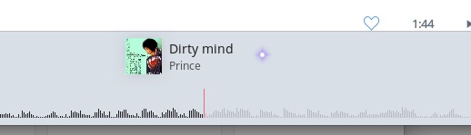
The grey text on blue-grey background is difficult to see, and the Artist is too small to read. The Signal Path icon is barely visible to me. The ‘unplayed’ portion of the histogram is far too low contrast, and I can’t really see it. The playhead colour is really thin and causing an interaction between it and the background (they’re ostensibly complementary colours), making it difficult to view.
The current playhead time is too small, and too low contrast to read
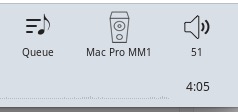
The icons are a little strange… they’re not the same line weight, so it appears the Queue icon is ‘bolder’ than the others (save the waves from the volume icon). The label for each is also too small and too low contrast to read. Also: while you interact (hover over them) the icons become lighter and therefore more difficult to read. Usually on hover, things increase their contrast from the background, not fade away as to appear suddenly disabled. As mentioned earlier, the end time is both too low contrast and small to read.
The histogram is also really near the bottom edge of the window (I use it windowed, as I have a giant screen, and I like to multitask), so I’m now mis-clicking and bringing other apps to the foreground when I want to skip to a particular spot. The vertical scale is also really tiny. Notice how low the vertical space is in the images… The hit area is much larger than the histogram (it’s roughly the height of the playhead), but it seems there’s some room to make it altogether taller… or simply move it up. Also… is it only showing a mono signal now? I thought the other design had a mirrored view that showed the distinction between the channels, although perhaps that was simply a bit of graphic liberty.
I only have limited sight and I find the Dark Theme gives me better contrast on both my iMac and iPad. I assume you have tried that? I know everyone with limited vision sees colours differently so this may not work for you.
It most be very difficult for all software developers trying to find a balance between those with full and limited vision. But I hope Roon will give some thought to this as I personally, and I would suggest many others, find music is very important as we are limited in being able to access other forms of entertainment.