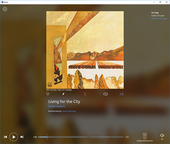
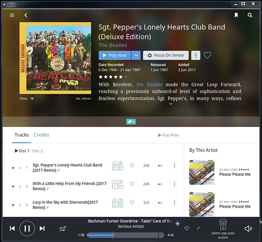
I could provide better feedback, if I could see a photo of what you are seeing when you’re mirroring. But I’ll try without it just based on what I’m doing and seeing with my set up.
As background, I’ll just say I’ve been involved in graphic design and website design for a long time, so am not insensitive to UI and good design.
Roon presents itself in horizontal format, but does not perfectly sync with today’s TV ratios. So if you’re mirroring, the Roon display will never completely cover the width of the monitor, which you already know.
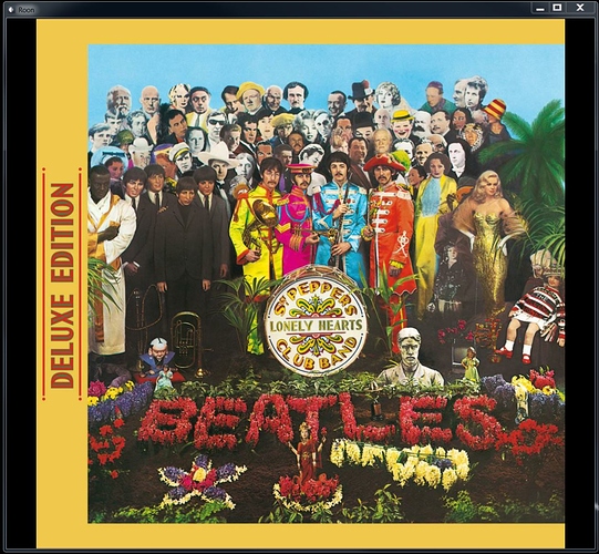
The good news is that on my monitor the bars on either end that the Roon display does not cover are black. So I set Roon to display with a black background. This way type reverses out in white and all artwork and graphics colors jump vividly off the screen. Roon’s display does not go all the way across but because black is the base color for Roon and the monitor, everything looks cohesive with black running across the entire width with the amount of black space used by Roon varying depending on which Roon page you are looking at.
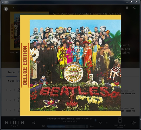
For example, if u start from the Roon queue page and clack on the now-playing album cover, it enlarges. Click it again and it enlarges again. The album cover fills completely the height of the iPad and it fill the entire of my monitor. The width enlarged to the appropriate proportion.
The entire tv monitor is black except for this huge album cover in the middle of the screen, top to bottom. Really, it looks fabulous. If Roon were to enable the album cover to switch to whatever was playing it would be awesome.
Same thing if they would enable the artist photo to display and change with each track (they’d meet to make artist name much smaller so could actually enjoy the photo)
Currently, much of the artist art Roon delivers is terrible. The large format pix are fine, but when they stick a photo in that looks to be a thumbnail, nothing looks good or displays the way Roon intended them to (see Roon-provided Beatles photo as an example of the way all artist photos should look). I replace every one of those thumbnails with a better photo that is sized to run the width of the iPad.
Hope this helps. If not and you want to share a photo of what you’re trying to improve. I’m happy to check it. I’m out of the country now so can’t show you a photo of mine.


