I’ve read a few folks on here saying that they have failing eyesight and battle with fonts (generally not just the ones in roon…)
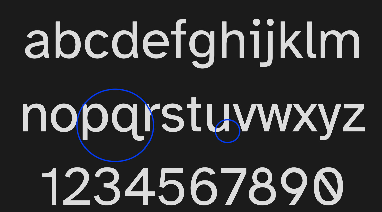
So, in case folks aren’t aware of it, the Braille Institute released a font at the back end of last year called Atkinson Hyperlegible. The idea behind it is that letter shapes are quite different from one another and distinctive.
If anyone is interested in the font, it is able to be obtained here:-
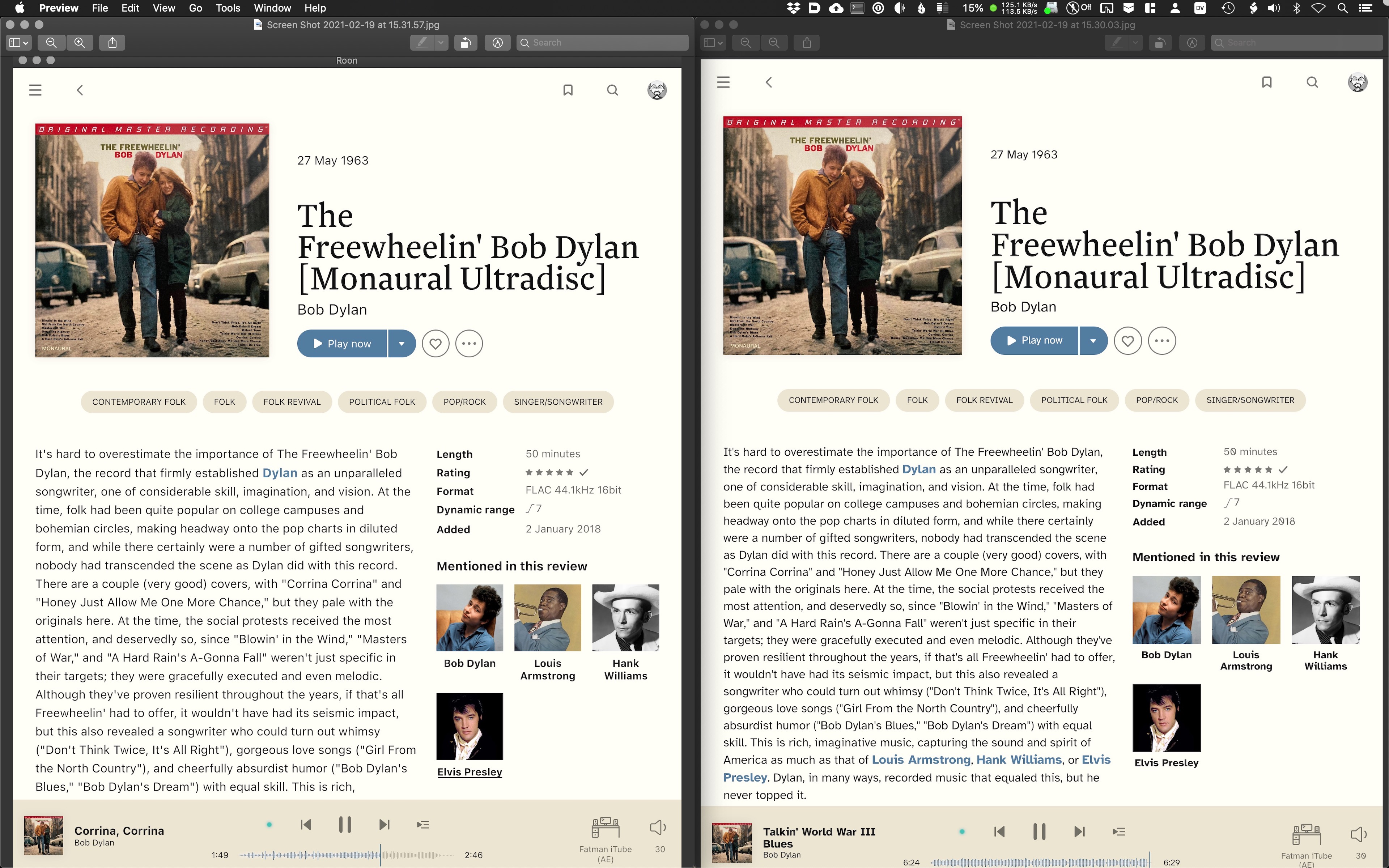
That looks pretty good. Here’s a side-by-side comparison. SF Pro Text on the left (the font I’m currently using) and Atkinson Hyperlegible on the right.
Apparently it is letters like lower case q which is then distinct from p, and the ascenders and descenders are slightly out of like with each other and characters have “chiselled” bits so people can identify shapes.
Don’t know - my eyesight is fine (fly helicopters so I hope so) - but if folks are battling it might be worth a try.
Yep, I’m sure it will definitely help, I just meant that it would help more if there was a way to change the font size in Roon - whichever font you install is still quite small, which clearly doesn’t improve legibility. Maybe this is something Roon will consider for the future.
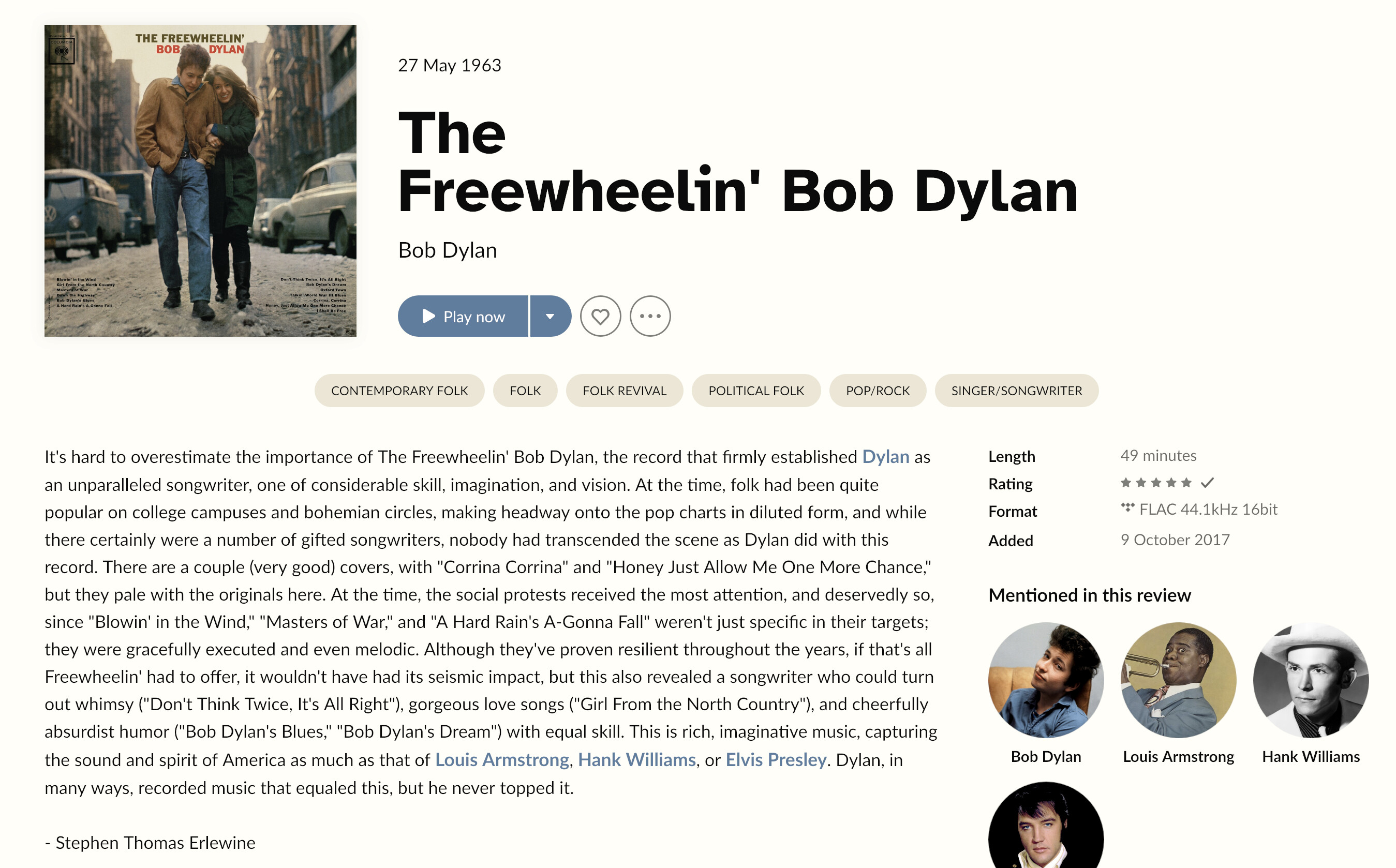
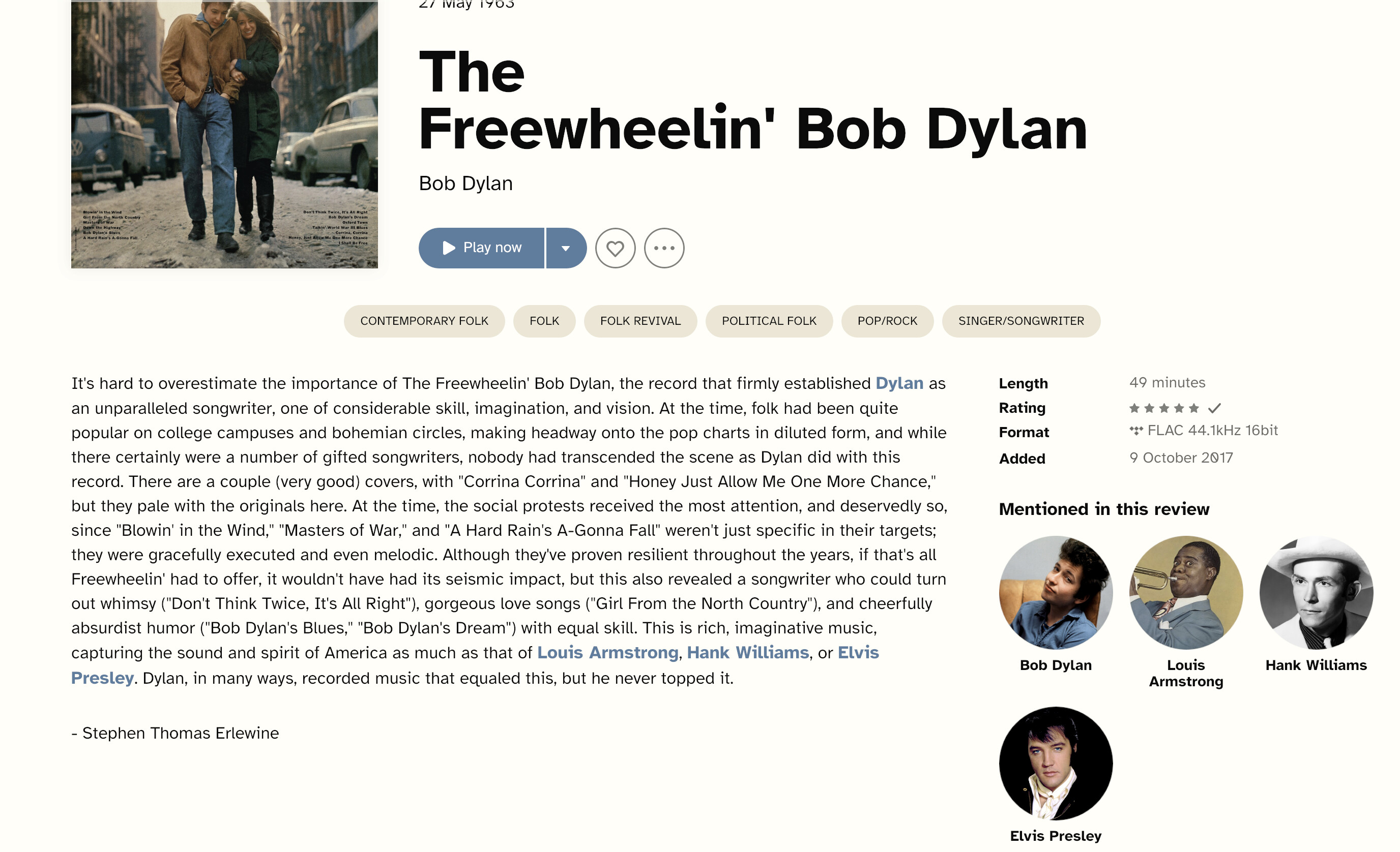
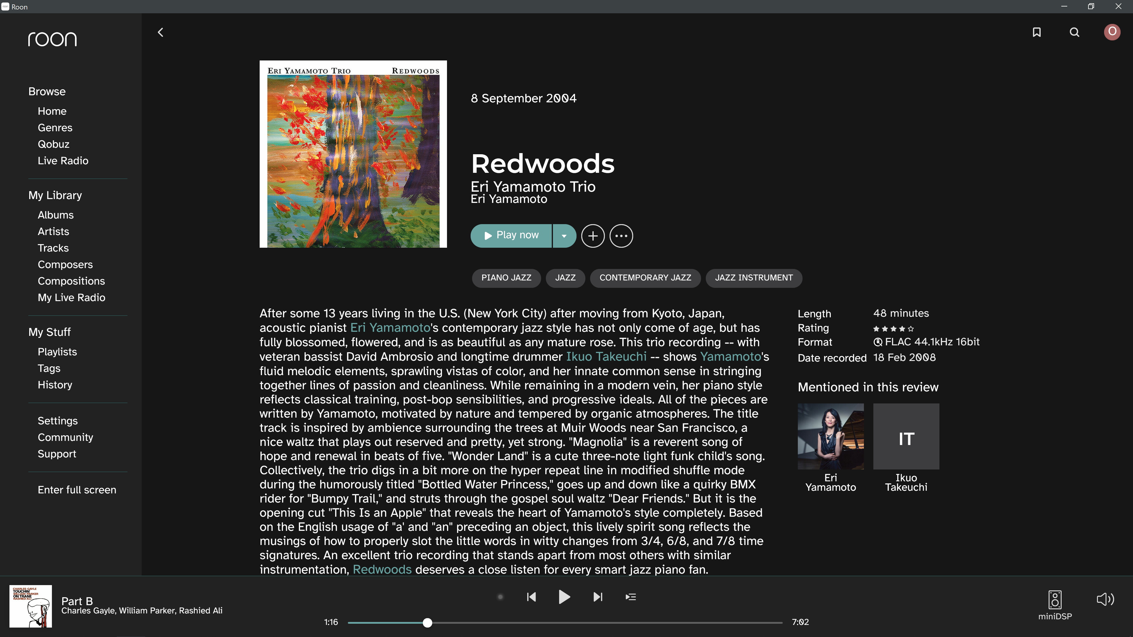
I tried replacing Grifo-M with Atkinson-Hyperlegible-Bold-102 and Grifo-S with Atkinson-Hyperlegible-Regular-102 and using the same album and colour scheme get:-
There are two groups of fonts that control the text in Roon. GrifoM-Medium and GrifoS-Medium control the title fonts (these are the ones you changed), but Lato-Regular, Lato-Medium and Lato-Bold control the body text. If you want to change these, use the ttf fonts in the ‘Web Fonts’ folder (from the Atkinson Hyperlegible download folder) rather than the .otf versions in the ‘Print Fonts’ folder.
I am just curious, but what if you used a font editor to make your own font that had different spacing so it looked better when made larger? I know that in some of them you can edit how much space is around each letter above or below it. Or will any font spacing be determined by Roon?
Man, this theme of yours looks spectacular. And bonus points for how you changed the color of the already-played part of the waveform so it doesn’t get obliterated as the track plays
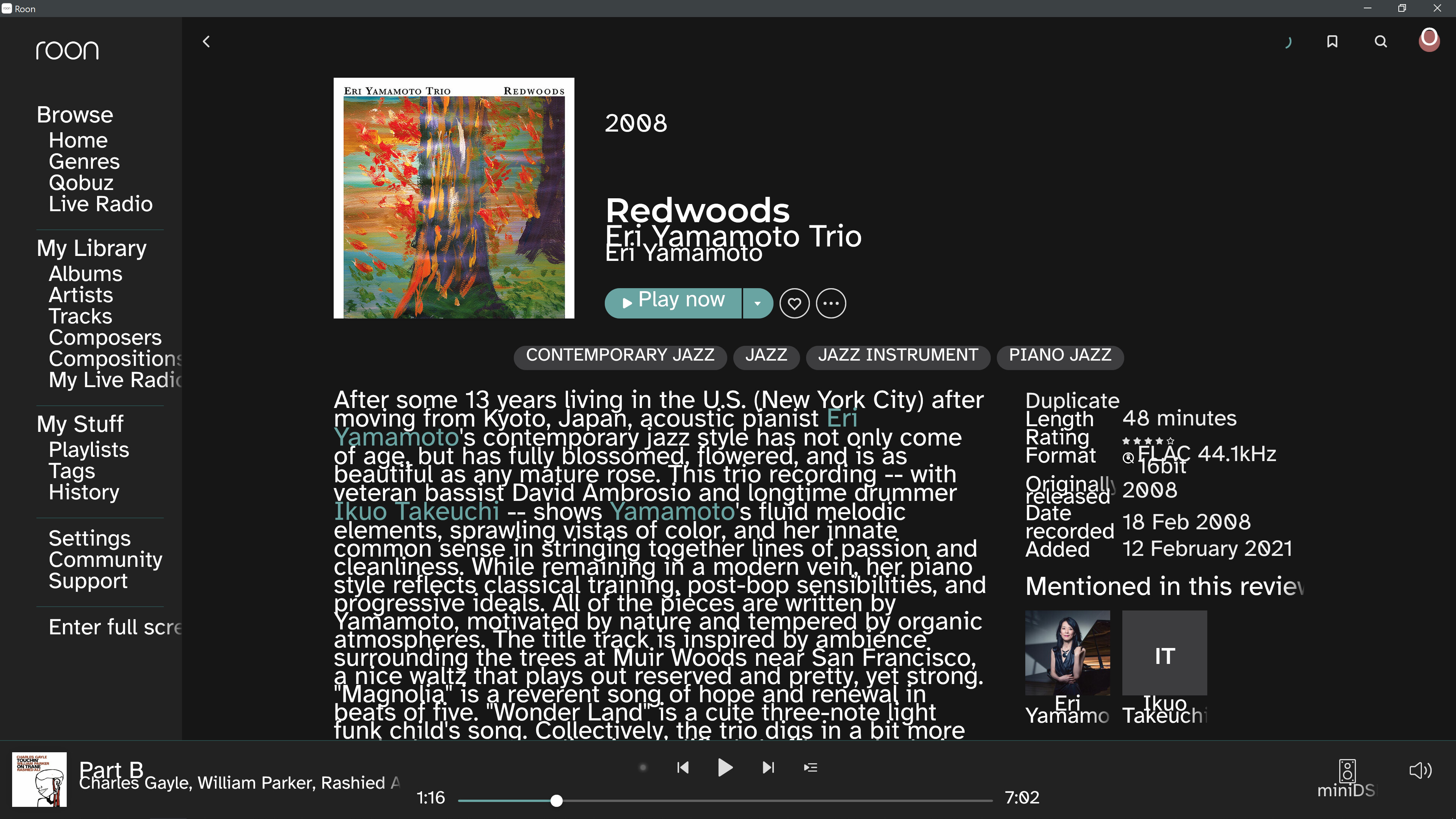
It’s more a case of the background of the footer being a bit darker than a deliberate attempt to make it more visible. The overlay colour (that hides the waveform in the stock theme) is set by the same variable that determines the lightest font, i.e white. As such, if the footer is very light too, the waveform gets hidden. So not so much a design choice on my part, more of a happy accident.
It looks like Font Forge has a way to increase line spacing. I did take a quick look, but couldn’t get it working. Maybe you’ll have more luck. Here’s the link:
yeah, me neither. I was just throwing it out there in case anyone had a quick solution to that. It looks like a big project if you have to do every letter individually and get them to fit together nicely.
This is quite a good example of readability. To me, while I can read both I can read the right sample at twice the spead as the left sample. Why? because in the right sample I don’t loose track of the lines. In the left sample I have to slightly refocus on each beginning of the line after having read about six lines. On the right sample it’s easier to stay on the line so fatigue is largely reduced and readabilty improved.
The change in background colour from the overly white in the original Roon light theme also helps quite a lot in readability. Further improvement would be the use of alineas in the text, but that is outside of Roons control, it’s just the way Rovi delivers it.