Excellent choices, thanks for putting it together and sharing.
1 Like
No, not yet. It is either hardcoded or less easily named in the config files. But I haven’t give up yet.
I think this is a tough one, but they might be part of the .png’s that are spread about in the Resources. They could be ‘baked’ in at another level as well that is unchangeable. Even so, changing the size won’t change the surrounding screen real estate taken up by them.
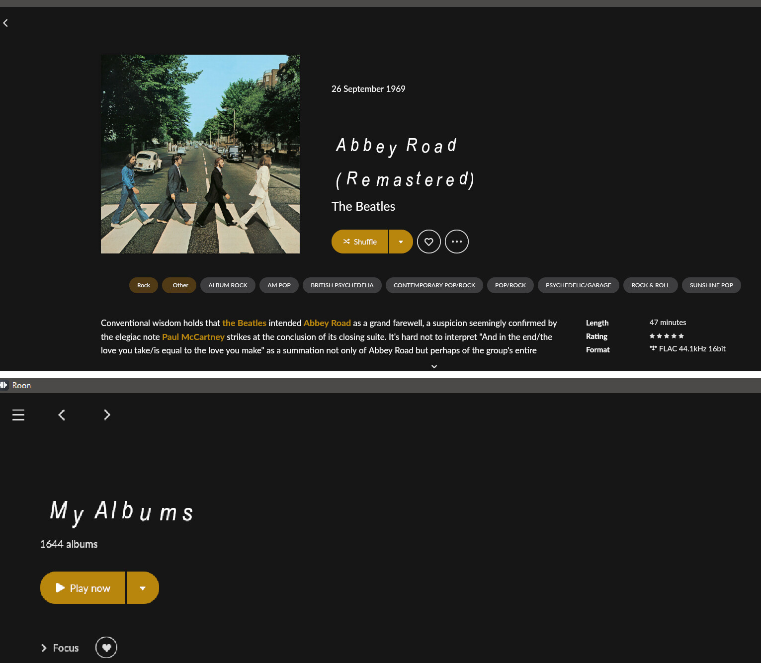
I was also interested in scaling up the fonts in the footer. They didn’t scale well on a full hd monitor. I also would love to see a bit bigger font in the now playing screen so it becomes readable from 3 meter distance. But you are right, the space wouldn’t change, just more white emptyness or font overlapping. The empty space is a design choice of Roon, one I will never understand.
1 Like
To many threads about same topic ![]()
1 Like
There must be something in the font itself that tells roon what size to display, at least for the Lato. I’m just dropping these into the font folder and roon displays them as different sizes and wraps the text properly.
Garamond (16 words on top line)

PT Serif (15 words on top line)

Merriweather (13 words on top line)
![]()
Each font file includes package of alphabets symbols lets say from 5 to 72 size. In the program is defined: Header.FontSize = 24. Each font has individual precise size in each standard, officially 12 Arial Narrow and 12 Century are different in size when you compare for example in MS Word.
Second case we have in the Roon option to auto size font to the shape 
Hope we can change it by manipulation inside Font file → Decrease dimensions of particular size. I am preparing this kind of super duper combination and will see…
Haha finally…
Yes, I do like wavy font!! 
**for not involved in that the dark top secret project: This is 50% smaller font vs original 
1 Like
 feels like I have one too many looking at that but at least you have manged to edit something font wise.
1 Like
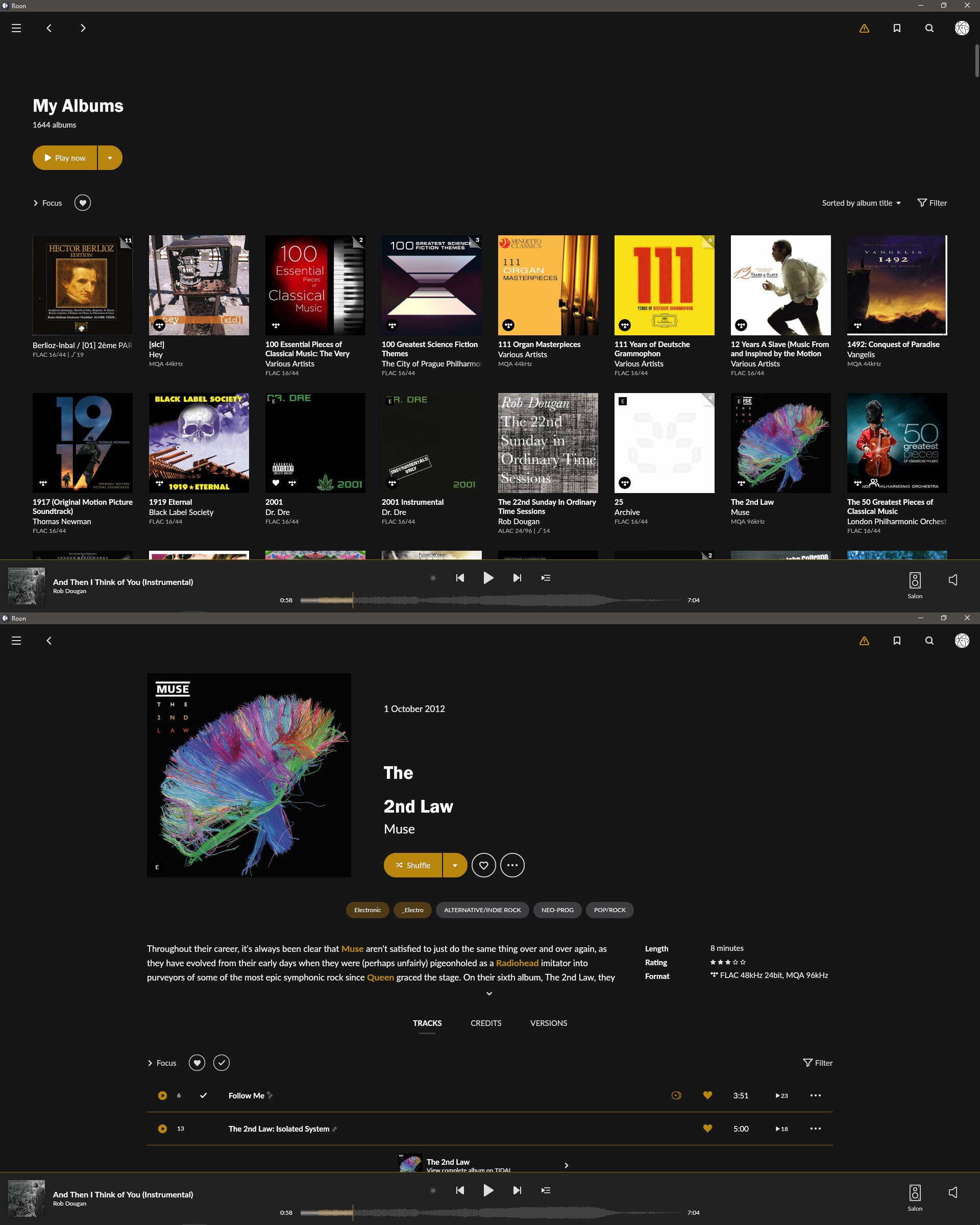
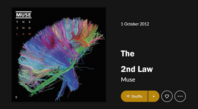
You must be controlling the size of the Grifo here. Is the waviness intended or just an artifact?
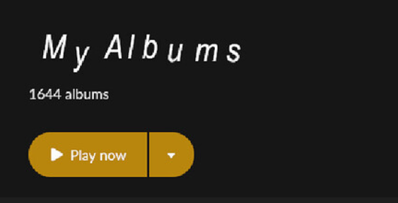
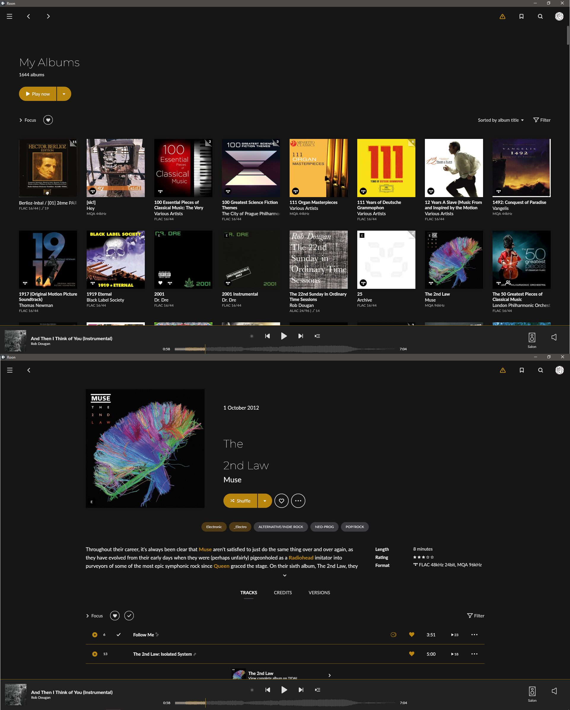
My “My Albums”
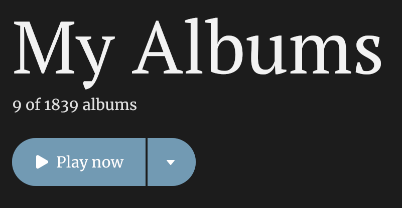
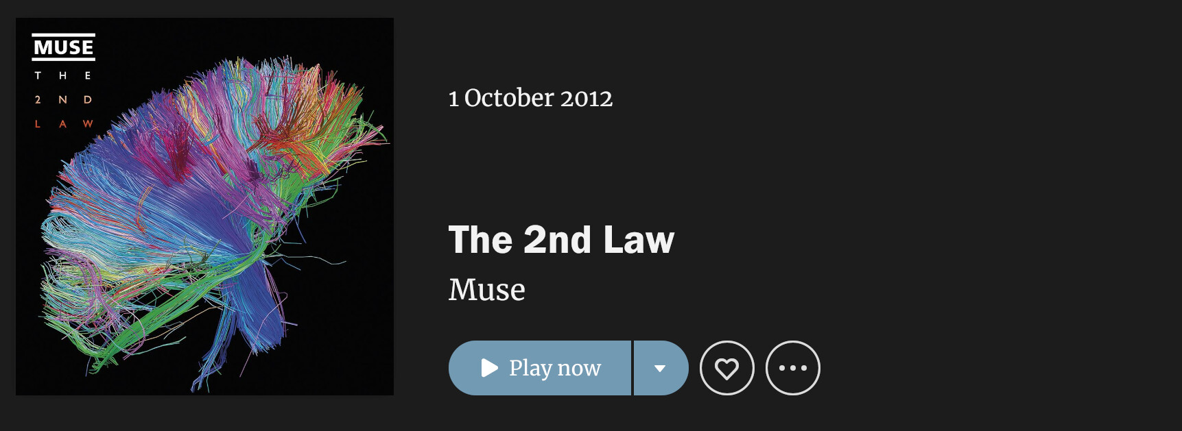
Official announcement - We have a control over the Album Fonts!!
[Win] Just replace your original file GrifoM-Medium.otf by one below
*Changes on your own risk ![]()
Franklin Gothic Version
https://www.dropbox.com/s/0oraqx1hw41dkb4/GrifoM-Medium%20-%20Franklin.rar?dl=0
Monteserrat Light Version
https://www.dropbox.com/s/ouwyaxdeqzozsym/GrifoM-Medium%20-%20Monteserrat.rar?dl=0
Yes I do. Waviness came as an issue during tests.
Great! Is there an easy way to do this? Are you using FontForge?
The odd line breaks in album titles is something Roon will need to fix I think.
Yes, I will prepare the instruction.
Unfortunately line breaks is something out of ours hands
Use non breaking spaces. But that will be done album by album.
I put non-breaking spaces in the title of id tag and switched to “prefer file” for Album Title in metadata. It is a fair amount of work so I’ll just use it sparingly.
Non breaking space:
1. Click in a placeholder, text box, shape containing text or a table where you wish to insert a nonbreaking space.
2. Press and hold Alt and then type 0160 on the numeric keypad.
3. Release Alt.
1 Like
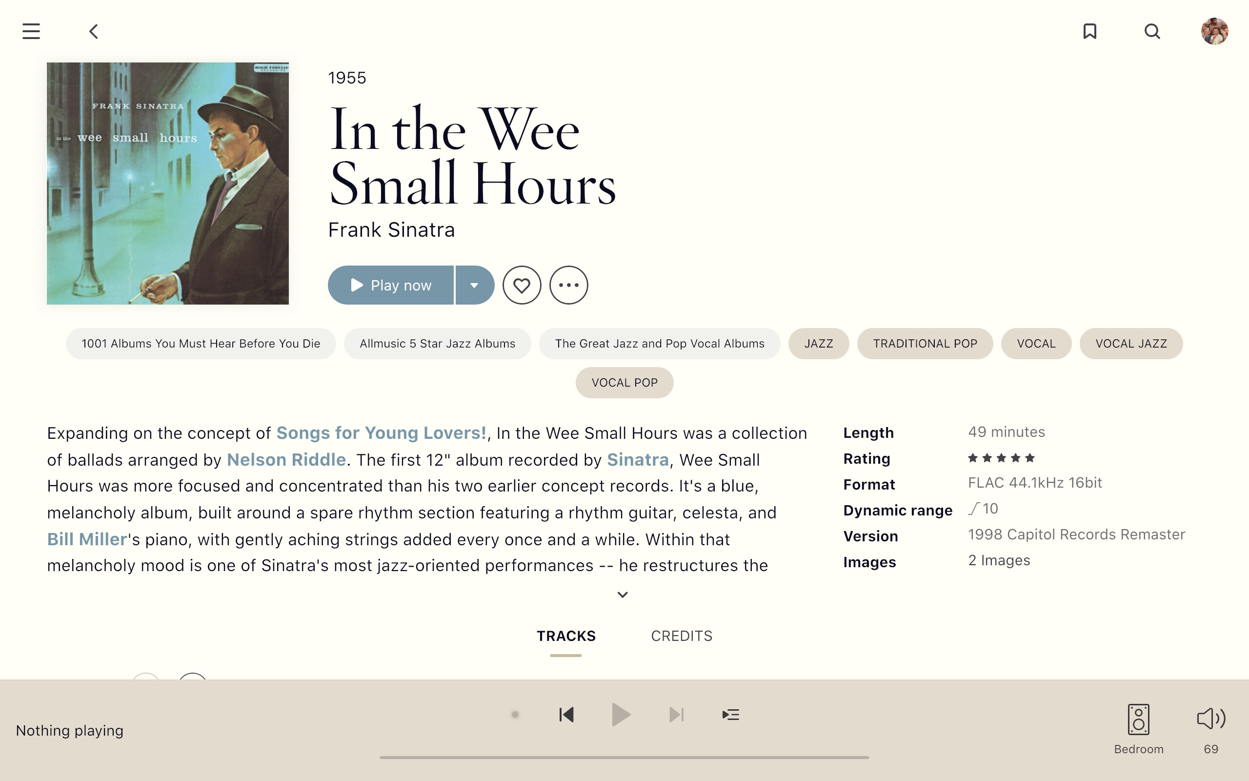
I changed the fonts and like it a lot.
I’m using Hoefler Titling Light (replacing Grifo) and SF Pro Text Regular (replacing Lato).
6 Likes
The colours and font look great.
Looks great with improved readability as far as I can see. How does it work out on the full review?
Care to share your theme map?
That’s one of my themes (unless @Candombe has modified it). You can download it here:
2 Likes