Not sure if on purpose or not but the choice of the album goes well with this color schema (which you should name Oceans)!
I’m going to repeat my previous post so newcomers are aware.
Changing or altering any database files can end up with a non-booting client or worse. And as such, is not officially supported and you do so at your own risk.
2 Likes
Love it! Was trying to make something similar yesterday I just had trouble making at look cohesive and the proper use of the different shades. Good job!
Good catch. Yes, it is 
(btw my “Album of 2020”).
Then maybe Roon can decide to FIX 1.8 and there won’t be massive need to do it ourselves…
2 Likes
Not sure Roon needs to fix anything. The product ships with two themes. The themes aren’t broken.
Some folks have chosen to change the themes. With the associated risks - as pointed out.
2 Likes
Very small risks actually what we are doing (or what I am - can only speak for myself) as it’s on my Mac remotes and not the ROCK core itself. Be sure to have multiple backups in multiple places of the database as it is - good practice no matter what.
3 Likes
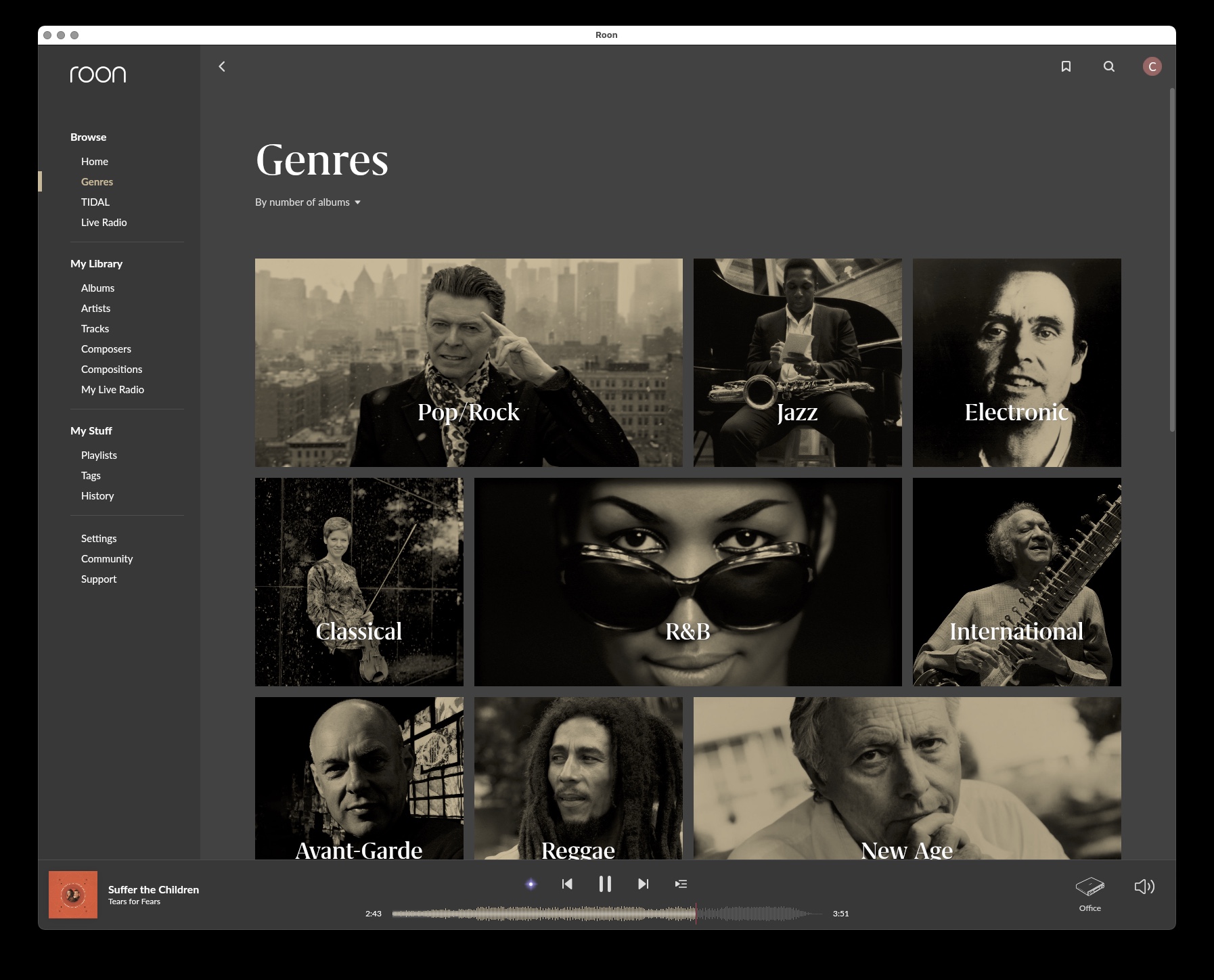
Anyone know which line is for the screened back color on the genre photos etc?
atom-genre-mapping?
1 Like
Pretty ugly, but fun nevertheless.
Screenshots like this will probably be used by Roon team as evidence why they do not want to provide colour cutomisation 
I do like the colours for the listening history.
Which atom- parts are they?
Highly enjoyable thread. I’m busey with a theme for my own personal use, might take some time. You have probably noticed that colour themes are not very easy to make for both looks and usability but I am so glad to have at least some control over it.
2 Likes
![]()
atom-graph-1
atom-graph-2
atom-graph-3
atom-graph-4
atom-graph-5
atom-graph-6
2 Likes
Yep, fanboys.
Duh. Got it. BTW Orange-mapping is for those pics in boxes that are orange screened. Now have a gray and ‘gold’ theme throughout.
5 Likes
Oh well it was worth the ask!! Looking at the colours file did not think I could change the background on the now playing screen oh well at least the rest of roon is in a nicer theme for me now.
1 Like
Fanboys are customising the themes? Yeah I guess. Not liking a colour or a font is the epitome of opinion. So we make one we like and I guess are fanatical about our own creations 
1 Like
In the meantime while waiting for the FIX, trying to help myself 
When I bought my latest house I redecorated, because I could. Roon has opened up a way to edit the the theme, so people are doing it. I’m struggling to see why you think this is a problem?
Sorry. I forgot to write FIX
The problem is, the negative space looks great as a screenshot or print out, but in actual use it just becomes wasted space with extra scrolling needed. And I agree 1.7 was somewhat cluttered. But now I find it the actual elements even more cluttered - they just moved the junk shop into an empty arena so it feels less so.
Do they? That’s a pretty hideous purple colour they used. Not sure what they were smoking when they chose that, but it’s a pretty niche colour at the best of times and I doubt appealing to all but a minority of users. What this thread clearly highlights is that there should be a colour selection panel within the settings for users to set and save their own schemes without having to edit files. Most programs have this functionality and for something as costly as Roon it seems a glaring omission. Likewise with the fonts. The album title font is IMHO way too large and just doesn’t fit with the rest of the scheme.
TBH I know it’s early days but I really liked the previous look of Roon and saw absolute no need for wholesale cosmetic change. I welcome additional functionality but at the moment I’m struggling with things that seem to have been removed, and the only really welcome addition so far is vertical scrolling.
2 Likes