Thanks Andres! Interesting feedback! Some parts I agree with and some I don’t. Firstly, I think we’re mostly on the same page, with the main difference from my side being that in my opinion, the queue shouldn’t be on it’s own screen, and at a bare minimum, not segregated from Now Playing. To me, the perfect music software has two core functions: 1) Find music to play and 2) Play and navigate through the music found. That should be the only natural divide in the UI and both should be accessible directly from any screen.
For maximum ease of use, everyone at a party who’s never used roon expects to be able to pick up the ipad left in now playing view to play/pause a song, skip a song, see what’s upcoming, and change what plays next. Hence, in my own opinion, the segregation of the queue to it’s own screen is cumbersome, segregating and adds unnecessary hopping between screens where it should be immediately accessible so anyone can pick it up. (My fiance agrees for what that’s worth ) You’re also possibly taking the proposals a little too literally, and not reflecting that these changes would of course require some matching rework of other screens of Roon to ensure UI consistency, cleanliness and maximum usability throughout the platform - which was the cause of me making these suggestions in the first place. However, I hope it’s easily imaginable that in this form, the now playing bar could gracefully vertically collapse (with subtle annimation) to hide the bitrate display, album name, and shrink the artwork back within a shorter now playing bar that is consistent in leaving the core roon controls and popup queue accessible throughout the entire interface. (Given the appropriate layout provisions on other screens to ensure responsive restructuring of content or appropriate padding and opaque / near opaque overlap to avoid conflicting visual content (like that currently observed with the buttons hovering over the lyrics screen).
Taken to the next level, that would even allow functionality that Roon doesn’t yet posses - like dragging albums or songs directly from a search or album browse to exactly when you want them played in the queue - perfect integration of the two find and play software functions.
Besides that the greatest ability of a pop-up queue is of course, when you do want to concentrate on the content, it gracefully hides and leaves you 100% focused on what’s behind, without having to compromise the rest of the view. People that don’t use it never notice it and you avoid poor uses of undesirable screen estate like the giant current radio bar that shows nothing when playing a local playlist
Overall, I hope the Roon team can focus on providing the technical stuff when needed, but keeping it out the way of the enjoyment of the platform the remaining 99% of the time.
I think this illustrates the distinction we discussed between people who play albums and those that play tracks/playlists. For me, when I’m listening to an album, I absolutely do not want immediate access to changing the queue. It’s like having the tone arm in my hand while reading the album cover. Or watching a movie with the remote in the hand, changing channel in the dull bits. But I know people do that…
As long as the queue panel expands and collapses. And the radio panel. And others.
But consistency and universality remain key. Available from everywhere, in the same way.
Hi,
for my part I listen to entire album instead of playlist but I like the third rearrangement anyway because I can directly take a look to the remaining time and the remaining tracks.
1 Like
James_I
(The truth is out there but not necessarily here)
272
One thing I have noticed lately, although I don’t think it is the result of a change in 1.6, is that I think all of the buttons and menus need to be slightly bigger to work very well with a touchscreen PC. Of course that depends on screen size but I have 22" and 24" touch screens and after a beer or two I frequently miss the play/pause button and some of the hamburger menu items, especially the full screen button which is just a tad small. I’d love to see like a 25% increase across the board in the size of all the elements other than the main objects in the window (i.e. album/artist thumbnails and queue contents…all of that stuff is fine)
Please keep the album covers clean, without the play buttons hovering over it. Ugh, that is looking disastrous.
Also, I find it usefull to see info about tags and playlists for the Now playing song.
No, imho this looks even worse.
I don’t want tags and playlists on the now playing screen.
For me also the display of the file format should not be there.
1 Like
James_I
(The truth is out there but not necessarily here)
276
Well all this does is illustrate that no one layout can be Right or Please Everyone.
Regardless of the version, I think that Roon has always placed too many commands in their interfaces.
It seems they want to allow every action from everywhere.
I would prefer some more clicks but a cleaner interface.
The last of your examples looks really good, though the pause and skip buttons could be moved from the album art to the empty space… and made a little larger
Wouldn;t look as good on Windows desktop, though as we still have to put up with default windows 10 title bar, which screws up the entire look.
Yeah, but that is only for full screen.
I like to have Roon open to one side whilst I work.
Code wise it is very easy to apply a design that bypasses the default windows 10 titlebar. Most well designed software does this.
Not even Microsoft use W10 default title bars in their software.
For sure! Personally I like the overlay which can fade to transparency if not rolled over on a desktop client. As stated, it does presume that the upper content area can be used to show the full album art and booklet artwork as one of the upper content slides, making the slight covering of the thumbnail non-critical.
That said, I’d also made a non-posted mock-up with the play controls just above the song title to the RHS of the album cover as I presumed that would be the biggest cause of controversy Still looks pretty clean, just not quite as polished.
They could also be moved in place of the bitrate, which personally does nothing for me either but I know others like to see the info.
@anon47919701 I’m a big fan of spectrum analyzer / visualizations / music videos as optional slides to the content display. Works great for those using the Now Playing screen on TV and projector displays, without hurting or complicating the overall use or aesthetic of the interface itself. Roon’s new ability to activate/deactivate and reorder screen displays is great for this sort of customization to personal preference and future development in this regard.
Excellent examples of aesthetically pleasing and sophisticated layouts. These look like what I imagined when I saw the Roon web page for the first time (the front page ad showing album browsing), and was meant to convey via the app but has yet to reach.
That said, I don’t think 1.6 is disastrous either. Change is so difficult for humans and yet we’re the most adaptable on the planet and deal with change nearly constantly.
 ) You’re also possibly taking the proposals a little too literally, and not reflecting that these changes would of course require some matching rework of other screens of Roon to ensure UI consistency, cleanliness and maximum usability throughout the platform - which was the cause of me making these suggestions in the first place. However, I hope it’s easily imaginable that in this form, the now playing bar could gracefully vertically collapse (with subtle annimation) to hide the bitrate display, album name, and shrink the artwork back within a shorter now playing bar that is consistent in leaving the core roon controls and popup queue accessible throughout the entire interface. (Given the appropriate layout provisions on other screens to ensure responsive restructuring of content or appropriate padding and opaque / near opaque overlap to avoid conflicting visual content (like that currently observed with the buttons hovering over the lyrics screen).


 Yes.
Yes.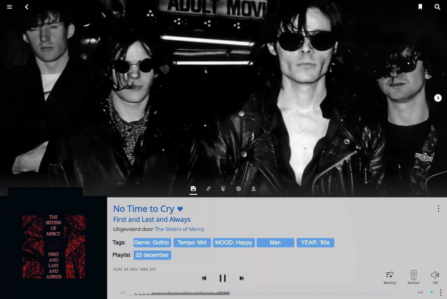