That is a question for someone from the Roon team to answer (make it a feature request). Analysis currently works by operating on a whole stored file at a time (I assume), so rejigging Roon to do it differently would be possible if rather messy. It would have to deal with partially downloaded/skipped tracks for example. Plus the analysis has a processing impact which may disrupt playback on some systems. That wouldn’t make for a great user experience. Also, the track isn’t in your database, so what would the analysis be stored against?
Totally agree with all of this. I use the waveform all the time.
No need for screenshots. Just re-enable the previous UI version of Roon and everything is OK again ;).
Then use your time to develop a UI design interface for the main “playing” screen so each user can do what he/she needs to be happy.
1 Like
Just re-enable the previous UI? Good luck with that!
Please keep up the great work – I love that you’re continuing to invest in the product. I do feel some consistency was lost (I’d put DSP back where it was), but nothing I can’t live with!
1 Like
Meaning what?
Meaning you are wasting you time asking for what you just asked for…as it has been discussed already and shot down.
I preferred the black bottom panel which was much clearer and easy to locate
2 Likes
I wish they’d allow hiding that “related” sidebar. It’s so long on my Fire HD8 and often results in me scrolling WAY too far down and then again back up because it’s laggy and my library is huge.
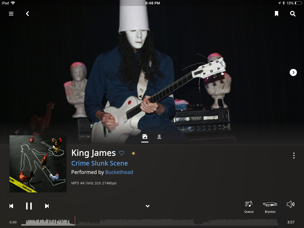
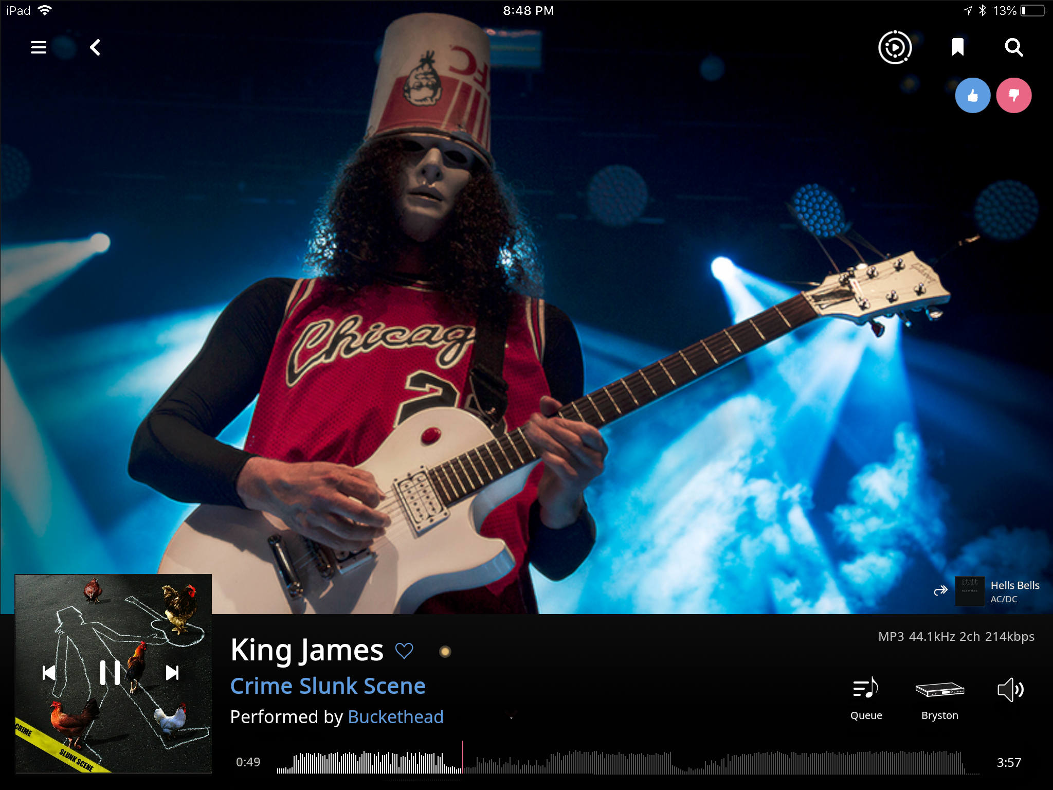
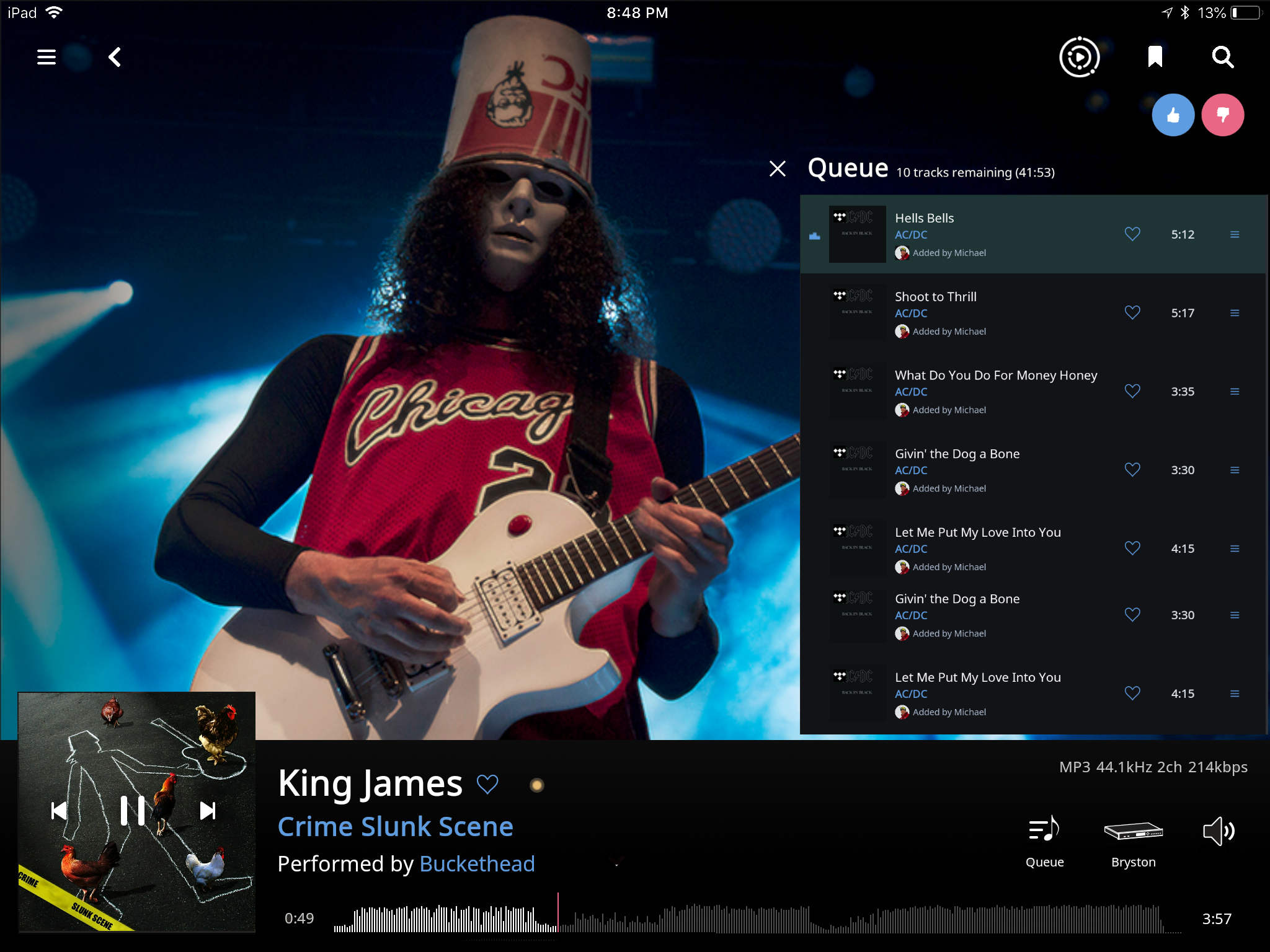
What I really miss is the now playing section at the top of the queue page. Now I have the queue page with a tiny footer and a micro album art, or, the now playing screen with a nice footer (except for the color) and some clumsy cropped cinemascope artist pictures…
@danny Would it be possible to add the queue as page to the new now playing screen?
Thanks!
I just got this software 4 days ago so I don’t know the older UI. So far I’m getting used to it. I can’t say I’ve run into any huge issues.
However the ability to swipe the screen edge to go back absolutely must be implemented. It’s in so many programs now that I think most people take it for granted. Besides putting the back arrow on the top of the screen makes two handed use necessary. It seriously should be one of the top 5 things to implement in any iOS app.
2 Likes
Well, the streamed tracks are cached locally during playback, so it must be possible to analyze them and display their “spektrogram”.
I’d like that too! And it should not be impossible to save these for identified tracks from streaming services either? (So, once played=analysed and cached locally)
Alright, here goes: A few subtle layout changes, some simplification of functionality and the use of layering to combine multiple screens into a single interface can make all the difference. I don’t doubt there’s a lot more that could be done here, and a few necessary buttons missing but hopefully this serves as some inspiration towards something much cleaner and more aesthetically pleasing (at least to me). I wanted to have a crack at the other screens too but unfortunately I need to get on with actual work 
One side note, that’s incorporated in this design. I’ve always felt that the thumbs up and thumbs down icons are limited in functionality if I don’t recognize the name of an upcoming song (true for 95% of radio songs. To me these should be act on the currently playing track if the intention is to learn from the selection for the future.
Lastly, if there is any desire to appease the requests for multiple themes, by far the simplest way to offer customization with minimal development time is to keep the light and dark themes as the only options, but to allow the system wide font/button/icon colours to be changed. Requires almost no testing in addition to what’s already present.
No offense taken if everyone hates the suggestions  Hope these are useful @danny
Current:
Simplified:
Slide from right Queue
16 Likes

Could I see a mock-up using the Beatles’ White Album, please?
1 Like
love the mockups! we are doing similar stuff for the next release, but let me get this to the team.
I also happen to love that album!
4 Likes
I love the pop up queue! Very similar to the Zune desktop software’s now playing, which was way ahead of its time.
1 Like
The rearrangement in the second image is cool, but I don’t like the third.
One of the great things about the present design is the consistence:
Wherever you are you see the Now Playing bar, and can expand it to the full Now Playing page by touching on the bottom, and get back to where you were by touching again.
Wherever you are you can open the Queue page by touching the Queue icon, and get back to where you were by touching again.
This includes going to NP from Q and back, and from Q to NP and back.
This convenience reduces the need (or desire) to combine the NP and Q, you can switch instantaneously back and forth.
And I think the two have very different purpose: NP is when you are enjoying the music and maybe want to see more pictures and read more about it. Like an album cover, in fact. (The PDF should be conveniently integrated!) Queue is when you are being a DJ, choosing what will play next, reordering, managing the system. I always use Now Playing, almost never the Queue, just like with an LP.
Combining too much on each page is not necessarily desirable. Clutter, ugliness. Do it when the information is closely associated, not when it is not,
Practical concerns: for consistency, if the Queue should slide in from the side on the NP page, it should do so on all pages. Including Portrait view. And it isn’t really useful because when it is in, it obscures part of the bio so you can’t read it, just like the current full-page Queue. If you do it, there should be consistent behavior and gestures for all the other little guys on the right (Zone selector, volume panel, device setup, DSO setup) which are all inconsistent now.
So treating Q like the other little guys on the right is maybe ok… But it doesn’t magically solve the NP/Q separation problem, which isn’t a problem in the first place.)p
Hi,
This is exactly what I want!!! 
1 Like
Hey Charles,
That’s only because my distant wish is to be able to browse the full CD/Vinyl booklet artwork as one of the options for the main display area, just like it’s presented on Roons home page.  Maybe someday!