Focus Release Date bar chart alignment

Core Machine

Win 10, i5 3.2ghz, 8gb

Network Details

Gigabit ethernet

Audio Devices

Android Galaxy Tab A 1.5 2018

Description of Issue

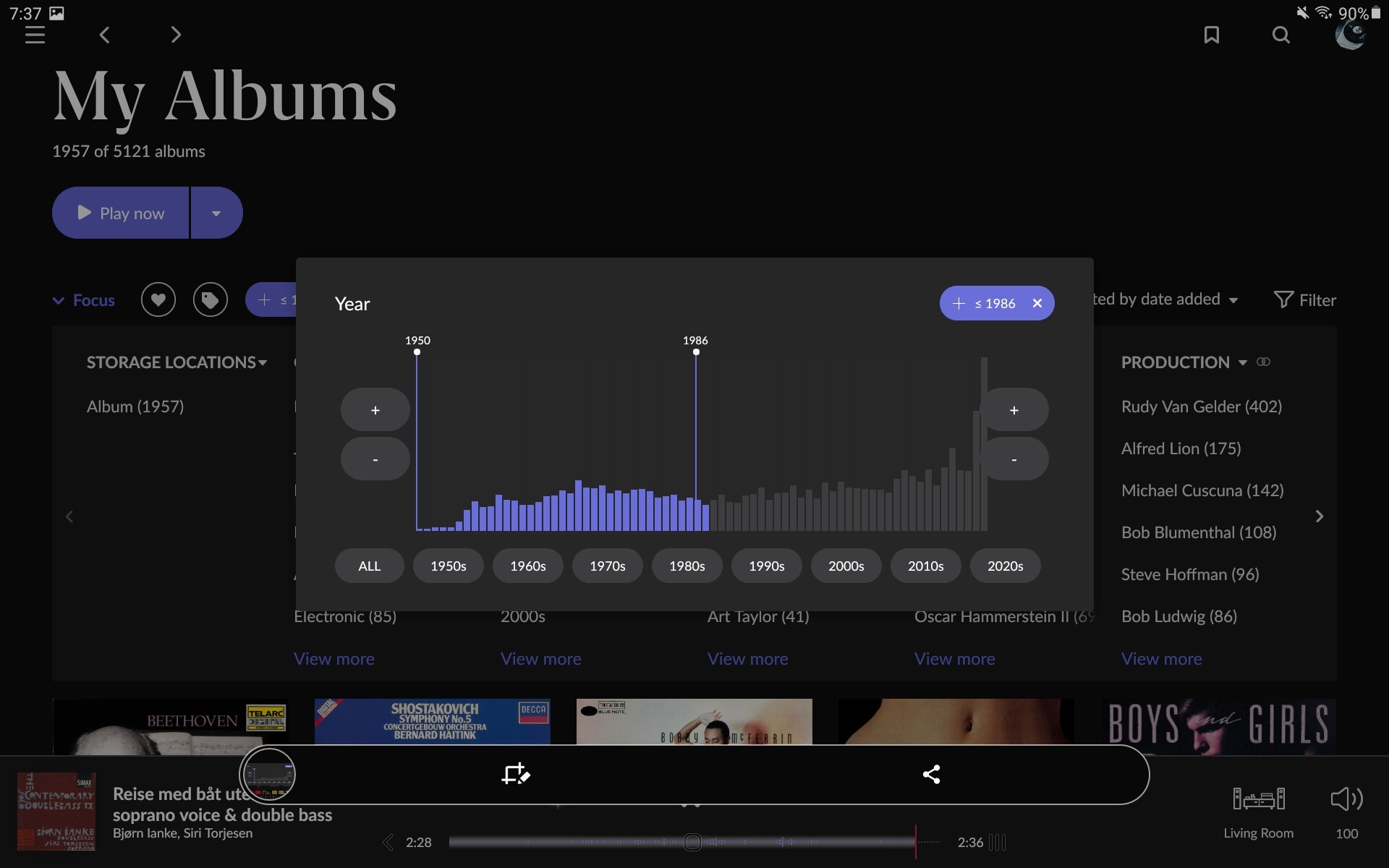
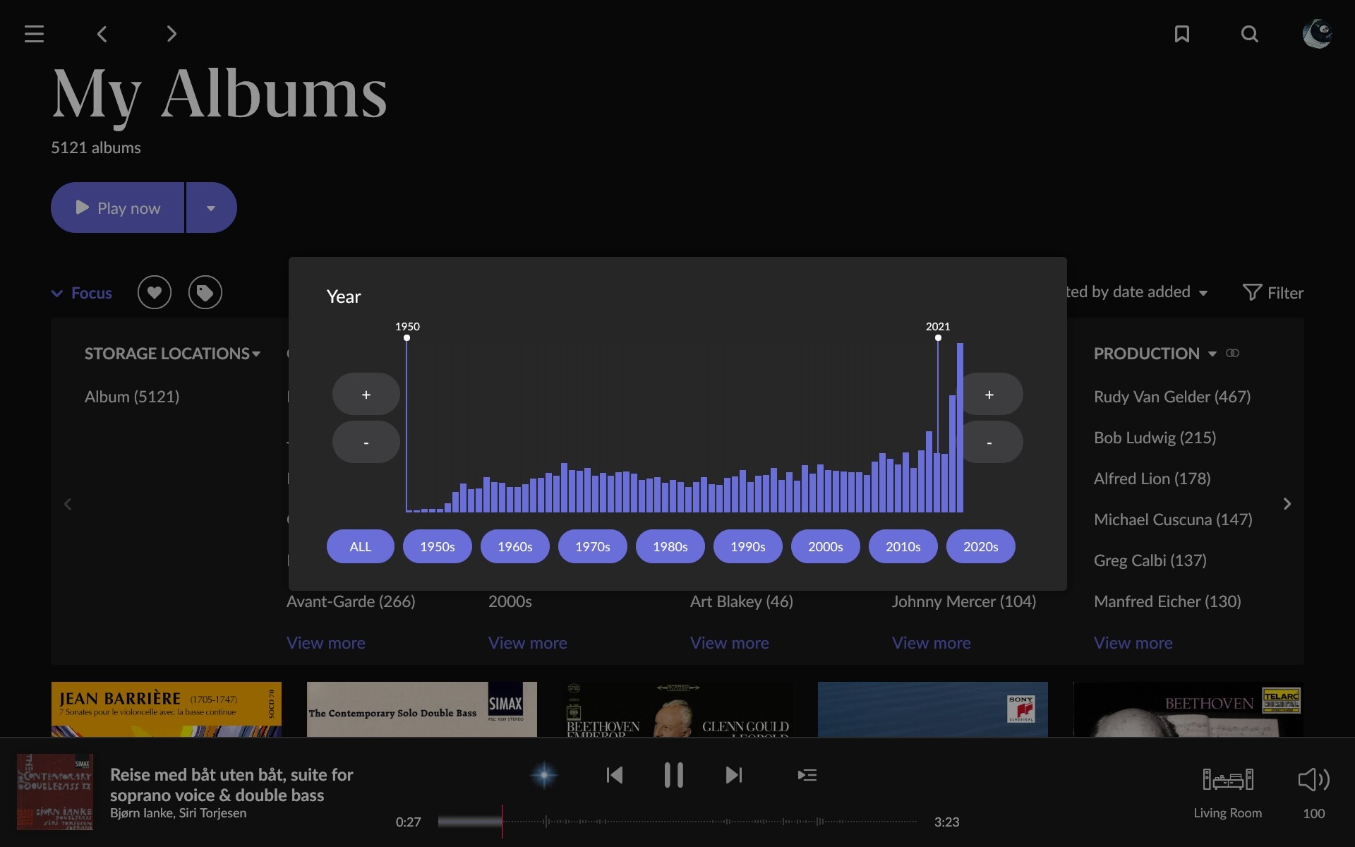
Using Focus on release date (via Show More). The bar chart extents too far to the right and is out of alignment with the right-hand vertical line showing the maximum year for the selected range.

This needs to be flexible, to accomodate for various languages description of decades:


Not the greatest solution, no, but still usable i’d say.

No no. Look at the right of the bar chart on mine. It’s starting to overlap the +/- buttons.

I’m not referring the the row of years along the bottom.

Ah, that might be down to the graphics drivers/implementation on your device.
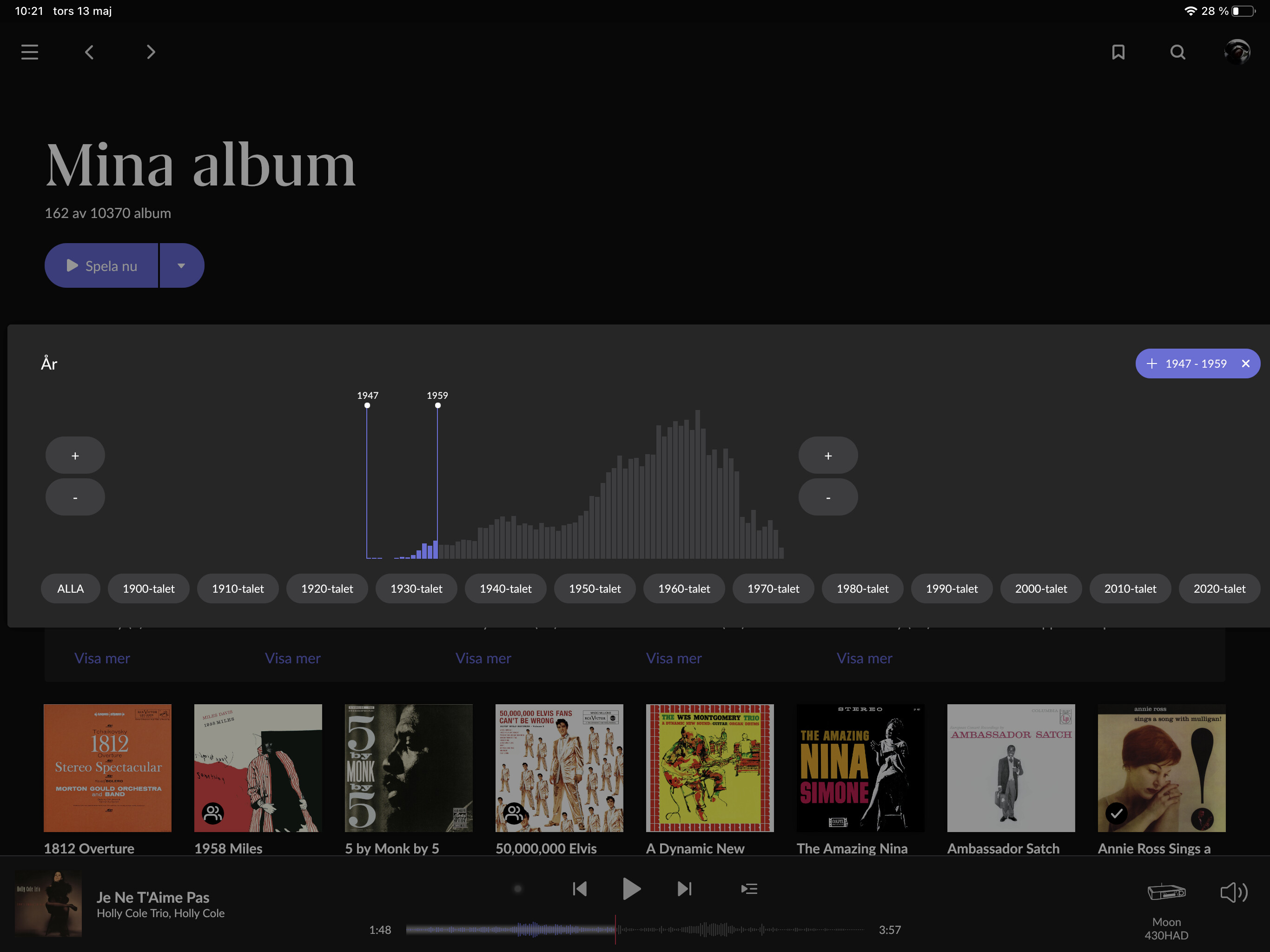
Are your screen shots from the Galaxy or some other Control?

It really doesnt matter, though. I there’s potential for improvement here!
(Look att the low end increase/decrease button on my screen shot. I haven’t even seen them, before?)

Well. This was posted for the benefit of Roon to be aware of an issue, rather than starting a debate. Thanks.

Sorry for the prior lack of response, @anon11710408 — I just wanted to let you know this was passed along to the team for further investigation. We appreciate the report!

Closed due to inactivity. If you are still seeing this issue, please open a new support thread.