I have to agree with the original post. I was looking forward to the upgrade, but iOS crashes out all the time, the removal of the waveform and lyrics, plus so many of the other issues listed make for a very poor experience. Does anyone know if it possible to revert back to 1.7 and how it is done, or are we stuck here?
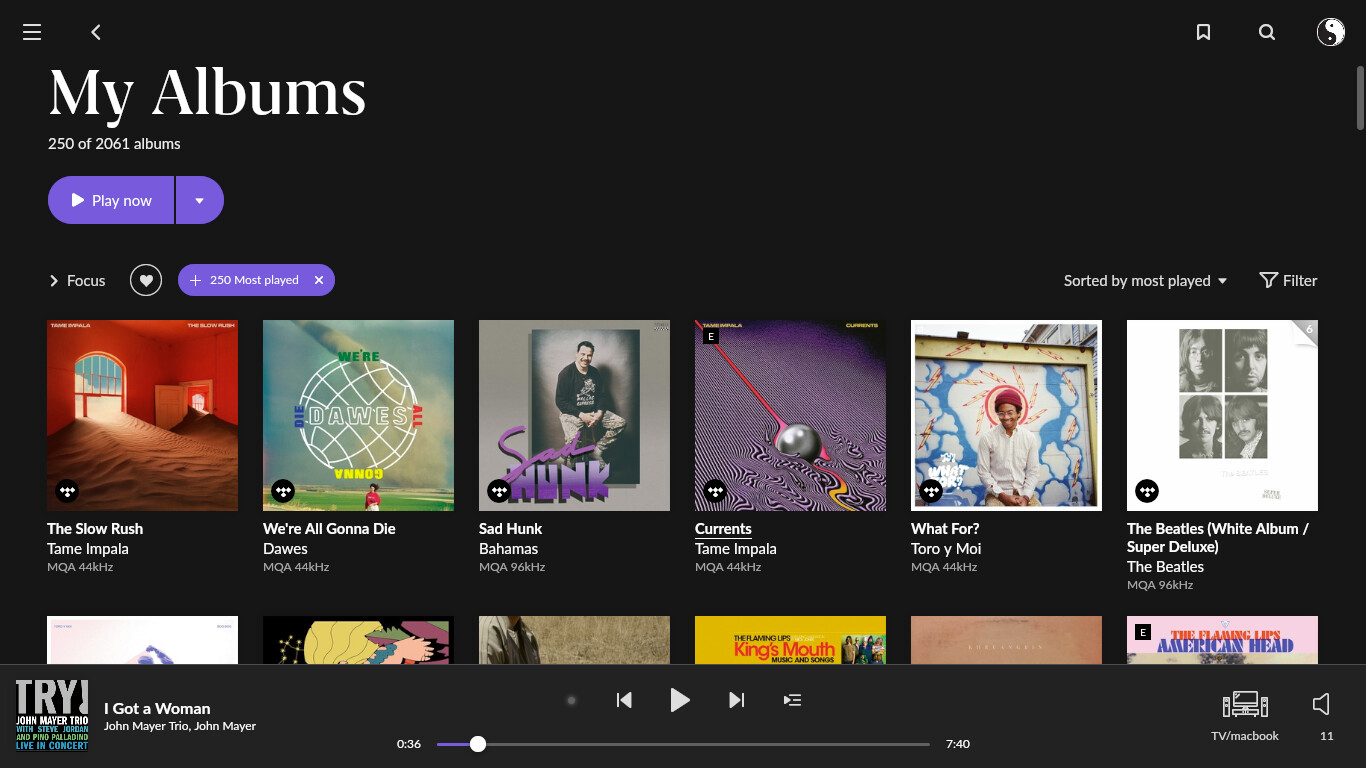
Hello Mark. If I am not misreading your question, something like this is maybe what you are looking for? The second option under Sort?
Using Android, so may look little different for you.
There are also the ‘what you’ve been listening to’ options on the homepage for albums, artists and genres:
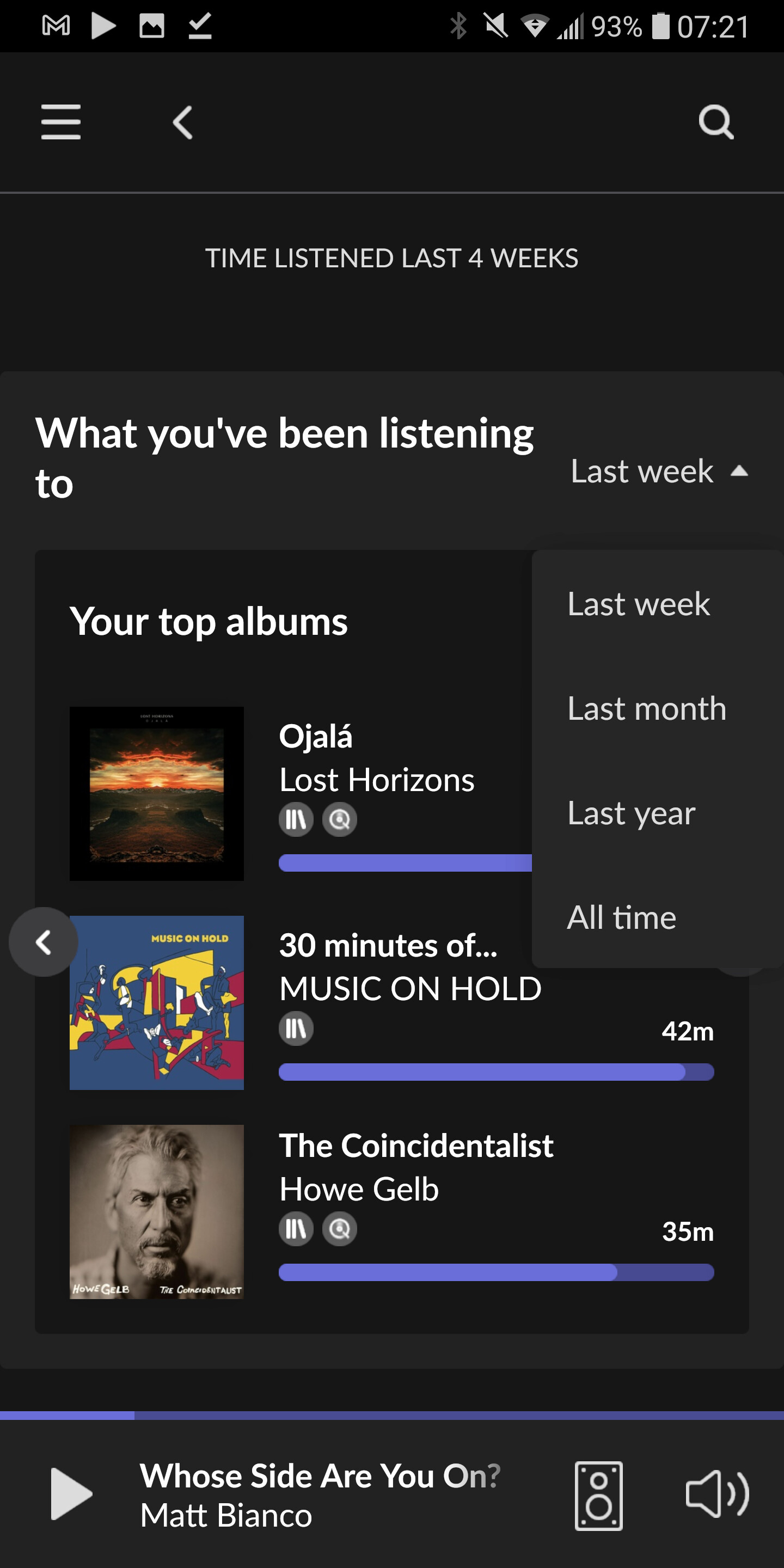
I believe latter won’t give you as many as 250 or 500 though. Limited to 50 I think.
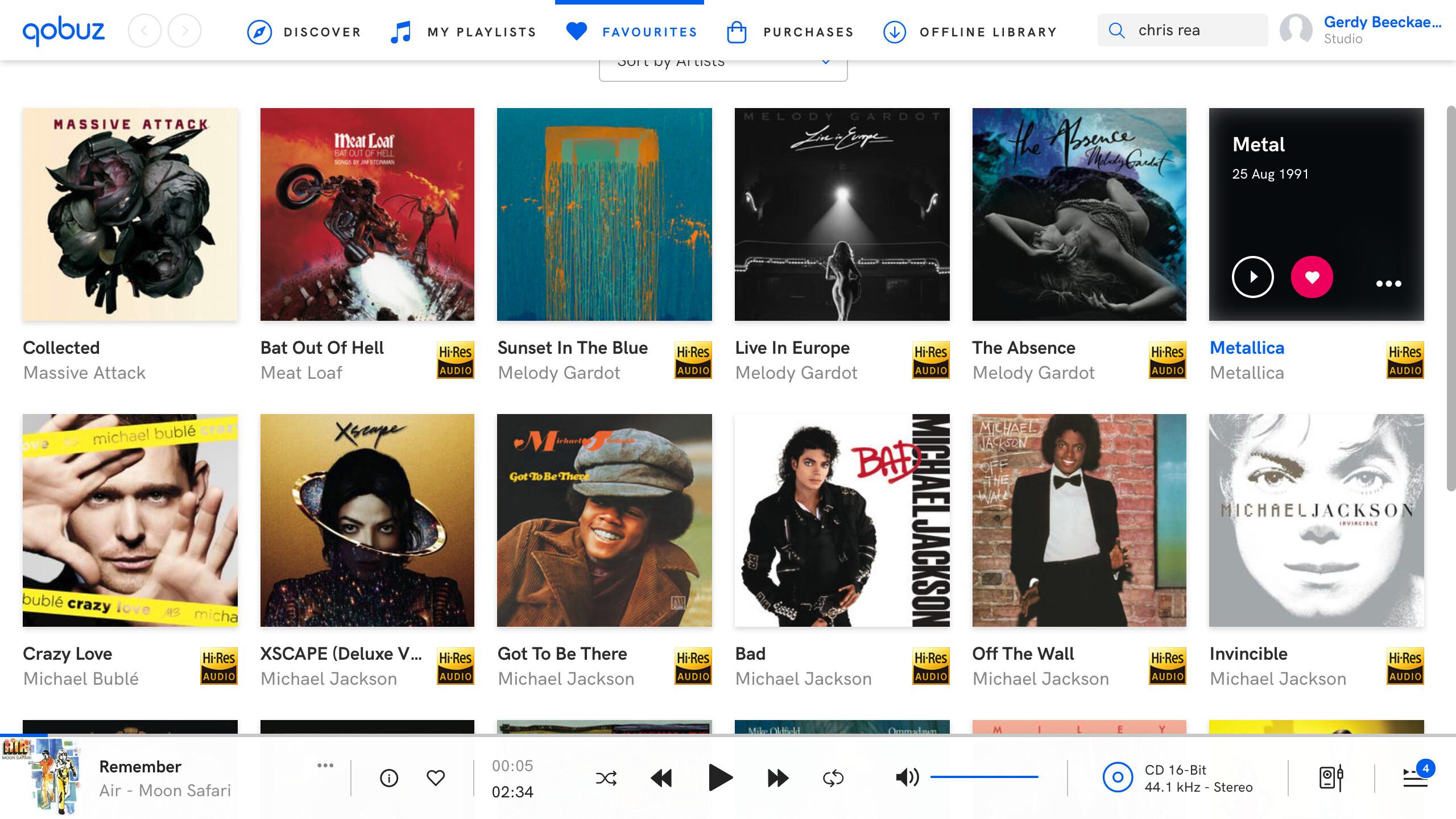
This is one of the failures the different between Qobuz en Roon Fullscreen on my screen, more album covers on Qobuz then on Roon therefore more overview
This is how it should be
9 Likes
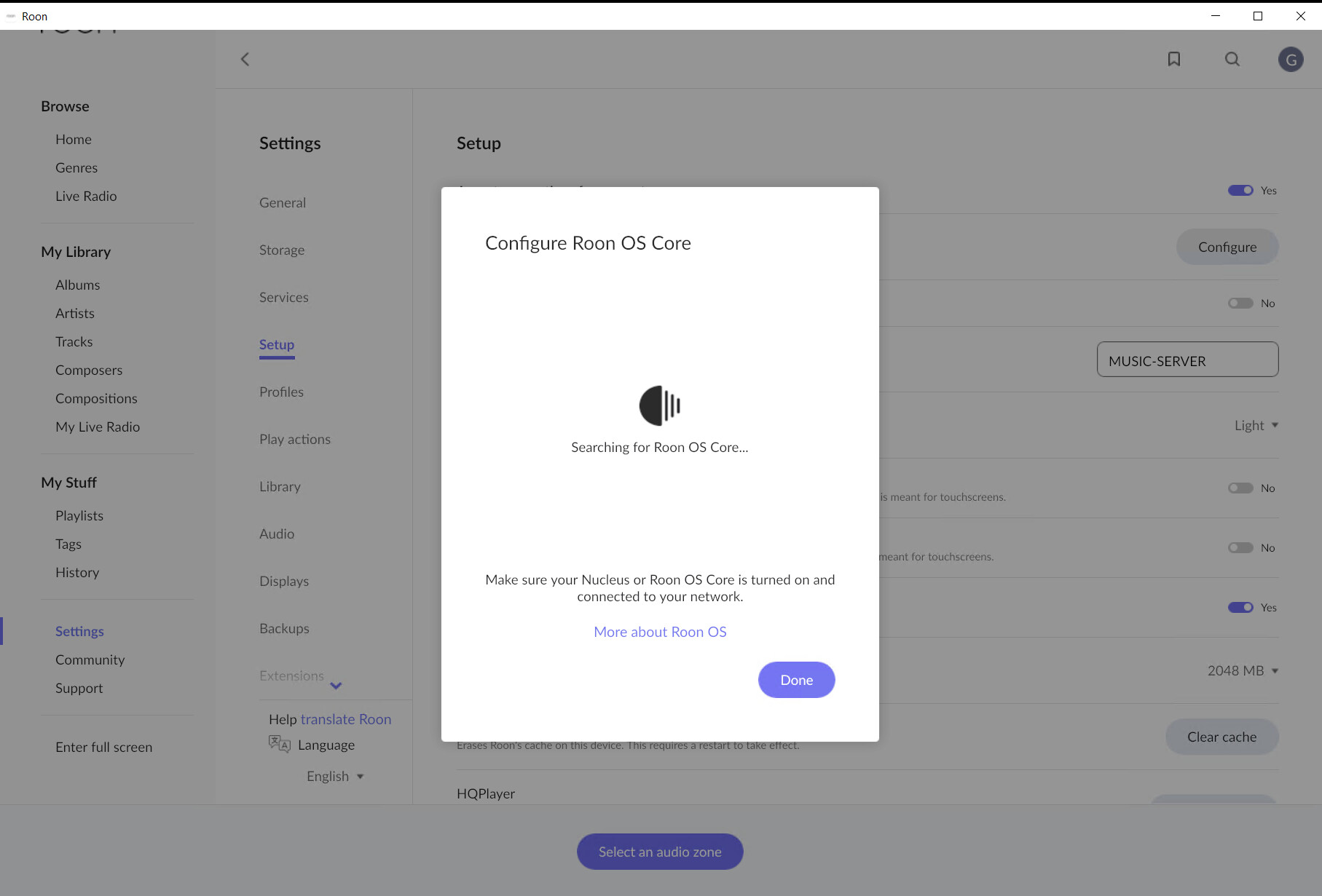
On the core of 1.8, this is the screen that is still searching for the core to configure:
I wanted to make a PC into a Bridge only, without the UI and just have the engine running. These are on the downloads page, scroll right down and down, and down…
There was a choice yesterday as to assign different icons to different devices, other than Roon ready audio components. Well today they are all the same icon, a desktop speaker.
thank you man for your thoughtful response.
i found those as well, and while that allows me to view them in order, i can’t use shuffle as i did previously.
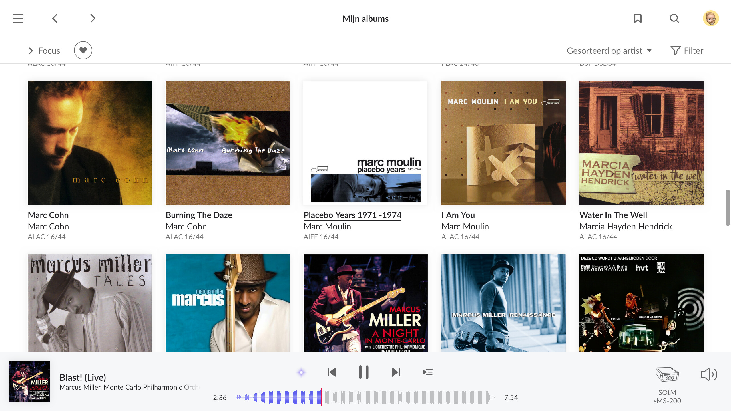
this is my mac which has a 250 filter available to toggle still:
Add images
3 Likes
Since, as can be read, some beta testers addressed the many bugs in Softaware 1.8 before it was released and the software was nevertheless released against their better judgment without warning, the disappointment is even greater.
You can certainly argue about design, but not about massive restrictions, the withdrawal of popular features such as B. the lyrics with your microphone function.
Instead of apologizing and taking back the software, it is advisable to switch to the English language to return to the
important setting mode. I find this very amateurish and inexcusable, since the mistake was known.
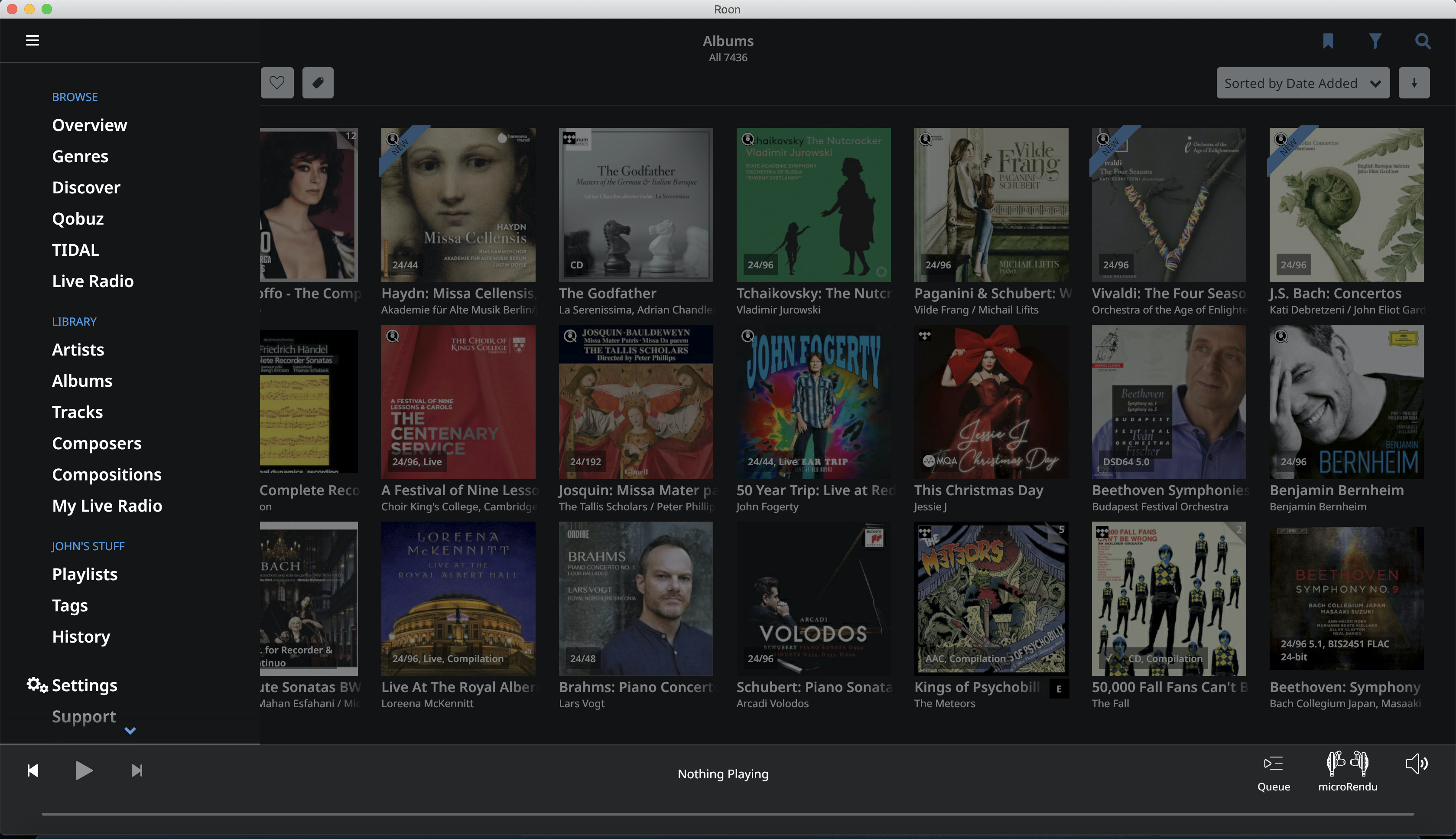
Sure you get even more information, for example about the contributors to a CD, which is positive, but here too there are reductions that are incomprehensible. Often the images of the artists are missing, which one could at least upload in the version 1.7 Not possible in 1.8. I have 26,000 albums on my NAS and I want to search for artists using the alphabet a, b, c, through z. This letter bar has now been replaced by a much more difficult to use bar on the side without letters. What for???
In version 1.7 you could turn the list of artists like a book, now you scroll up the list of artists. What for? In version 1.7 you could see and click on the other albums on the hard drive with covers on the right. An absolute must that is missing now. Why???
When identifying the albums that cannot be found, there is still no option to list all albums of the artist (e.g. 150)
in order to then click and identify the correct one. It
only a maximum of 25 are displayed and with these 25 the searched album is almost never included.
The wealth of information provided by Roon is certainly a major benefit, but the reduction of all information to the English language
is also a huge disadvantage because it is very tiring for a user who does not speak English well. A translation option
should be implemented.
As many nice functions either removed or from the controls
1.8 is a very bad update for me.
All important functions should be on the called side of a CD
be visible, because rarely do I deal with any background information. The focus should be on playing numbered tracks (also missing) and playing a CD in the best and fastest possible way, and not on a minimalist design. And the software has to be stable, which it is not at the moment. Form follows function
6 Likes
Album name in wide screen
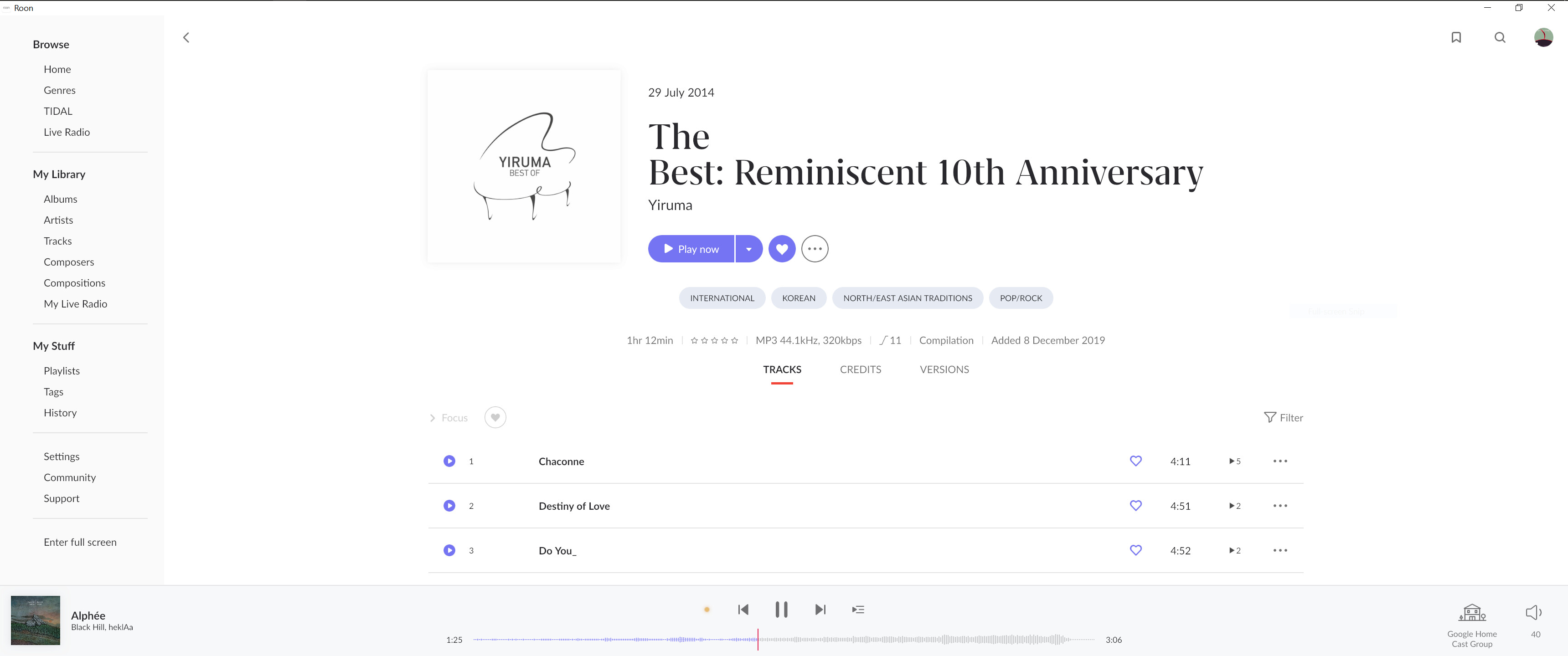
In half screen
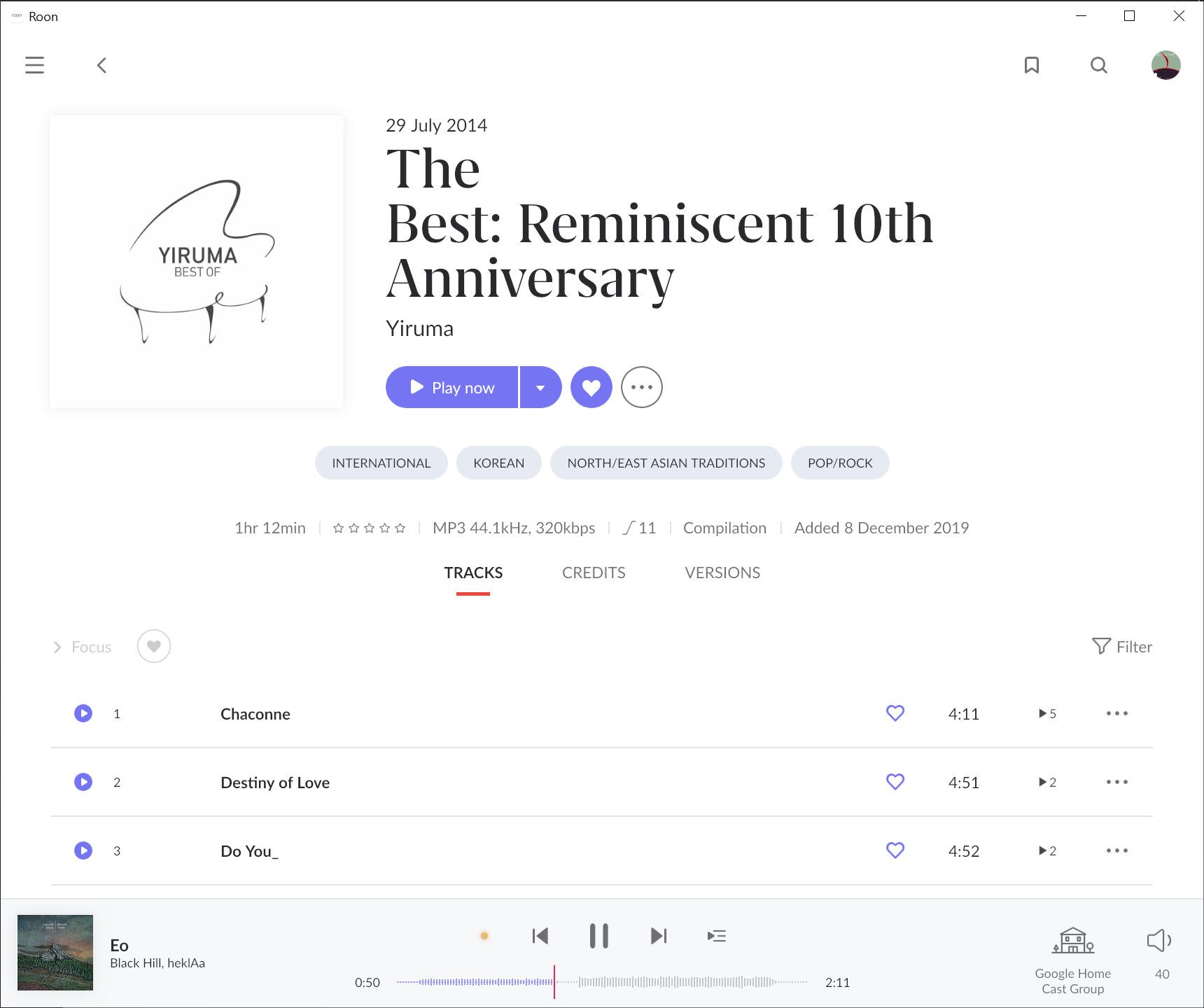
The world The doesn’t need to have its own line. If you really want to do 2 lines minimum. At least write a more sophisticated algorithm to do the line break. Do something like
The Best:
Reminiscent 10th Anniversary
10 Likes
That “Configure Roon OS Core” screen is intended for discovering Nucleus or ROCK/NUC devices on your network. They are the only devices that run Roon OS. If you don’t have these devices present, then that “Searching for Roon OS Core” will never find one, and continue be displayed until you close the window.
Got you. Could you save that view as above from your mac as a bookmark, and use the bookmark on your iPad? You would only need to save it once, it ought to update dynamically when you apply the bookmark on any device.
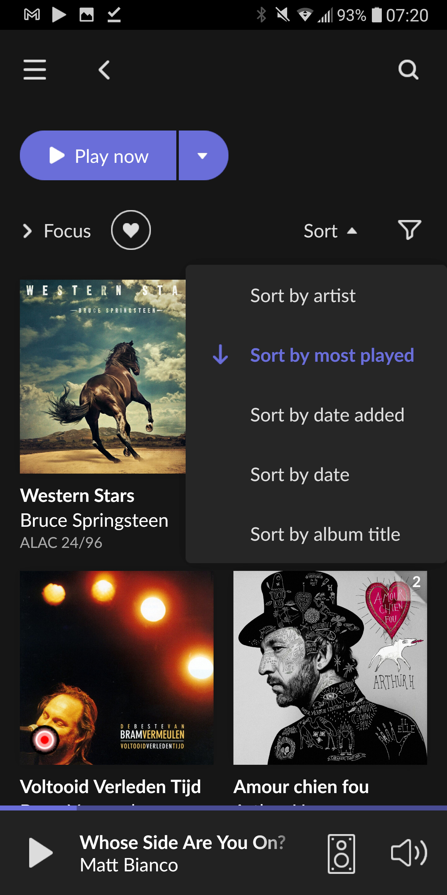
But a question in return: where on the Mac do you see the ‘XXX most played’ filter? I fail to see it in any of the Focus columns!
that’s the crazy part ozzie, i think that it’s just a remnant from the past version
but excellent idea with the bookmark - worked just as you hypothesized. also ozzie is my dad’s fav artist and our family dog’s name, so basically you are my hero
1 Like
This thread title is a complete nonsense.
I like the new version, there is lots of improvement in a new direction.
Well done Team Roon, good job!
8 Likes
Yes, I agree with that. In fact it is about the music and the minor frailties of the OS and it’s change range lower in my priorities.
1 Like
I had been wondering if you had created a tag - which wouldn’t be dynamic - to ‘grab’ your 250 / 500 most played albums at some point and bookmarked it in album view. The tag itself would still show up in your Tag column in the new Focus, so seems unlikely.
Can’t remember for the world if there was a built-in top 250 / 500 option in 1.7. Amazing how quickly one moves on and forgets. Glad you may have a workaround though. Say hello to Ozzie the dog, who is probably the real hero!
1 Like
definitely not a tag, and if i had created a bookmark it was only by mistake. never took advantage of that feature, thank you for pointing it out.
it was definitely an option in album view on 1.7 because i switched between the 250/500 options often.
1 Like
I’m not sure I qualify as a hypercritical audiophile - I’m certainly rather a musicophile than an audiophile. As somebody who was invited to participate in the last couple of days beta testing I have absolutely expected this sh*tstorm to happen.
You can for sure argue hours and hours about optics and I would not want to argue about whether I like the new UI more than the old.
What I absolutely don’t understand is the lack of proper communication on release day. They knew they had major problems with localizations. At the same time they decided to release anyway.
Why not include in the release notes that there were some problems identified late and that the team would work on it? Explain the workaround as part of the release notes and lots of angry reactions would have been dealt with.
Also what angers some of the (minority?) of Roon users with huge local libraries like me is the lack of proper advertising of new features as only available when having a connection to a streaming service.
I also don’t think anybody really blames the devs. It’s sales and marketing and management that decides on those things.
11 Likes
Easy there fella 
I think Roon are aware they’ve got some tidying up to do… perhaps wait a little before consigning it to the scrap heap? Give it a few weeks and I think a lot of the rough edges will be ironed out.
1 Like
Now that the settings are not broken anymore with the new build, 1.8 just still looks like sh*t 
3 Likes
All seems well now. Confidence restored.
Thanks for the pointer. One nasty bug out of the way 
Has the jittery scrolling on ipad and iphone been fixed? I was using it last night and still horrid to use, also blinded by the white screen before it switched to the dark theme. Not got access until this evening. Glad to see the devs are working on the bugs though which is promising.
1 Like