Do you have a screenshot of the overview page or song playing page?
The OP needs to take a minute.
I’d hate to be on the end of them when something really impactful happens in life, given the OP’s reaction to their first world problem: “My multiroom lossless audio rendering software isn’t exactly how I (capital ‘I’ there) want it. And its not perfect. Not at all!”
I mean come on.
Let’s try and be constructive - especially when you are giving feedback on one install, in one system. Give the team a break, they need to assess useful feedback, establish thematic issues to solve and be given the time to fix.
For a lot of people, this is the UX they prefer (I’m not sold yet) - and things are working just swimmingly.
Indeed.
FWIW, our house has 1.8 on the following hardware -
ROCK core -
NUC 8i5
Remotes -
IMac (big sur)
Huawei mate 10 pro (Android 10) x 2
Huawei media pad m5 (Android 9)
All setup in English as os language.
All of these appear to be running 1.8 very well at this moment.
Very slick.
No I didn’t change it from English (UK)
I was one of the beta testers and translators of the beta version (s) of Roon 1.8. All bugs found by testers have been reported to the developers. (I tested on an a Dutch iMac)…
wow…that is shocking
On my computer and iPhone, 1.8 works fine (technically)
That’s normal
Very strange. Why have roon abandoned that? It was actually what drew me to roon in the first place. On many older players all information was in the track name/title. In practice this meant that displays of Classical works were often unreadable because screens could only show the initial identifying information of tracks which was all the same. Tracks became indistinguishable. 1.8 is not as bad as that but still a very odd retrograde step. Large works like opera with many Acts/Sections are now just a long, long, unstructured blur.
 you made my day
Version 1.8 (from what I have seen so far) seems from a visual perspective to have focussed on phones and tablets and in particular on portrait view on these devices. The preferences of those of us using larger screens in order to appreciate the beauty of the visual impact of Roon and its UI (pre-version1.8) appear to have been more or less discarded.
A very, very disappointing outcome!
[/quote]
I don’t like it on a phone (iPhone 12) either, especially the clunky title font.
Totally agree. I am interested in popular music since over 50 years, vinyls, cd‘s, now also streaming. I prefer best sound. So I came to roon.
Tried others before. Liked roon. Because of sq. I know which music I like. So this update brings NOTHING I need. I would prefer an integration of room correction possibly made by roon or thirdparty. I would like the integration of other streaming services. But not this update without any substance. It is only a shallow update with lots of issues and a step from a good software to mediocracy. I will look for others in the next time.
The new Roon layout and features will need some time to get used on. What I don’t like is the fact that the IOS app crashes so often. I hope Roon will fix this as soon as possible in an update.
+1 to that.
would you maybe check whether you experience the same on your side? This is something I have observed during the short beta test period.
The calculation of items in Focus and also in Play is not correct in regards to Compositions. Since some of the bugs I experience are not experienced by others, I would be thankful for your feedback on that.
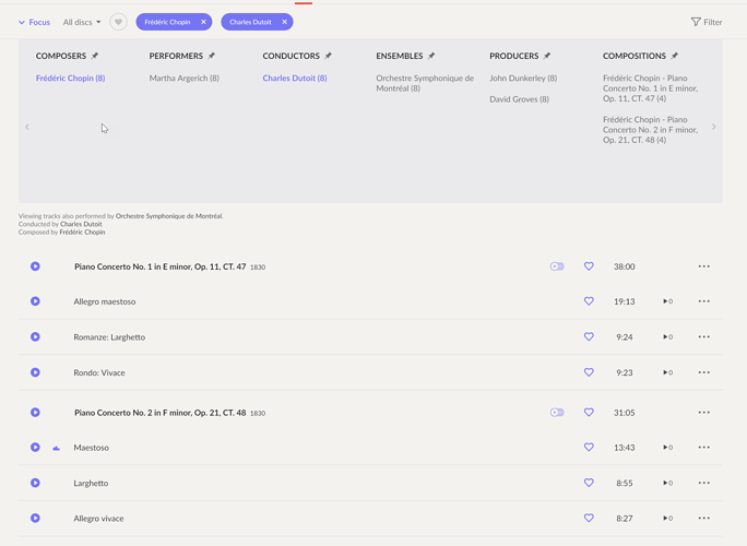
I’m starting to play around with the focus feature. I’m not sure what the numbers in brackets after the performers are supposed to mean.
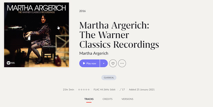
I have taken an boxset of Martha Argerich and focused on Chopin and Charles Dutoit, which leads to 2 compositions. Although the result of the focus are 6 tracks it say (8) for the composer and (4) for the composition. Can it be that the composition entry is added to the number of tracks?
On the level of composers I would either have expected (6) as the number of tracks or (2) as the number of compositions. For classical I would think the number of compositions would be better, but the displayed number (8) does not fit into anyl logic for me.
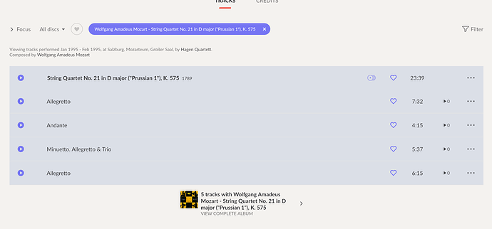
Another indication that there is some miscalculation happening. Focusing on a Mozart String Quartet. The Commposition consists of 4 tracks but Roon indicates, that 5 tracks have been calculated
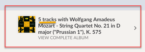
Roon counts the composition entry as a track.
or EVEN FEWER.
While I whole heartedly agree that the release itself was a bit FUBAR and its shows a lack of beta / load testing. Humans do make mistakes, and issues with typeface / size are rather subjective, it is hard to please everyone all the time. Not to mention that some of the issues are likely related to backend falling over due to lack of load testing.
Functionally, my only problem is that I can not shuffle my entire library, and I hate the looks. I’ve had zero crashes on my iPads or my PC. But, the mechanics of a person trying to find how to do this or that has changed so much, they need an online manual thoroughly explaining how to do everything, and they need it NOW.
I do agree: Settings not working on Roon Core (windows PC), when you tap on Settings on Ipad (or iPhone) App Roon Remote crashes! I even cannot setup a new directory for my music because i cannot access to settings… It’s a complete disaster!!
The software needed more beta testing before it was released, it’s a shame.
Is there a way to downgrade?
I’m with you about the “fanboy antics.” When I was new to Roon last year, I made a few posts about the Roon UX that I thought were strange or nonintuitive. People dogpiled on me like I shot their mothers. Defending Roon against all change seemed to be a sport.
So I take the OP with a grain of salt. I like nearly all the changes. Roon 1.8 is stable for me on iOS and Windows 10. I feel bad for those with settings and playback issues, but I’m confident that Roon will catch up to you all. As for the UI/UX, that’s in the eye of the beholder, but I love it.
