Are there any users who are now openly happy with 1.8 and would also stay with 1.8 if roon offered a reversal back to 1.7?
I intensely disliked the look and feel of the new UI when 1.8 was released, and held off updating for quite a while. However, I now realize just how much the visual appeal of Roon contributes hugely to my enjoyment of listening to or discovering music, and when a number of enterprising users identified means of tweaking Roon 1.8 themes, quite a bit of my aversion to 1.8 was removed.
I’m now fairly comfortable with 1.8 and its newly customised and modified look and feel. Having said this, I would still be tempted to move back to 1.7 if I had a choice.
I would certainly have found it difficult to continue with Roon 1.8 and its stark dark purple on black or purple and black on white themes, but the option of personal customisation of themes has thankfully resolved my issue to a great extent.
I just wish Roon would introduce some more subtle and easier on the eye alternative themes for iPad control devices. My iPad Air is now my least favourite Roon control device. I find dark purple on black almost impossible to read comfortably.
1 Like
How do I change the color or theme of roon? I don’t see an option in settings. All I see is a choice of light and dark
Roon doesn’t (yet) provide a way of doing this in settings. But, if you head over to the ‘Tinkering’ section of this forum, you will find a couple of threads dedicated to changing theme colours. A number of individuals have come up with instructions of how to do this and have also provided examples of the appropriate files that you can just replace the original files with.
There is also a way to change artist ‘circles’ to ‘squares’ again if the circles annoy you as they did me.
Remember to always take backups of the original files before you change them, just in case you make a mistake when editing.
By the way, this will work with Windows 10 or mac Roon control points. Themes on iPad & phone control points can’t be changed in this way. You are stuck with the Roon default themes on iPads & phones.
1 Like
Yup… I disliked 1.7 pretty intensely. That said I had no technical issues with 1.7 and none with 1.8 so I am going purely on the UI side of things. If they reverted back to the 1.7 UI, I’d take another extended hiatus from Roon as I did before.
Heck yes, I’d stick with 1.8 over 1.7. I think there are bubbles even within this forum 
Well… On Android devices you could probably use apktool to unpack the APK, change the theme, and repack it. You wouldn’t get the same signature, but it should work. Haven’t tried it.
Happy may not be the appropriate word. Even if the really bad bugs have now been eliminated, there are still enough illogical and less intuitive operating steps as well as a user interface that still has significant potential for optimization. Not to mention the choice of color.
The positive thing about it: Thanks to some clever guys in the “Thinkering” thread, I learned to design my own UI within the limits of the possibilities. With the V 1.7 I didn’t waste a thought on the UI, it was ok, you don’t have to question anything.
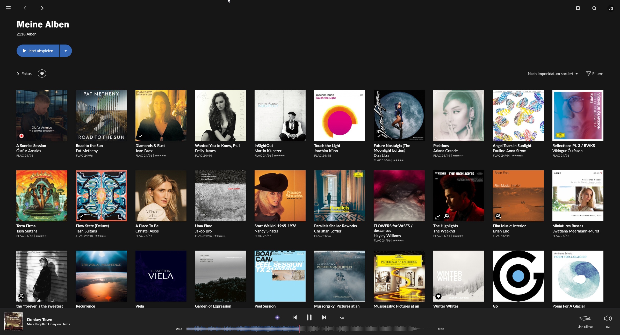
Now my font has a more comfortable size, the colors of the buttons and links as well as the UI no longer cause eye cancer and the squares are back. Now I can live with it so far. I use the iPad relatively seldom because you can’t change the design. I’m not telling you anything new. But when I display my albums on the iPad, I see exactly 5 of them. Of mine over 2100 … Half of the space is completely wasted. It is like it is. Maybe the Roon boys understand and correct it.
My personal Roon Survival Kit:
First: My Colors
My Font at the albums:
and my buttons. But a lot of wasted space…
Not to forget the squares for composers and performers.
After this experience I only fear one thing: Roon V 1.9. God save us from another stroke of fate.
8 Likes
Circles to squares, font to font, the many different colours of the rainbow. My my my whatever next… 
The files you need to change can be found in the following folder (Win 10 devices):
C:\users\AAA\AppData\Local\Roon\Application\999999999\Themes\Dark (or Creamsicle).
Where AAA is your chosen Windows name.
The file that defines the colours in both Dark and Creamsicle folders is simply called colors.
I would create an additional folder under themes called anything you like (say ‘Custom’) and copy any colors file of your choice from the ones offered to you in one of the themes threads as a first try. You can create your own Colors files later once you have worked out which colours to change. When you create the new folder, you will see a third Theme choice in Roon ‘Settings’ called ‘Unknown’. Choose this theme in ‘Settings’ and you should have your custom theme up and running.
Note that you will need to sign in as Administrator on your PC in order to have access to these folders.
Remember to back up the original ‘Dark’ and ‘Creamsicle’ (Light) files just in case!
1 Like
Thank you.
![]()
Love your description. I hope Roon at least does something better with the font/font size. Roon 1.8 always feels like it’s screaming at me! ![]()
2 Likes
Perhaps the volume control feature? ![]()
I know what you mean, I spend a lot more time listening to Roon than looking at in truth though…
I agree. Just another one of these UX revamps that tries to be trendy, breaks legacy functionalit, and overall is a step backward for the human machine interface.
3 Likes
Note that you can also change the circles that hold the artists’ photos to squares, or even change fonts if that is your preference.
However, these changes are a little more complicated and potentially a little more dangerous.
1.8 has been working fine for me. No dropouts, no lost endpoints. As for the problems with appearance, those are all subjective.
5 Likes
Thank you for taking the time to let me know…unfortunately if I understand correctly that this is for laptops or macs only. As I primarily use Android tablets and android phones, I think I’m out of luck.
But I’m easily confused confused by Roon, so if I’m wrong please let me know.
1 Like
You shouldn’t have to though… The way roon has incorporated the Dark and Light themes allows for than more just 2 settings. All that needs to done is create a new theme layout and a new .plist or whatever it is that they are using to register the option in the dropdown menu.
Then all client platforms get more than 2 options.
I simplified that a bit but that’s the basically it.
1 Like
For mobile devices it would be a bit more tricky. Ideally the themes would be stored on the roon core so they were accessible to all remotes.
Currently with tinkering you can change the fonts, colours and shapes - but some things are hard coded so aren’t able to be tinkered with (things within colours, fonts and shapes it seems).
I never minded the default UI, but for a bit of academic fun I’ve changed fonts, colours and shapes…next update and install will wipe them out, and I may or may not bother to change them again…
3 Likes
Hmmm…likely mentioned before, but only occurred to me now.
Scrolling is ar$e!
That is for example when I search by genre and I have 1000’s in some, I will scroll down (good), then I go to look at a given album I am tempted to play and decide nope not that album. So going back I am back at the top again, not however many albums in where I had just looked. I should be taken directly to where I had stopped my search/scrolling.
There needs to be some sort of ‘placeholder’.
It’s akin to scrolling though a website looking for some gear. When you go to click on the gear and going back, instead of going directly back to the page in question, you are taken to the start of the search.
There are some sites (guitar) that I know do this and I try to avoid them like the plague and make an effort to shop elsewhere.
Not good… 
9 Likes