I suspect you may be out of luck, but I have no experience of Android tablets.
Your best bet is to submit a feature request post asking Roon to provide some alternative and more subtle themes. It’s something that they could do very easily, and the more people who ask for this the more chance that Roon will listen to us.
I’d like them to move the ‘Queue’ icon back to the empty space it left behind. What was the motivation in moving it and creating big hole where it used to be? It makes zero sense.
You do realize that the like or dislike of colour is a personal preference and highly subjective, don’t you? Your view is unlikely to be shared by the majority. Has anyone ever informed you he doesn’t like one of your photos because of an abundance of one colour? A lavender field, perhaps? Yet, oddly, others like it?
Interestingly, someone posted his redesigned Roon in one of these forums a few days ago and the first thing I thought was: “Really? Sh*t brown?”
That, too, was subjective. However, I’m certain if that were the colour chosen by Roon it would have generated as much invective here as purple.
Yep, I do realize that, and I was relaying my personal and subjective opinion, just as you are in your response. So get over it that some of us will be highly critical of the appearance as purple is typically an unusual choice for highlighting other colors (and most album covers are in color). Yes, some of the user themes created here don’t appeal to me at all either. The one I’ve created for myself does, which also points out that Roon need to do more to allow customization (which should probably should have started at 1.1).
That’s as maybe, but the one thing that doesn’t boil down to personal preference is the fact that dark purple on black is not an easy read for most people in middle to upper age groups.
I do wonder if any form of accessibility testing is done on the Roon UI. A decent automated tool can detect sub-optimal contrast and font choices fairly well.
The Aurender program was “sh*t brown” for years, and lots of people complained about it… Now they offer a couple of different interface color theme choices , which is what Roon need to do.
No problem for my eyes, and I’m 67. Do you have scientific proof of your claim? It’s news to me. Purple isn’t my favourite colour, but I’m not bothered by its use in Roon. I should point out that I prefer Roon in dark mode, which I used before 1.8 and continue to use. To be honest, I’m far more bothered by people who go on and on and on and on and on and on about purple here.
Of course I don’t have scientific proof. I was going by my own personal experience & the fairly obvious assumption that any dark colour such as dark blue or dark purple on a dark background is unlikely to be ideal.
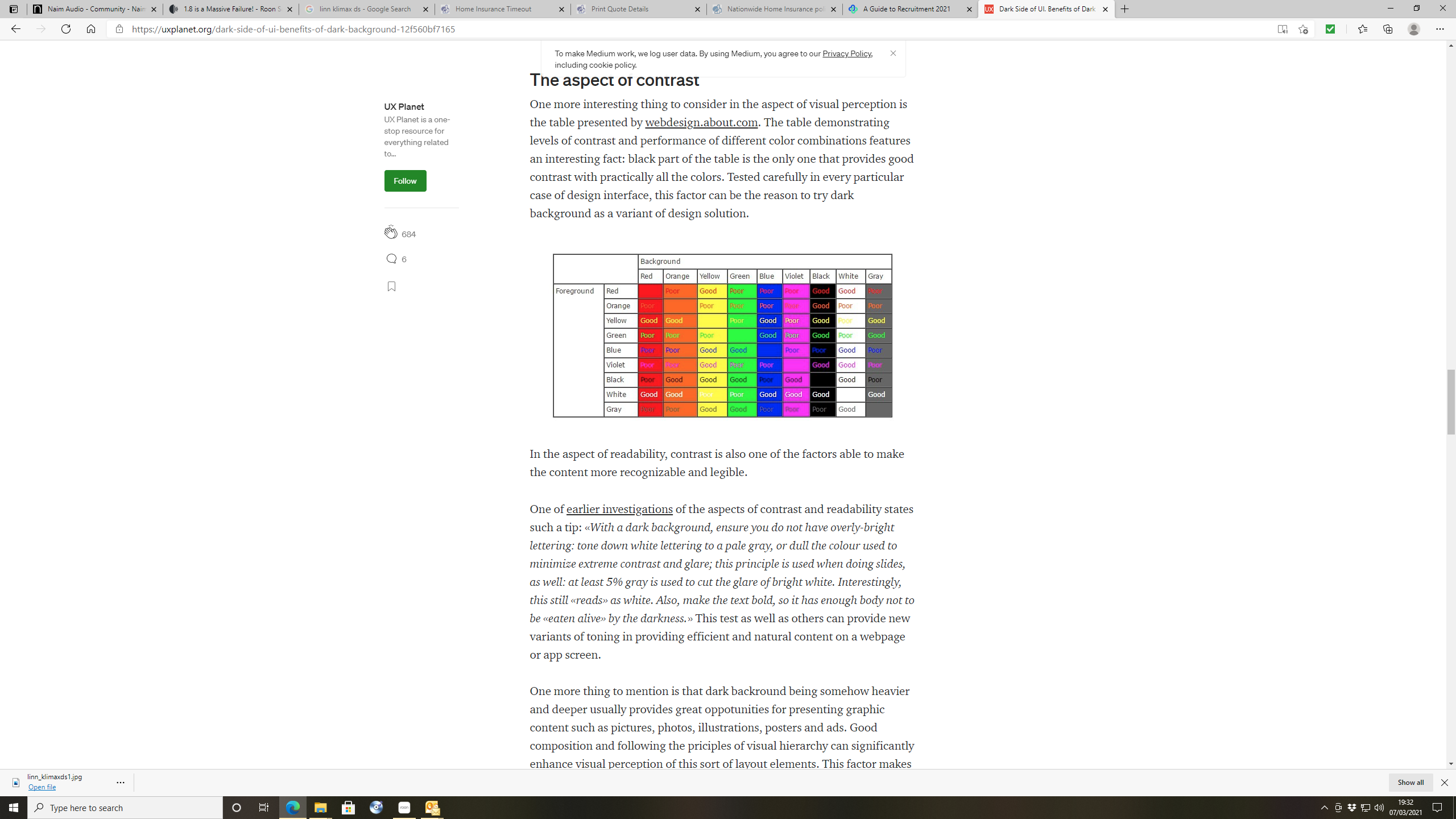
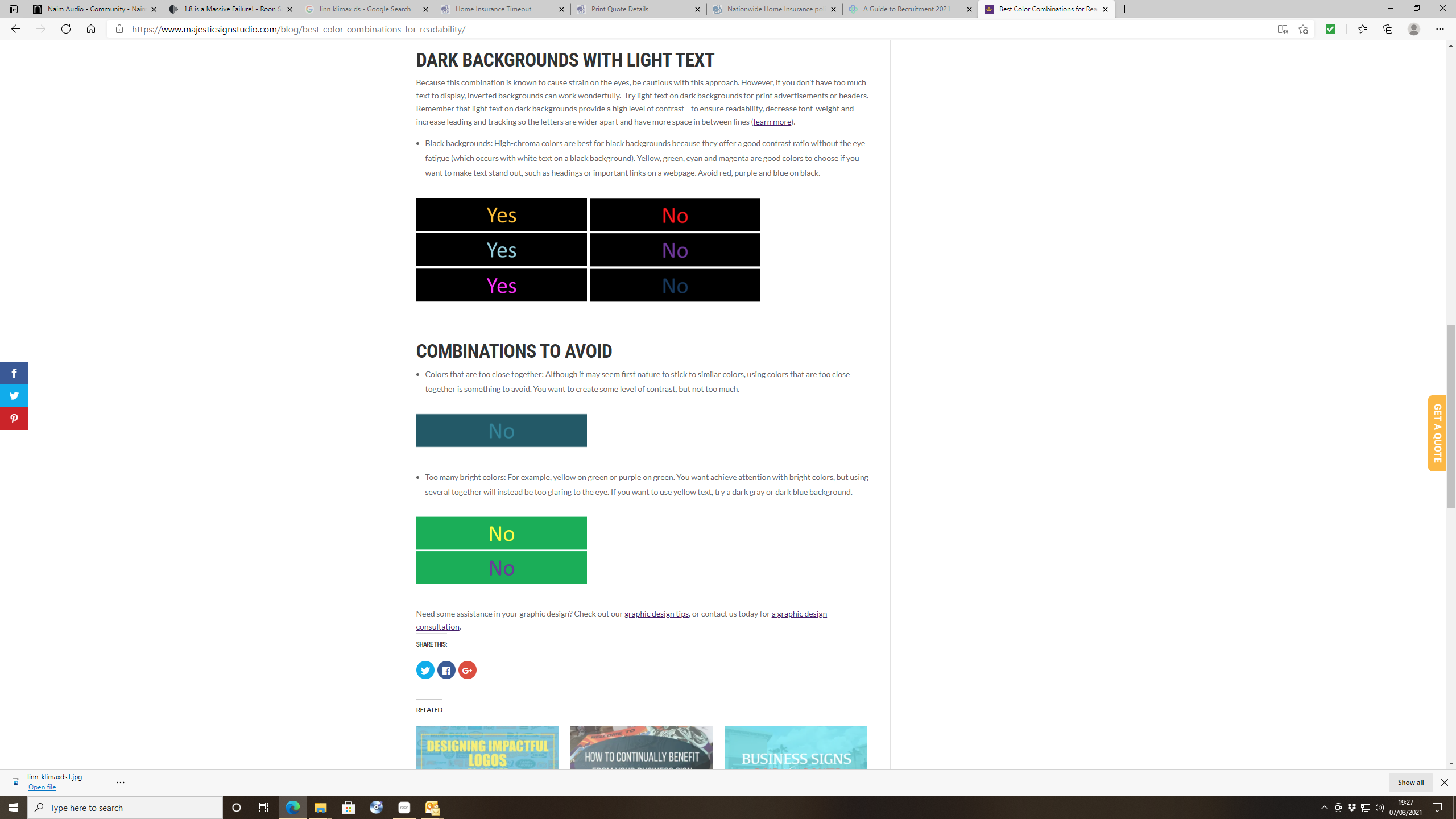
Not scientific papers, but here are a couple of extracts from studies into readability which allude to this:
I don’t think the Roon colour is “dark” purple. To me it is a blue-purple. It doesn’t really matter what I call it, but on my iPad and core notebook there is plenty of contrast against a black background. Obviously on white, which I don’t use, it is fine for contrast.
But then it simply boils down to the ‘fact’ that everyone with a modicum of aesthetic sense would accept, that the purple Roon has chosen it is just a plain ‘ugly’ colour.
‘’'and no - I don’t have scientific proof that it is ugly …at least not yet - but I’m still looking!
Hi Ethan.
I tested on my iPad mini and iPhoneX. No issues when adjusting random DSP settings.
I suggest you uninstall the app from your IOS device and reboot it. When restarted reinstall the app. It may have a corrupt cache. Also disable any VPN you may have running on your IOS device and server.
Opinions are like @r$eholes…everybody has them and most of them are $h!t.
I think it was Einstein or Lincoln who said that… It was on the internet and had their face next to it, so it must be legit.
No matter what roon does with colour or shapes, it will evoke strong opinions. They should call all their themes “Marmite”. The pic I posted - I swapped out artist circles for a “filmstrip”… I was playing with what was possible with the icons… transparency, colours etc… it was an experiment. In the end I was quite happy with the result so kept it (for now). I’m figuring about 99% of folks on here will hate it! And I suspect a good number here - given the chance to customise roon will do so repeatedly. And each will believe that they are right. Which they are… for them.