In your opinion - for some of us it works pretty well. Like reading a book - I read a page from top to bottom (vertical scrolling), but then I flip the pages (horizontal scrolling). ![]()
4 Likes
Not an opion. A fact. The user interface is a mess.Its all over the place.
And I would refer you again to the Ring species concept - it may be evolution in action. The design language has changed considerably since I started using version 1.1
That is definitely an opinion. However, I’m sure Roon has heard your opinion on the subject, so how many times do you need to repeat it, outside the Feature Request thread?
2 Likes
Nonsense! It’s all just random mutation and natural selection! ![]()
2 Likes
Inany case, I am convinced Roon has already made up their mind in which direction scroll will work in future. All recent addition are vertical.
I just wish the transition would be faster so we finally at least approach a consistant layout.
Hi Jim
I am not bashing ROON at all as I mentioned that new features are quite good to me.
I am just asking if the UI will evolve in a more consistent way in terms of scrolling. As someone said in the thread, the UI had constantly evolved through years. ROON is maybe testing things before doing a major change… or not. Whatever the scrolling is horizontal or vertical (very personal, it is up to ROON to propose what they consider is the most convenient UI), I however think it is confusing to propose two different ways for the same mean: scrolling through albums.
It is neither a feature request as the it exists, just a question of consistence to me.
However, not a big issue at all. The overall system is the best to me.
… and survival of the fittest… 
Its on the roadmap: Vertical scrolling [On Roadmap]
Hint: Every new UI screen introduced in past releases (since 1.6?) features vertical scrolling.
The UI does need to be consistent, plenty of us have asked for vertical scrolling.
For me personally horizontal paging is unintuitive, regardless of the inconsistencies in the Roon UI. I don’t want my iPad experience to be like reading a book, it can be so much more than just pretending to turn a page.
We are way past skeumorphism, I used to be fan of that approach when I first started using OSX Panther but really, our tablets and iDevices have the potential to be much more interesting. Scrolling through a digital booklet that is like an endless page within the Roon UI would be fantastic, same goes for scrolling through your albums.
The UI really needs to be something special but I agree with @Geoff_Coupe that Roon are laying the foundation for that, with small and for some, frustrating steps.
Good news !
And I love horizontal scrolling on my iPad, wouldn’t want to lose it.
1 Like
Well there you go Chris, not everyone will ever be happy. Such is life.
At least we are still living eh?
What’s your view on the bits the scroll vertically?
Phil, I wasn’t replying to you. Thanks.
No problem! Forums are made to discuss.
1 Like
I’m super happy with the way it is and the way it looks, please don’t change it too much!
The only request I’d have would be to have an option to include only local music in the roon radio so that when an album ends and the radio kicks in I don’t have to worry about busting my limited internet.
1 Like
Software is hard. Good software, doubly so.
I’m a big fan of Roon and the value and experience it provides. They keep improving it, and listening to customers. They’re doing a good job. Thank you Roon team!
5 Likes
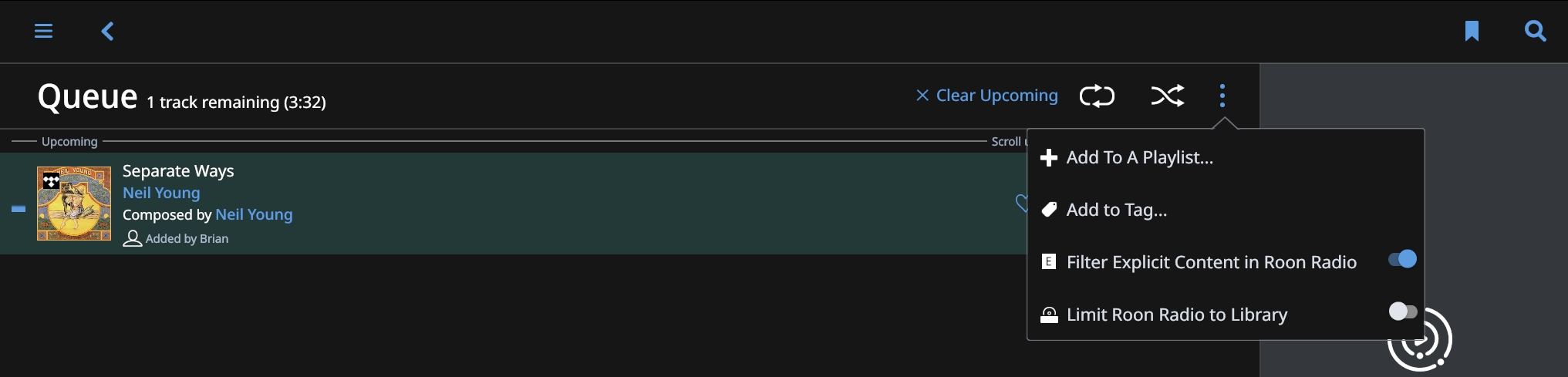
This doesn’t seem to limit the radio to my local library but to my general library which includes tidal albums.
Is it supposed to not include tidal albums that are in my library?