A warning for everyone who wants to upgrade to MacOS Tahoe, be warned, it is te most ugly and user unfriendly UI design upgrade Apple had ever made. It is but ugly but most of all, elements are all way too big, screens have double borders which makes it hard to view which UI element belongs to which. The menu is even further detached from the program screens. The translucency and the way to rounded corners feel like a 15 year step backwards in design. It is just plain awful and gets in the way of usability. I use macs for professional use but the UI now look like a childrens toy. Be warned, stay at Seqouia, skip this one, it is one serious big mistake.
I’ve only used it for a few days but find the Photos app much improved …they learned a thing or 2 with the acquisition of Photomator with better HDR raw integration. Also appreciate the collapsible side bar.
There’s no accounting for taste.
For me it is the same problem that I’m having with Roon’s UI design, elements that are too big are really bad for overview on a screen. This in combination with a bad colours scheme makes it unnecesary hard to use, as if designer don’t give a damn about usability anymore. Macos of the last ten years used to be good in this but it is completely destroyed now in one upgrade, it is just an absolutely terrible downgrade. For me, ot is not about taste, it is the same as Roon’s UI, the white theme is way too white, the black theme is way too black and UI elements are way too big, very bad for overviewing a screen.
What UI elements are you refering to? All is in the same place it used to be. Also you can scale a lot…and can change more colour schemes than before. In my view this update is the most flexible Mac OS has ever been.
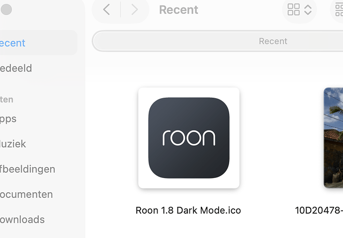
Do change the Roon ico to the old one so it’s not in prison
I never see these “radical” changes ![]()
I’ve been using Tahoe on my personal Macs and Sequoia on my work Mac and, yes, I see a very SLIGHT difference, but certainly nothing affecting usability. I probably wouldn’t even notice unless I were running them side by side.
It really is awful and even worse on iOS. Refuse to upgrade my iPad Pro for the time being. I tested the Beta on MacOS, iOS, I can’t say I like it at all. I really do feel like I am back in the early 2000s when glass was the rage. These extra boarders around menus etc…. Hoping it’ll get smoothed out in later builds - however the overall features are quite nice, especially spotlight.
