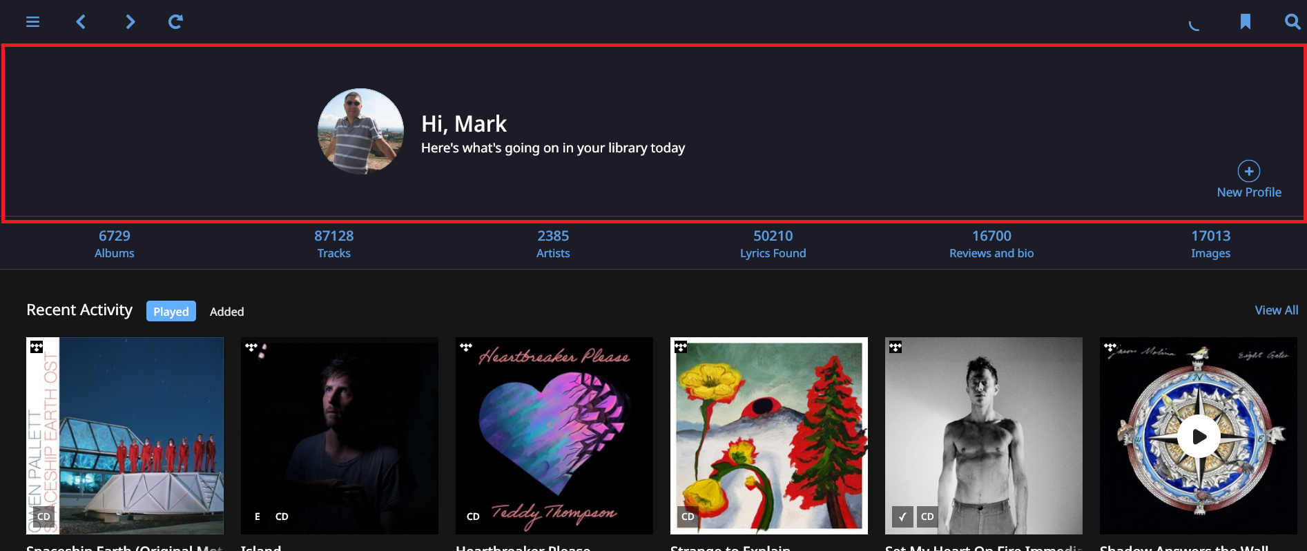
We’ve had a fairly major change to the Overview screen today, but I’m still struck by how inefficient is still is.
The profile area -marked red - is dead space (about 15-20% of my screen real estate on my laptop) and it is front and centre, and I don’t personally find Featured Composer particularly relevant - I’d like to chop it and allow for more album space.
James_I
(The truth is out there but not necessarily here)
2
Beat me to it!
I was going to say something similar. I have mixed feelings about Recent Activity. The feature is fine…I can seem myself using it…but I kind of feel, in my humble opinion (I come off as humble, right?) that it is a wasted effort relative to what Roon really needs.
There needs to be a configurable page. Navigating Roon is too inefficient because you have to use the fixed menu. I’d love to be able to change the order, put in full, half, or quarter panels, have buttons that are bookmarks, etc.
It can’t be that hard. There’s only 4 major operating systems to deal with.
I know you meant this in a tongue in cheek way but realistically it’s only two, since there’s no Linux client and I wouldn’t expect this functionality to make it to either mobile client.
Drag and drop configuration screen design elements is certainly not science fiction. Whether the underlying platform code base supports this sort of thing is another matter of course.
At the very least kill that profile bar. It’s terrible. It could easily be replaces by a profile avatar in the corner of the screen - rather like this very forum software displays.
1 Like
James_I
(The truth is out there but not necessarily here)
4
I had this same thought - PC/MAC only. Of course, that will get the iPad users howling.
What might be quite easy to implement is something like a second version of the “Welcome” row and a page view count: the second time in a session or within 24 h you reach the Overview page it does just show a (much more) compact version of the profile picture / name + stats. So while I do understand that Roon wants to greet me (nice, I wave back), it doesn’t have to too often …
A new release and still I have not been able to remove that useless screen real estate from Roon. The 20% which is used by “Hi, Maarten Here’s what’s going on in your library today”. I commented on this a couple of years back and in 2019 in the Feedback post on 1.6. I had to wait a little. Great stuff coming up. Still nothing. It is really a pity.
And of course the left and right swiping is still not implemented as in web browser. Roon starts to feel like old tech. Clunky. I had hoped it would progress faster.
I’m not sure I’ve ever worked for a software house where we’ve changed our design because one bloke didn’t like it. I guess it’s an approach
Edit. A couple of blokes.
Such wellcome screens are useless in this application … that’s the point.
Some kind if Webpagedesign … but this is not a webpage, that you visit for a first time. Its your own library and in 100% of the time you have to scroll down = is useless.
Maybe because I mentioned a couple of times over the years and every time they told me: “wait until the next release.” And what’s the problem adding this as an option?
Totally agree with you.
There tons of other graphic elements that need a big overhaul but probably they’re still looking for a fresh designer and given that all the other software are crap and they all look like winamp Roon don’t have any interest in developing UI/UX