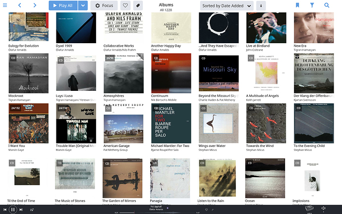
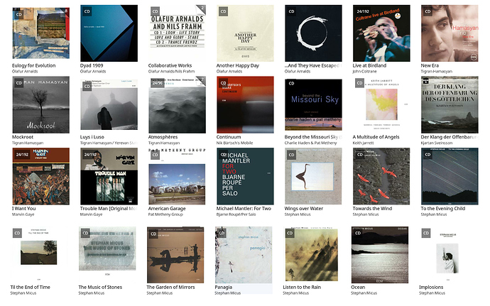
Um - it’s not for me, I’m afraid. You say that “A picture says more than words”, but you seem to have illustrated it with a picture that has more words than pictures… 
Excactly. Front and back cover display at the same time. Wasn’t that what Roon was all about? And it can be done with a clear interface
Here are a couple of questions that would be interesting (for me anyway)
- Do you use the “focus” feature?
- If so, do you use it to filter on tags, or use the charts to filter on genre, date etc?
- Do you play albums or individual tracks? Play artists (multiple albums)?
- When you play something, do you listen to it entirely, or do you find at some point you launch off into other artists?
Yeah, like a car with “24V DOHC AWD V6 INTERCOOLER” all over the back.
Vinyl is the worst offender! “Direct to Disc” “45rpm 180g Virgin Vinyl”
… 
I’d love front and back cover display. I agree with you 100% that was (and is) what Roon should be about. On the appropriate page though: the album page. Imagine the overview page cluttered with back covers, disc labels, liner notes etcetera… But perhaps I’m being a bit unfair: please show me how this can be done all on one page with a clear interface?
1: yes, but I don’t find it very convenient.
2: I filter on many criteria, whatever needed to get me what I want.
3 and 4: I do play complete albums, I do play randomly either a selection or my entire collection. I Do let radio play at the end of an album. I do switch artist in the middle of album, I do play tracks, I do browse and play Tidal content of the same artist and similars and skip back and forward. I do play music 24 hours a day if I can. In other words I don’t have a standard scenario of playing music. I’m not sitting down and carefull select an album to listen to like you would watch a movie. I’m allways in for new music, allways want to discover and explore.
I don’t get it. What are you trying to say? . Seriously I haven’t got a clue what you are talking about.
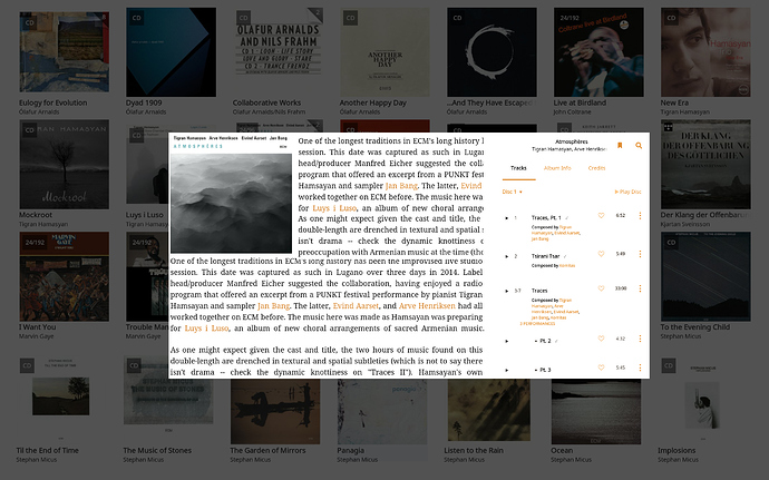
I’m not talking about bitrate, format, Tidal tad etc information here. I couldn’t care less. Totally agree with you on that point. I’m talking about a quick view of album content in an overview. The current view with only pictures cramped together is not a good overview and looks quite oldskool to me. Every player did that for the last ten years and I don’t think it is very pretty either. But that’s just my taste. And remember this is just an example. I’m not saying I want it excactly like this. No, bur I want a better overview. Track listing helps me a lot. I have worked with it for the lat 8 years and once you get used to it you’ll never want to miss it again.
OK, I’m old school, but I simply cannot conceive of having to spend 8 years using track listings in place of “at a glance” album covers. It’s telling that you said “once you get used to it…” Nope, that’s a road I don’t want to go down, thanks all the same. 
Roon devotees really start to behave like Apple devotees I’m afraid. “Think different anyone” But as long as it comes from the hand of the creators, otherwise there are only reaction like “Why would you want something like that?” , “We want to keep everything excactly like it is”, I have been hearing these kind of reactions for 25 years in any hardware and software development discussion in my profession. that’s not going to bring us anywhere. The other side, ‘change because of a change’ like many developers do who are afraid to fall behind isn’t usefull either so yes ideas have to be usefull but don’t reject them because of a fear of change. Wander what the reaction would have been when an idea like this came from the Roon team. Please keep an open mind. I’m not saying I speak the truth, far from it, but don’t reject ideas so quickly just because…
The current album browser is not what I would call State Of The Art and I can’t believe anyone would be happy if it was the end of the road in development here. Would love to hear other ideas of how to improve things here. Prove me wrong but not because of a fear of change.
Ideas or implementations like this should allways be optional. If we just had a checbox “show tracks in album browser” then all of you don’t have to use it, everybody happy.
It should evolve… to an even more simple design in my view. I’d like to see a vertical album browser where ALL elements but the album covers fade out once you scroll (kinetic).
I’d like top and bottom elements to be far smaller. Some might say it will take the “air” out of the design but as it is now far too much space is wasted
I’m not talking about a replacement of anything. I’m talking about an enhancement.
I don’t have a fear of change - I’m simply saying that your suggested change does not appeal to me in the slightest. In the course of the (almost) two years that I have been using Roon, there have been many changes to it, and, so far, I can’t think of any change that I haven’t liked. And we know that more changes are coming, including a radical redesign of the UI. One of the things I appreciate about the Roon team is that they appear to consider design changes very carefully, and quite probably reject more ideas than are implemented.
“Roon devotees”? I – and others, for that matter – posted quite some wishes to improve Roon UI. And I can’t wait for the UI update to be released. I love Roon, but especially in its UI I think there still can be a lot of improvement. But I agree with @stevev1: it should evolve into an even simpler design, not into a christmas tree. If you would come up with an idea that appeals to me, I would be the first one to give you credits for it.
Do you really find it so hard to believe that perhaps, you just might not have the best idea, or perhaps a sensible idea but not the best suggestion to implement it? I think I agreed with you on some points, and invited you to come up with some more examples of its potential (you said there are many), and another way to do this with a clear rather than cluttered interface. To date, no reaction.
Yes, could be. Any ideas on that you would like to share?
give me 5min 
I don’t have time all day photoshopping, sorry
The interface isn’t that cluttered. I should have made it for lower resolution screen. You really have to view this one on an at least 1900×1200 screen resolution.


