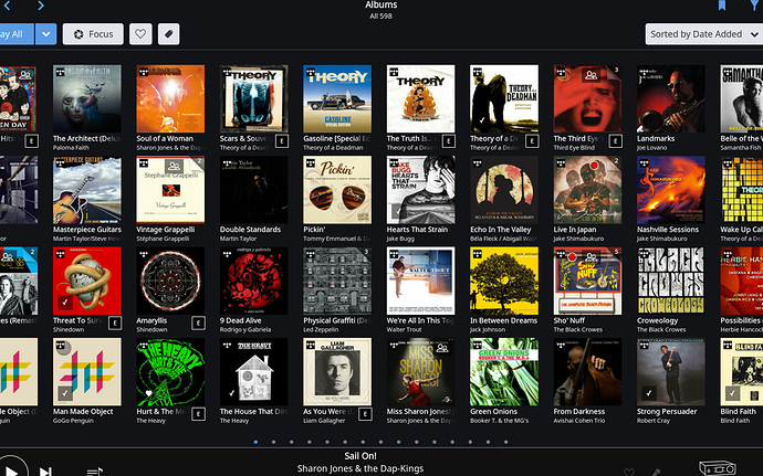
I think on a lower resolution screen like my iPad 2017, the only thing that will be left is just one row with six albums, followed by nothing but columns with song titles. That’s not an overview, that’s six album views merged into one, missing a lot of options the current album view offers.
I can see a case for what Sjef is saying. I like the idea of having the UI cleaner and more intuitive and not cluttering it with things like track listings. But I also think it depends on how well someone knows their library. In the case of @stevev1 - your library seems to be CDs that you know pretty well. Looking at a grid of album covers, you can pick out the one you feel like listening to right now.
The other side is the streaming model. A user goes on the forum, see someone post what they’re listening to right now, and go listen to it. They like it. So they add it to my library - mainly so they don’t have to go back and find it again in Tidal later. In this case the library isn’t this curated place but more a placeholder of interests. They don’t know the album well - at all. Plus if you added “collections” you end up with things in your library you don’t recognise because you didn’t add them (as is my case).
Today they can click on an album and it takes them to the album page. Which is great. But what if it wasn’t the album they were looking for? They click back, find another, click it, click back… In this case it would have been useful for them to have more information available to them. But we don’t want to clutter the display.
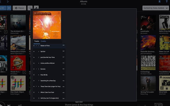
So (apologies for the bad cut and paste job - there’s a reason I’m not a plastic surgeon)…
User clicks (or taps) on the album and gets a popup like the settings one. I’ve put a couple of details on here, but from here I’d see the user being able to go to the full album view, be able to play the album directly from this popup (not shown), potentially audition the album from here - I don’t recognise this album, what does it sound like? If this isn’t the album I want I click (or tap) off the popup to go back to the library.
If they double tap an album it goes directly to the album view.
Thoughts?
Now that could actually work. Keeping the clean overview (and let the Roon team make it even cleaner  ) yet offering quick access to songs and/or album details.
I prefer full screens to pop-up screens. It would also add another click/touch to opening the album view. A back/forward swipe gesture would work better. This is an area that needs a lot of work.
It adds another click if I know where I want to go… I see an album, I want to open that album. In the case of browsing the library for something I may want to listen to, having to go to a separate screen is (to me) distracting.
It comes down to use case and how familiar you are with what is in your library. If you use it as a repository for things you may want to listen to, you’re likely to go into several albums before settling on the one you want.
I’d also like the ability to have a different page from the album view where if I click play on a track, it plays it, but doesn’t impact the queue at all. Basically allowing to listen to it to decide if its the one you want to listen to, and then adding to the queue or not. If you click off the popup, no changes have been made to the queue and you can resume playing the queue as it was.
Agreed - it is an area that needs work.
A hard press/ right click that brings up a pop up of a mini album page?
That could work… but this action is now used for editing the album
It’s fun to speculate… I bet the roon guys have thought this through. Can’t wait to see the revamped UI they have in store for us 
Maybe next to the focus button we have a toggle… the Kimi Raikkonen setting…
That’s a usefull contribution to the discussion. Thanks for that. Nice idea. Could also work with hoovering over instead of clicking. Your discription of “why would someone wants something like this” is spot on.
Another completely out of the box idea would be something like a “Raskin” (google it) interface wich works like a microfiche on a computer. In other words a completely zoomable interface. Works great with if you work a lot with pictures or lots of documents. Could also work great for music
Hoovering on tablet will be quite difficult  . Hard press would work
Yeah, you are probably right. Just tinkering. Raskin would work with two finger zoom. One of the great strenghts of Roon is also one of it’s weaknesses, providing a consistent interface among totally different devices.
It’s just an example for tinkering. I originally posted it in the tinkering section but the admininstrator unfortunatly moved it to the feature request.
The current album browser does not appeal to me in any way, just a basic view of some pictures with little or none information. Haven’t seen any changes on it soo far. Maybe the new UI would make up for it, who knows.
Strangly enough some people even don’t like ideas if they would be optional. My example was purely optional. No changes if you don’t want to. So even if they do not have to use they don’t like it.
I think it’s time for Roon to make more things optional to please the “minimalist eye candy people” and the “hardcore music explorers” at the same time. (Just to make a clear generalisation example, no pun intended, not offending anyone)
Not really, developing anything be it optional or not takes Roon resources … and thus push’s back Roon working on more strategic developments.Thus it should be discussed on it’s own merit.
So one has to like each optional idea, just for the sake of it being optional? Don’t see what the optional has to do with the inherent quality of an idea whatsoever. This reasoning is exactly what I oppose to. Like @Carl says, if Roon would incorporate each and every idea or feature demand individuals request, optional or not, it would take resources better spent on ideas the majority would like. Also, it might clutter the core functionality of Roon itself.
I’m a “hardcore music explorer” and I like “minimalist eye candy”. Don’t quite get the contradiction in that. On the contrary, IMHO less is more and contributes to a better exploring experience.
Some arguments not supporting your idea have been repeated by different people in this thread several times. Also, they’ve asked you to explain a bit more if you suggest having more examples/arguments. Instead, you choose to either keep ignoring them or dismiss them as narrow-minded people who are not open to new ideas. It’s that I don’t like, not change or new ideas (as I stated above Roon UI can still improve a lot, plus I quite like the idea behind @anon73739233’s mockup).
I would rather see the Roon team working on the UI then on something like MQA implementation but I’m not complaining they spend time on it. The better do because it seems to be important to some people.
Now on that I 100% agree with you! ![]()
You don’t have to be so offensive. I’m not accusing anyone, never did, never will. I don’t like the tone where this discussion is heading. I’m afraid there is a lot of misinterpretation going on here.
@Sjef_van_de_Ven,
I’ve been following this topic from the start … I don’t see anyone here being offensive.
People are entitled to their option, if you posit an idea some will like some won’t and you have to accept that and be prepared to “defend” or perhaps better expressed … to expand on your case.
Right or wrong / popular or not … what’s important is that Roon staff do read all these posts which may have a bearing on the development choices Roon make going forwards.
@Sjef_van_de_Ven - it is always tough to put an idea out and have it debated. To us it is our “baby” and then someone calls our baby ugly. But it takes a fair bit of courage to put the straw man out there in the first place. If you ask users “what do you want” you’ll generally not get a lot back. But put up a straw man and you’ll get loads. Having users say “I don’t like…” is actually very useful feedback. It also makes users think about things that they otherwise wouldn’t necessarily do. You had an idea. A couple of folks on this thread have riffed on that idea and had other ideas. Would that have happened without the straw man?
Does our posting here mean that roon will build something? No. For one thing if they took the feature requests here and sat down to develop all of them, verbatim, it would a) take a very long time and b) result in a pretty horrible product. However it can guide them to look at the experiences we have with the product. With a more complete view of things, they may come up with a new UX that isn’t 100% what anyone asked for… yet 1 thing addresses 5 requests - but does it in a more cohesive way than building 5 features.
Roon is very much about the experience. And the users are a passionate and outspoken lot. Their music library is their baby - just like the feature requests are ours. And everyone is pretty protective over theirs.
Thanks for getting this debate going. Putting out the straw man takes guts - and a thick skin 

