Re-design Playback Screen - The let-down of Roon

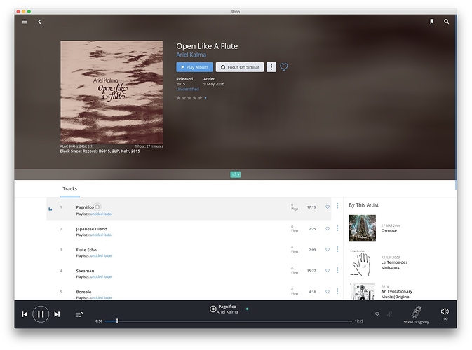
Roon has all sorts of lovely information and pictures that are tagged against tracks and albums. So why on earth doesn’t it present this when actually playing the music? The playback screen looks like a void of emptiness. There is one teeny tiny album cover at the top, one teeny tiny album cover at the right hand side if you’ve got Radio on or next tracks, and maybe there is a queue list of items if you’ve made one. That’s it! Seriously? Good progress so far but can’t believe no-ones mentioned this.

It’s just not cool and it should be really easy to do this as it’s where Roon could really shine - I think back to day’s with Amarok where it handled this very nicely (not so much today though).

This is especially important when using Radio mode. This could further be piped to a television from e.g. a Raspberry Pi running Roon bridge displaying relevant info as each track comes alone.

5 Likes

Hi,

I’m not at my laptop now, can only see it at my S7. Looks good though; while I’ m playing music I can either have an album cover or read the album info.
As far as I remember the desktop version has full screen mode.
Can’t find a way to upload a pic with my phone but I really think it looks good, while playing

I believe keeping all info and cross-links just in the “browse” albums view is correct

issue, in my opinion, is that “intermediate” play queue (talking about desktop version) with only the upcoming tracks and a small cover art on top beside playing now one :expressionless:
I’d like instead to have a full list of what’s playing, has been played and will play next with large cover art as a “now playing” view

Yeah should have been more specific, this isn’t about phones, it’s about desktop. Given the stated intent of this product to take us back to the day’s when we had fold out vinyl albums with amazing graphics - phone’s are never going to recreate that. However on a desktop / TV / tablet or laptop this is the area I am referring to. As per pl_svn we can further discuss what ‘should’ go here, however currently it’s basically empty and extremely bare. I have no idea how it looks on a retina / 4k screen, possibly worse. This is where we can bring things to life - even perhaps with options that can be ticked on as per desired behavior.

HIya Quentin,

Just to make sure everyone is talking about apples to apples and to perhaps help focus your Feature Request.
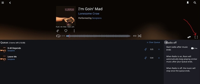
This is the Queue Screen, personally I never watch the Queue screen while my music is playing I am always in album view.

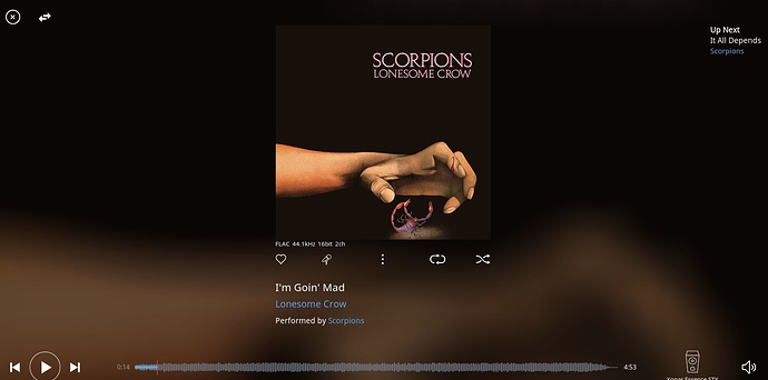
The box on the far right will turn the Queue Screen into a Theater View Screen like so…

So are you suggesting adding stuff to the Queue Screen which I think of as just a management screen? Or are you really suggesting beefing up the information displayed in the Theater View Screen?

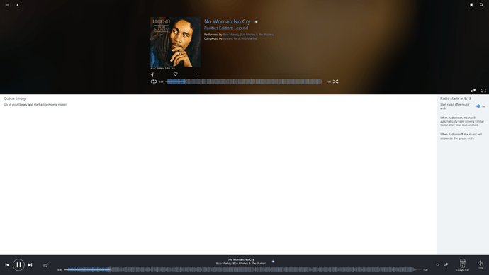
I was more referring to the below screen, however you could apply it to where you have shown. I find myself using the Radio mode a lot, because honestly it works incredibly well, (another feature that Amarok had BTW).

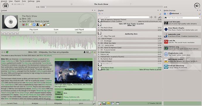
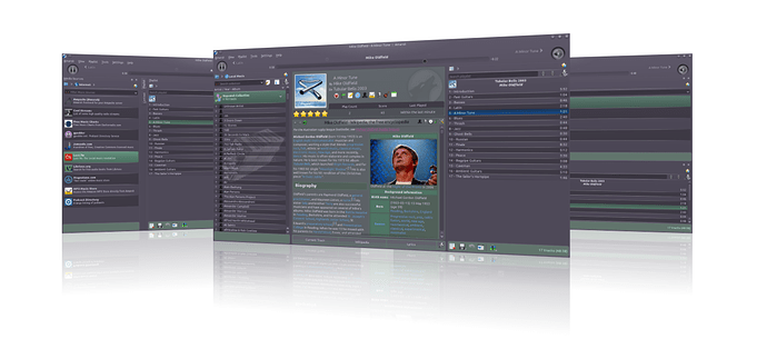
However, as I’m watching music play on a second screen, tablet or in a window it’s a great feature to bring up contextual information. The second screenshot is an old screengrab of Amarok from the internet which sort of shows what I mean. My hope is not to replicate this specifically, but just to expand in a similar direction. It really is quite nice. You can turn a lyrics screen on and off too. My monitor is 27" (as are many Mac’s) so it looks even better (or more sparse) on this screen.

Note the huge white space that does nothing while in radio mode. Ripe for contextual information!

1 Like

Screenshots of latest Amarok version here.

I’ll just chip in with my 2c here. Still just a day or two new to the product, and coming to grips with …

Firstly I havn’t fallen for any software before as much as I have for Roon. I’m genuinely saying that and hats off to you guys behind it. I’ve collected digital music bordering on obsessively since 1998 with about 22K albums ordered/named/tagged in iTunes, and another 10K+ in the process of tidying up. Also several thousand LPs FWIW. The act of browsing and playing digital music has always been an underwhelming experience. It feels like Roon actually cares about me.

Getting to the point - I love simplicity in a play screen.

Thinking about the context of use - I have a player in the lounge, connected to a 50" TV, and the theatre view is perfect. I have a player in my studio where I work, and I would like the player minimised so only basic track information and play buttons are visible (I do other work y’know). From time to time I’ll be interested in reading about the album. I currently store this in my own text files in a folder with the sound files along with extra artwork, and more recently in a personal wiki (Confluence). Combining this information with the listening experience is a wonderful thing Roon does, but please I’d never want that getting in the way. Ideally I’d want control over the content, when and how it displays.

The problem I have is with Playback is the number of clicks it takes to get from album browsing (tiled view). The design/workflows could be optimised, so there’s less drilling in, then reversing back required. I just want to play music from the tiled view, while I’m browsing more albums, then flip to an album overview, or playlist, or theatre view, or minimal view, if and when I choose to.

The Radio concept is nice (playing similar for ever), but I don’t think the term Radio expresses that well, and the microphone icon communicates this even worse - I don’t think this metaphor is right. Radio is awesome, but this isn’t it. Radio is properly curated and presented content from someone else. Maybe there is a another feature here?

I reckon you just hit Play from the tiled view, as with the latest iTunes update. There is an option to inspect the album/tracks/content, and can also begin playing from this album overview page. While it’s playing you can choose to play infinitely. You might choose how music is chosen - entirely randomly, or similar, or within certain constraints (based on data).

Filtering on the tiled album view is critical to zero in on something. Search isn’t enough. I have 20433 Albums on there now, and growing. I’ll want to focus in on music between 1978 and 1983… then only show the Zickzack label (which i have in the Comments tag).

Browsing a really really large number of albums in a meaningful way is the challenge I’m looking for Roon to meet. There is a massive opportunity for you here.

Discovering delightful features like the how you put the tagged Comments with the artwork - I’ve used this for Record Label, Catalogue no., Format, Country, Release Year. And it works perfectly!!! Browsing by label is incredibly important for me - this was the only way I could achieve this in iTunes, sorting on the Comments tag.

I’m rambling - too much I want to say. Keep it up!!

1 Like

I’m wondering how you got it to show album info. Unless you mean the same as my screenshot. Which is not contextual, it’s just browsing ‘any’ albums info.

The contextual ‘now playing’ screen. There was a huge following for this - eventually Amarok redesigned it, which was complained about often. They’ve now gone back to their roots and designed it in a similar way as it was originally. That made a lot of people happy. Given that Roon is supposedly filling the gap of Vinyl amazing photographic covers, with lyrics printed etc, something like this would be a fantastic (and probably not too hard) addition to the now playing screen.

1 Like

I installed Roon in large part for artist/album art during playback and am disappointed that the rich features cannot be automated. On my Kodi box, I have addons that display all kinds of web pictures during playback and was looking for a similar experience on my laptop. Given the hefty price tag with lack of a key feature, I will be unistalling.

Hardly a key feature for a music server.

2 Likes

Bliss HQ might be worth looking at for this purpose. It filled the gaps in my Sonos album art collection. Not sure whether or not it will automate different cover options during play. If that is the only thing the program is missing for you, consider making a feature request. Not sure if that is something Roon devs would consider though.

Actually, C-Levell has it exactly right, and regardless of your opinions evand, I believe that contextual information is EXACTLY what Roon advertises as a core feature. We get all the info in the world, except on the currently playing track / album, on the play screen, where it should be just as if you were to be playing Vinyl and looking at the Album cover - Vinyl replication is the advertised comparison is it not? If I understand C_Levell correctly, he’s adding his vote to this thread for the same feature. I don’t see the point in starting more threads. Personally I think people don’t know what they’re missing, but either way I hope some more people will support this feature request ultimately, via this thread - we shall see. I’m a bit confused however if Album art isn’t showing up - that is also a core feature, so unless the library is missing all of the tags / filenames etc. Bliss seems to only be for art, I used a combination of itunes and Tuneup to sort my library out. Art, metadata and filenames all sorted. Put Plex and Roon over the top and done.

2 Likes

I agree that the now playing screen could do with enhancement, but I don’t agree that means Roon should go trawl the web and show me random content about the artsist(s) in question.

FWIW, there are some enhancements scheduled that will address some of your requirements.

Please keep the Now Playing screen clean and simple. There is too much clutter in this world and it is a relief to have some white space on the screen.

5 Likes

One thing I think should be in now playing screen is integrated lyrics (possibly synced lyrics,a feature I’m asking since I subscribed) not showing in pop up as it’s now; there is plenty of space for that in playback screen.

2 Likes

No, I don’t want lyrics unless Iwant them. Make that an option please.

3 Likes

Of course I talked about an option, just as it’s now but integrated in playback screen and not as a popup that goes upon the screen; there’s no sense in showing lyrics as default