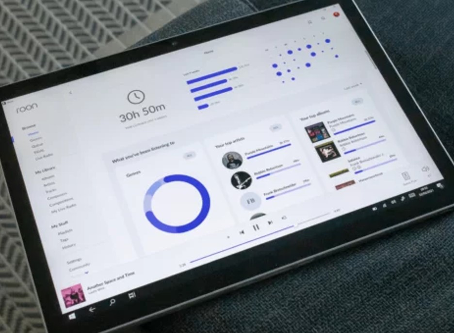
Am I alone in thinking that this rather large lot of homescreen real estate is something of a waste of space. (I know, I know…“You don’t have to look at it if you don’t like it”; “In a world of war and famine, is this really that important?” Save it. Please.)
Perhaps if I knew how, if, or to what extent this data informs the choices made by Roon’s “ultimate music expert”* (Valence) regarding my Daily Mix offerings, Radio selections, New Releases for You (Me), Recommended for You (Me), and such, I’d find this mishmash of data points more…informational?
Maybe if I understood what to expect out of the ridiculously shrouded Valence I could figure out if such stuff as Radio and Daily Mix are malfunctioning or are just dependent on a really low IQ machine intelligence. Or maybe if it’s still learning! Maybe if the data in the Use Data space does inform Valence, I could do a better job of selecting music in a way that would help it learn how to “present the world of music through a lens personalized just for you [me].”*
I don’t use the Roon home page on my iPad at all. I also feel it is largely a waste of space. It tells me my name, which I already know, it tells me how many CDs and tracks I have which is uninteresting, and it takes an unnecessary amount of space to do that, it tells me what I have listened to recently which I can remember, I can’t understand why the seven new releases for me have been selected for me, daily mixes are of no interest as I’d usually rather choose my music myself, especially as I listen to classical, and then half a screen full of huge graphics giving me some again uninteresting statistics, and more analysis of genres and top artists which is of no value to me. I kinda know the broad outline of what I like, don’t need to see it except occasionally. The next bit is good though, if I make it that far, a couple of interesting suggestions, and then the old Discover which I thought was quite good as it gave all sorts of different perspectives on my music and was useful sometimes to seed a suggestion of what to listen to. IMO all the sections should be reorganisable by the user. I would push all the historic ones - statistics, recent listens etc. - to the bottom, and bring the discovery type stuff to the top. And dispense with the greeting, or at least make it a lot smaller.
what about this, all that empty space but if you want queue controls you need to click a button and get to another screen
there was no room to add a shuffle button
the roon philosophy
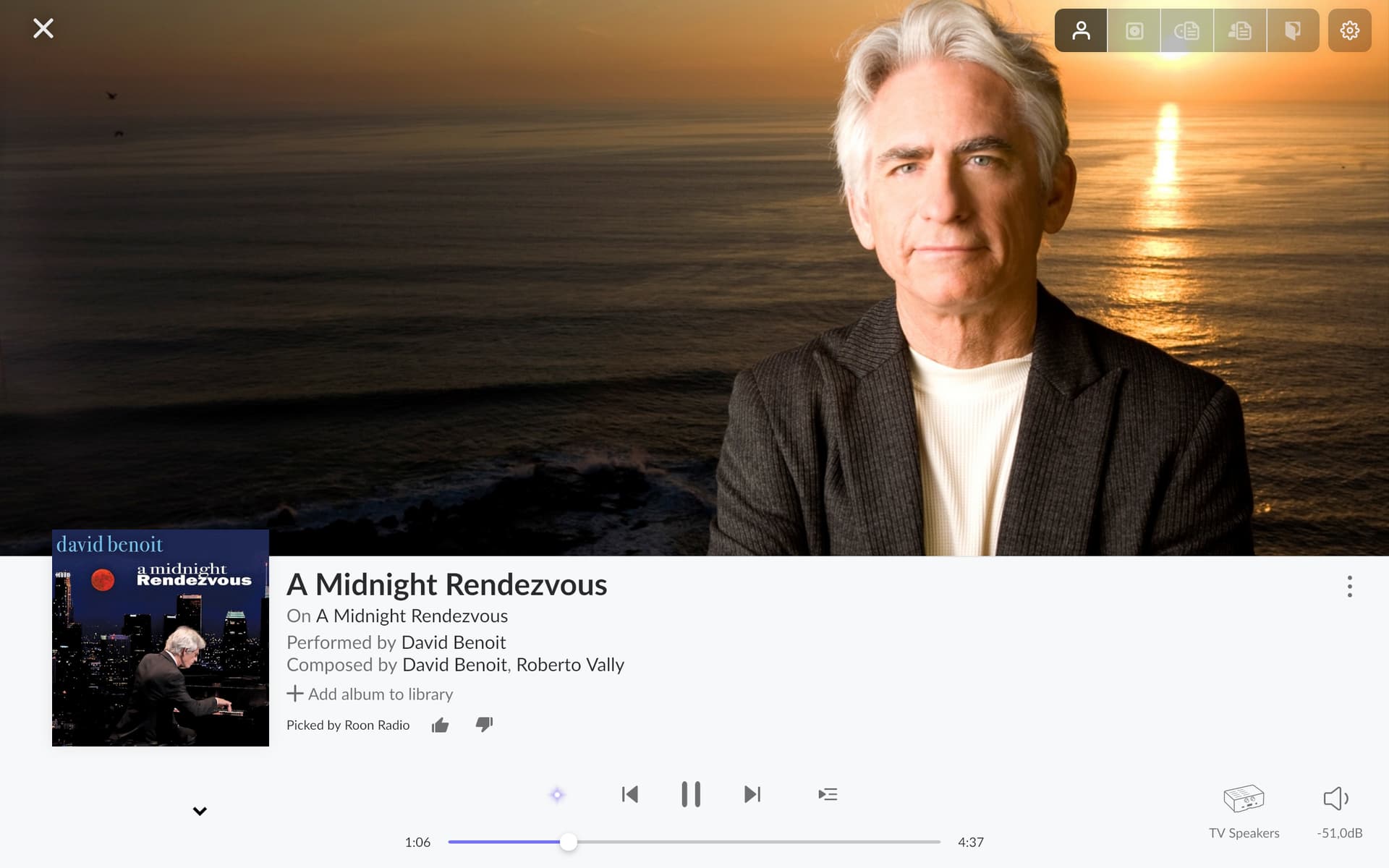
what about the actual usefulness of valence? do you guys get good suggestions? I only get rubbish