Hi,
I have a feature request not for the Roon software itself but for the release notes.
I had an issue with 1.6 because there was a major update to how Android works and now my DAP no longer works with Roon. I didn’t know that before I updated and only found out once it stopped working and spent more time on this forum than was really necessary. To be honest, Roon’s release notice policy doesn’t really help.
As it is, on my laptop I see a notification that updates are available. There is no warning that there that there have been major changes that are not backwards compatible. A minor update that fixes a syncing issue looks the same as a major rewrite at this point.
From there, there’s a link to get more info. If I click on that, on my laptop, I get the About page that indeed shows some more info. But not about breaking things. Again, the same for a minor fix as a major release that breaks backwards compatibility.
Finally, after a few more clicks, I can get to the actual release notes on the support site. While the information is found there, the information architecture for the release notes puts all information at the same level, from how paths are displayed to bricking devices. Basically, a note for a syncing issue looks the same as breaking someone’s stack. If I want to be sure I don’t miss something I have to read the whole document, and they can be long, in order to determine if there’s something disconcerting in the release.
I’d recommend placing a warning in that very first message alerting us to updates. If it’s a breaking update, put a warning icon in there with a message to check the release notes as things may, knowingly, break. Doesn’t have to go into detail. That’s in the release notes and a heads up is probably enough at that level.
On top of that, or at the very least, maybe call out changes, like updates to Android so that all version less than 5.0 will no longer work, in a special section or with a distinctly different visual style so that a person can just quickly scan the notes for anything they may need to worry about.
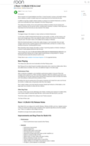
Here’s an exercise IA/UX people use: blur your eyes when looking at a layout and see if the right things stand out. I’ve created a blurred out image of the release notes explaining that my DAP will no longer work. As you can see, there’s nothing to help me pick up on that info. Yes, for those familiar with the notes, some bold text is used but bold text is used all over the release notes so there is nothing saying “This bold text is the super important bold text”.
