So, having read the rest of the Thread, I now understand the issues and complexity of screen layout involved.
Also it is ok, to have multiple reports against a bug, it should reflect the priority for any refactoring that is required, just like voting on future requirements. It is also ok, to have Bugs sitting in the backlogs, just along as these are groomed, re-prioritized and re-estimated every so often, following a sprint retrospective (excuse the Agile/Scrum language, I don’t know what Development methodology Roon follows).
I was reacting to the fact it doesn’t look right, with the top of the Album covers under the top navigation bar and tons of space at the bottom of the screen.
In fact, my route to this screen, was a search on a Conductor, which gave me Search Results by Artist, then in the ‘Main Albums’, I clicked ‘All Albums’ which brought up the Focus screen.
Suggestion: The ‘Focused on’ is taking up two lines, with whitespacing around it.
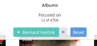
If you made the ‘Focused on’ & the results ‘12 of 4706>’ one line, and reduced the whitespace about and below it, you would get back most of the overlap, and then reduce the whitespace, a little, above the dots at the bottom
Then the integrity of the main components is not changed i.e. the top nav bar, the bottom play bar or the sizing of the album covers, so no major rework!
The marginal reduction in whitespace around the album artworks would be offset against the lack of overlap at the top, which just looks wrong.
Don’t mean to solutionize the problem, but just a suggestion…
 ). The margin hosting the Focus banner also obscures icons on the Albums as well as artwork, meaning it is not just an aesthetic issue.


