Roon 1.4 request: rethink UX for consistency and convenience

I’d agree with the sentiments expressed here. I don’t find the UI particularly problematic at the moment - in some ways it has some of the features in OSX that I like (and hope that Apple don’t lose with rumours that they might move OSX towards a more iOS feel).

There have been some suggestions (in other threads) about the need to show MORE on screen by default. Some feedback from Roon team has said that developers like having space on screen. I would strongly support that. The ability to show additional items as an option is far preferable to a cluttered screen.

So, review and improve consistency - yes. Change basic philosophy - most definitely NO.

1 Like

Thank you for this thoughtful writeup. I agree, a UI / UX sweep would do wonders for the overall feel of the app. Priority One should always be delivering the best quality music to my ears, but if I as a user of the software can’t access the music easily (through bad UI / UX), I’m more apt to choose another product.

It’s a lot of work to take full UX inventory and see all the different ways icons, dialogs, layouts, etc are used, run them through the lens of the user’s contexts, and the design philosophy of the app, and make changes (to both the UI, and the design philosophy) — but it will lead to a radically better app.

Frankly, it’s what users who pay $500 for an app expect.

1 Like

First of all, fantastic work Roon team considering the great leaps forward in functionality since Roon 1.0. Things have progressed so fast, it’s hard to remember that the initial release had no iOS compatibility, no DSD, no RAAT, no headless RoonServer, no linux, etc.

I generally agree with the requests to prioritize UI issues to ensure the experience and polish remains on par with the powerful performance. Many of the comments have focused on consistency, icons and space (a stylistic choice, to be sure). There are also many places where the basic display of text is not without issues:

2 Likes

I totally agree :+1:

1 Like

+1. I like Roon a lot and appreciate its features. Yet with the UI inconsistencies, I always feel that I’m stumbling through it and never know what will happen next. It also feels unnecessarily awkward to do simple things, such as change the volume. I think the OP (@AndersVinberg) did a good job of listing many major inconsistencies, and I urge the developers to read his post carefully and think about how to improve things.

I will add to that the need for better visual ergonomics, which has been raised before. For example, the white-on-black typography of the artist and composer pages can be quite straining to read, especially as the fonts can’t be enlarged. Movement names (of classical pieces) are in the smallest print on the page, even through they are the most relevant information. Roon software certainly would not meet ADA standards (whether they apply or not, they are reasonable and helpful).

not worth opening a dedicated thread so I’ll add it here

a very welcome change would be… “Playlists:” (a track has been added to) always being added as last line, instead of immediately below track’s title beacuse if/when “Composed by:” is also shown (which not always is the case), result doesn’t help at all readability :confused:

I wouldn’t mind seeing a file/folder tree view when looking for music.

1 Like

The playlists line has never felt quite right to me. It’s formatted too similarly to the track info so as you say it gets lost and is a bit confusing.

I think there might be a nicer way to separate this. Colour palette, icons, fonts, something…

1 Like

I would rather see a possibility for “album collection” instead of playlists. I never work with playlists because I don’t like handling my music as a spreadsheet like list.

1 Like

Tags? That’s what I use for what I think you’re describing.

I agree with Sjef and would love to do what you do, Steve, but unless I’m missing something, the only way I can play my Tags is shuffle per track. I find this makes for very unrelaxed listening. In my opinion, this functionality is exactly what playlists are for (not tags).

I would love to “Play Tag” and automatically start playing entire albums. Use my tagged albums as a collection of albums rather than tracks. I don’t understand the logic behind the current default shuffle mode. Why not provide an option to either shuffle or play entire albums?

[EDIT] I stopped using the Roon Playlist functionality and deleted all my playlists for the exact same reason as Sjef. A simple “Play/Shuffle Tag” choice button (or something similar) would add tremendous value and listening pleasure IMHO.

1 Like

You can can play a Tag view in two ways. Play All shuffles the songs in the tagged albums. Select/SelectAll/Play plays the albums in order.

Edit: This isn’t intuitive and is a good example of where consistency could be improved.

1 Like

Thanks @andybob, that will do exactly what I want!

Edit: Also fully agree with your edit! :wink:

1 Like

I think it is important for a UI developer to get remarks from a ‘fresh’ user. A developer get’s a little ‘blind’ after a while because he sees the interface the whole day. Some things are indeed strange, e.g. Closing a popup window by clicking outside this window. And not following the windows, and I guess OSX standards.
What I like to be improved is the displaying of boxsets with a collection of cd titles. Now it is displayed as tabs with no cd title info on it, only disc 1 disc 2…

5 Likes

Completely agree with you on this. I think if you end up using Roon, you’re pretty organized already. I know where my music is by folder, artist. But finding it through Roon isn’t fun if you’re scrolling left to right (must be changed top to bottom - every other app is this way). And have a sidebar with files/folders.

Agreed. Need more one click and go buttons.

It would be so awesome to have Sort by “Folder View” in the Albums section. Just show the root of each storage folder and then you can dig for music from there.

I will say that, this is one feature/option that JRiver has you beat at. But it’s not over and you can still adjust! :slight_smile:

1 Like

@Benjamin_Gold @Chris_Lischy

Since I have been arguing against the folder thing, i’d like to take another cut at it.
“Folders are of the devil and you will burn in hell” – ok, maybe not quite that.
I have already written about why I think they are not useful: the constraint of a single root, etc.
But why do I think they are actively harmful?

A parallel: consider the Save command in most of our software. Why do we have it? Save is actually a hack caused by a hardware constraint: the memory that a computer uses when you work with it is expensive and volatile (information is lost on shutdown), so we need to use disk for permanent storage. The problem is that this physical distinction has been elevated into the user abstraction. Why should I need to pay attention to the difference between two different kinds of storage? And why do I need to care about a session? If I walk away from a computer the information is still there, but if it is shutdown during lunch the information is lost? If I have been working on a document for an hour, of course I want to keep that work, why do I have to be responsible for saving it? It’s silly. Obviously, the sensible design would be that my work is always kept without any action on my part.

This has been known for 25 years. So why does Word still have Save? Because there are a billion users brought up on the current design who would scream bloody murder if it was changed. (Believe me, I worked at Microsoft, had this discussion many times.) This constraint doesn’t apply to new software: Outlook and OneNote do not have Save. But the existing legacy locks down Word: I’m convinced that Word 37, when we have mental dictation and direct retinal projection, there will still be a Save command.

This is not just a stylistic issue, the two-tiered storage model with RAM and HD is becoming obsolete in very fundamental ways. New options are appearing:
SRAM: latency 1X, size 1X
DRAM: latency 10X, size 100X
Xpoint: latency 100X, size 1,000X
SSD: latency 100,000X, size 1,000X
HD: latency 10,000,000X, size 10,000X
If you are building a server operating system or a database or a cloud service, totally new design points appear. And if you add battery consumption to the comparison, there are new design points for handheld devices. If we keep designing for RAM and disk with a Save as a transition, we will be lost.

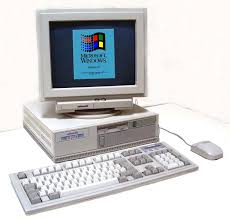
You mention JRiver. I think JRiver is the pinnacle of the Windows 95 user interface paradigm. Of course, the design of the Windows 95 paradigm was laid down in 1992. Do you remember 1992?


But we have moved on. The Web doesn’t look like that. The iPad doesn’t look like that.

So it isn’t just that I worry that you will waste your time on an inconvenient paradigm, or that the Roon team will waste their time on an implementation. I worry that we will cement a 1960s concept, the file folder, into the Roon design and we will still have it twenty years from now and it will constrain the design.

The iPad is free to make good decisions, because they were not locked down by backwards compatibility. I don’t want Roon to be locked down.

11 Likes

Just no, no, no. The whole premise of Roon is it’s like picking up an album and playing it using the art work, not looking in your filing cabinet and picking out the writing on one piece of paper.

If you like the way JRiver does it use JRiver! you have managed to pick one of the things about JRiver I dislike the most and want it in Roon.

2 Likes

Jeez, I don’t particularly want it but if it is there nobody is forced to use it…