Settings, services, Qobuz.
ged beat me to it!
Still no notification control on Android. This is standard for all music apps so just can’t get why roon still doesn’t have it even after 2 years of feature requests.
Ability to add to Tidal playlists another gripe for me.
But happy for the other features and fingers crossed they add the above two soon.
2 Likes
Since V. 1.6 the problem is, it,s not possible to create (parametric ) dsp notch filters with a Q > 10. 10 seems to be the max. Nobody knows why.
Ged and Joe - many thanks for prompt reply. Had totally forgotten the need to add to Services.
Thanks again.
1 Like
My first impression is I dont like that the new play bar at the bottom, I think its a little plain and I prefer how the older one looked. It no longer follows the theme setting and is a contrast to other areas. That’s 30 seconds in so I’m yet to discover other features, the bar isn’t why I bought Roon anyway and it remains functional, just not as pretty in my opinion.
4 Likes
I believe it has been reported earlier in this thread. This is a regression from the previous release. I agree higher Qs than 10 are sometimes useful and should be possible, at least up to 20.
A post was merged into an existing topic: 1.6 New search great but very slow to get results
See this link New search great but very slow to get results
Yes, definitely seeing this, in stark contrast to prior version. Even getting “Error Loading Page” messages although only AFTER the page has loaded. It says to check my network connection, which is wired, working fine, never had this before.
On Now Playing and “Up Next,” I did notice that 30 seconds before the end of the current track, a little note pops up with the next track. That’s kind of cool, but I would just pop it as soon as it is determined and not wait until that 30 second point.
And I do, I really do, think that larger album cover art is necessary. The “Wow” on Roon’s home page is the album cover. Yet the largest version you can get for the current track is a very small sliver of the window’s real estate. Tastes will differ on this, and so I think the only real solution is to let folks have some choices, some ability to configure it themselves. Not the order of slides which is the current configure option, but layout, size, what is shown on a single screen.
3 Likes
Congratz on the new release, love the Qobuz integration. No comments yet on the new footer and the now-playing-screen, those things can’t be judged by one look.
1 Like
Radio feature isn’t a big deal for me as 50% of my listening to is to orchestral music and I prefer to hear entire works versus a mix of tracks (the other 50% is hard bop jazz, electronic/downtempo/trance and then some 4AD type music).
However, If, for example, most of my listening was within similar genres, I would likely use radio CONSTANTLY.
1 Like
When I use my TV as a monitor its hit or miss if the Lyrics scroll. Usually it doesn’t scroll at all. A bug or am I missing something? Wish there was an option to use the old version…good to see its still that way on my iPhone.
You have a zone selected? I just tried this out and both work fine for me.
Thanks for this significant update!
1 Like
Only timed coded lyrics scroll. The ones with a clock next to the microphone symbol.
Cosmetic feedback
The new look took some getting used to but after 30 mins of comparing with another tablet still running 1,5 over 30 mons overall I think it certainly looks cleaner and more logical. What I do not like is the color of the footer. It seems to take an average of the colors used in the album that is playing which most of the time results in a smudgy color. Why not stick with black as before or go with white. Also, matters of taste aside, black text on a greyish background does not yield great contrast. Finally, I concur with other complaints about the placement and look of the buttons and seek bar. The latter looked better when it was symmetrical and is indeed too easily pressed by accident when handling the tablet. The former are too cramped and I am really missing the circle around the play/pause button.
2 Likes
Well, on this one thread it’s several dozen out of maybe a hundred so I’m not sure where you’re getting your estimate of a few out of a hundred thousand.
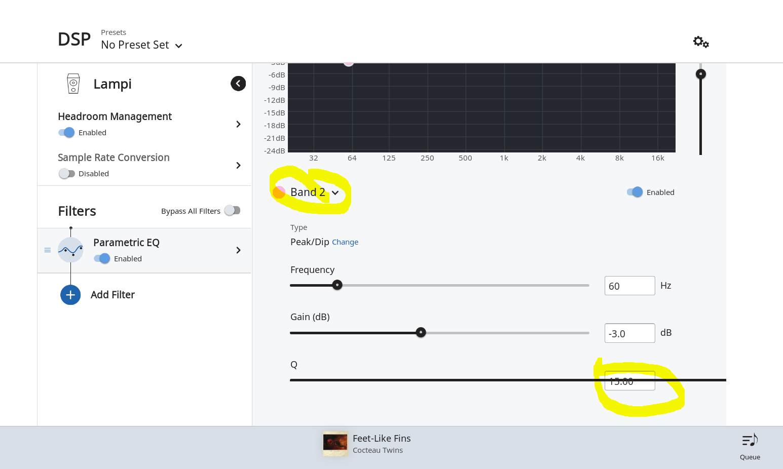
Hi,
still finding way way around, but first gripe is DSP.
I like the way the DSP page persists, the old dialog style box was a pain when tweaking.
But I don’t like the fact all bands are not displayed at once, I can no longer see at a glance what all of my bands are. The old way was easier, more effective and gave a better overview.
Also looks to be some display fault, on one band by Q settings are struckthrough with the Q bar as attached
The roon team said it’s hardly ever used and there are around a hundred thousand subscribers.