After adding a streaming service, Roon could ask for confirmation before adding more than albums for which the equivalent resolution is already in the local library.
And also who don’t agree  , I like the new UI.
3 Likes
Yes, I’ve seen this happen all the time with title mismatches. If you edit the title(s) to be the same, that resolves the problem (although this is kind of a clunky solution, in Roon terms).
My first Search. I typed in ‘rachmaninov’ but just hit enter rather than select Sergey Rachmaninov from the drop-down. Here’s what appeared:
The Top Result is the first thing we see is this:
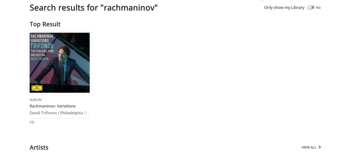
Comment: one album and a lot of bare real estate. What makes that one album the “top result”? There are thirty or so so albums with ‘rachmaninov’ in their title. Just curious. Several search engines present top album, top artist, top composition, top composer in a drop down. That approach appeals to me more than this.
Next appear the Artists:
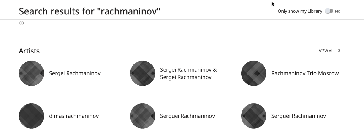
It turns out that all of these gray dots are TIDAL in-place albums, but there’s no quick way to tell. The information yield/acre of this screen is very low. Don’t know why there’s a total absence of art; maybe too early yet.
But when you View All Artists, things turn a bit sillier:
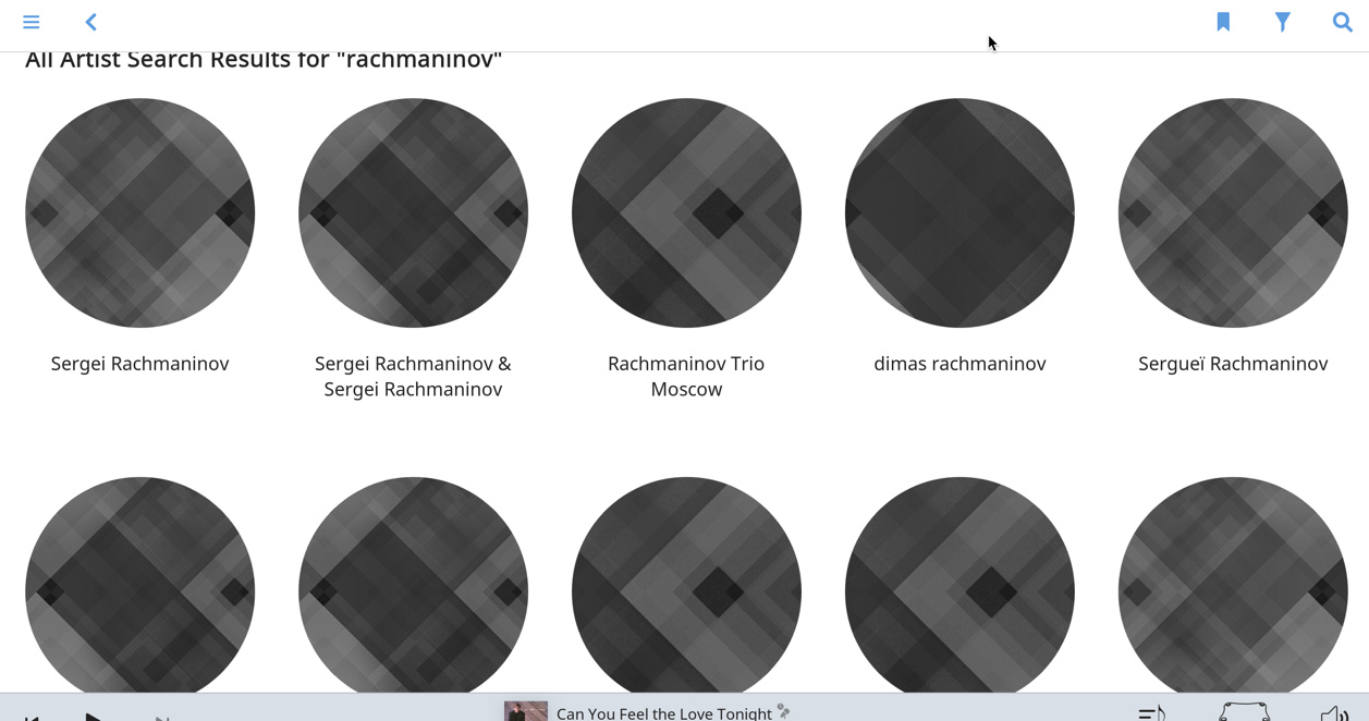
Ten gray circles, but we’re not through. All counted, there are forty nine gray circles with variants of rachmaninov in their names.,
At the very end of the scrolled page, we come to these two “matches”: Vladimir Ashkenzy, and Valery Gergiev. I can’t fathom why these two, and only these two, artists would be snagged in the search. Maybe they had shared some Stoli shots with Rach once.
Albums come next, and it looks like Roon only pulls those with ‘rachmaninov’ in the Album Title. But it doesn’t pull, say, a composition album with two or three Rach tracks. No big deal IMO.
The Tracks List is pretty standard, but I wish Roon would use WORK and PART to munge a title. It seems to use either the track title, or, worse, the file name. Also, when Viewing All Tracks, it would be nice to give the user some sort options.
Nothing interesting about composer matches for ‘rachmaninov’, except that Tchaikovsky is one of them . Both Russians?
Now for my least favorite view, the View All Compositions page:
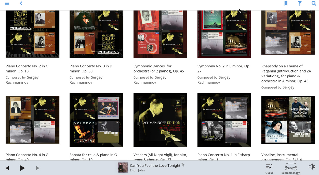
Those pics have zero informational content and need to go or shrink. I think a list format works better here.
I think some views could benefit from another iteration. Admittedly, this search wasn’t very flattering, but I didn’t choose it; it was just the first one I thought of.
5 Likes
I would like to have an option on that syncing issue.
I really don’t like the visual appearance I always use “Dark Mode” but the play progress bar at the bottom is now grey it just looks wrong I want it to match the rest of the screen that is Black or Dark.
Regards
9 Likes
I don’t know, try it and let us know ![]()
I know that when I’ve had TIDAL linked up but no subscription, I could browse and search the TIDAL database completely. When I tried to play a track, it just wouldn’t play anything.
I would posit that there is no “right” here and this is just a matter of subjective preference.
What frustrates some users is that a choice is not provided, when the pages were already built and exist in the prior version anyway. It seems to me it would not be that difficult to offer some configurability here, and not have users have to wait until the next release, which could be months, to have something back as simple as a combined queue-now playing, or the larger album cover art, which was just there yesterday.
Roon is expensive enough that this type of feedback is plenty fair. Not talking about the tone - no reason to insult anyone as some posts were close to – but the feedback that one liked something the way it was, please leave it there for me – is not unfair. It may not always be possible, but where it is, I’d like to see Roon offer more choices and less of the prescriptive approach.
2 Likes
Click on ´queue ´and be the DJ !
I respectfully disagree with the design choices driving the new DSP settings page.
Working professionally in UI/UX development, I certainly understand the team’s point of view and reasoning behind the changes. I don’t particularly enjoy fielding repeated support questions on the same topic, but I do interpret that situation as an indication that something is wrong with the design (as Roon did). However, when I saw the new interface for the DSP settings page (and admittedly fumbled through it), my first reaction as a developer was that users aren’t going to understand it immediately. From a user’s perspective, until I read Roon’s reasoning behind the new design decisions, I couldn’t figure out how I needed to alter my DSP presets to make it simple for my use cases. And while I won’t pretend to have the right solution to Roon’s DSP page’s interface, I would politely suggest that when there is user feedback such as that from Jeremy_Jones, something still isn’t quite right about the design.
My personal workaround was as follows:
- Create a “DSP Off” preset
- All (now 6 from previous 5) of my presets show all possible filters. I realize some filters can be added more than once, but I’ll keep the example simple.
- For each preset, enable only the desired settings.
Now, as I cycle through my presets, it’s easy to see (at a glance) all possible DSP settings and which are currently enabled. My “DSP Off” preset shows that nothing is enabled, which was my personal interpretation of the now-removed DSP Off switch. The only problem I found with this idea is that by including the “Audeze Presets” setting in all presets, even if it’s disabled the icon for the zone shows the Audeze Headphone icon. The workaround is to include that setting only in my “Headphones” preset. Perhaps showing the headphone icon when Audeze Presets is disabled should be considered a defect.
Best wishes to Roon and thanks for the feature updates. I know the hard work that went into the release.
2 Likes
This will evolve based on feedback, no need to throw the baby out with the bath water 
1 Like
Well, I like them, so here’s my vote in favour 
You might consider adding Play Store to your Fire tablet, just Google that phrase.
Any advice on how to sign up for Qobuz? When I try to create an account, I get a message that Qobuz is in closed beta and to come back later to sign up.
Please, for the love of all that is holy, hire a UI design specialist.
11 Likes
Haha, yeah true!
Some of the new stuff looks great.
Qobuz I’d jump at (been waiting to get rid of JayZ for as long as I’ve used Roon) but now practical reality of preserving my playcounts, favourites and ‘date added’ data (my primary sorting) makes this tricky - I already hate losing this when I replace Tidal albums with bought ones.
Radio too but to be honest Ive been using Spotify for discovery for past 6 months and have discovered way more than I ever did with Roon and very little effort on my part. And it’s available when out of the house (I rarely if ever use the Tidal app on the move now, despite the quality loss). Soundiiz syncs it to Tidal for me for home. So that’s me good for a bit.
Much of my reservation is UI and DSP.
IMO it’s impossible to have a nicely designed product when you update the design piecemeal. It’s a really bad idea, again, IMO. Roon started out with a clear design feel, albeit a little basic and immature, and up to 1.5 had drifted a bit too far off that for my liking. Quite a few inconsistencies, bugs (some very very old), and backwards UI steps. 1.6 seems worse still, and the revelation it will just keep ‘improving’ piecemeal, I read as ‘will just not be right for ages’. I strongly feel it would be better to add features piecemeal and do a big overhaul of the UI in one go - yes, a year or more is ok for me. Also the DSP, other than presets, seemed like the least urgent area to improve.
Anyway don’t get me wrong I use Roon everyday, it’s great software and I love the ambition of the team behind it, but it just isn’t exciting me in its more recent developments.
So for at least a while more I’ll enjoy 1.5. But I’m sure I’ll crumble at some point, but more to part company with JayZ…
[oh the irony of what just happened, the timing was almost comical… ![]() ]
]
1 Like
A post was split to a new topic: Play/Pause/Next buttons disappear in Now Playing
Great upgrades to the radio. Sorry a huge forum now so not sure if mentioned but having the thumbs up and down on the next track coming up has never been useful to me. I can’t judge a new song while listening to the current. Then when it starts playing and I know if it’s good or not, there’s no way to feed that back. Any way to add the thumbs up/down to the current playing track in radio? I know it’s like spotify but it’s much more useful than on the next track. Many thanks! H
2 Likes
There is feedback
I have considered it and have no interest in bogging this already sluggish tablet down with even more bloat. I use it ONLY as a Roon controller and have no need for any Google services.
And my own question was answered late last evening: on the Fire HD8 a message about an update being available was displayed and I chose “Update all.” After that completed, it wouldn’t connect because Roon on the Fire HD8 could not be updated.
The new .apk was something like 3.6MB larger than the old one and upon installing it after uninstalling the previous version, it was in fact version 1.6. It required a little manual intervention but everything’s working fine–better actually. This seems to be much snappier than 1.5, especially when dealing with artists with hundreds of albums.