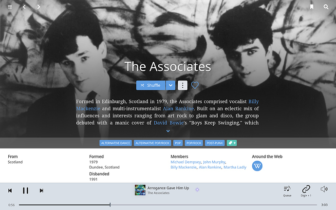
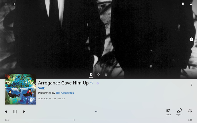
About artist photo in now playing screen:
The order of artist view reviews etc is configurable
1.6 a pleasure to use
only gripe is with classical metadata (box sets a major frustration)
otherwise, no regrets
thanks, ta-ra
I’m glad I waited to use 1.6 a bit more before commenting. This has allowed me to discover new things that aren’t immediately obvious, etc.
Overall, the feeling of flow while using is improved. Of course, Qobuz (when I can subscribe in the US!). Radio is working so well. I rarely am skipping tracks, so far anyway.
The now playing screen is an improvement except for the lack of album art as so many have expressed. I see the potential to add more screen choices to the top half. It sounds like you already plan to add an album cover view to the choices. There will be more possibilities (see below). The album review and artist bio on the now playing screen is great. I like being able to scroll to read. I always disliked the need to press an arrow to expand and contract. Scrolling leaves the bottom area visible. Lots of things to comment about and most are positive, but I won’t bore everyone going through everything.
More on the now playing screen. It is now, for me, the heart of the views since more can be accessed from here without having to leave the screen. I have complaint about removing the now playing section from the queue page. I would argue for restoring that but, even better, would be to add the queue as one of the top half views in now playing. This would give both the queue view and now playing as before but integrated in the new multifunction now playing screen.
Now playing: add swipe to move between the top half views - most intuitive action when there is touchscreen.
Now playing bottom section color is fine with me (I use light view exclusively). However, as in “Big However,” the progress bar is a step backwards IMO. Too wide. Drop the three icons (queue, etc) down a bit with the progress bar narrower. This would feel more natural and allow the perception of the red line to progress more smoothly. And, I have loved the DR contour, or whatever it is called, on the progress bar. It is now less attractive as a half graphic, is to low on the screen to use easily, is easily touched by mistake, and it is less visible due to poor contrast (this last one about visibility is important to me).
Finally, a minor feature, but major reaction to the round artist pics. I am not histrionic, so when I say my first reaction was shock and disbelief, I am really saying something. It is so inconsistent with the look of the rest of the app and is a functional downgrade. I never realized how much I depended on those graphics when scanning artists (and other things) until it became hard to see what the pics were. Why reduce the visible graphic area and replace it with white space (essentially the four corners). Please, please, reconsider this one.
Thanks if you’ve read all this! Again, more positive than negative in my view, but I have devoted more words to the constructive (I hope) criticism.
Re now playing display. (pardon any duplication; didn’t read the 613 posts)
- On a 44" LED TV, the font sizes can now be read across the room. The bad news is that WORK and PART pieces can rarely be read in their entirety. For example, a simple title such as “Symphony No. 4 in D minor, Op. 24” take the whole title line with no room left for the PART. And, it is not clear what variables are used to munge the text: should be WORK and PART if present., and track artists and composer if present.
So, more TV real estate needed for proper display. Either a third line, wider/longer lines, rollover text, move text to the top left corner, and or scrolling texts (my vote).
- On my MacBook screen, I’d say good job.Title line expands and contracts with varying name lengths. Still, some titles will test this new limit, and what to do? “Nothing” is my least favorite option
You could try signing up for a free account (if they offer it) or starting a trial and then canceling. As long as you have an account with TIDAL (doesn’t have to be an active subscription) you can navigate the TIDAL content – I suspect that would enable the ML radio as well.
So, link an account with no subscription, and restrict Roon to play only from your library.
Worth a shot…
Is there a way to change the default Now Playing view to not be the lyrics? Feels like Roon just turned into a karaoke machine.
Thank you very much for the great Update/s. I enjoy my music with Roon like the first day i use it… Qobuz integration is great!
There is a configuration option mentioned several tones on this thread and on the announcement thread there is a graphic also.
.sjb
@mike @soundserge
I’m not sure what “fix it” means.
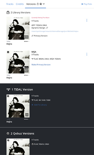
In addition to the points I raised earlier, consider that Roon shows existing versions of an album in other services, whether you have them in your library or not.
Look at this listing: I have two versions of Hejira in my library, a high res download and an MQA version from Tidal, and in addition there are other versions in Tidal and Qobuz.
So what is the complaint here? If you have bought a Qobuz download, the streaming Qobuz version that you had previously favorited shows up on a white background instead of a black background?
That doesn’t seem like it would bother me much.
The statement “I get 1,000 duplicate albums added to my library” is difficult to parse, because simply by being connected to Tidal or Qobuz you get many more than that in the Versions list.
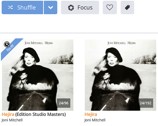
Of course, this presupposes that Roon identifies them as versions of the same album. If not, you get duplicate listings in the album browser and that is horrible:
In my case, Roon is confused about this, it shows those two versions, but the Versions listing for each one is partially correct. This is a problem, but it is separate — if the version identification doesn’t work, no “fix” could work. (NOTE that you need to say No on Show hidden albums in Settings, otherwise you get all the duplicates.)
Queue vs. Now Playing:
I absolutely agree with @brian’s point that they have distinct purposes.
Now Playing is for the present enjoyment.
Queue is for managing what will be playing.
I understand his point that Sooloos had them merged, I had a Sooloos, but that doesn’t make it right.
And other programs do what they do, that doesn’t make it right either.
Yay for the split!
Yes! I want that too.
Having skimmed through this topic, I think I’ll cling onto 1.5 a bit longer…
Thank you @Chrislayeruk.
I’ve found where the settings were located !
In some cases, the albums that we have purchased from Qobuz, downloaded and included in our libraries have been automatically added a second time (as Qobuz streamed albums) to our libraries. It’s not consistent, there may be a time factor involved. I’ve just been through my library cleaning out the unwanted duplicates. Not every purchased album got duplicated, but probably about 80% were.
same here. 3-4 tries after a reboot and it finally launched
Are they not identified as versions of the same album?
If they are, what does duplicated mean?
And what does “cleaning out” mean? Change the background in the Versions list from white to black?
If they are not recognized, that’s a problem, indeed.
Stick-in-the-mud.
The radio is worth it.
To the extent that I now use it and previously never did.
So it is in effect a new function, and a useful one.
I take the standpoint that “favourited” albums in Qobuz should be automatically synced to the library (as is done for TIDAL favourites), and that purchased albums (from Qobuz and other sources) are downloaded and added manually to the library.
The issue is that the sync process is also adding the purchased albums a second time to the library giving me unnecessary duplicates. In some cases, it has also set the streamed version as the primary version. And of course, the versions page then lists the Qobuz streamed album twice - once as being added to the library by the sync process, and once as existing in the Qobuz catalogue.
It’s messy, and brings on my OCD. 
@PatMaddox you are a genius! It worked! I had a Tidal login from a previous free trial. There is no payment method in my Tidal account, so I won’t get dinged, but the Roon Radio feature is working!!! However, it doesn’t ask why I declined a track if I set it to play only from my library. So, I wonder, will it ever play anything from Tidal if I don’t have a payment method?
Thanks so much for the suggestion! I. Am. Stoked.


