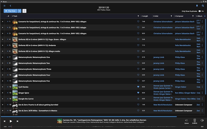
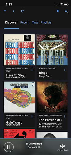
Wow, a real world problem.
Fonts all look good here, in as much as I dont see any difference to before. Server is running in linux on a virtual and various endpoints including PC, Mac, iPhone etc, dont see any strange bold font stuff.
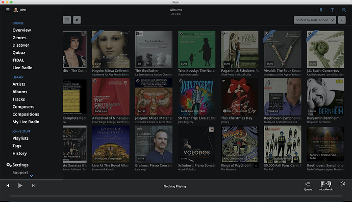
MacBook Pro 15", macOS 10.15.2
Native resolution, no scaling
In the album view - font is so large many album titles are truncated
In the “hamburger” drop-down menu
Using custom color profile, but reverting to standard Mac profile looks the same
UPDATED to include screenshot:
Would be great to get some more details about your setup (as described here) guys:
@mike
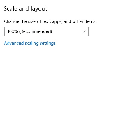
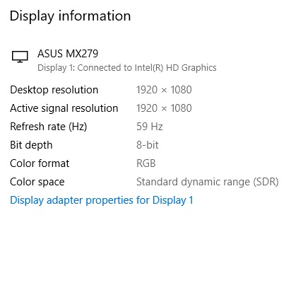
I predominately use an iPad Pro 12.9 as my remote, however I also use a Surface Pro 4 at home from time to time as well as a crappy 23" 1080p monitor at work. Both Windows units have their Scale and Layout set for 100% and their native resolution selected.
I should point out that my preference is to use the Dark theme, and this seems to be where the issue presents itself the most. The Light theme looks far better. However I definitely do not like the bolded left-sided Main Menu on either theme - it is unnecessary in my opinion.
You’re feeling this on the iPad as well? Not just the 100% Windows displays?
Thanks Mark, and @Edward12.
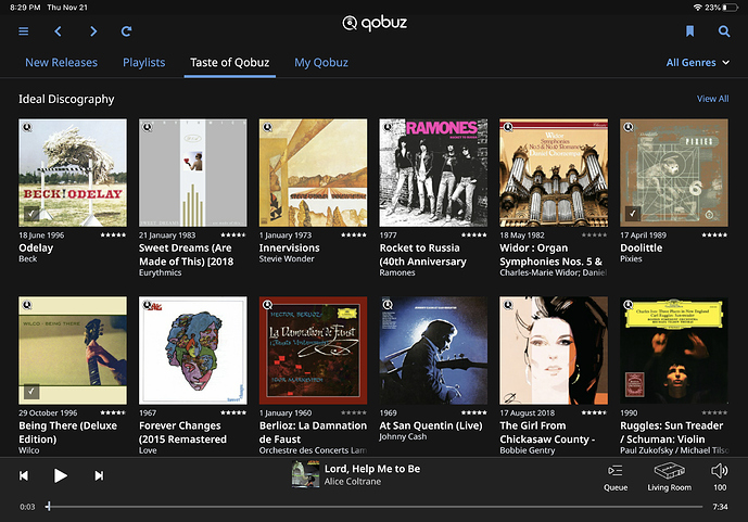
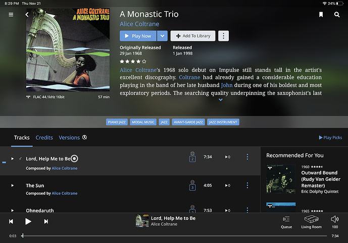
It certainly is more pronounced on Windows than the iPad. On the iPad it looks Ok (although I don’t like the bold in general).
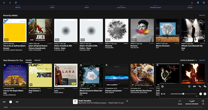
Here is a screenshot from the work Samsung monitor:-
Thanks for asking, Mike. I’m using a Mac running 10.14.6, but I restarted and some of the funky bold stuff seems to have disappeared. The song titles are still bold, which I don’t think it’s a great choice (like, why?), but I concede it’s not the first thing to fix. Surely a higher priority would be to left-justify lyrics. Who made the decision that they should be centered? It’s completely … well, let’s just say “nonstandard.” Seriously, that decision makes zero sense from a design or readability standpoint, and while I’m not coding Roon, thank goodness, fixing it would seem to be a pretty minor operation.
There’s an easy solution for this, create a poll:-
A. I like it
B. I don’t like it
C. I don’t care either way
If B or C come out top, leave it as is.
Looks good and easy to read on iMAC 27" retina 5k 2017 with Catalina.
I will make some screenshots later, I’m away from home for three days now.
My main music PC is a windows 10 desktop which resides in my audio rack. It’s an Asus zm87plus mainboard with intel i7-4770s cpu. I use the build in graphics of the cpu. Monitor is a AG Neovo X-24-E. Fonts are really bold on this machine which makes readability a lot harder either from close to the screen and from further distance. 3 meter readbility of the now playing nscreen allways was very hard, now it is non existence.
I mainly use my macbook pro or my Ipad as remote. On the macbook things look better. Album titles are pretty bold but artist names have decreased in size. I allways use my screen in 1920*1200 resoltion setting.
On my android phone things look best, that ia at the sparse moments my android phone is able to connect to the core. Ipad ain’t all that bad either, a matter of taste but nothing disturbing. On the windows mwchine it’s not a matter of taste but a matter of decreased readability. I’ll post some screenshot lster this weekend.
How about just create a toggle inside the GUI itself.
Feedback statistics can tell Roon which one people use the most. This can give Roon true metrics on the feature.
In fact since Roon does phone-home [often] these type of user metrics should be collected to drive dev anyway. For example, if people don’t use ‘Discover’ they could just take it away instead of spending more money on it in future dev.
P.S. this is not meant to troll Mark, Roon or the thread in any way…so please don’t flame me.
Hi @Mark_Hyland
If you have a chance, would you mind taking a screenshot of the bolded left-sided Main Menu? This is clearly a thing for some users, but things on my machines look just peachy. I’d love to get a sense of how the changes had this effect on affected users. It’s just a curiosity thing.
Thank you.
Monitor: Nec PA242W-BK
24" display
running at native 1920x1200 resolution
Not using Windows scaling (i.e. I’m @ 100%)
DVI display calibrated using x-Rite i1 Display Pro
As for where text is overly bold:
- Overview: album titles & artists
- Tracks
- Albums overview seems ok. Album detail is not: album description text is noticeably larger than track listing.
- Compositions overview seems ok. Composition detail is not: composition description test is larger than composition parts listing.
- Playlists: Playlist details (i.e. the listing of playlists available is not too bad)
- Tags: Tag name & number of items
- History
Artists, Albums, & Composers overviews, and the Settings screens seem ok. Most everything else is hard to look at. Also, the problem isn’t simply bolding. Some of the font sizes, e.g. album description, are too large.
An example of a Playlist Detail screen is attached.
Addendum:
I just spent some time with the new version of the Android Client on my 10 inch Samsung SM-T813 Tablet, screen resolution 2048x1536. Things looked fine there. So my guess is that your font scaling is not allowing for larger displays with comparatively fewer pixels per physical inch.
Bit off topic but that Sacred Shakers album is GREAT
I’m seeing the same truncating of many album titles in Album view on my iPad mini 2 (Retina display, iOS 12.4.3) and on my iPhone 6s (iOS 13.2.3).
Hi, sorry to say but I think the new bold font across the board looks really awful, so for me it’s taken the shine off v1.7.
I’ve a 1680 x 1050 22" IPS monitor running Win 7 at the default (100%) text size. Any chance of rolling back?
