Fonts are all jacked up on new Fire HD 10 - not bold-looking, exactly, but all squirrely. This tablet is brand new, so I don’t know if it was also like this prior to 1.7.
Fonts look just fine to me - 13" MacBook Pro with retina display.
Maybe you are just not noticing it. I also have a macbook pro 13 retina, and the font is WAY too bold for me. I am bothered by the bold font on all of the devices I use. My macbook pro with retina, my desktop with a 27 inch 1440p screen, and my living room TV which is 65 inches 4k. All are too bold, and very straining on the eyes. Between this and the fact that the roon client has been unusable on my Mac mini for MONTHS due to a bug with cpu usage, I am seeing less reason to keep paying for Roon every day. I have been nothing but disappointed recently.
The font changes have had different effects on different devices with different scaling. They were introduced incrementally during testing, so the changes may have been more pronounced for users upon release of 1.7. The devs have heard the feedback about fonts and made some changes in Build 505 which has just been released.
Let them know if you think Build 505 has made a difference.
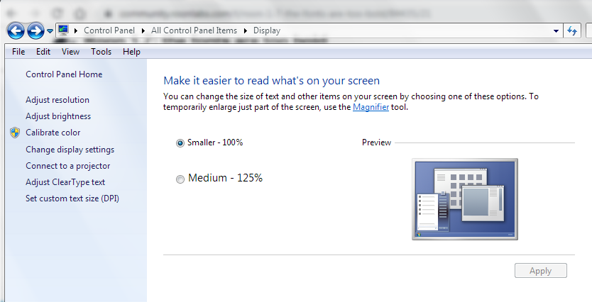
Build 505 is up with a fix for this.
Hmm - hasn’t changed a bit for me 
Looks exactly the same as the screenshot I posted earlier in this discussion.
check settings -> about – make sure you are running build 505
I am running build 505.
I took an “after” screenshot and compared it to the “before” I posted here - now I can see the difference, but it’s subtle. And I really only see it in the menus, not on the album titles, which look almost exactly the same. I was expecting a more dramatic difference.
Perhaps I’ll get used to it 
See a slight difference…at least its more crisp looking.
Thx 
I don’t see any difference with the new build 505. The fonts are still far too bold and straining on the eyes.
1 Like
The difference with the new build 505 is very subtle indeed.
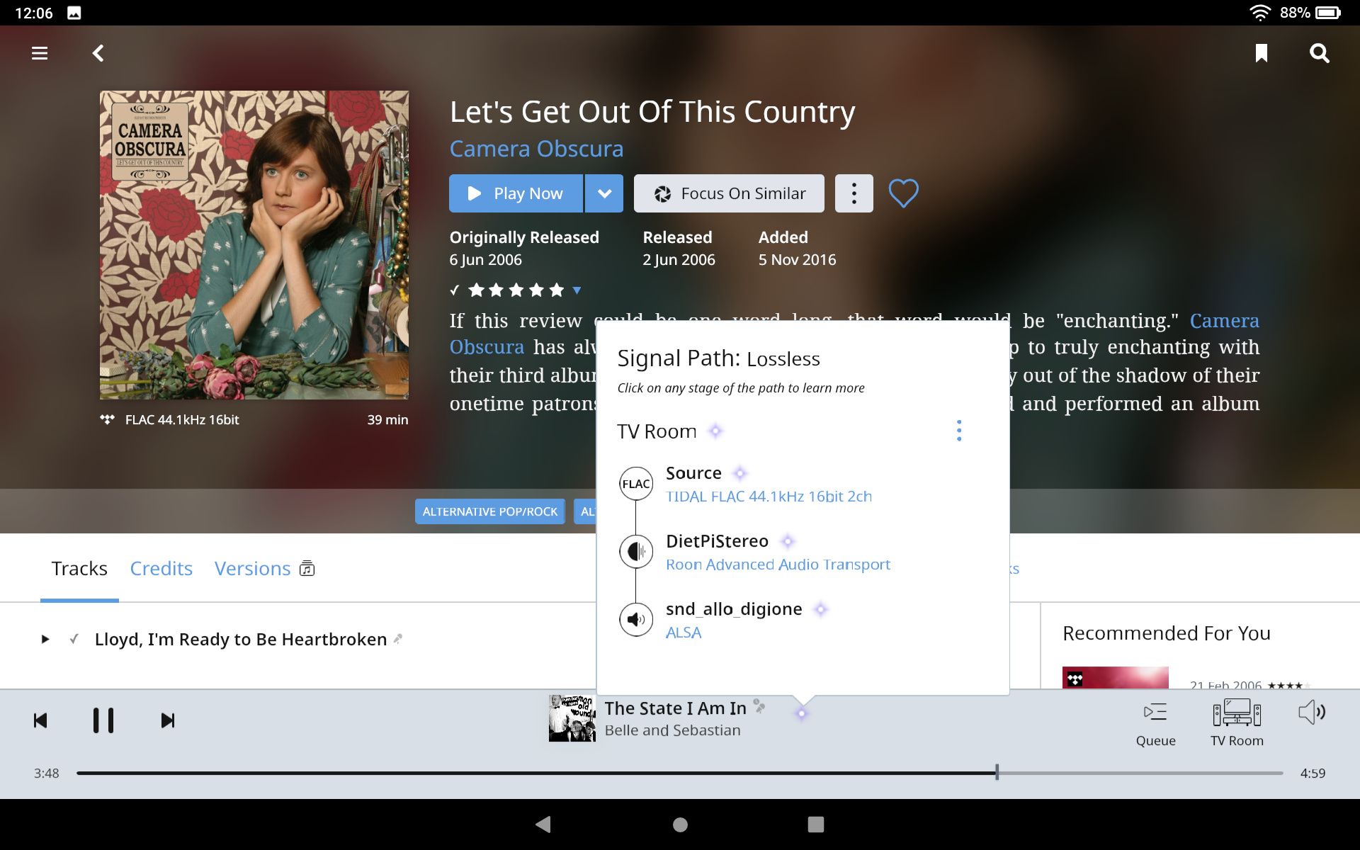
I still find it disturbing and… ugly, especially when you use the option Allow for now covers and photos in the Roon Remote (using remote mainly on Windows 10 PC).
As many many users this bolding thing was the first thing I noticed after the 1.7 upgrade.
When you’re writing text you use Bold to catch the eyes attention.
But now almost everything is bolded and my eyes don’t know where to focus… You have to choose which information is/are important. For me, only album titles should be bolded on this view (and track title in the currently playing info below).
To sum up, I don’t understand this change in the UI. It was perfectly fine for me before… and I use Roon a lot…
2 Likes
If it wasn’t broke in the first place…why fix it?
Perhaps this is ‘job security’ on the programmers part…
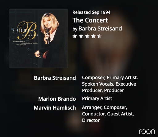
Created with current stable release (B505).
Didn’t expect this result. The credits (names too big, too bold) just look ugly IMHO.
2 Likes
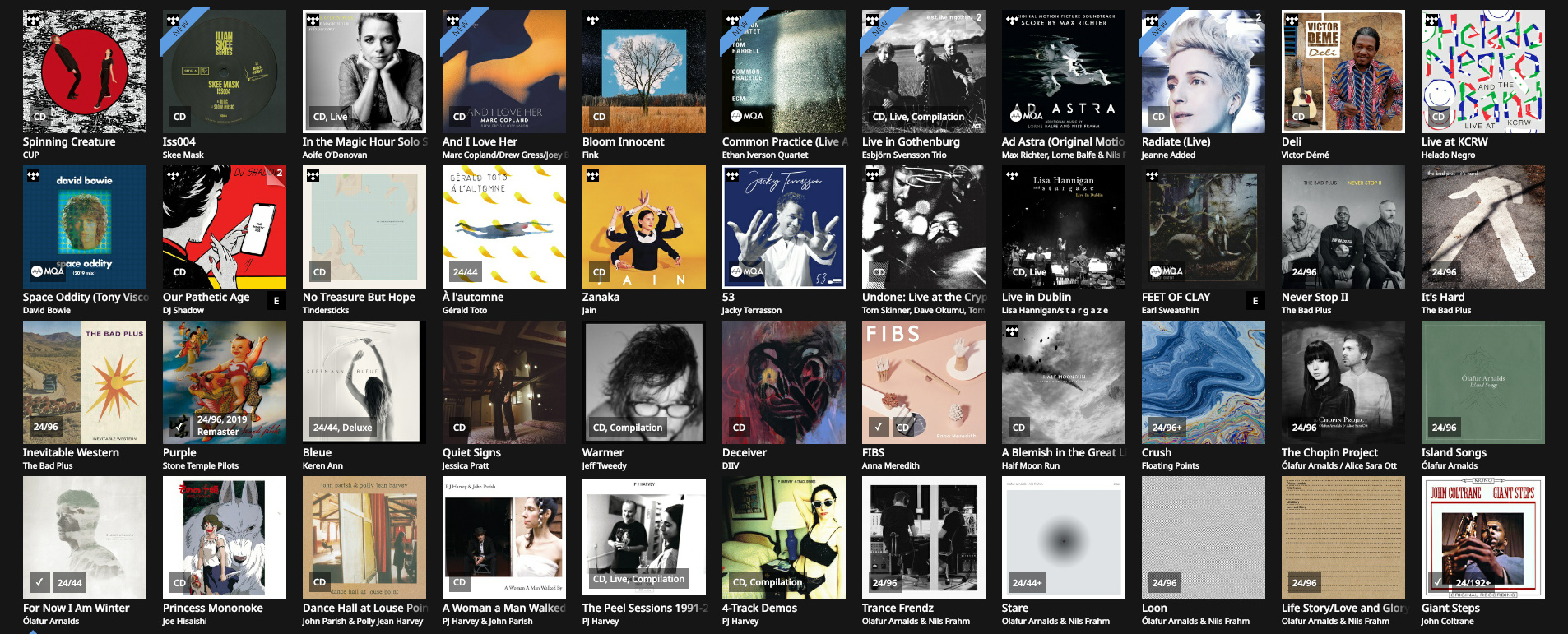
Fonts still all jumbled on Fire HD10 with build 505
1 Like
Text looks awesome on Fire HD 10 after new update!