We were using synthetic font bolding before, and now we are using a proper semibold font in it’s place. It actually looks a lot better if you have the PPI to support really nice smoothing (retina screen or equivalent).
However, some of the techniques we’re using to hint text for lower density displays is overly strong.
I have this problem on my 4k 38" screen but not my 4k 15" screen.
We are tuning it now, and have gotten much better results, but this needs to be tested across more monitors before we can release.
This is pretty much my first impression as well. I hate to be so negative but wow. 1 year of waiting and the most noticeable feature is bolded text everywhere?! My god.
It might be a user issue but where on earth can I find all these new bold fonts? I’m using roon on a PC running Win10 for everything and when listing to music use an iphone as endpoint. I didn’t notice any change in fonts on either and am starting to feel funny about not seeing what everyone else seems to see…
I guess I’m just not seeing the bold font issue. I see several points sizes and some are bold and some are not, to my eyes. It appears to be the same as 1.6 though I must say I never really took note of fonts. They appear crisp and clean to my eye. What are you seeing?
I’m also curious if multiple font weights are being used, versus just regular, italic and strong text.
If there are multiple weights—like Light, Regular, Book, Medium, Bold, Heavy—then this will need to be a more nuanced discussion to account for where and how those different weights are being used. If it’s simpler than that, and the app only uses regular and bold text, then using a wider range of weights could be a significant improvement.
Aliasing methods may also be involved in how different users view v1.7 on different devices.
I wonder if those who feel that Roon got too bold could add a few more data points: like what devices (mobile or desktop) and what screen resolutions (regular or HiDPi/Retina) are used?
While Roon looks different I’m not sure that it looks wrong. Also, the transition to the new UI is still on the way, I suppose. So probably release by release things will look better and better - or more coherent.
For everyone complaining about bold text in 1.7 – we’re already iterating on the treatment and we want to make sure we understand exactly who is feeling this on which displays.
Details
It would help us if everyone could let us know:
What monitor and OS you’re experiencing this issue on? (model, physical size, resolution)
What display scaling settings your monitor is set to? (see below)
Where specifically in the app you’re finding the text to be overly bold?
Are you using any any color calibration settings?
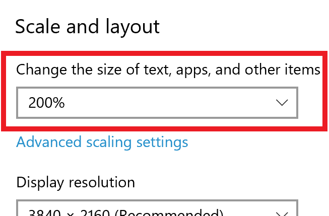
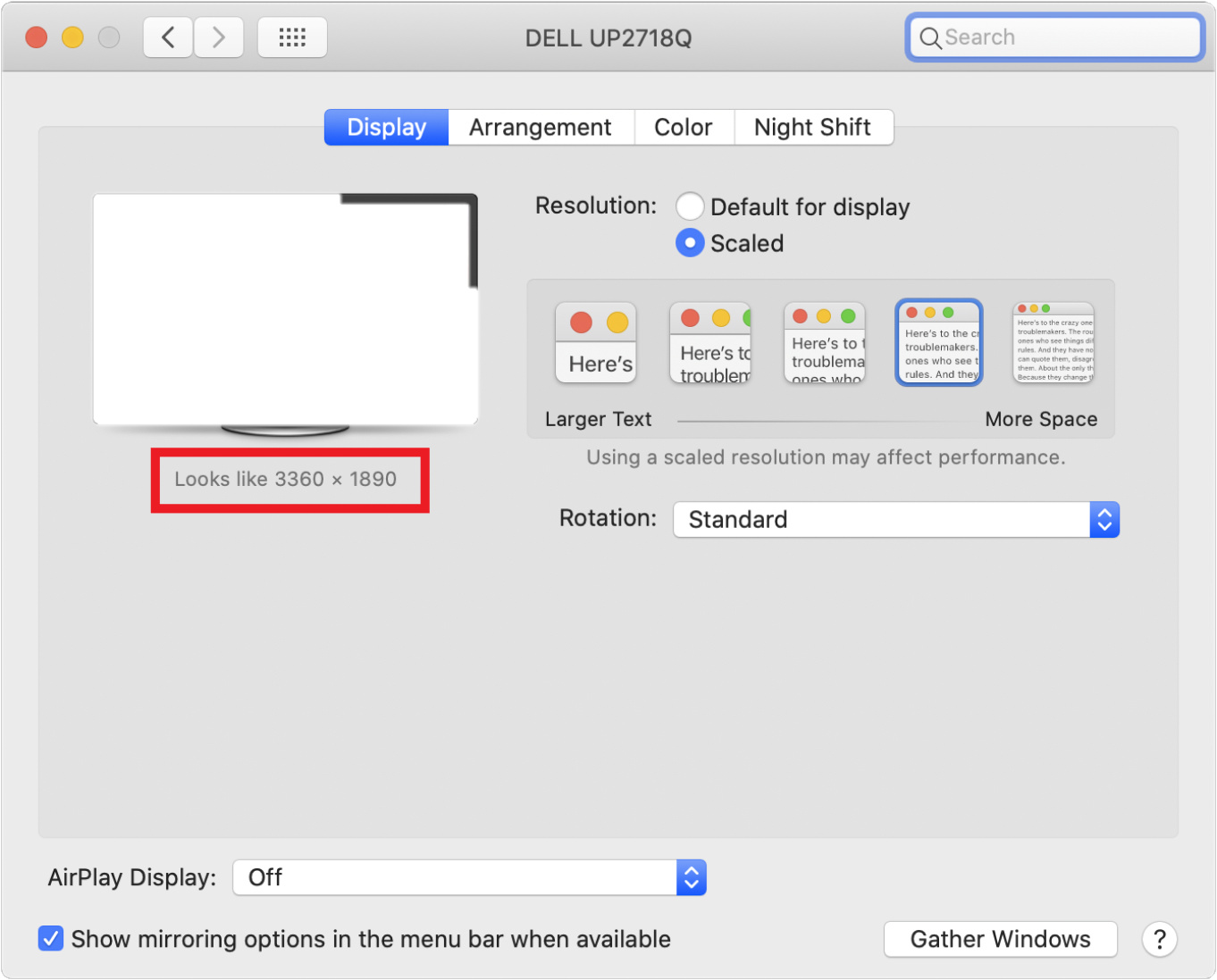
Display Scaling Settings:
To get your display scaling settings:
Windows
Go to Display Settings and let us know this number:
Mac
Hover over the letting and let us know the “looks like” setting and the native resolution of your screen.