You ruined Roon. Switching to my volumio. [Moderated] Was so impressed with 1.7
Why use a color like purple and not simply give the user a configuration item to pick their own colour ?!??!!??
Seriously guys? Why? This is terrible.
The people wants the bookmark pin back in the main screen and not hidden in the side menu (on mobile app) - side menu that is even not accessible by swiping from left to right due to iOS integration
The people needs to be heard !
As I posted earlier, a LOT of wasted space at 3440x1440 on my desktop. Artist page also displays a lot less information before even though it scales across. Playback spectrum shrunk as well which is a regression in my opinion (image in linked post)
which ones?
Yes the reduced size playback section is disappointing. Why would they do this? The full width playback is really useful for easily locating sections of a track.
Weirdness, when my Mac mini screen saver kicks which is where my Roon Core is located, stops showing any Audio devices connected to the Core.
Personally, I love the new look and I greatly appreciate Roon’s effort at the redesign. Certainly you can’t please all, but IMHO, this is a step to make the process of listening to music also one of learning.
One thing I greatly miss… when displaying ab album under 1.7 and earlier, there would be a list of similar albums extracted from Qobuz & Tidal that Roon thought I would also like. That has gone missing and I don’t see an easy way to recreate it. Roon Radio (once the bug is fixed) will help, but seeing similar albums at the time I’m listening to the current album gives me something to explore while listening. If anyone knows of a way to see “similar artists/albums” in the new 1.8 UI, please share.
It’s also missing the list of albums in my library by the same artist as the album I’ve currently got selected, but at least that I can readily recreate via Discography.
A post was merged into an existing topic: Settings not displaying properly or crashing on 1.8 [Ticket in - Workaround in thread]
The way I said this is humoristic and should not be taken too seriously
However the complaint is serious
The bookmark pin in the side menu was already noticed in this thread a couple of times
It was much more easier to access quickly the bookmarks
I am also having track shuffle only shuffling 5,000 tracks.
And it seems to only be selecting artists that start with “A”
I can see why they don’t want to wait for the weekend on big updates like this. 
Not happy at all here on my desktop PC. Just discovered Roon a week ago and 1.7 seemed great to me, but 1.8 is a huge letdown now:
- too much wasted space on 3440x1440
- color purple should be customizable
- search bar should pop up in the middle again, not upper right corner (please make it at least customizable)
Worst of all: the serif font. Awful. Take it back to something neutral, please. Or customizable.
Apps on Android tablet and phone seem to be ok. Except for that font. Yikes.
it was obvious after email 3/5 that this release will be nothing short of a complete disaster. 11/2019 → 02/2021 - and almost nothing to show for it. all this time, all this bugs. it is not even working! we will never get an adjustable music server software with roon.
we have to let go and move on
look at plexamp mobile and how much better it is short time after release. speed of development is ten times higher and they know how to code and design software
Delete the mobile app and re-install from Google Play. It should update to 1.8 (that’s what I had to do).
I see the 5000 limit for shuffle as well…this is a buzzkill…only gets to “F” with a filter on…probably wouldn’t get to “C” if I shuffled the entire database
Anything Room can do here?
Major drag…
Good news for 1.8:
- Core seems to have updated easily and successfully.
- Windows remote working fine after update.
- Apple ios Remote working fine
- Samsung S20/Android 11 issue resolved apparently?
Bad news:
- AlloDigiOne has completely bricked itself in the process
Amen to that! I’m so glad Plex also indexes my music collection.
Comparing Plexamp and the new Roon app side by side tonight makes it even clearer who’s the winner…
Good: Vertical scrolling, dark mode still exists
Bad: New font. Screen real estate optimization is poor on high resolution monitors. Why is everything so purple?
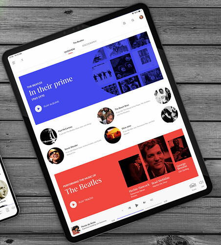
Has anybody allready seen the purple “in their prime” section in the artist page?
I have seen it in all of the the commercial/marketing/reviews/emails about 1.8 but it is not there. Am I missing something.I have looked at the beatles and at David Bowie, the same as in the pictures seen everywhere but nope, nothing.
Anyone know where to find this?
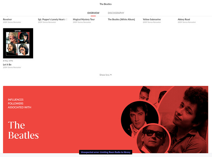
looks actually like this:
Besides when it would be there it wouldn’t fit on one screen. The red “associated with” takes up 1/3 of the screen on all devices. There is no room to show another 1/3 section and a header and a footer and two rows of artists in between. At least not in any layout I have seen so far. What Am I missing? Is it something I’m doing wrong here?
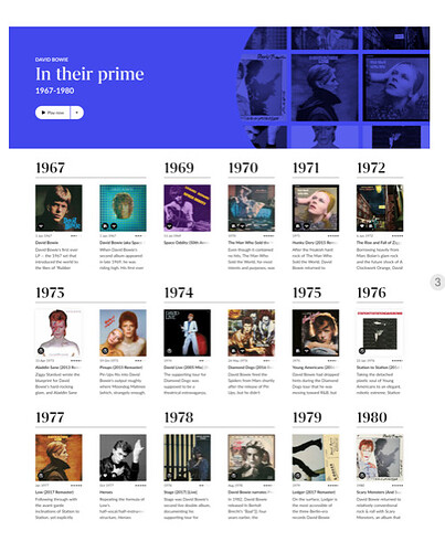
Same for Bowie. In the commercials it looks like this, we have all seen it many times but it is nowhere to be found.


