first word that comes to mind is childish.10 times more interested in viewing my own name or the words “My Albums” then the actual album titles themselves. This is totally absurd.
Fonts and colours in general are a bit of a mess, readability is worse then ever before
The artist page is a monster now. Everything seems to be about exploring. The right information is at the wrong places. The information I want to see is buried under all sorts of discovery nonsense
Different screens are either completely empty esoteric or complety bloated with all sorts of nonsense
What on earth has a “artist born in england” screen that takes up 1/3 of the creen to do in an artist page, nothing. Exploring is nice, but keep it in the right places, now it only gets annoying. It feels like spam.
There are even more inconsistencies then ever before. We have to scroll up and down even more then ever before. There is less use of scree real estate the ever before.
Everything feels to be algorithm created. Personal curation of a collection has becoem second place
Any nice things to say.
Oh Yes, I do like the use of metadata, but please don’t shove it into my face like you do now. It feels like you are so willing to let me see what you can do with metadata that it has to be present at first glance more then any personal curation. That’s only annoying and over the edge. The Johnny Darko review said the new Roon version was all about You. It turned out different, it’s all about algoritms. “You” have become second place. Maybe the algoritm can get a little less prominent place to make things more human again.
The whole look, feel and handling makes me question where my own library went. Do I still have my own library?, I don’t recognize it as such anymore. It is buried somewhere under a giantic pile of information.
I think Roon has tried to design an interface for either todlers or cheriatric people. There is so much emphasis on totally useless information while at the same time more important information is getting buried away. I will never understand these looks over function choices that look nice on display or for showing off to your neighbour but only get annoying with daily use.
For me, this is a triumph. Yes, one or two glitches to sort out, but overall a massive leap forward. Absolutely loving it — jazz, pop, classical — can’t stop playing stuff.
@jez Whilst I understand having fewer albums displayed is disappointing for some let’s not make it out to be worse than it is, only 5 albums displayed? On the initial screen yes but as soon as you scroll down it is 10 albums, that’s a 100% improvement
Roon was never designed to be experienced on an iPhone. That is an extra convenience for quick control.
This is my issue with people wanting iwatch controls. Soon they will want it all on such a device.
I know that Roon Labs does not inform us about the new releases while they are working at it. But now that 1.8 is released I wished I got an email where Roon informed me about what is new, what has changed, what to look for. But no, not a single mail. Marketing Dept. sleeping? Customer relationship manager absent? Communication breakdown?
And after all the problems reported I will wait another week before updating myself.
This is one of my biggest disappointments in Roon in general. My guess is that the first users of Roon have been these kind of people. Now we are no longer the target audience.
I have long advocated for increased transparency on the Roon blueprint for future releases. Other users have argued both ways. I think recent events would bolster the argument for a more overt blueprint, as well as for increased end user involvement in UI and feature decisions, ideally via polls etc to fairly capture data.
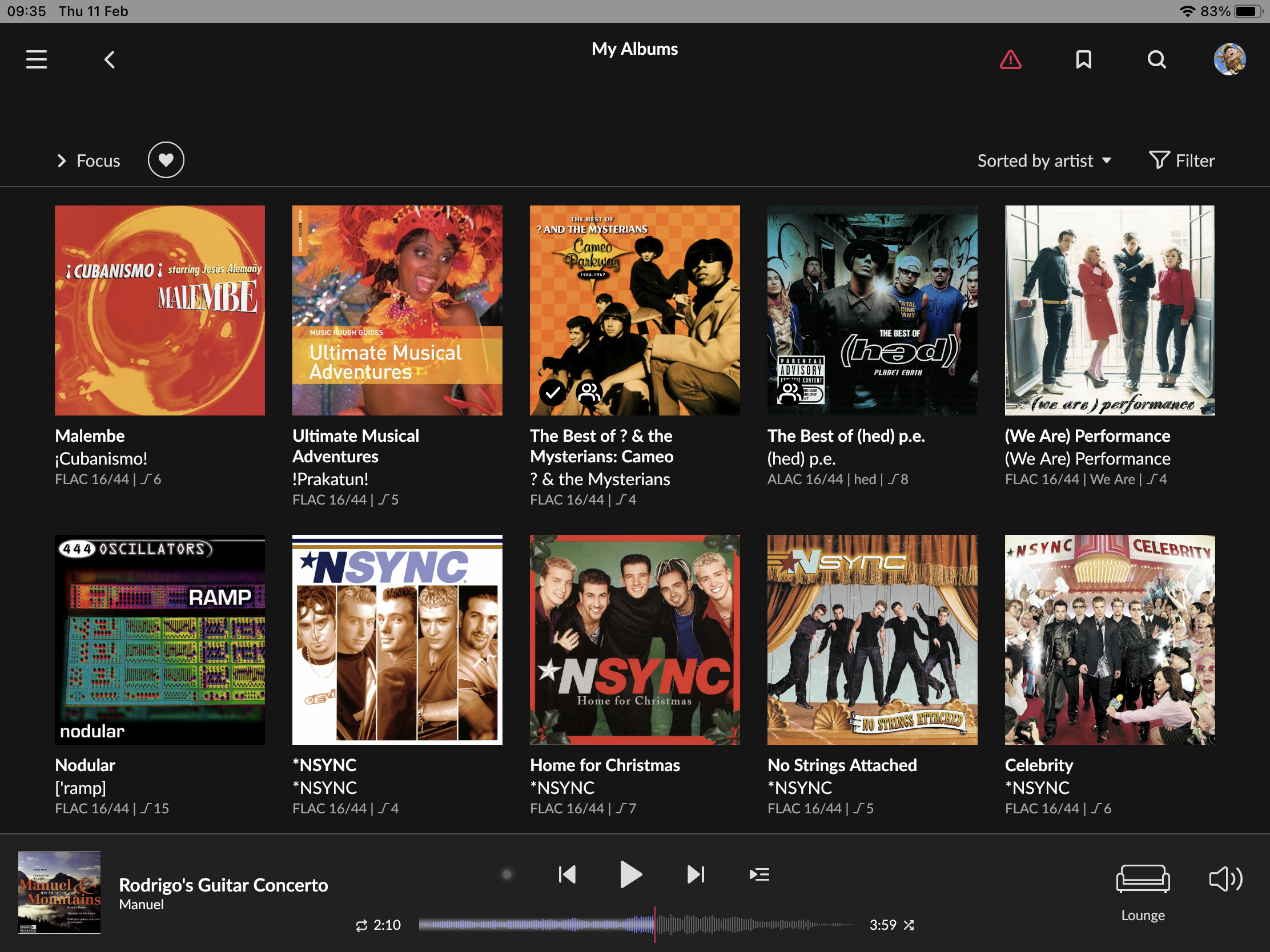
Yes, but I’m afraid Roon’s focus is no longer on large screens. On the “My Albums” page, I’ve got more than 22 inches (width!) of empty space on my iMac 27’'…
1.8 seems to be a case of form over function. Making something look like a magazine is not a necessity with a functional tool, which is what Roon ultimately is. When you choose a magazine to purchase then ‘form’ is important as you are more likely to buy a beautiful looking publication. When you use software day after day the functionality is much more important.
The endless white space, the large patronising ‘My albums’, the reduction in size of the playback bar, the downgrading of tags and playlists in terms of usability - it all points to prioritising form over function, which is wrong for software like Roon.
Perhaps it is done to create an instant visually appealing ‘look’ for prospective new subscribers. In that case having a more functional version for regular users is perhaps a compromise.
I love it! Update installed without a hitch. The graphics look awesome and … it is so responsive. Very fast, indeed. I’m still exploring it, so I’m sure there’s lots more to uncover.
The only slight niggle that I’ve uncovered, is that on both iPad and iPhone … the new icon is white (looks great, btw), whereas on the core (Win.10, i7, totally updated) the icon remains the old black styling.
Thanks ROON Developers for making 1.8 an awesome update for us.
I think Discover is an underrated option, and very useful, especially for those “what should I listen to …” moments. Pity to see it buried under pages of stats about listening habits. I wonder if Roon collect stats about how frequently options like Discover are used - they’ve put a lot of work into all those fancy graphics, but I wonder how often people will actually click into many of them.
For my use case, 1.8 is a significant improvement on its predecessor, and being able to access Roon in portrait mode on my iPad mini has induced a state of euphoria which hasn’t quite worn off yet. Thank you for all the hard work behind the update.
My only issues relate to the iOS app used with an iPad mini 5 and iPad pro 12.9 and are those which have already been noted elsewhere:
scrolling is at different times somewhat janky and less than smooth particularly noticeable in the main album/ artist views.
in dark mode and when returning to the app running in the background, I experience a brief bright white screen (like a camera flash) as the page updates and loads.
With regard to personal preference, I concur with those who don’t like the use of roundels for artists and credits.
A couple of additional bits of information would be interesting.
Firstly, it would be interesting to see the split in respect of the control devices used by voters.
I can imagine that most Roon users who use phones as their sole control devices may be happy with the UI changes introduced by version 1.8. I can also imagine that some who use tablet devices as their control point may also have a positive outlook on the changes.
However, I really find it hard to believe that anyone who uses a Windows 10 desktop (or large widescreen laptop) Roon app as their control device of choice (particularly those with a reasonably large hi-res wide-screen monitor) can possibly have anything positive to say about version 1.8.
Secondly, it would be interesting to see an age demographic associated with the poll as well.
Obviously, there will be exceptions. However I suspect that the split between ‘lovers’ and ‘haters’ of version 1.8 would correlate with age. Younger users (who probably use mobile phones for everything that they do) will tend to like the look/feel of version 1.8. Others in the older age brackets will be less inclined to be positive about the changes.
WAVEFORM-BAR to Short
The wave form bar was and would be one of the best Roon functions for playing special sections within a title.
On a standard Ipad this is now too short to find precise starting points.
My album, on the other hand, is too big and really doesn’t offer any profit, everyone will know what their albums are.