Well, I sleep/wake the MAC from the Raspberry using Harmony, it works very well, the last 1.7 releases worked very well, I think that keeping the server on h24 it is against any envirnoment logic
i dont’t have any problems and i use MBP 2020, iPad and iPhone 12 Pro and Rock
i like the new 1.8 great work…
There are some here that only complain. You should first try out a few days and also look for the new functions and then complain. Roon certainly works hard every day to keep improving it, so please be patient in this difficult time. corona makes a lot of people aggressive.
Sorry my english, greats from Switzerland
1 Like
I see. Most of this is not new. That is what is difficult to understand. It has certainly been re-packaged and moved around. Is that what you mean that this functionality is more accessible than before?
I basically never used any of those features on classical music. There is some specifics new stuff (see the link I posted above).
If it was 80% there and I never intuitively accessed it before, then it’s a win for users I guess.
Closer to 100%
Glad that it works for you! ![]() You are right in a way, it was just that in the context of this thread I (mis)interpreted it maybe. I would also like to listen to music, but I also use Roon for detailed crediting, and the very real issues with editing are keeping me from listening. For listening I would not need it …
You are right in a way, it was just that in the context of this thread I (mis)interpreted it maybe. I would also like to listen to music, but I also use Roon for detailed crediting, and the very real issues with editing are keeping me from listening. For listening I would not need it …
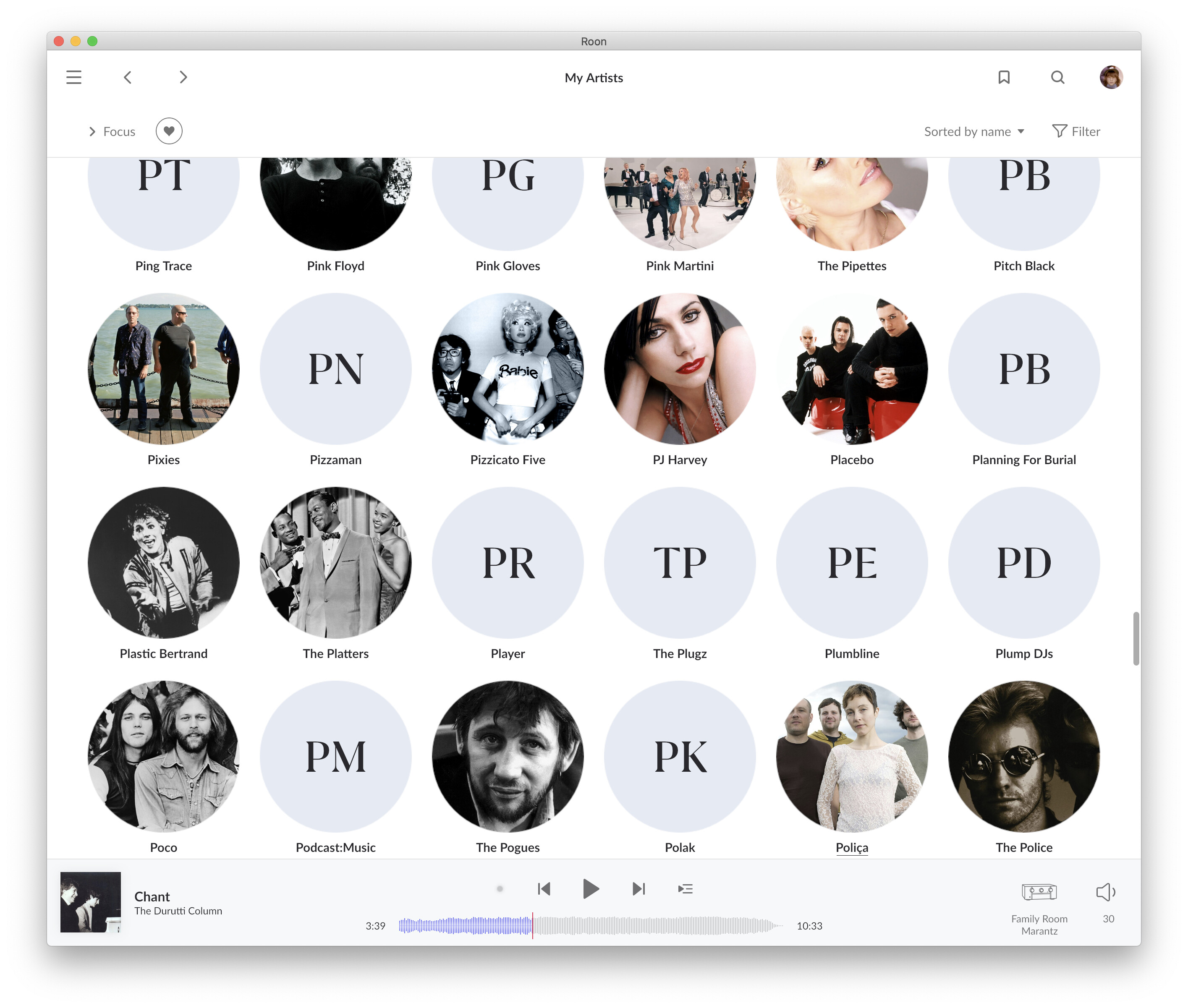
I’m liking everything so far except for one maddening design decision.
The two large meaningless letters in the artist circles with no artwork makes browsing artists very frustrating.
The two letters aren’t used to relay any sort of useful information since what they abbreviate is inconsistent and often times meaningless.
If the artist / band name is:
One word = First and last letter of the name
ie: “Laidback” shows “LK” or “Presence” shows “PE”
Two word name = First initial of each word
ie: “The Plugz” shows “TP” or “Midnight Oil” shows “MO”
More than two word name = First initial of the first and last word in the name
ie: “King Biscuit Time” shows “KT”. This is especially bad with duets such as “Lisa Gerrard & Pieter Bourke” showing “LB”
The eye is drawn to the large letters which in no way relates to the alphabetical sorting of the artists. Even when I consciously know that I need to ignore the large letters while scrolling and skim browsing my library.
The two letters add nothing to the experience and they are arguably a hinderance to usability since they appear to be large sign posts for where you are alphabetically.
3 Likes
@BR_BJ you are kidding us, right?
1 Like
Why would I?
I’m just giving a user feedback, it seems that for a lot of users, nothing is new on the classical implementation. If you want detailed lists of things, since I’m not a roon dev, the best place is on their release note. I’m not trying to argue on technical stuff. That was just my feeling on 1.8.
You need to fill your artists with pictures and the whole thing starts to make more sense. These two letters are indeed, well, just spaceholders…
Not much resources should go into science how to fill them. imho.
OK. You might have missed the sarcasm of @Tony_Casey and me. Tony is using Roon for his collection for quite some years now and is very active in the forum, especially on Roons classical functions. We both posted questions about the advertised significant new functions for classical in 1.8 and we were really struggling to see them for our use cases.
Posting the 1.8 release notes as an answer to our questions seemed a little bit odd. You can be sure we read them very carefully.
I had no intention to attack you in any way.
Ok, I understand your point of view!

Stay safe&greetings from Switzerland
1 Like
I think any change is going to have lovers and haters. I’m fine with the GUI changes.
It must be incredibly difficult to keep everyone happy with their subjective opinions.
A few notes:
- Vertical scrolling on my i7 laptop (Controller) is a little jittery (HP Elite i7 core). I hadn’t noticed this before, in saying that I mostly use iphone and ipad to control the server.
- In terms of playback functionality its been perfect, so far. No reportable issues.
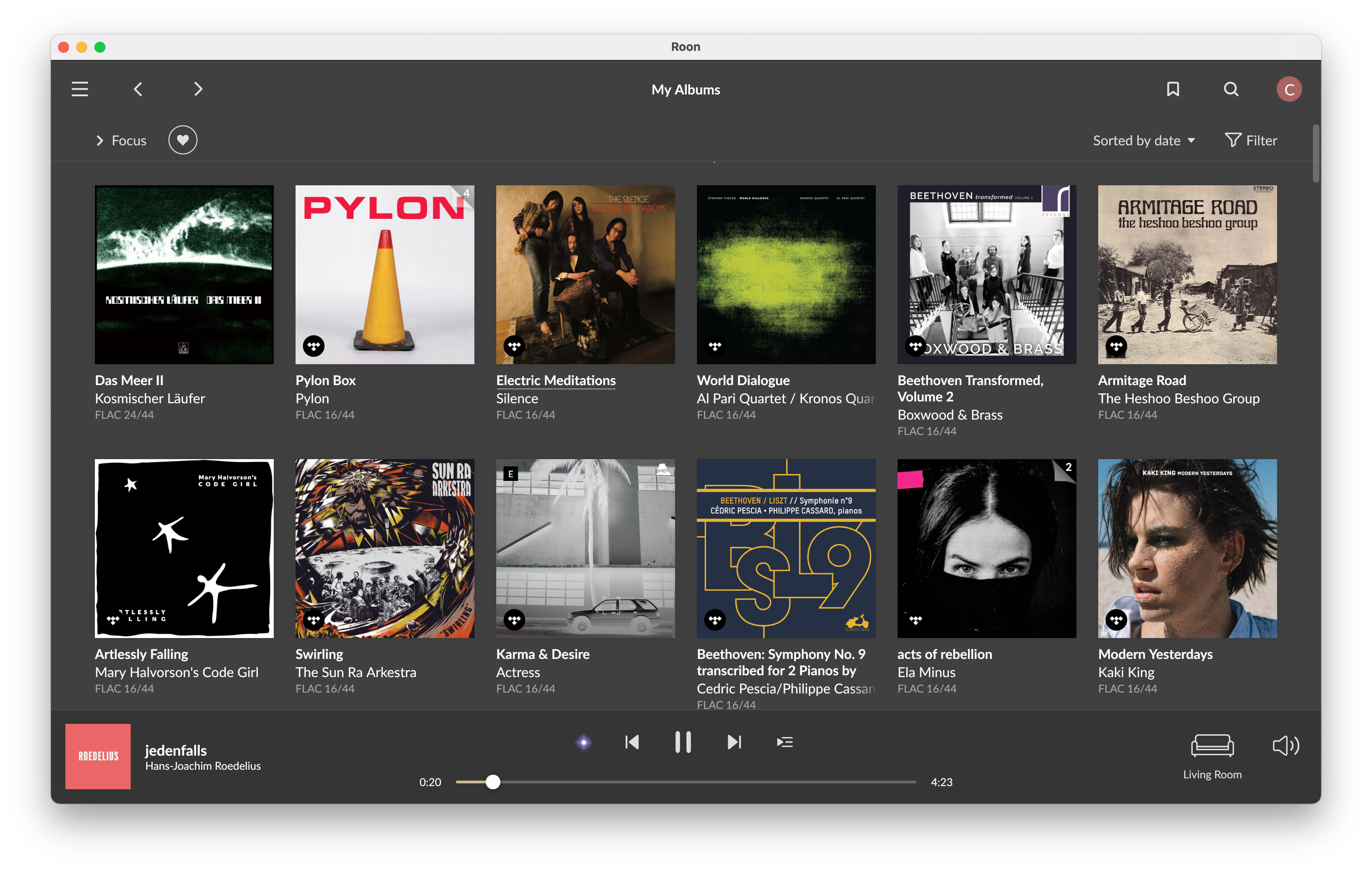
- I wish album covers were shown in playlist track listing summaries.
- When you select an album to play, clicking through the top tabs: tracks, info, credits etc makes the screen scroll up, rather than positing at the vertical height last viewed. That’s annoying.
That’s all i have noticed so far.
Small reminder for scrolling. PageDown/PageUp button working well in alternative.
1 Like
Yes that’s a given, but with 2900 artists and counting it’s a long long road before they’re all filled.
The terrible UI / VI decision to have nonsensical giant letters in the artist browser remains. The experience would be better if they were left generic as they were previously. At least then they wouldn’t essentially lie to the user.
3 Likes
One change I really like:
1.8: When viewing album versions (not already in my library), I can click on the “+” to add, and it’s added immediately.
1.7: This almost never worked from the versions page I would have to click on the version of the album I wanted to add, then click Add to Library. And it would often take a very long time to complete.
Thanks Babtiste. There was no intention to offend you in any way. Just looking for this new Classical functionality we couldn’t find. It seems roon’s restructuring of the UI makes it a lot easier for occasional Classical listeners to access old Classical functionality. That’s undoubtedly a good thing but I am sure you understand why some of us when reading the release notes are confused and disappointed.
Just some feedback. Hope this is the correct place.
The new Roon looks okay, but as someone else has said, the’ light’ version is a bit too bright, and the ‘dark’ is black, which I find too dark. Perhaps a third in between option? Can’t be that hard?
I thought I’d lost ‘Discover’. Thankfully it’s still there, just hidden. I’d prefer it on the home menu. Or perhaps users could configure what appears in the home menu?
Had some initial crashes, but seems to have stopped now I have disabled Tidal. coincidence?
Seems to run smoothly now.
Like ‘Discover’, has the album info that I used to love to read, really gone, or is it still there’ hidden somewhere? I can find the info on an artist, but not that, that used to go with an album. If it has gone, I’m very disappointed, as that was a key reason for buying Roon. I am from the older generation I suppose, and one who loved to read Lp sleave notes, so loved that.
Like many too, if much prefer the waveform to stretch much further across the screen, as before.