Not too sure this is an issue. I have the same setting under “General” and then under “Albums” I can sort in various ways, Date, date added, Album name etc… Ascending, descending…
Or am misinterpreting your problem?
Not too sure this is an issue. I have the same setting under “General” and then under “Albums” I can sort in various ways, Date, date added, Album name etc… Ascending, descending…
Or am misinterpreting your problem?
Am finding new version totally unstable. Impossible to select music and play to any audio zone. Have uninstalled and reinstalled three times so far…am I alone on this? Seems to be a problem with the iPhone app, iPad and Windows seem ok…
You would have to be a little more precise on what exactly the issue is. You are not getting your library loaded on iOS? Or have no Zones or both?
There was an issues with the first iOS version of 1.8. Are you sure you’re on the latest? If so, maybe you need open a support ticket wirh wour setup etc.
Casual use case here - just use very basic search, play and queue features + love RoonRadio function. (I know Roon offers so much more but as a lifetime subscriber I feel I have time to discover this when I get time!).
However, even for me this latest issue has presented 2 niggles:
I use a Surface Pro as my controller (as a touchscreen only) - so not a small low res screen by any account - but now have to scroll to maximise/minimise the screen when opening and closing the app, and what once felt like a simple task of pressing play / pause and skip now feels like it needs surgical precision. Seems small but these are real world functions I use constantly and have made the experience frustrating for what appears to be no gain.
Really glad to see such levels of continued investment in Roon development despite perhaps not as successful release this time around.
Kind Regards,
Simon
You are missing a feature of this function.
Next to the filter funnel click “Albums by Release Date”
Then click the “Sort by Date” up/down arrow to invert the function. If it is sorted by newest first, the arrow is pointing down. Click the arrow, it will point up and oldest is listed first.
The point is that this setting which you refer to has no effect at all at the sorting in the discography.
Thanks!
I clicked multiple times on the “^ date” and this made no difference.
Now I see that I need to click on the small arrow itself. This works!
Thanks again.
Part of the problem solved. I now at least can change the sort order this way.
Oh I think I understand. Indeed that „General“ sort setting has now somewhat been superseded by the various sorting options on „Album View“ itself. Probably a „left over“ from some earlier releases.
Confusing, but at least it doesnt do any harm  And I guess you found your way around now
Looks good. I would also include the ‘popular’ tracks in a tab, and similar album recommendations, lose ‘discography’ and return to the 1.7 style of listing separately under the artist which albums are in your library and which are available streaming. Tab views though are the way to go imo.
This definitely looks far better to my eyes!
But I fear others would argue…
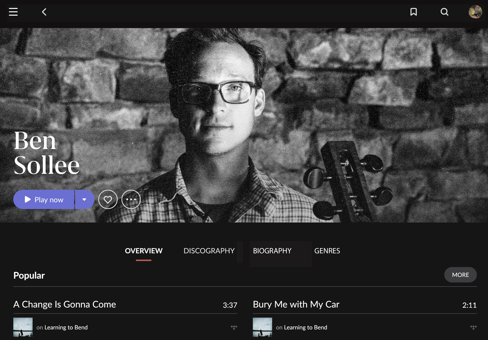
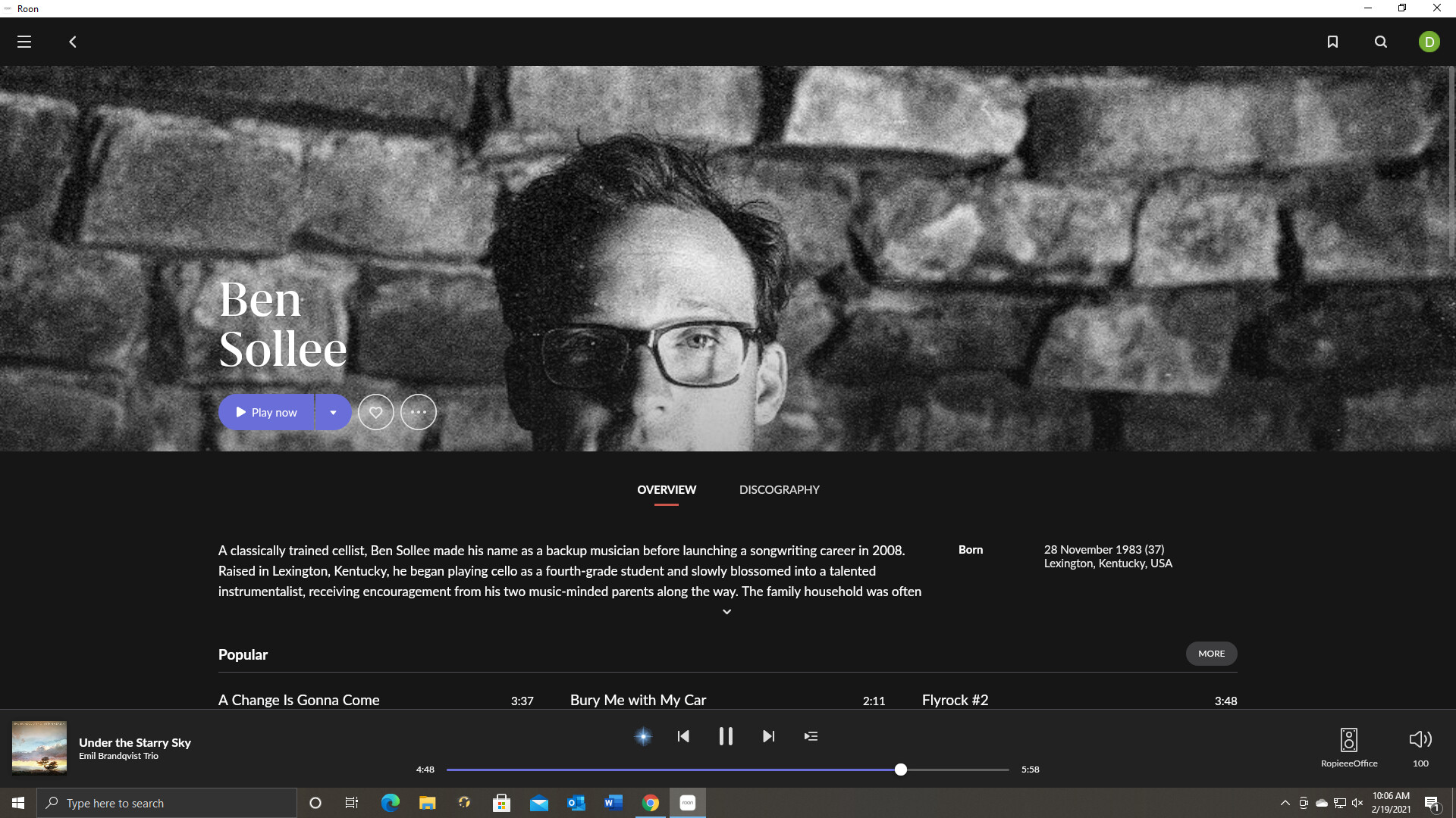
Yes! Love it. and unterneath that photo it should straight list the albums in the library and not „Popular this…“, „Top that…“, etc…
Particular if I listen to an artist several times or already know the artist very well, that bio just gets in the way.
Think these are track that are mentioned on the write-up for that album. They were there pre-1.8.
The biggest thing I see missing is the star rating system on the initial page of recommendations or artists albums. I have to click on each album to see the rating and that wastes a lot of time and hurts music discovery badly. If I am unfamiliar with the artist i want to see upfront ,before I click on the albums , what are the best rated albums.
The rating system , from All Music I think, is generally accurate . Sometimes i disagree with the rating but mostly I do not.
I agree on the star ratings. Very helpful. It would also be great to have a symbol that shows whether an album has a review or not. Even better would be a drop down of the review without leaving the thumbnail view, but I know that’s a big ask.
What I’d like to see restored to the album view in the desktop version from 1.7 is:
The sidebar that puts recommended albums in view instead of hiding them at the bottom of the page and also contained the current artist’s discography. The recommended albums change with every album change and now the user does not see them unless he or she manually seeks them out. Every time.
The former playback bar at the bottom of the screen which had the full waveform, larger buttons that were arranged more logically and the current track information above the waveform in a larger font that did not need to be truncated for lack of space.
These are things that were not broken in 1.7. I don’t recall reading complaints about them. Mobile users with their smaller, narrow screens never had these elements as part of their album view, so these changes don’t effect them. But the desktop version of 1.8 is less functional than it was before.
100% agree however Roon at least for me is like my employer. They ask for your feedback then they ignore it.
Still waiting for the mini player… 3 years now…
100% right !!
Been following this thread regularly since 1.8 and honestly I see enough variation and disparity in subjective opinions on the look/feel/usability that all Roon really needs to do is add more customization into the mix. Examples, I should be able to customize what I see when I view an artist, or the left navigation menu, the transport/waveform playback view etc. The albums view has some customization, but this also could be improved. These will go a loooooooooooonnnng way to really scratching so many people’s itches here, I know it’s not the sexiest of things to throw into a PR or new feature list, but they are essential if Roon intends to remain competitive.
I would love to hear more about what you guys are prioritizing moving forward. Are you going to be focused on refining and improving your browsing, filtering and playlist management but also increased customization as well? Is that a priority at all? Is integration with streaming services and refining Roon Radio, more important than this moving forward? Would love to see more transparency here to the community. To me it feels like a medium term focus on UX would be massive, but I would love to know what the dev team feels about all this.