Idk how to do any of that. As of 3 days ago, roon app simply doesn’t work. I get that screen I pictured earlier.
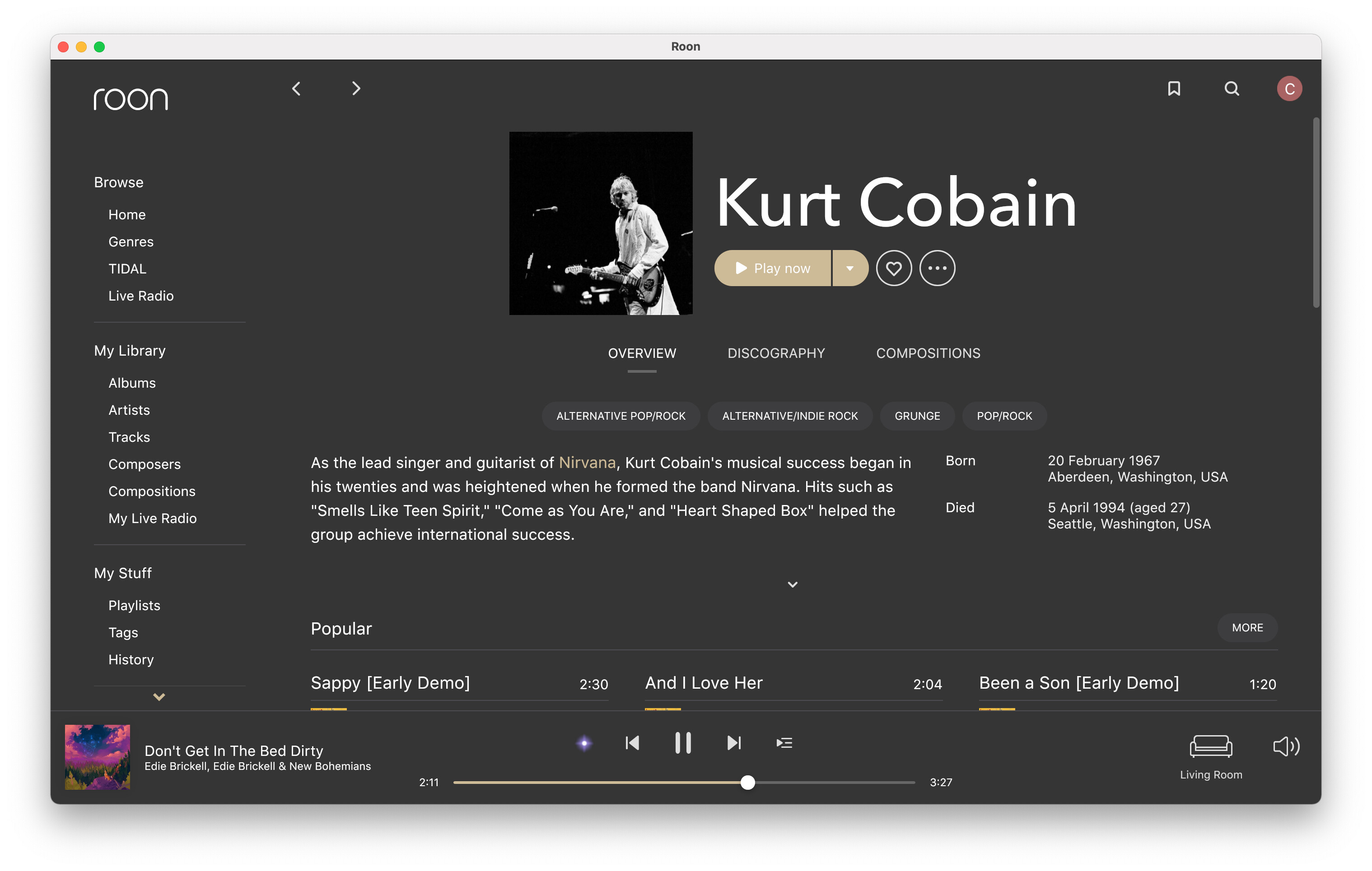
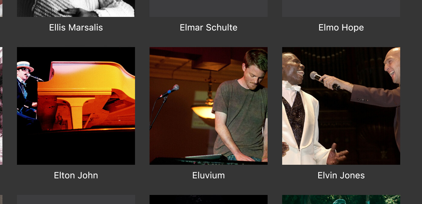
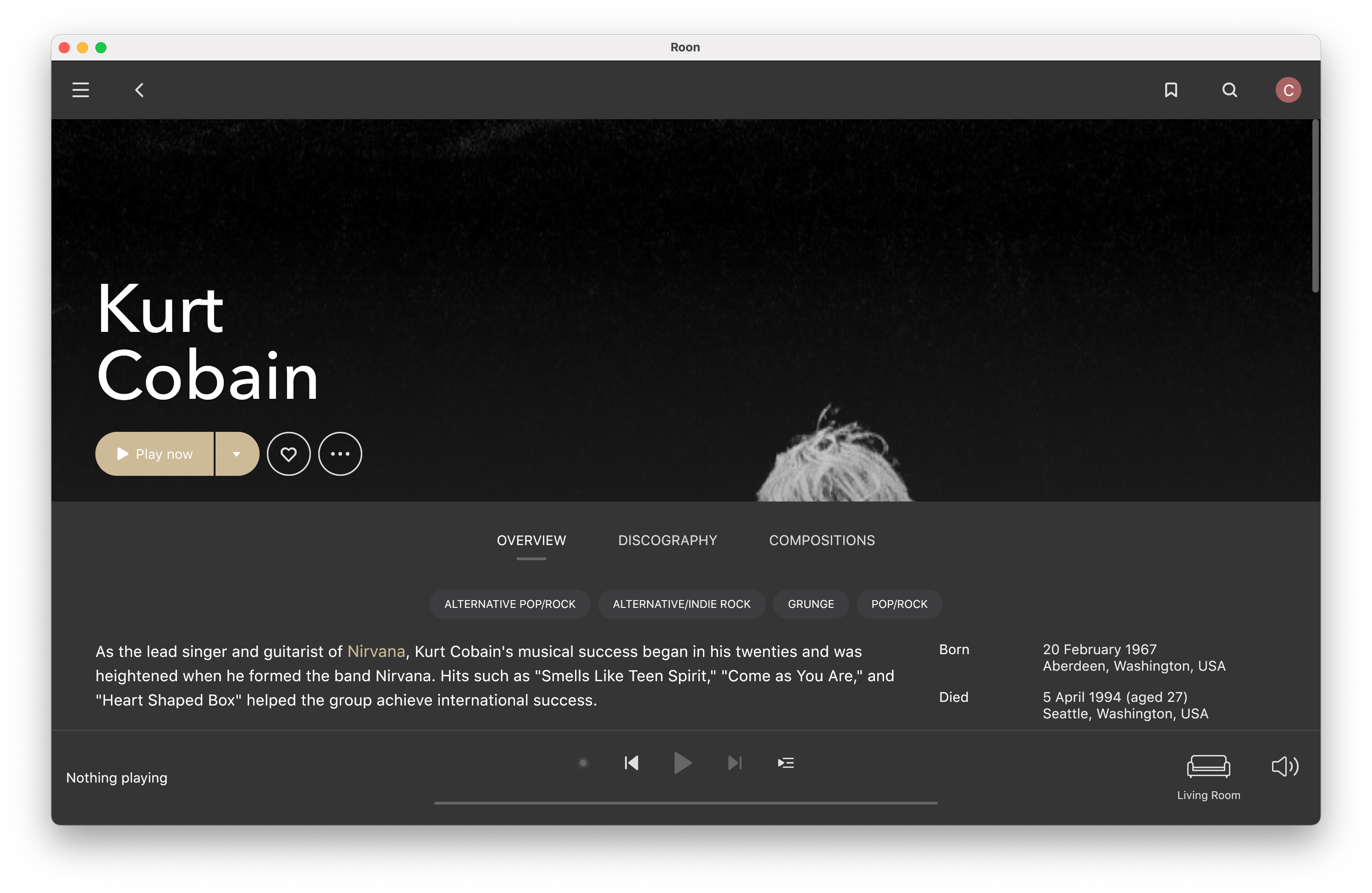
Switched to squares for artists and seems to be better behaved whether to open the image wide across the screen or leave as a square. I can see how extremely cropped images are bad for circles - I came across these three, all of which open out across screen perfectly. The previously circled Cobain expanded full screen for some reason. There’s some sort of face and/or shape recognition going on, but I haven’t fully cracked it yet. Abstract or very wide images (orchestras) seem easily tricked and automatically go wide. I would shape the algorithm to if no face detected don’t expand.
Overall as I’m able to customize enjoying 1.8 more and more.
After initial problems with the iPhone app crashing, I love 1.8. So much easier to explore and find music. App still has issues (and is slow to load/refresh) so please work on making it rock solid. Overall very happy. Nothing beats it IMHO.
1 Like
I think the interface is graphically dull. Nice effort on the Home page, but the artist page as an example is a real snooze. Does not motivate me to browse through my artists just get to a destination. The coloring and the larger images of the artists made it more fun and interesting to make a stop on the way to another artist.
1 Like
Fantastic analysis, which should be read over and over by Roon team and all its users.
Totally agree. The very apparent switch of favor towards phone as the preferred remote seems to explain most of the disagreement expressed about the new Roon 1.8 UI.
May I suggest that the Roon team conducts a survey to correlate the feeling towards the 1.8 UI with the type of remote used.
1 Like
Where is this “albums playing” page?
I have been trying very very hard not to lose my Schiit over 1.8. on Windows 10 with an extremely expensive LIFETIME SUBSCRIPTION. I want to give Roon 1.8 the benefit of the doubt. I really do. I like Roon. I like the idea of Roon. I like the community at Roon. But trust me when I say that this exercise in restraint to aggressively express my rage at 1.8 is becoming extremely difficult.
Where is the queue? Is it buried in some place I can’t find? Is it gone? HOW THE FK do I know what’s about to play in a shuffled playlist? It’s asinine that such a basic function was taken away from us, or buried so deep you can’t access it. I understand Roon is more than music playback software, but it is also MUSIC PLAYBACK SOFTWARE.
Please, someone tell me I’m completely blind and missing the obvious location where queue was moved to. I’ll willingly eat crow and apologize if you can do that for me.
Have you got Queue enabled for each view (Albums, artists, etc.) in Settings > Play actions?
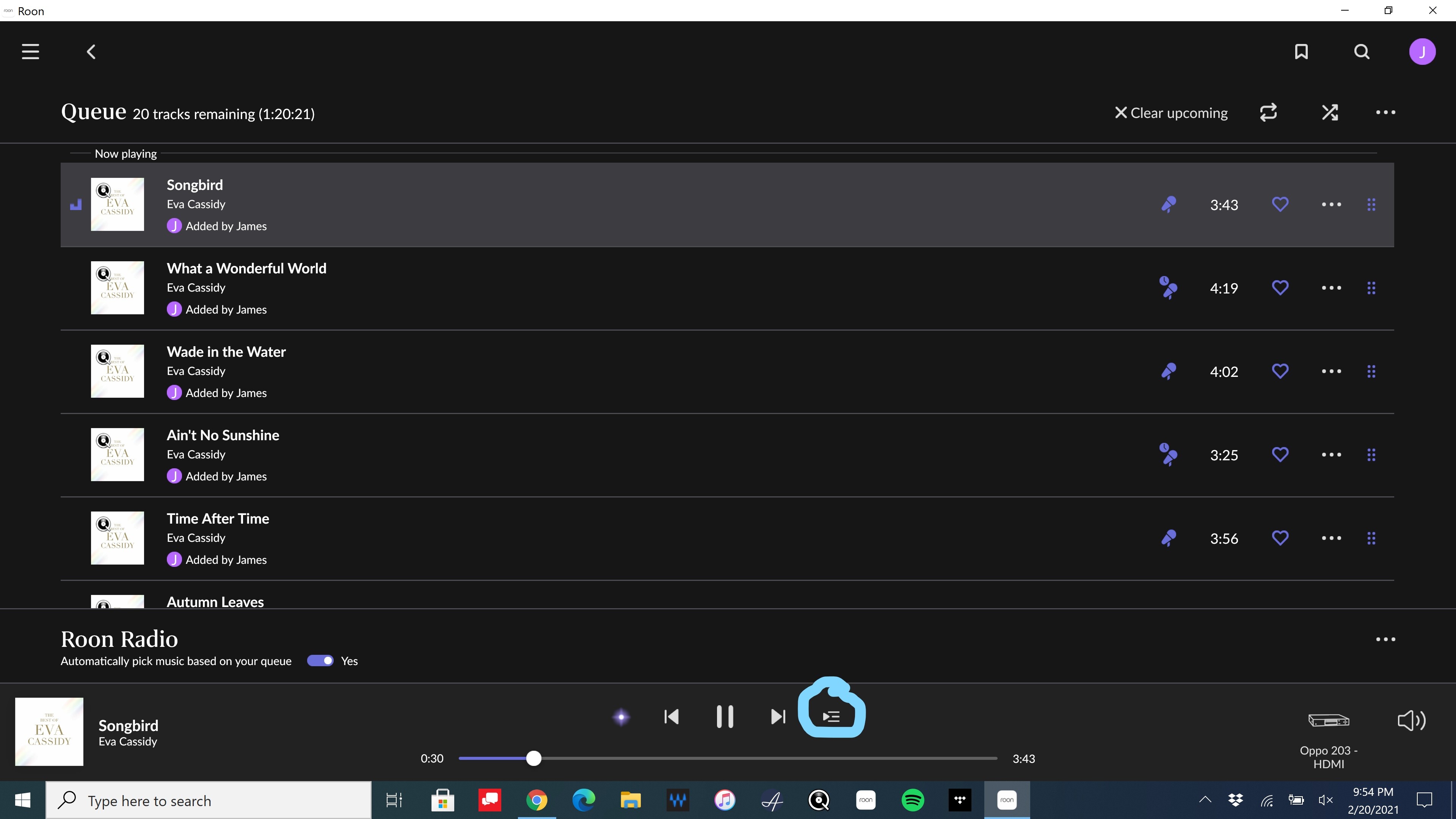
I do. Queue is enabled in every option under Play Actions.
omg.
Ok.
My apologies for the outburst. Thank you for your assistance.
… smh
3 Likes
Reboot all components?
As a fan of Jason & Mike, this phrase has me happy (and glad you found it, too)!
3 Likes
They make great… stuff.
=)
2 Likes
See your other post, download and reinstall the manufacturer graphics drivers the reboot
Other Windows users did this fix
Opposite again 90 % iPad Pro, 5% iPad mini 5 % Windows Desktop ( just for maintenance etc)
Just love the iPad Pro 12.9 
2 Likes
I need to restart server software every time when I open Roon app in my iMac and I don’t understand how could it act like this. even if I didn’t close the Roon app and I need to restart the Roon sever software after couple of hours not using Roon app.
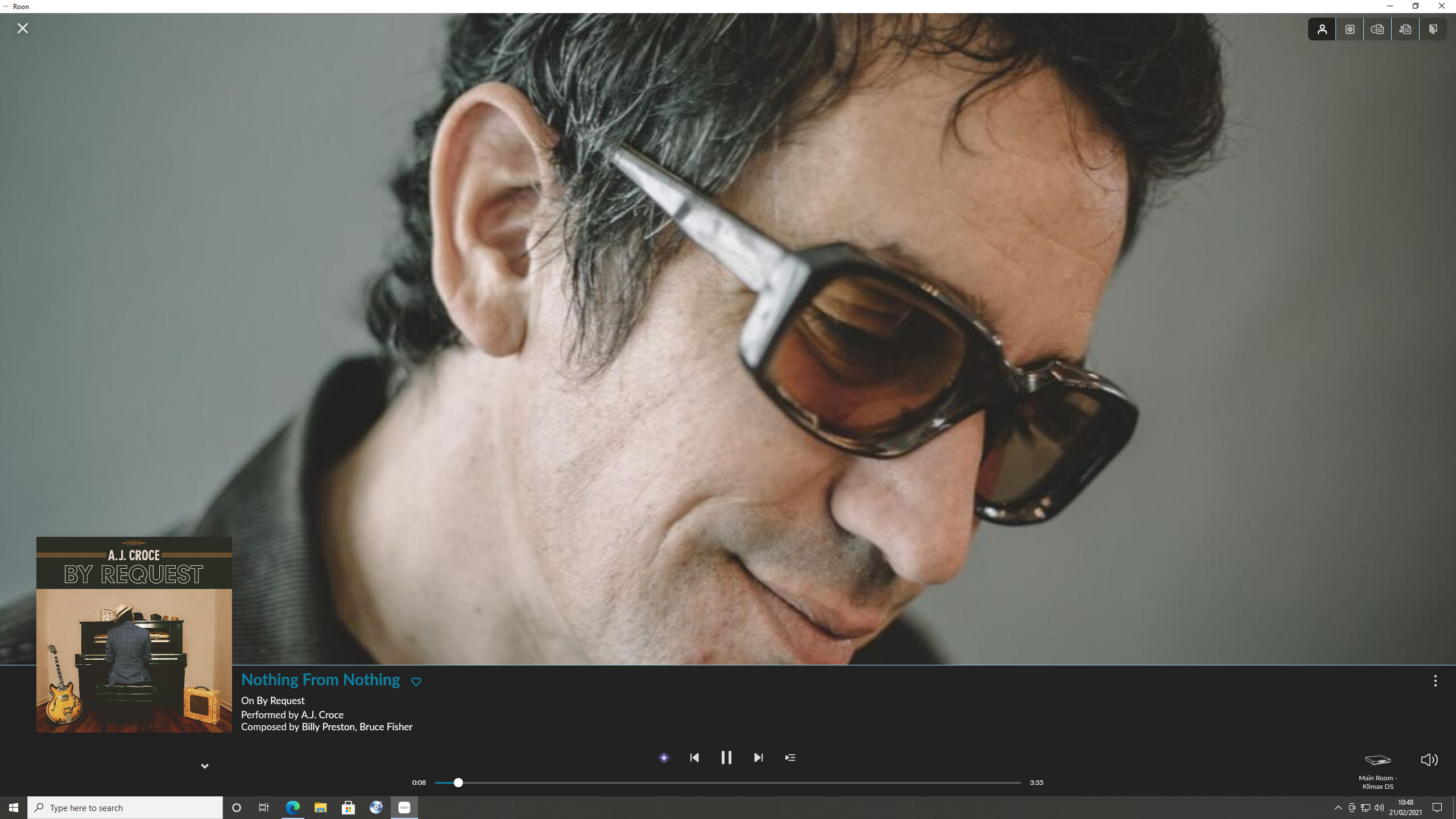
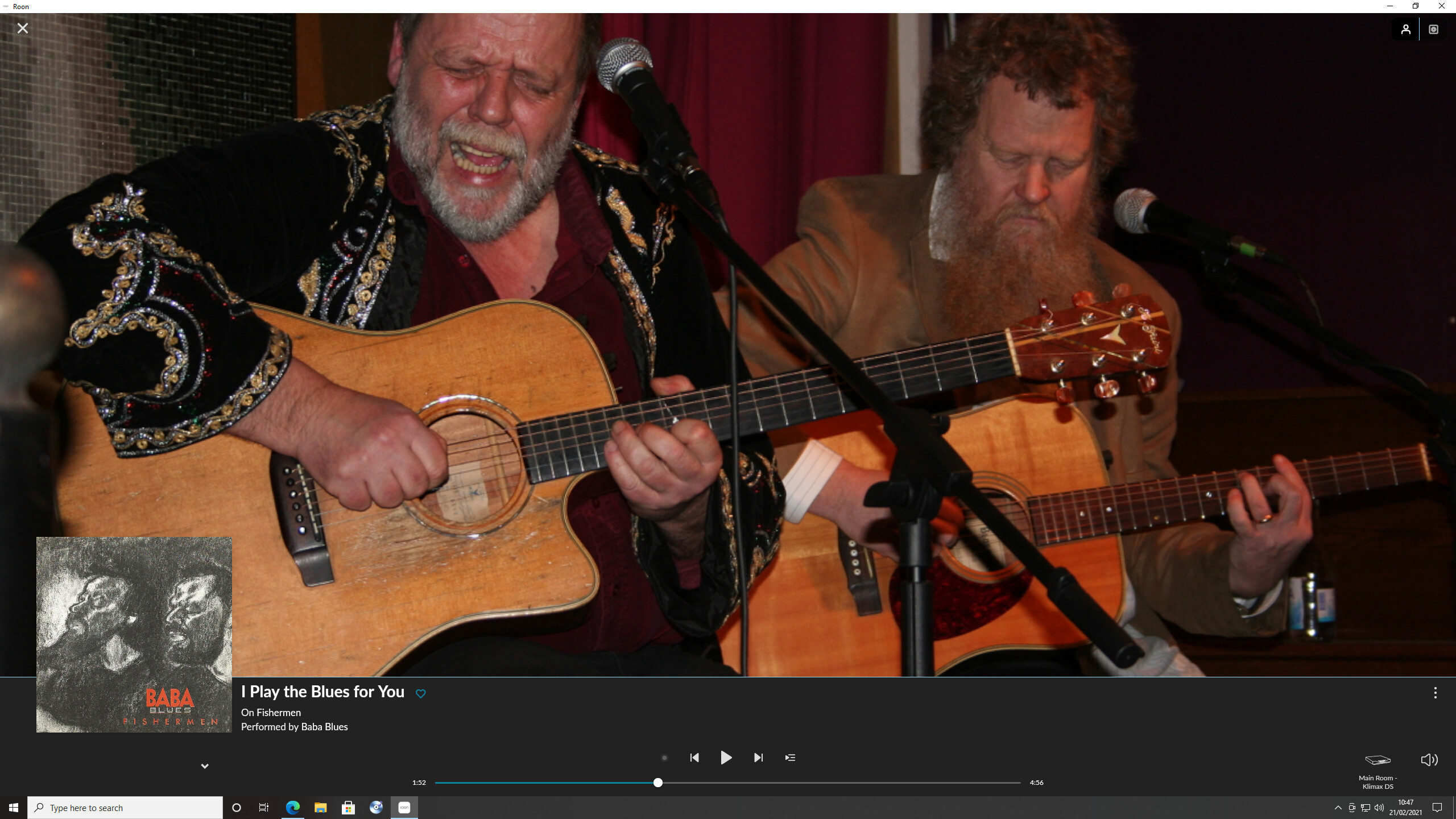
Sorry - I think I should have said “Track playing” page.
Here are a couple of examples:
and
On the first of these screenshots (A.J. Croce), the track playing is a link and coloured purple (or blue in my case). However, the album name, artist name and composers’ names are also links, but there is nothing to show that this is the case. They too sshould be coloured ‘purple’.
On the second of these screenshots, for whatever reason the track playing is coloured white and not a link.
The album title and artist name are both links but coloured white.
There should be consistency: all linkable text should be highlighted in some way (eg coloured purple) to distinguish it from standard text.
7 Likes
The new look of 1.8 is something that has not resonated with me at all. I’ve tried to work with it, but the sheer size increase and wasted space on the screen removes any functionality. for example here is what my home screen looks like:

The amount of wasted space on this page is ridiculous. Why is Roon screaming my name at me? The text sizes and types are oversized pretty much everywhere and the text is now some odd gray color, where it was sharp and distinct before. Navigation now requires multiple taps/clicks to get somewhere when it used to be one. How is that better? For example: I work from the queue more often than not, I like to use/build a list of music on the fly (find an album, add to the queue), shuffle it all around and listen as I continue on my day. Sometimes if I hear something interesting, I will go to the artist page and read/learn more: one day it was Billy Joel
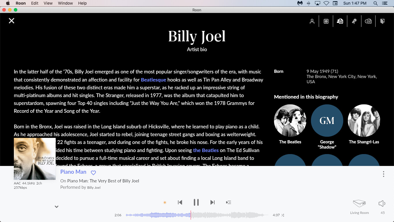
Why is the album art overlapping on the text? Again, lot of wasted screen space. Duplication of artist info - the links in the text are duplicated in the picture circles, which have lots of missing pictures. I see a relationship with Quincy Jones, and click on that
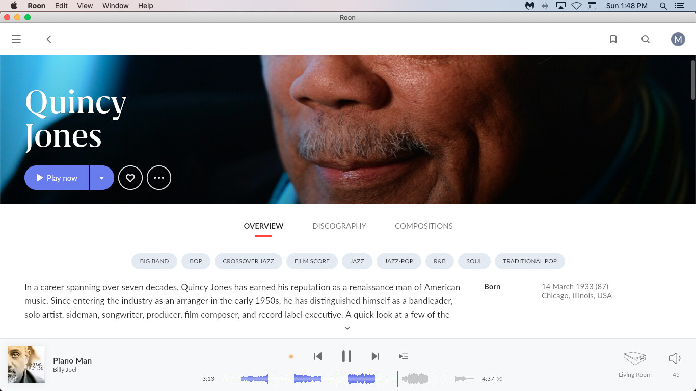
There’s a lovely picture of Mr Jones nose, lips and mustache. Must be his most admirable facial feature.
Ok, then let’s go back a page. I click on the back arrow (the one at the top next to the menu icon) and I end up back at the queue - wait, I was looking at the Billy Joel artist page.
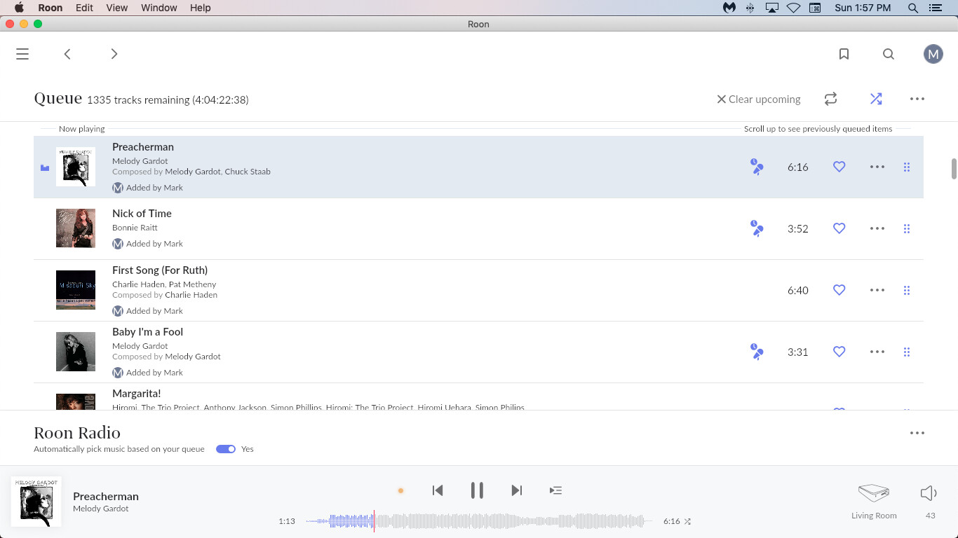
The queue has moved on, so I now have to search for Billy Joel’s page to complete the reading I was doing.
I found little navigation hiccups like this all over the place.
A feature I don’t understand is why the
bit M logo for my profile has to be everywhere. The line itself is a bit of a waste of time, but could be useful if multiple users are building up the library and playlists. But the M logo? more waste of space.
Roon Radio bar horizontally on the queue, another waste of space - IMO should be back on the side. Then for some of the people who want more functionality of the waveform back, there will be space to do so.
I’m a lifer on Roon, so somewhat stuck with it until the ‘bugs’ - technical or self induced experiments on aesthetics - gets ironed out. But for the moment, it’s less enjoyable to use. Which is a shame, I was really enjoying it. Again - IMO - 1.7 was great. Lots of functionality, ease of navigation, sized well (for me - use scaleable texting would have fixed that), no redundant features on the same page, easy to explore and find new music. I can still do that - but I have to click/tap more, scroll more, restart searches more - work more at it.
1.8 reminds me of the ‘upgrade’ of MS Excel - a couple decades of knowing how/where all the functions were - then changed with a whole new learning curve. Change for change sake - 1.8 kinda feels like that.
14 Likes
Just found a bug (I’m sure it’s been pointed out already): An album in my library is showing as not in library under artist discography when it is in my library (no in library badge).
When perusing an artist’s discography I was trying to add an album that I thought was not in my library because it didn’t have the “in library” icon, but it wouldn’t let me add it. If I click on the album then it lets me add it but then sits there with a spinning circle forever. Which led me to believe I in fact did have the album in my library to begin with.