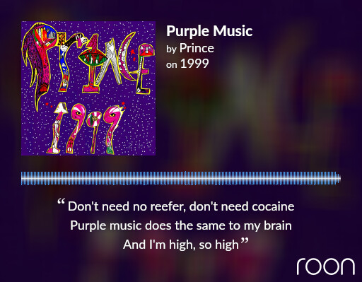
Roon 1.8 is great but please change the colour purple
What’s wrong with purple? Stands out at least.
I think to have a selection of colours would be preferable as I for one, love the Mauve…
Love it, modern and vibrant.
Check this thread:
I like the purple but it would be sensible to give users the ability to change the palate.
Yes, I’d be much rather have Roon add a “color picker” than deal with side-loading user-made alternatives. Good intentions and unpredictable results…

I love purple - one of my favourite colours 
Yes, it is not a question of THE purple or whatever other only color the interface would be based on, but that the UI would be more usable with a selection of colors. For example, I can barely notice if an album is unidentified, as it is written in the same font and color as the format, date added, etc (not purple in this case  )
)
Hmm, same as the purported “museum look” this 1.8 was hoping to achieve, you have to closely look at the labels to identify the artwork unless you know the piece and/or style.