Showcase your 1.8 themes

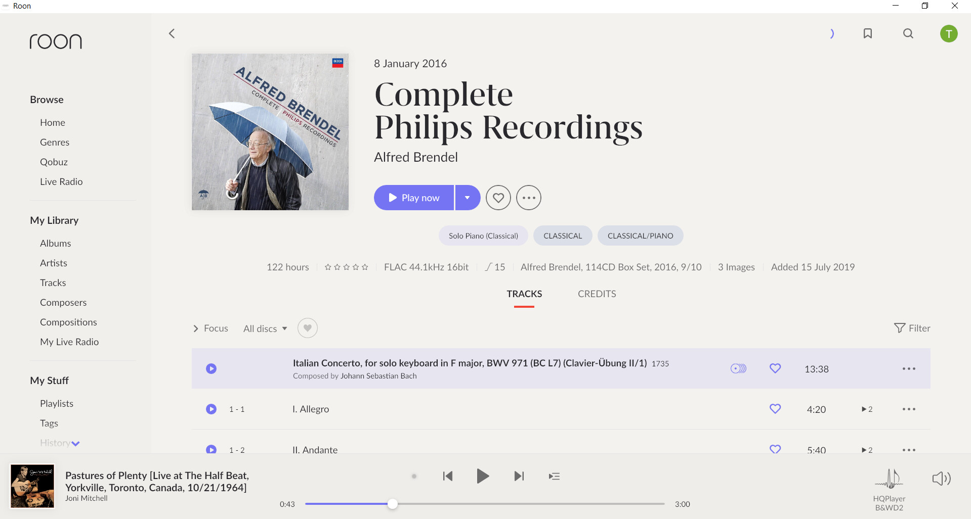
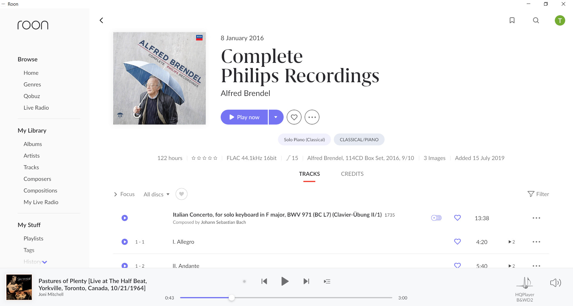
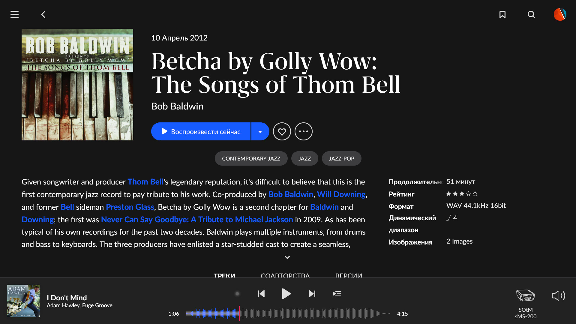
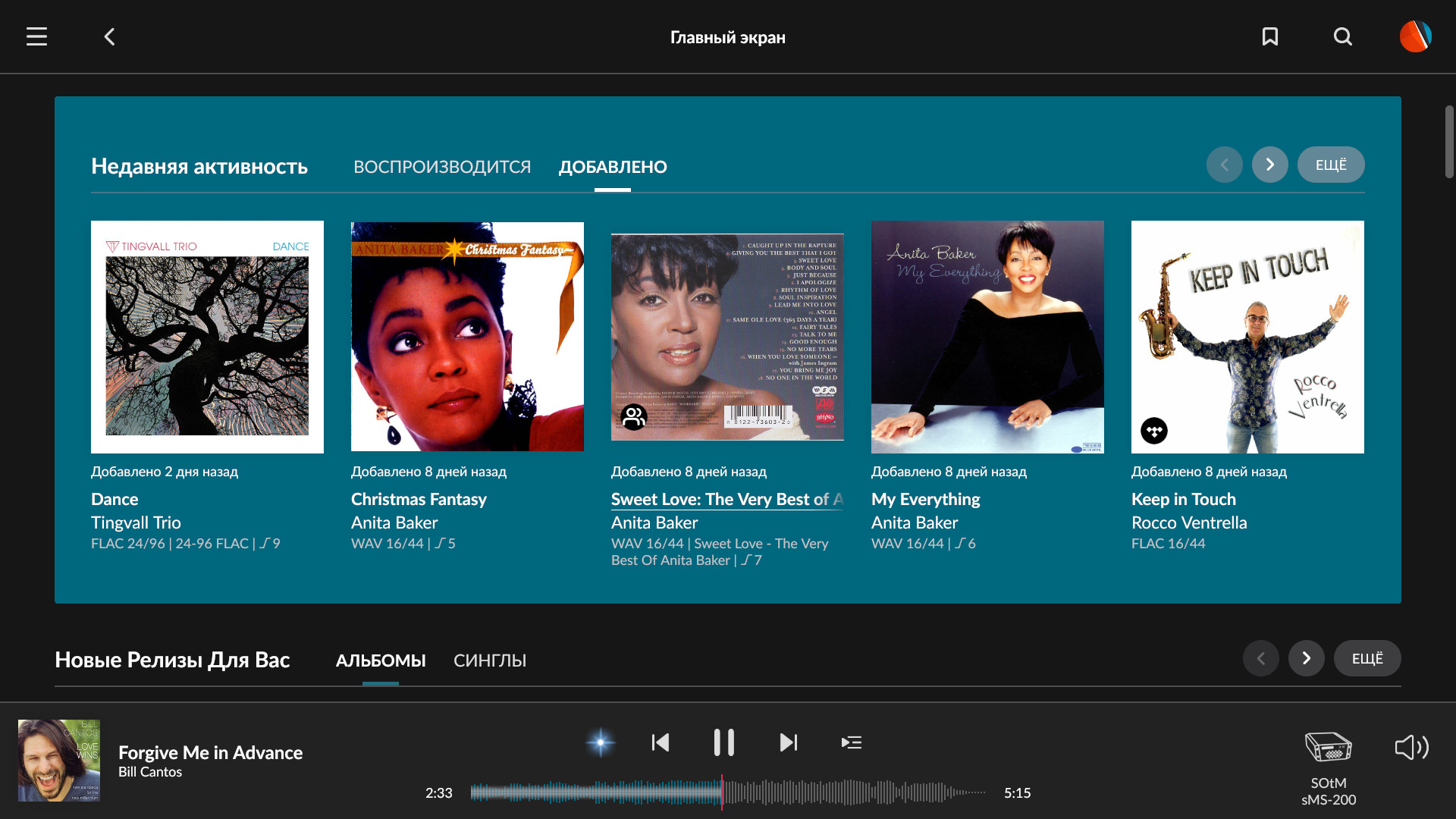
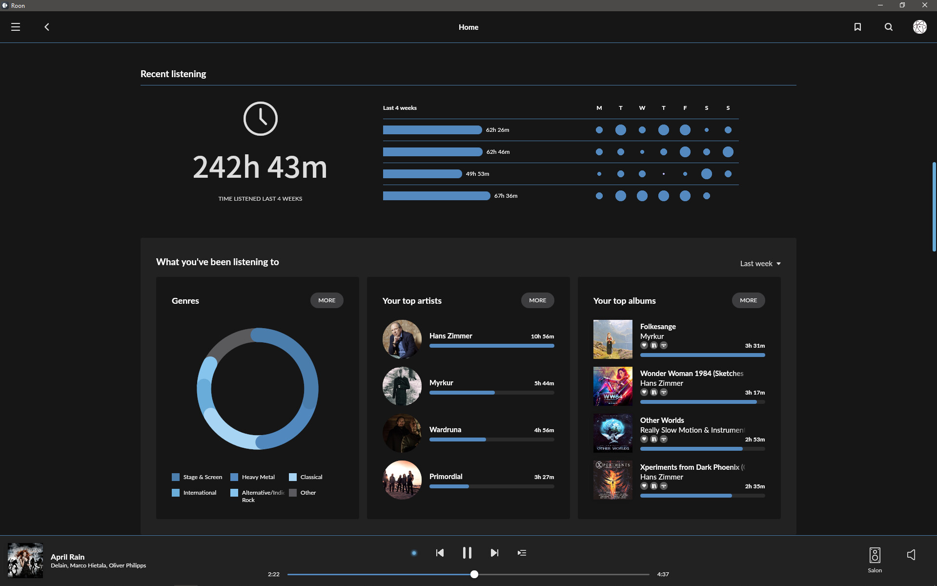
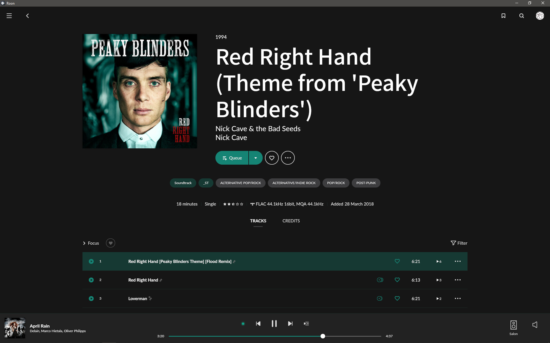
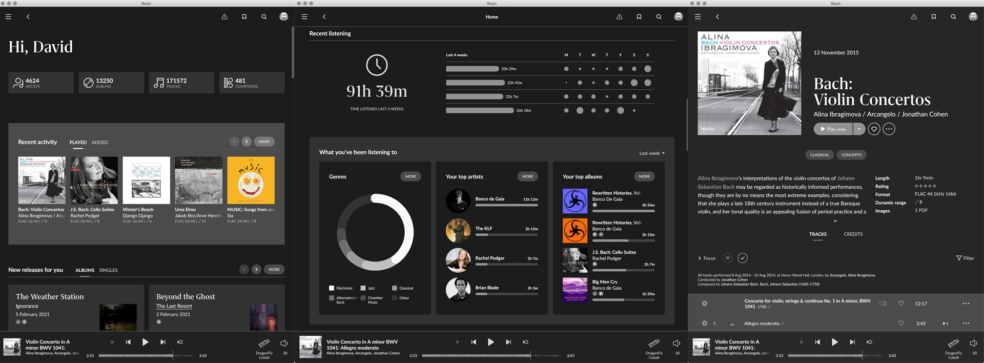
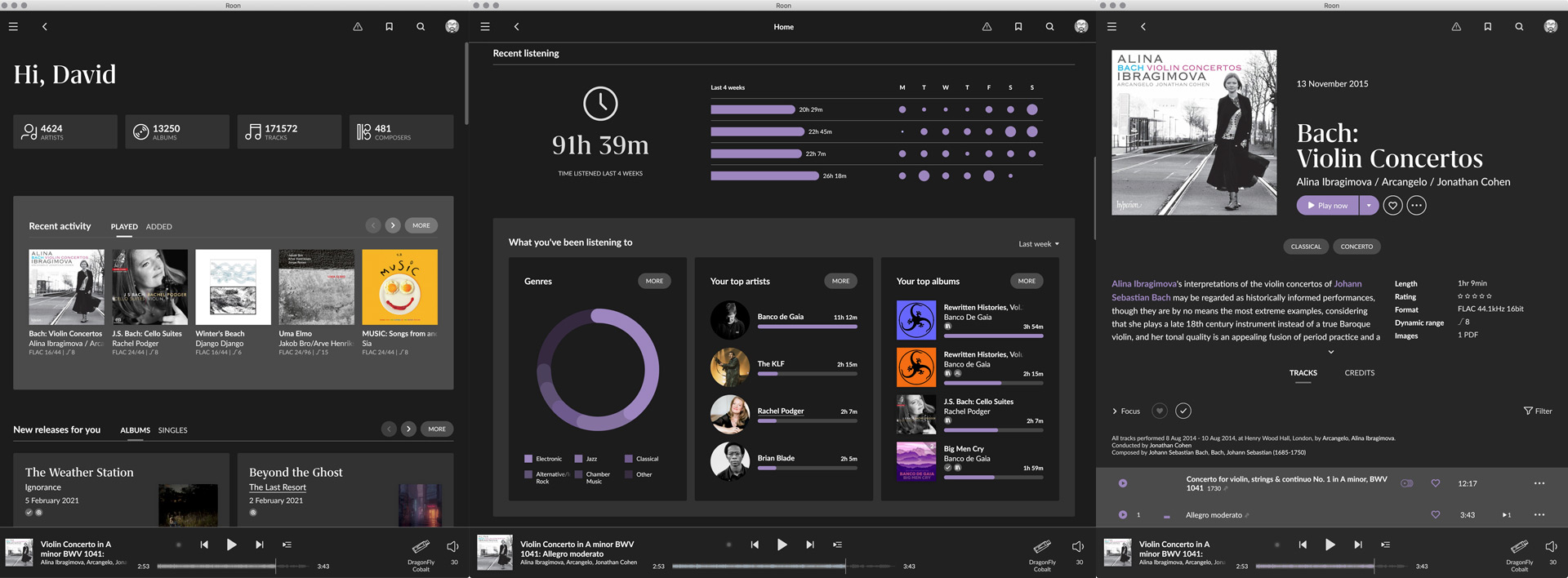
There are quite a few modded themes being posted, in various different threads, so I though it might be a good idea to start a new one where we can gather them together and share ideas. I’ve included my recent efforts below - a set of largely monochromatic themes with a muted accent colour. I’ve also included a Dropbox download link if anyone is interested in grabbing them.

Be warned, modding the theme files is not a supported feature, so proceed at your peril.

I would also suggest that you don’t try this if you’re running the combined Roon app as the app can crash, which could (potentially) cause database errors. Bad news. This is much safer if you’re running a separate occurrence of Roon and Roon Server, even if you’re running them on the same machine. Long story short, if you’re not 100% comfortable doing this, maybe you shouldn’t.

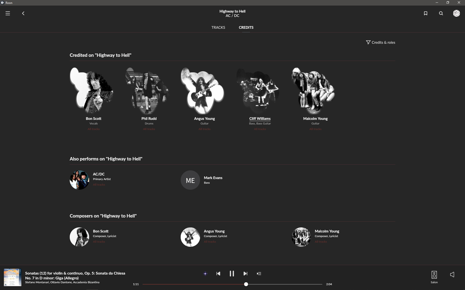
The themes folder can be found on a Mac by right-clicking the Roon app, selecting ‘Show Package Contents’, then navigating to Contents > Resources > Themes. In that folder you’ll find Dark and Creamsicle, the standard Roon themes. I’d suggest duplicating and then renaming either of the default theme folders - Dark, or Creamsicle - then edit the new ‘colors’ file. To select your edited theme in Roon, go to Settings > Setup, and then change the Theme to ‘Unknown’. After restarting Roon your new theme will be active.

If someone can tell me the file path for the themes folder on Windows I’ll add the info here.

Also, it’s worth remembering that any changes you make to these files will be overwritten by future updates. If you want to apply the same changes to the next version of Roon, make sure you have a local copy that you can put back into the themes folder after the update.

Alternatively, if you’re working on a Mac, copy the Resources folder to somewhere outside of the Roon app then create a symlink to link this folder to Roon.app/Contents/Resources. That way you don’t need to remember to back up your changes as they won’t be overwritten by an app update - all you will need to to is recreate the symlink. Again, if you’re not sure how to do this, it’s probably better that you don’t.


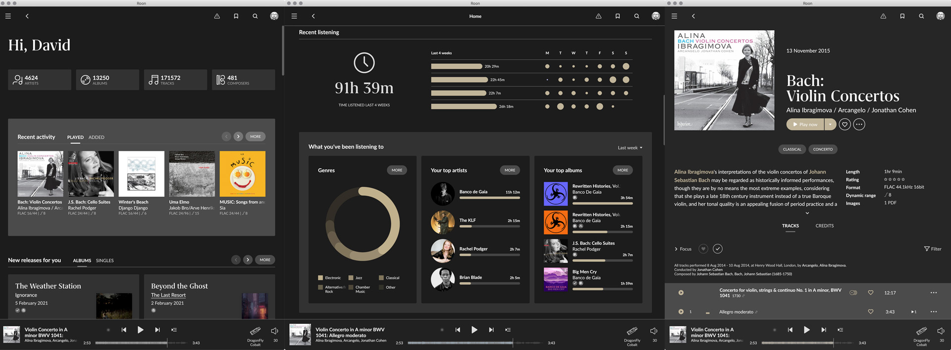
These themes can be downloaded here.

If you’d like to have a go at creating your own themes I’ve created a semi-automatic way to generate a new theme file (see this thread for details).

22 Likes

Great work, thank you. :+1:
I like “Monochrome” the most.
Assuming that this theme is “Dark-Monochrome”, do you have a “Light-Monochrome” version?

1 Like

I’m not a huge fan of lighter themes, but if I have some spare time over the weekend I’ll create one.

2 Likes

Hello @DaveN, I think such tinkering belongs in the #tinkering category. It is outside the scope of the normal #roon_software category.

Great, thank you.

Classical in roon has been singled out for an especially low contrast grey on grey light theme. Borders and side panels now blur into a horizonless “grey-out”. This is actually different from the default Pop light theme. The theme is being controlled by the “Classical” tag, so if you remove it you can see if you prefer the default light theme to the Classical light theme:

This is what the unusually low contrast album view in 1.8 currently looks like for a Classical album in the light theme:

Deleting the Classical tag turns the display to the much higher contrast default light theme:

Obviously deleting your Classical tags is not a solution but you can see in a low-risk way what you prefer. I am playing around with higher contrast buttons, fonts and scroll bars at the moment and will post a higher contrast light theme later over the weekend at some point.

1 Like

Thanks @BrianW, #tinkering is a much better fit.

2 Likes

Nice themes - thanks for that. No messing with fonts or garish colour schemes. Nicely done.

Shoiuldn’t they be Purple Rain, Mr Blue Sky… ?

2 Likes

Here’s my current. When I have time might try something a bit different or see what I can do with the light theme, but I think beyond the mess of a layout it looks quite elegant.

5 Likes

Yep, that looks good. Did you darken it a bit, in comparison to the version you posted the other day?

Загрузка 5.jpg

1 Like

Beauty Blue


Green Imaginaerum


Chocolate Brick


4 Likes

I did darken the background a bit. These are pretty quick choices - if I was actually designing for a release I’d tweak it even more as lots of gray shades available. I just wish we could make the album titles smaller!

I thought you probably had. Every time I look at yours I’m tempted to lighten mine a bit more :slight_smile:

And I’m with you on the font size. I don’t mind the default font, but it really doesn’t need to be that large.

By the way, if you’re running Roon in windowed mode (rather than full screen) you might also want to take a look at this post:

2 Likes

I steered away from vibrant colours with my themes, but I think Chocolate Brick work really well.

1 Like

Rectangular artists pics


Bubble artists pics


Open folder like below, make a backup copy of the original file, then paste and overwrite.
image

LINK

*All changes on your own risk :wink:

4 Likes

@Damian_Kurgan
Thanks for this - but I’ve just tried it (Windows 10 Pro 64 bit, Surface Pro 7) - and it doesn’t work…
This device is a Remote - does it need to be installed on the Core device?

Also just tried and it’s not working for me either (Macbook Pro running the remote).

1 Like

just tried it on a macOS remote … unfortunately, it corrupts shapes elsewhere in the UI

but i love the effort !!!