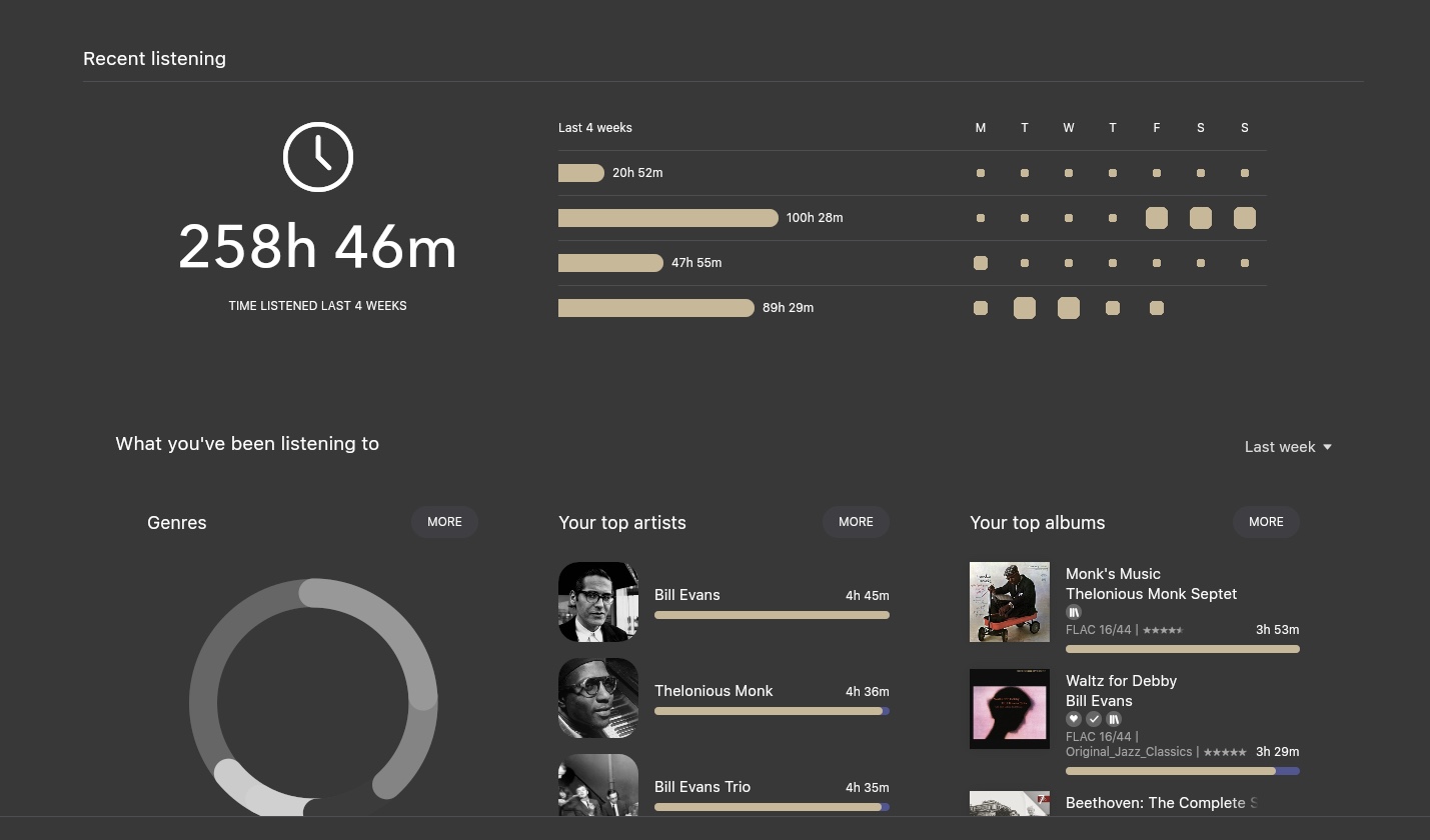
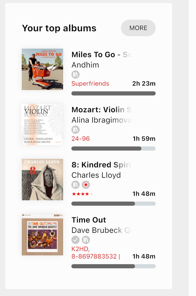
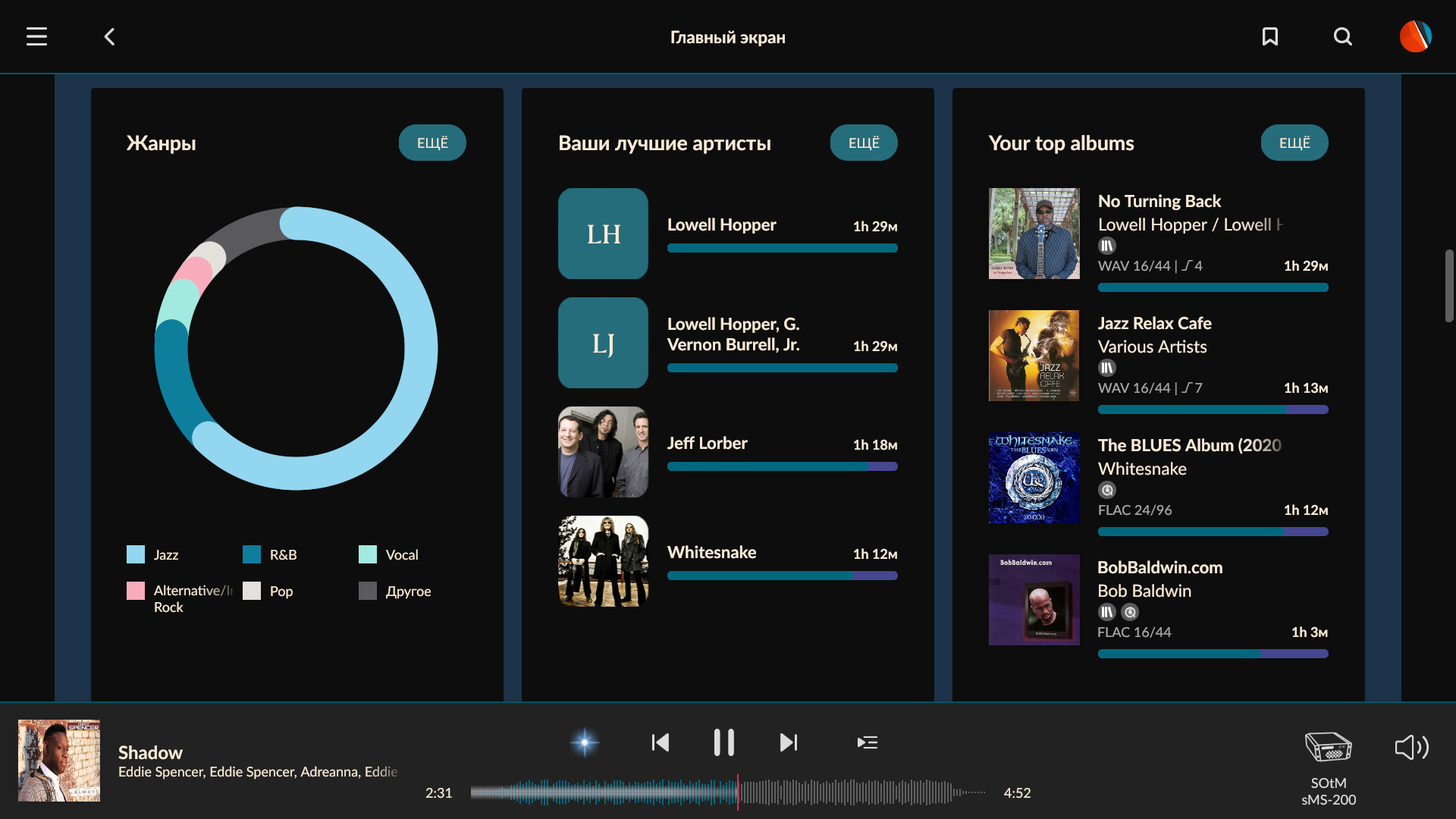
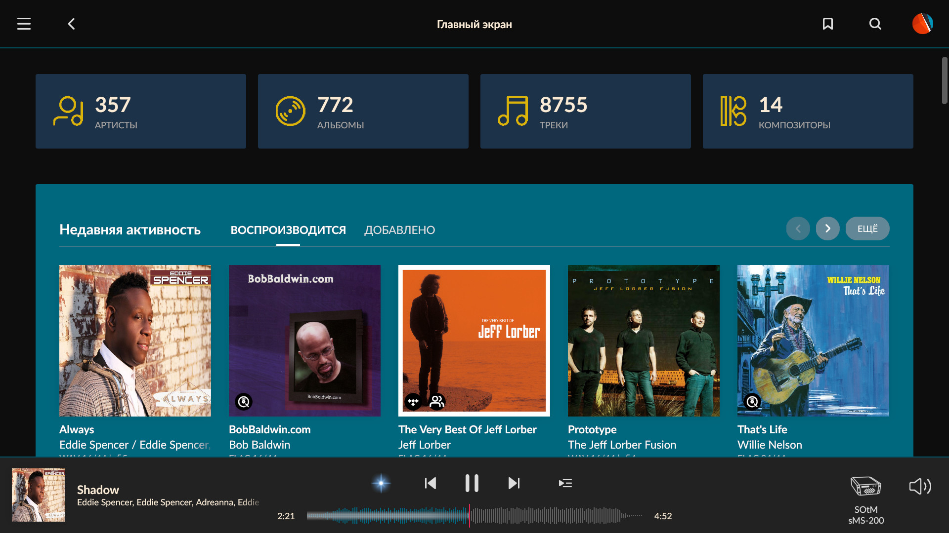
I’m not particularly sold on the ‘recent listening’ section - I can head over to last.fm and get a much more detail report on how I spent my time - but I do quite like the ‘What you’ve been listening to’ sections. I can’t see me using them all that often, but I quite like having that info to hand.
1 Like
My graph colors same as my Play button etc highlight colors (cdba96). Applied to atom-genre-mapping, atom-blue, and atom-orange mapping only.
But if you’d had a day of not playing anything you’d find that the slightly smaller dot would be ‘purple’. Try switching to a new profile and you’ll see what I mean.
Oh. Doesn’t matter to me anyway as I pointed out above. I’v been burning a new DAC in the office so playing 24/7 as it is. Not sure what the graph is supposed to tell me that I don’t know already (I’m sure it’s probably more use to Roon the the end user).
They probably have the info anyway, the graph is just a front-end onto the data that we can see from our end.

I “like” the graph. What does it tell me? Virtually nothing…
BUT… it shows someone is thinking about it. Roon captures metadata about our listening habits and if they want to build models that show some degree of “intelligence” they need to at least be thinking of it. This chart - doesn’t say much - but I see it as a statement of intent.
In the words of Simon Sinek - “Start with WHY”. This chart doesn’t really pass the WHY or the “so what” test… but it does point towards the notion that something is happening. Now I know folks will say that they don’t care about it…but then in the same breath will talk of some music services being vastly superior than others in such areas. There is a good reason they are.
1 Like
Has anyone found a way to change the colour of the rating fonts ? I would like the stars to be more bright…
Such a good thing all those custom themes ! One cool thing Roon Team can make to improve this would be to take the naming of each custom theme into account. Maybe someday ?
I think the stars are part of the ui_atlas files, so don’t think they can be brightened.
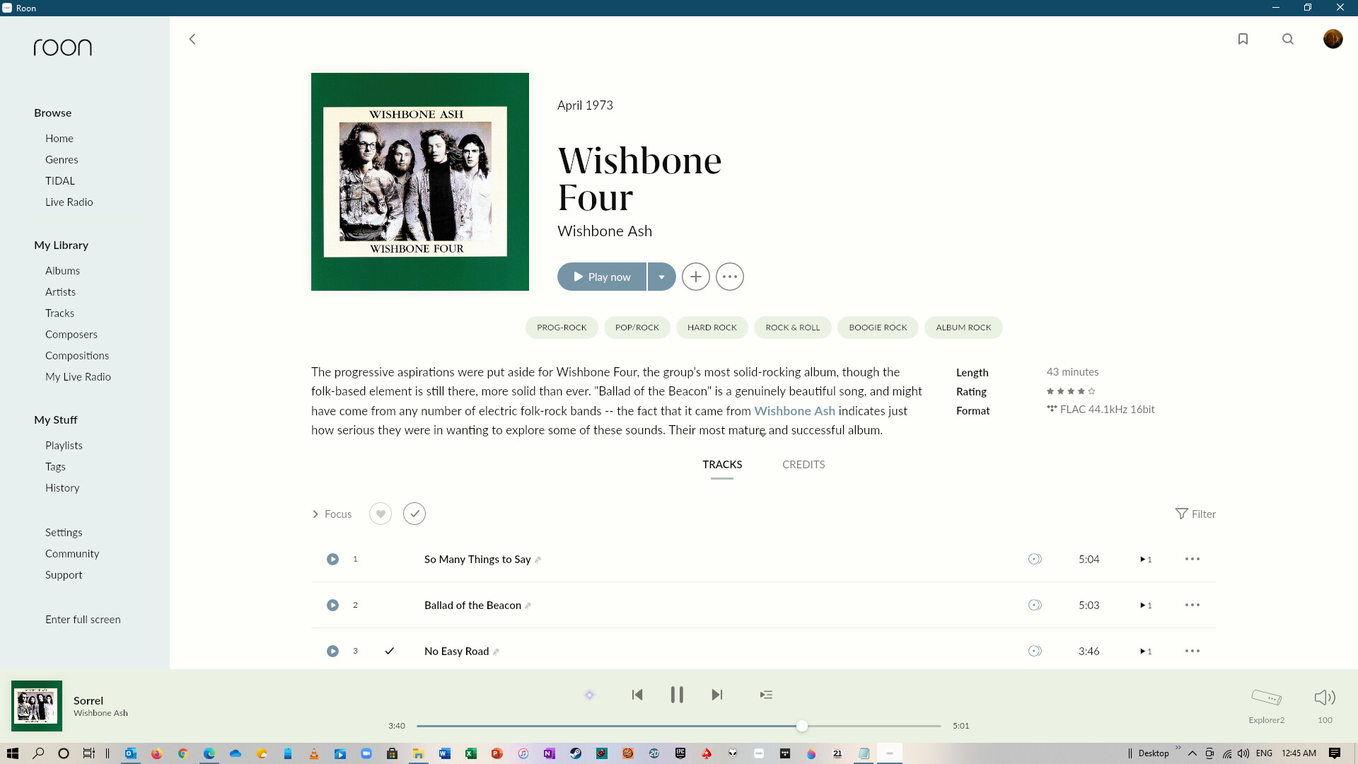
OK, so I’ve seen enough squircles to convince me, but I’ve gone for more ‘squ’ than ‘ircle’, on the basis that this is the smallest corner radius that still makes a significant visual difference without wasting too much of the original image.
1 Like
Oh, I’m not questioning the hidden utility of it, to devs especially, but the why does it take precedence over so many other things on the home page is the main ask. Because it’s so important to the user, or because it took a lot of time to code and is pretty?
The latter, I suspect. I know it’s been mentioned loads of times (in different topics), but the best way for Roon to configure the home page would be include some degree of customisation - turn sections on and off, move them around on the page, and so on. I’m have no experience of coding applications, but I don’t imagine this would pose too much of a challenge.
I have got the stars in yellow on mine as can be seen here:
I believe it is in the colours file within the themes section will have a look to see if can remember which label it was in the file but I think it changes other things to that colour as well so cannot change the star rating just on it’s own.
Edit - I found it it was atom-grey4-secondary and when doing a little bit of fiddling with it the only other thing it seems to change is the writing next to the stars, so not to bad if you want the stars in a brighter colour with a tiny bit of brighter text.
1 Like
Roon is built on their own underlying framework called Broo. I don’t know the reasons for this - maybe it was the time it was conceived in the Sooloos days. These days you have widget toolkits like gtk and Qt - the widgets are the elements that you see. Sliders, radio buttons, input text fields etc. How they look and what they can do is governed by the toolkit. Roon wrote their own (which is why it doesn’t look like MacOS or Windows or Gnome desktop or…or…) At the time maybe this was seen as a benefit. it had its own identity. Most of the frameworks have UI designer tools where you can place these widgets on a “canvas” to build the UI. gtk has Glade. Qt has Qt Creator. Roon built their own. Then you need a runtime environment - something that takes this UI (plus the code you’ve written) and execute it. Some of these runtimes were targetted at a specific OS or architecture. Others were cross platform. Roon used Microsoft .NET (I suspect they were from a Visual Studio background) which was written for Windows. A company called Ximian wrote their own version which was cross platform - Microsoft acquired it and that became Mono, which is what Roon uses for non Windows environments.
Sometimes building your own has benefits. And sometimes it has costs. Sometimes not immediately - but as tech debt that comes back later. Sometimes using someone else’s stuff has benefits, and sometimes it has costs. I suspect that the Broo stuff that was great for rapidly prototyping things has also held things back. I think this is why we see things that used to be in one place but are now spread out a bit. Or why some things are hard coded - changing Broo for these things is now harder than just writing it again (possibly). If they were doing it again now, from scratch, would they use something like Qt? Possibly.
But in a long winded way, I think Broo has given them flexibility in design initially, but now would be pretty hard to make customisable by the user - I don’t think it was developed with that in mind, and a “simple” job may end up easier written again.
2 Likes
It changes a few other bits and pieces too. Nothing major, but enough to create some annoying inconsistencies elswhere.
Never picked up on them, must be because of the amount of yellow in my theme, plus with the way I have done my theme I quite liked what it had changed but can see how it might annoy a few people in that case.
1 Like
Win10 users, don’t forget to choose a windows accent color that looks good with your theme. It makes a difference.
2 Likes
For some reason I can’t get squircles to work for me.
Do you simply replace the small circle in ui_atlas@1x-1.png with a squircle instead of a square, or is something different required?
I think the ui_atlas@1x-1 file is for low resolution screens so you probably need to try the ui_atlas@2x-1 file instead. Just replace the circle with a squircle (or square) and it should work. The only other step is to make sure you quit and restart Roon after you change the file.
1 Like